I’m always looking for meaningful items to bring into my home. I like to collect old photographs and I can never have enough chairs! But when I’m looking for that one thing I’m sure will make everyone say WOW, I opt for an oversized light fixture. The bigger, the better!
Before heading off to High Point Market, I was feeling like something in my home needed to change. The weather is heating up in Houston, and with that comes new life. The trees become greener, my flowers bloom. I’m actually attaching support beams to the front façade for wisteria to grow. So what could I bring inside my home that would reflect this change in season?
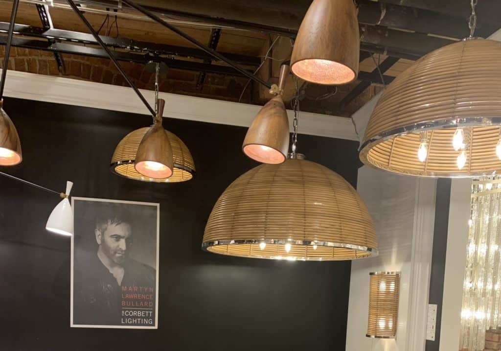
When I saw the Carayes at High Point Market this spring, I was sold. The massive size, the masterful curves. It was gorgeous! And I knew that I had just the right place for it: my breakfast room.
Any time I think about a new light fixture, I consider 3 things: the style of the fixture, its functionality, and how it fits into the overall room design.
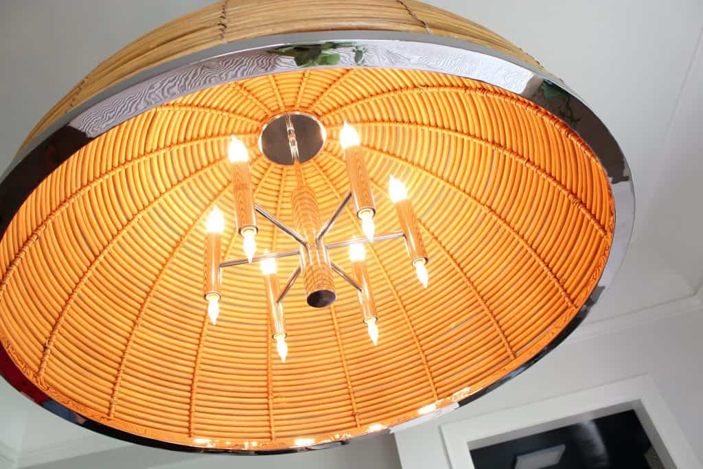
Let’s talk about functionality first. My breakfast room is bathed in natural light, so it’s okay to have a largely ornamental fixture here. If the room were darker, I would have chosen a piece with larger bulbs or something completely open. The Carayes has a dimming effect in terms of actual light and that’s okay in this room.
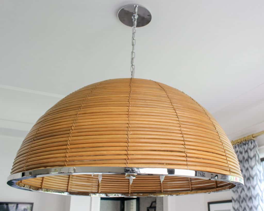
Next, style. I love the juxtaposition of the stainless-steel accents against natural rattan. It’s very unexpected and works really well. The rattan is hand-cut, and I prefer pieces that have a distinctly human touch. In terms of size, this piece is nearly 41” in diameter. That’s over 3 feet! The effect is definitely a dramatic one.
And finally, does this piece fit into the current design of the room? Absolutely. In fact, I chose the Carayes specifically because of its contrast. The breakfast room now is very airy and light, almost ethereal. Adding dark rattan is grounding. It completely changes the focus in this space. It’s easy to find lighting that works with your design style. But choosing something a little different is wonderfully unexpected and chic.
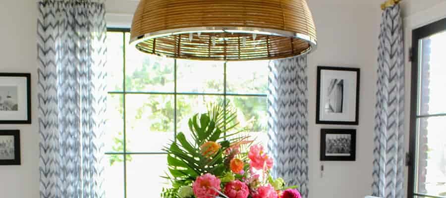
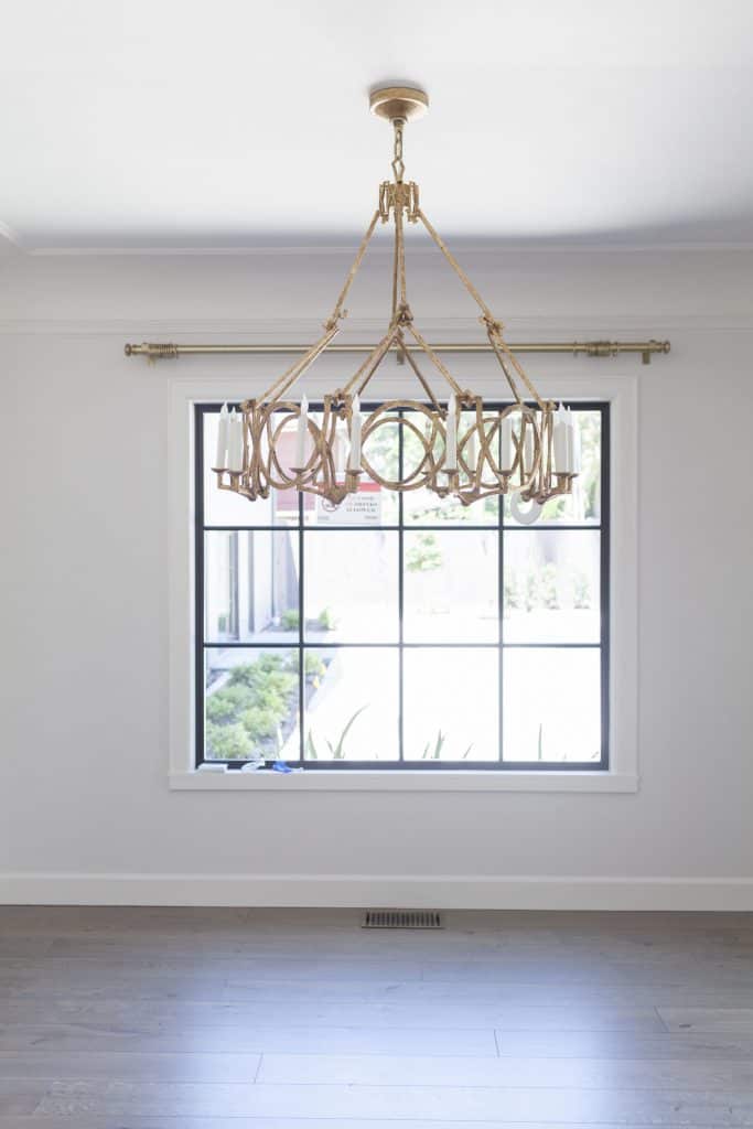
So let’s take a good look at the before:
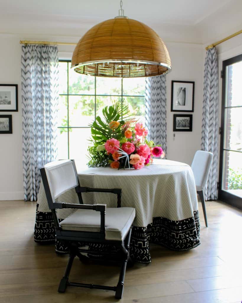
And now the after:
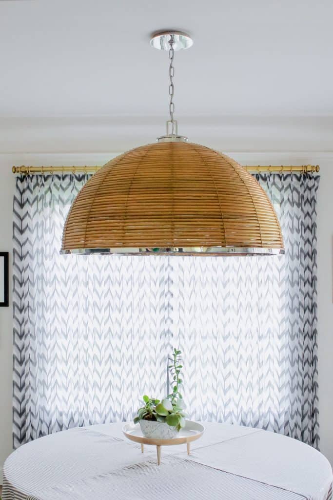
Wow!
I love the way this piece looks, don’t you?
Designer Martyn Lawrence Bullard created this piece for Corbett Lighting. Martyn is well known for designing celebrity homes and he has a great range when he does so. He effortlessly pulls off traditional, contemporary, Moroccan, Tuscan…you name it, he can make something beautiful.
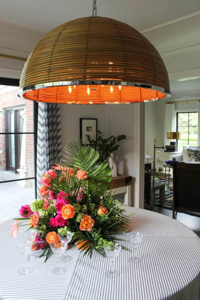
His line for Corbett is masculine and large-scale, mixing nature-inspired pieces with industrial materials. Being that my design aesthetic is a mix of traditional, contemporary, eclectic, and everything in between, I love this unexpected contrast.
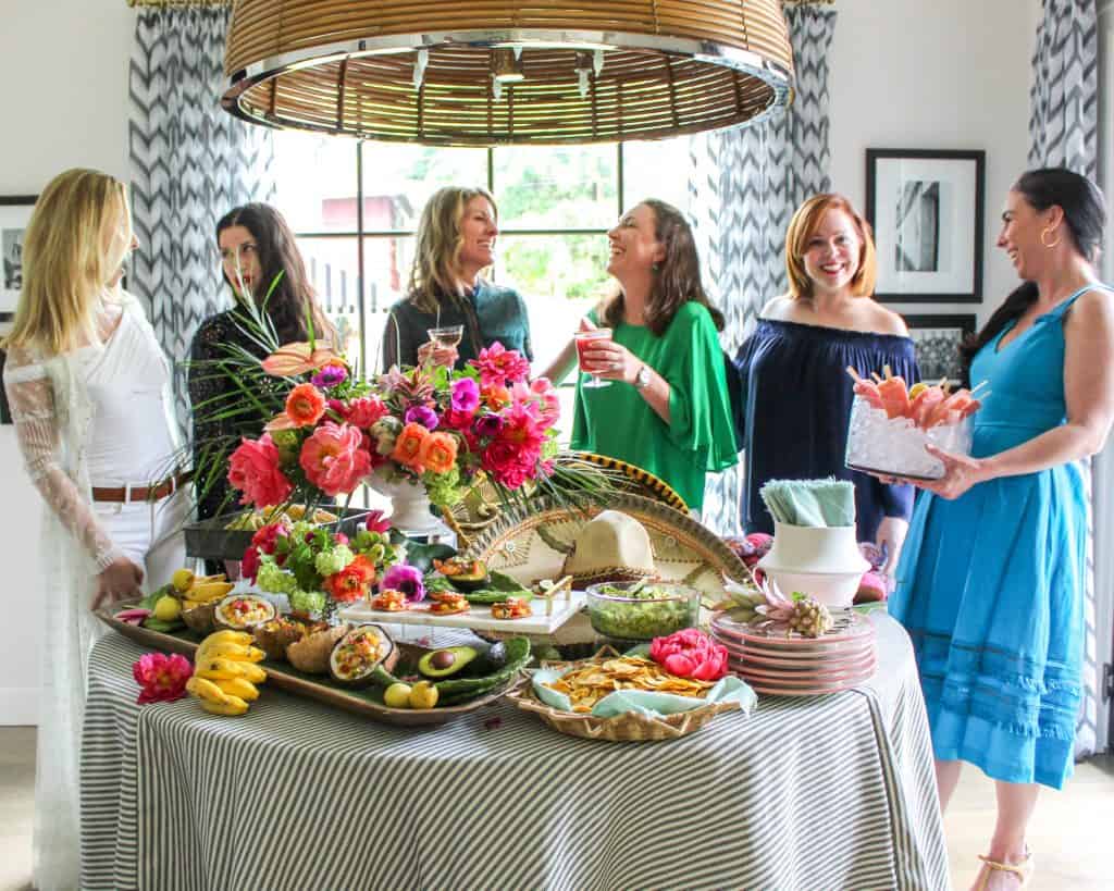
Most importantly, the Carayes graces the heart of my home. This is where we start our day. My girls have breakfast here. Michael and I enjoy coffee here. It’s where people gather during parties, and the best place to set a stunning bouquet. I must confess that after the soiree (that I hosted in honor of spring, sunshine, and boss ladies), this beautiful bouquet from Maria Maxit remained. Maria is a floral arranging genius, and to make sure that nothing happened to this display prematurely, we ate dinner in the formal dining room!
