A few years ago, our team embarked on a renovation of and addition to the stunning 1974 Bauhuas Expressionist home revealed in this post. We sought to preserve this one-of-a-kind home designed by celebrated architect Charles Tapley while honoring our client’s aesthetic and lifestyle. We drew inspiration from Tapley’s oeuvre, the natural world he adored, mid-century materials, and our client’s art collection. The result is a warm, open space that serves as a colorful yet calming respite for whirlwind businesswoman Jacky Fischer. Diane Cowen recently profiled our River Oaks Modern project and our client Jacky in an article for The Houston Chronicle. Learn more about Jacky’s goals for the renovation, her stellar career, and our approach to this unique home in Cowen’s piece here. For a virtual home tour of River Oaks Modern, read on below.
River Oaks Modern: A Bauhaus Masterpiece by Houstonian Architect Charles Tapley

The late Houstonian architect Charles Tapley is often celebrated for his unique contributions to public and private spaces throughout our city and its suburbs. He designed a number of churches, schools, pavilions, and private homes throughout his career in Houston. Tapley was also a landscape architect – a profession that was deeply personal given Tapley’s relationship with nature.
As Stephen Fox writes in the January/February 2016 issue of Texas Architect, Tapley dedicated himself to a “career-long mission to preserve and enhance Houston’s prodigious yet fragile natural assets.” Tapley was able to marry Modernist structures and verdant landscapes in a way that enhanced both.
The project featured in this post was originally designed by Charles Tapley in the organic, monolithic, and distinctly modern Bauhaus Expressionist style. This home pairs the emotionalism and dynamic, sculptural forms of Expressionism with the minimalism and modern materials favored by Bauhaus architects.
Remembering Tapley’s Commitment to Education and Environmentalism
Tapley was not only a working architect and landscape architect, but also a respected professor for The Rice School of Architecture (RSA) at Rice University. It was from Rice University that Tapley received his Bachelor of Architecture in the 1950s. Like Tapley, our client Jacky Fischer – owner of River Oaks Modern – is an alumnus of Rice University.
The school is recognized for its innovative approach to architectural education and its commitment to fostering creativity, critical thinking, and interdisciplinary collaboration – all of which Tapley championed during his tenure at Rice. He is still beloved as a mentor and friend by many faculty at Rice and students who attended RSA.
RSA also attracts innovative students with a clear point of view because of its emphasis on design, research, and exploration of architectural ideas within the context of broader societal and cultural issues. This likely resonated with Tapley, who was an activist himself.
As a proponent of the connection between nature and our built environment, Tapley created and cared for the school’s arboretum while at Rice. This project was one of many in which Tapley extolled the beauty, whimsy, and value of our natural world.
Both during Tapley’s tenure and after he retired, Rice University’s architecture program has received recognition in national and international rankings for its ongoing contributions to the field. Tapley too was acknowledged for his exceptional contribution to architecture. According to this article from ABC 13 Eyewitness News, Charles Tapley received a lifetime achievement award from the Texas Society of Architects towards the end of his life. Tapley was also a recipient of the Thomas Jefferson Award and the American Institute of Architects’ Houston Lifetime Achievement Award.
A conservationist and passionate environmentalist, Tapley was honored with a landmark in Buffalo Bayou Park for his years of service.
Taking Inspiration from Tapley’s Approach to Architecture
Drawing inspiration from Tapley’s oeuvre offered us the opportunity to create delicate interplays of light and space. We manipulated materials commonly seen in mid-century modern homes – like glass, metal, and warm-toned woods – to create these special moments throughout.
These elements serve both functional and aesthetic purposes. For example, the partial walls created with wood slats and the conservatory-like foyer punctuated with black metalwork reference Modernist architectural movements while optimizing the home’s flow.
River Oaks Modern: Challenges and Opportunities
As with any older home, this project presented its own share of challenges. However, each challenge was also an opportunity. Our three primary goals were to honor the original Charles Tapley architecture, update building systems to be more resilient, and improve the home’s flow and functionality for Jacky, her family, her pets, and her friends. Let’s take a look at how our team approached the challenges and opportunities presented by Jacky’s goals.
Honoring the Original Architecture While Enhancing the Outdoor Space
To honor the original architecture while adding important new features like the pool pavilion, home gym, and landscaping, we had to make a few adjustments. We began this renovation with an interior renovation – updating the kitchen, living room, dining room, bar, and game room back in 2019. In 2020, our client decided to add an exercise space and pool pavilion.
Permitting for our design proved challenging due to the location of the home’s patio. We could not move the patio, so we had to engineer an outdoor kitchen to create a functional, cohesive space that enhances their outdoor area.
Adding the gym was another challenge-opportunity in that we committed to creating a space that reflected Tapley’s original design while expressing Jacky’s personality and achieving the atmosphere she requested.
Updating Key Building Systems for Resiliency
Our second challenge became clear as we progressed with the renovation and discovered an outdated electrical system and bizarre A/C setup. First, we discovered that the original building was outfitted with an old-school electrical system that cannot support a whole-house generator.
We were able to design the gym addition so that it is compatible with a separate generator – allowing for efficient cooling and heating during an emergency when the family might need to shelter in place. Our team recalled the devastating 2021 freeze when designing this system – hoping to provide more peace of mind for our client.
To the latter challenge, the A/C was built into overhead can lights – an interesting but entirely nonfunctional design. As such, we worked with partners to completely redesign the A/C system and remove the existing can lights.
Improving the Flow and Functionality of a 20th Century Home
The challenge presented by our third goal was that the home was not designed for a contemporary couple who enjoys entertaining but also values downtime. To remedy this, we chose to open up the visibility of the living spaces while maintaining the elevation changes throughout the main living space.
The kitchen, bar, sitting room, media room, pavilion, and dining spaces are all social, but the different planes make these spaces feel cozy and private as needed. Because the home is tucked away towards the back of the neighborhood, it already had a cozy, secluded atmosphere.
River Oaks Modern Virtual Home Tour
As noted above, the home was our primary inspiration. Its architecture drove many decisions we made throughout the renovation. We retained some of the fun, funky shapes that were original to the home and warmed up the color palette without muting the black and white that dominate this Bauhaus-inspired space. Collaborating with our client at every step along the way, we created a durable and livable space that is rich with historical influences, allusions to nature, and Jacky’s diverse art collection. The homeowners’ love of travel and spending time outdoors is also apparent. Follow along for an in-depth tour of each space.
Entryway

Our virtual house tour begins with the entryway, where we enjoy our first glimpses of Tapley’s Bauhaus Expressionist style. Undulating shapes, flexible interiors, and use of materials like steel, glass, and concrete are all hallmarks of Bauhaus design.
Each features heavily throughout our River Oaks Modern project. Some spaces include bold colors and dynamic prints, but the home is free of superfluous ornamentation — making it calm, curated, and comfortable.
Bar and Powder Room

Next, we proceed to the home bar. In her article for The Houston Chronicle, Cowen notes that this “could be the most gorgeous home bar in Houston.” Pieces from the homeowners’ art collection, an asymmetrical bench, and an extra-wide door casing flank the entrance to this moody space.

When one steps inside, the Art Deco influences become clear. Mixed with materials from the mid-century and shapes from the postmodern period, this home bar harmonizes the many architectural and artistic influences referenced throughout this home.
Of course, the showstopper in this space is the Cranes wallpaper by Milton and King. Our client selected this wall covering, and it served as a jumping-off point for the rest of the design. Mounting the same wallpaper in the tray ceiling above centers the bar in a unique way. The shape of the bar so closely resembles the tray ceiling that it almost appears cut directly from it.
Another special feature is the cozy banquette custom-designed by House + Town. The Uphill Climb Bench from Uttermost just outside the bar also features custom upholstery.

The powder room takes tones and textures from the home bar and softens them. For example, the smoked glass accents and persimmon-colored tile pull from the bar without replicating its exact palette.
Media Room

From the bar, we head into the media room — which boasts floor-to-ceiling windows framed in that Bauhaus black metal and beautiful custom-designed built-in bookshelves. Our clients wanted this space to reflect their travels — which is an important part of the life they share.

LUDC designed the millwork to highlight their book collection and travel trinkets. The fireplace was also redone to mimic the undulations and three-dimensional shapes seen throughout the home. We furnished this space with pieces brought over from their Drexel home.
This space includes a classic Eames chair, art from Jacky’s collection, and a pool table with walnut accents and a red felt playing surface. The swooping table legs make what would typically be a heavy, visually overwhelming piece appear much lighter and more balanced within the space.
Family Room
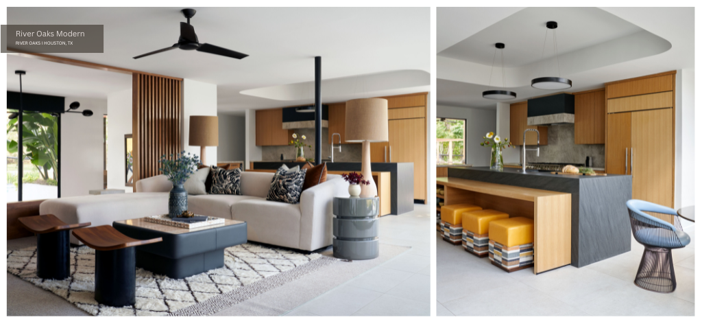
Another shared space is the family room — which is one zone in a large open-concept area housing the kitchen and breakfast nook. Vertical wooden slats separate this space from the hall without obstructing the home’s flow.
The stark black-and-white palette original to this home softens with the inclusion of blonde wood, beige accents, and touches of primary colors like yellow and blue. Its industrial flair is preserved through the soaring black-framed windows and blue upholstered chairs — the bases of which remind one of a Ruth Asawa sculpture.
Breakfast Nook

Kitty corner from the family room and adjacent to the kitchen is a bright breakfast nook — which is home to the intriguing chairs mentioned above. Purchased at an estate sale, these chairs belonged to our client before the renovation.
Inspired by the artwork mounted above the credenza, we reupholstered the chairs in Pindler & Pindler Barstow fabric in the color Sky. To showcase Jacky’s antique record player, we selected an Arren Credenza in Dark Chestnut and Antique Brass from Currey & Co.
Kitchen

In the kitchen, we transformed a cramped and closed-off space by removing a wall. We gutted and redesigned the entire kitchen. We love how the multiple wood tones and shapes in the cabinetry feel like a subtle allusion to De Stijl.
For this somewhat retro kitchen, we selected Maximo Accent Stools from Four Hands – upholstered in Wolf Gordon Cordova fabric on the top and Pindler & Pindler Janine fabric in Toffee on the bottom. Our client loved this dual fabric — particularly the pop of yellow which matches the range and the vinyl fabric which protects against scratches and spills.
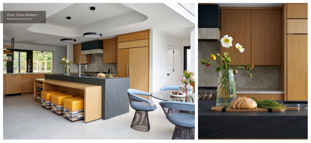
Again, we retained the unusual organic shapes original to this home in the tray ceiling and surrounding walls. Check out the incredible transformation from before to after here.
Dining Room

Separated from the family room by that slatted partial wall is the dining room — a serene space furnished with the client’s chairs and artwork. The dining room banquette was built and upholstered by House + Town.
Home Gym Addition

Continuing our tour of this home’s shared spaces, we proceed to the home gym addition. As noted in an earlier section of this post, designing this exercise space from scratch allowed us to update key systems and improve their resilience during a disaster.

Just as River Oaks Modern boasts the “most gorgeous home bar in Houston,” we believe this might be the most gorgeous home gym. White oak panels add warmth, while the linear LED lighting feels futuristic. Exercise elements include a tonal mirror, monkey bar, rock climbing wall, and Peloton.

Our client wanted to incorporate a lot of exercise equipment, but also wanted to be able to accommodate an overnight guest in the space so there is also a Murphy bed tucked away. As noted above, the house runs on a very old-school cooling system, which makes it difficult to heat and chill the house. Running on a generator, the gym was designed as a make-shift shelter in place. The gym also has its own bathroom.
Backyard and Pool Pavilion Addition
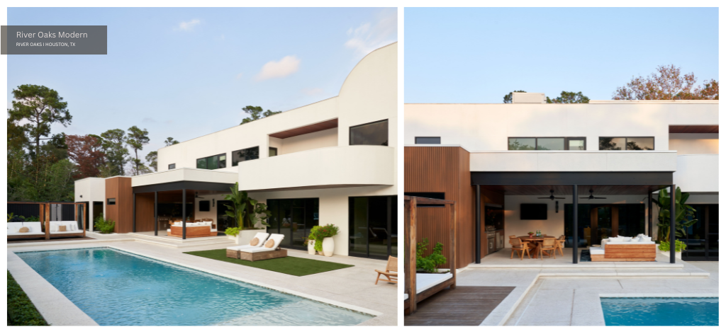
From the home gym, we head outdoors into a spacious, verdant patio and pool pavilion. As noted above, one major challenge posed by this project was structural limitations of the existing structure.
We could not exceed the existing patio above when redesigning the outdoor area. The design was driven by our desire to work with the existing home architecture and location of other elements such as the existing pool.
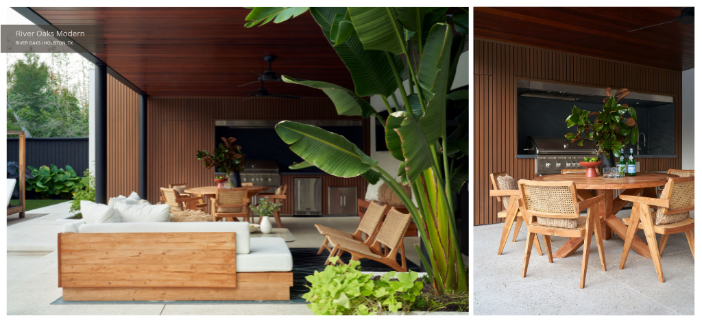
We reflected the home’s original architecture when selecting elements for this space. A parapet wall system and clean lines mimic the original design. On the same plane as the balcony, the new structure does not disrupt the existing building envelope. Instead, it complements the original structure while enhancing functionality of the outdoor space.
For continuity between interior and exterior, new and old, we carried the steel column from the home’s kitchen into the pool pavilion space. This exposed steel column is just one of many material selections that serve as a nod to Modernist architecture and design.
Stairs, Hall, and Landing
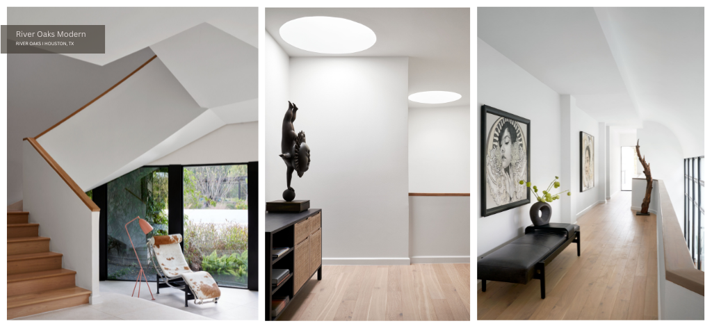
We conclude this virtual tour with a look at the home’s private spaces. As pictured above on the left, the home’s unusual architectural lines and planes are apparent in the stairwell. We honored Tapley’s original design with circular skylights and open shelving that acts as a railing to keep the space bright and open. The landing features a Four Hands Clarita Modular Filing Credenza in Black Mango from France & Son. and the client’s artwork can be enjoyed throughout.
Primary Suite
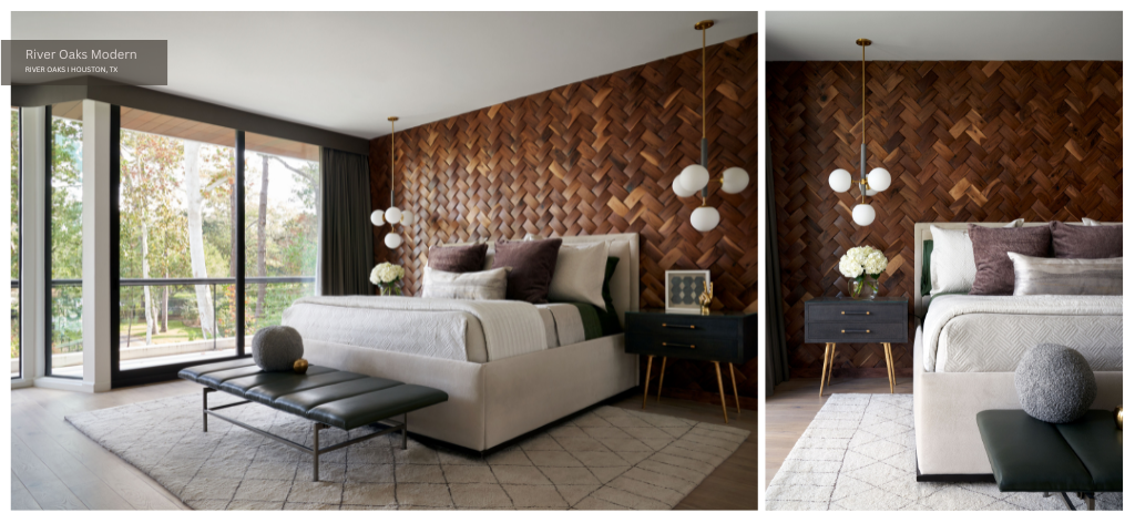
The primary suite is one of this home’s most special spaces. Our team selected the woven wood wall and completely renovated and redesigned the fireplace. We also renovated the bathroom and closet space.
The Inceptiv Tresses woven wooden wall panels are from Duchateau – designed by native of Mexico City and architect Joe Langenauer. Winter and spring linens are both from BedThreads, duvet is from Bee & Willow, pillow covers are from Saranoni, lumbar pillow is from Burke Decor.
Recessed drapery is Joseph Noble fabric with Holly Hunt trim. Pendant lights are Brielle by Mitzi from Hudson Valley Lighting with opal edged glass shades and aged brass hardware.
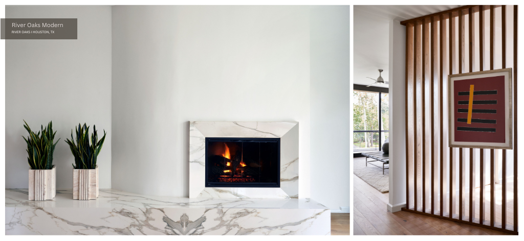
Another slatted wall allows lots of light to flood the space without sacrificing privacy. We oscillated between linear design elements and organic forms — adding dynamism and structure simultaneously.

We renovated the primary bath to create a spa-like open space with warm-toned woods and neutral colors. Aside from the views to nature, the star of this space is a vintage Shandong Elm Bench with Anatolian Berber hand-spun Kilim hemp wool upholstery. We also selected a Graduation Taupe Pendant from Currey & Company, a Dash and Albert Samson Gray Rug from Annie Selkie, Finn bath sconces in antique bronze, and Kassatex bath towels.
Guest Rooms
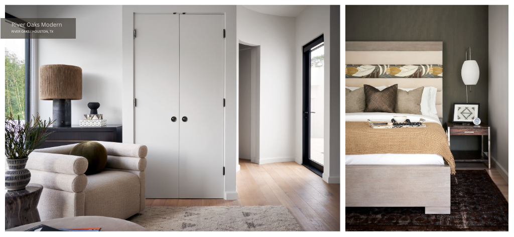
Last but not least, we explore the guest rooms. At just over 7,000 square feet, this five-bedroom, five-and-a-half-bathroom home boasts two guest bedrooms and two guest baths. We updated the first guest suite and renovated the second. Of course, pieces from the client’s art collection feature throughout.

For the second guest bath, we selected a Hudson Valley Lighting Mini Hinsdale 5 Light 11″ Wide LED Abstract Pendant in Polished Nickel, Ann Sacks tile, a Kenzie Hand Woven Ivory / Charcoal Rug, and Kyoto Bamboo Towels from Kassatex New York.
In the bedroom, pictured avove on the right, we upholstered a Linea Upholstered Channel Queen Bed Headboard by Bernhardt with Pindler and Pindler Delfino fabric in Caraway P6264. Era-appropriate elements include a Ramble Tall Dark Brown Ceramic Table Lamp with Jute Shade and an iconic Nelson Cigar Wall Sconce by George Nelson. To add texture, we sourced an extra long African mudcloth pillow cover for bolster pillow by Krinto on Etsy and a Dax ottoman from Four Hands.
Thank you for joining us on this virtual home tour of River Oaks Modern. Explore the project on our portfolio here.


