When we did the walkthrough of the Boulevard Show House pre-renovation, we realized something was missing. The layout didn’t include a family room or a playroom for the girls. These were two rooms we knew we definitely wanted to have, so the challenge was to figure out how to add these two rooms to the house. Luckily, one of the best parts about doing a renovation is that you have the opportunity to create new spaces from existing ones…so that’s exactly what we did!
The house did have a room, which I lovingly called the “rumpus room”, that included a bar, sunken lounge, and a library loft. It was way dated and didn’t flow at all. Cue the architecture for our new space! We decided to split the room in half and added a sizable loft to create space for a family room and a playroom for the girls, as well as a study for me and Michael. These new rooms were designed by Blair Foster, Lead Interior Designer, and Krysten Westby-Cole, Associate Designer.
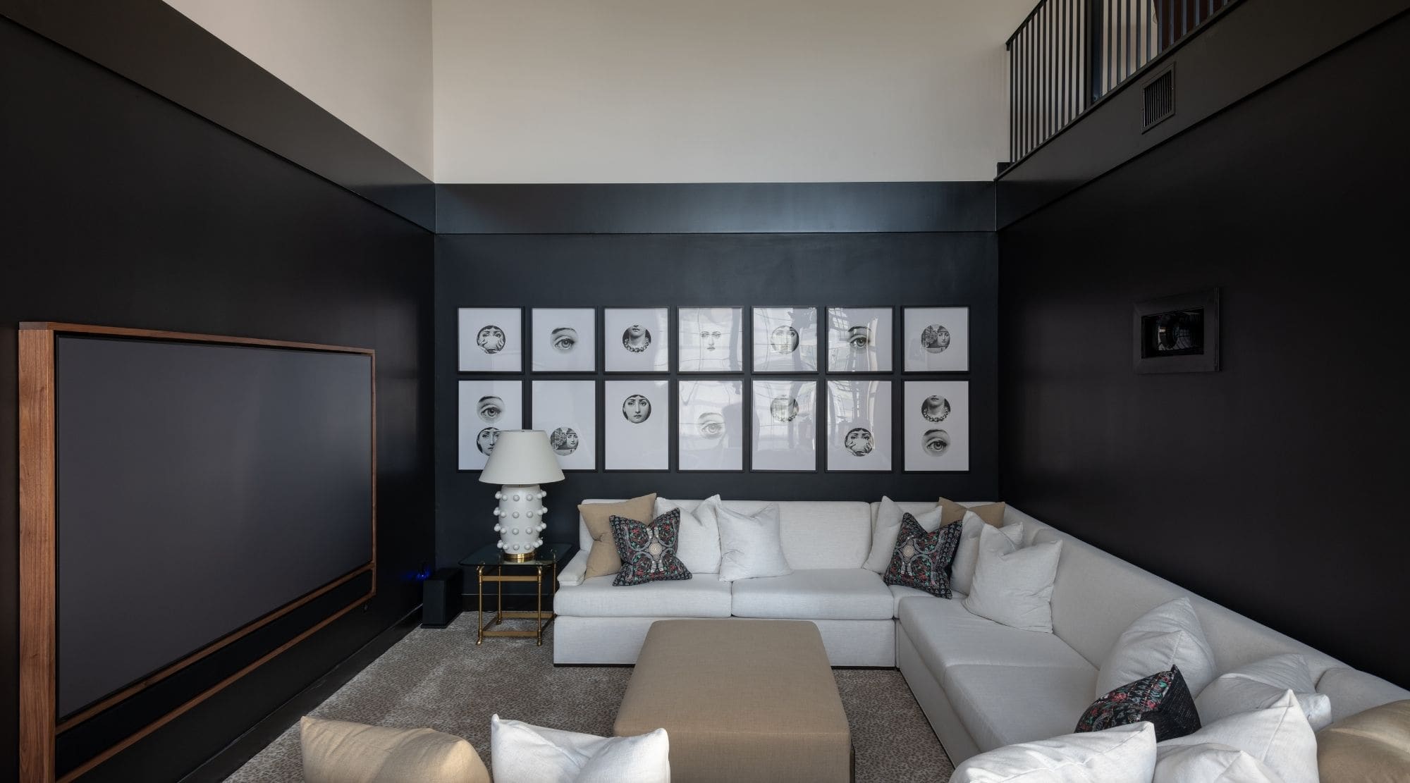
A look at the Great Room post-renovation!
Blair is a master at playrooms so I knew the girls were in very talented hands. The family room is very much my vibe with warmer tones and black and white. And the playroom is full of pastels, warmer tones, and fun graphic prints. It’s fun, sophisticated and a little moody – the perfect space for the girls as they grow. Today, we’re handing it off to Blair to get the details behind her designs for this transformed space!
All about the contrast
To me, the family room needed to be super contrasty. I wanted to mix Laura’s love of black and white with a few muddy, (but in a good way) warmer tones. This entire space has terracotta-toned Saltillo that contrast against the ebony walls. I saw the initial landing area as a perfect spot for showing off multiple collected areas and vignettes: an eclectic bar, center display table, and art gallery. The sunken living space has a lounge-style feel to it with a comfortable custom sectional upholstered in a durable Crypton fabric. It’s the perfect spot for family movie watching, as well as entertaining.
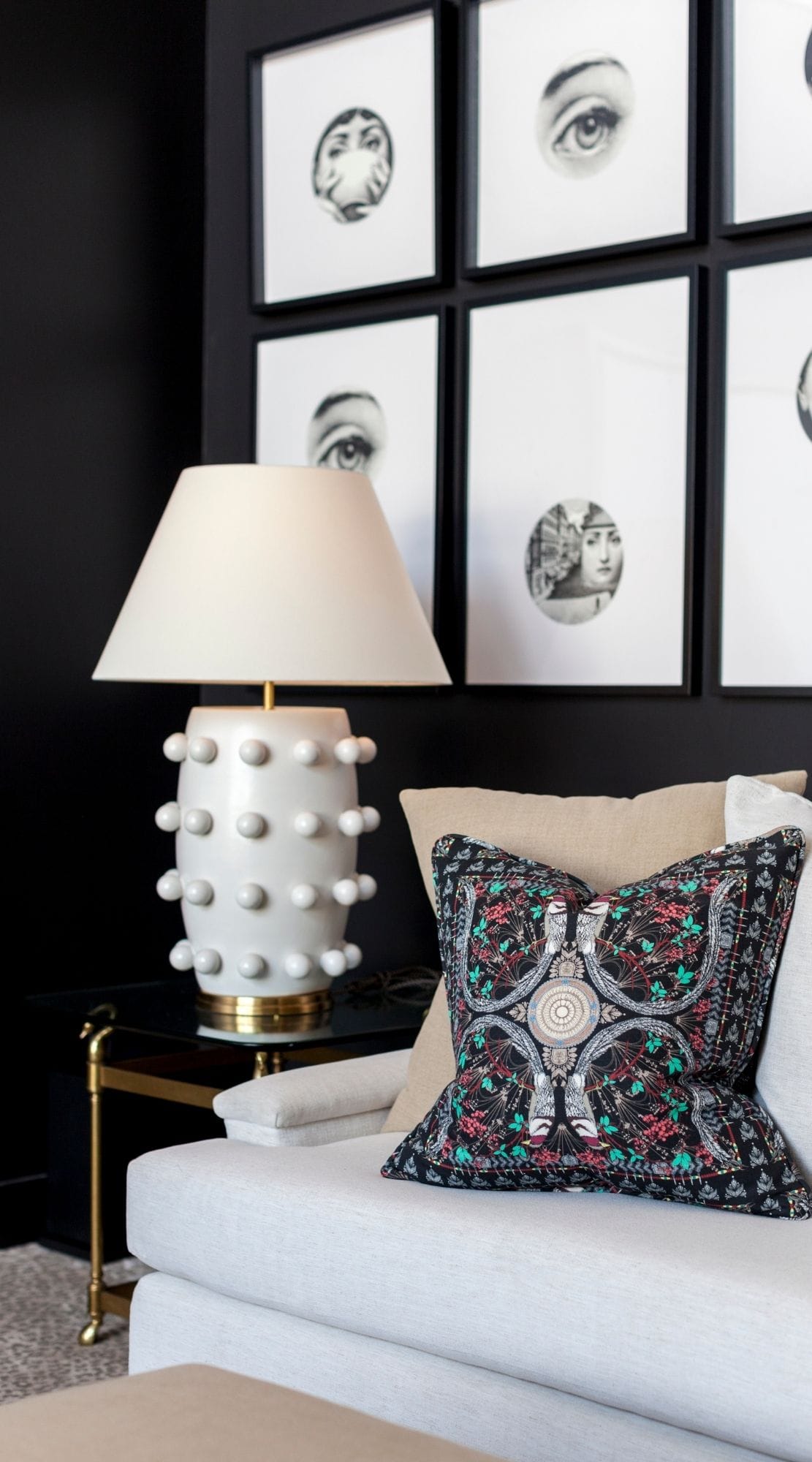
Family Room Landing Area
The key to using pieces from different time periods together is to stick with a basic color palette like black and white. We love the dark and edgy vibe of the stained Saltillo tile, but we wanted to add a bit of warmth to the space with this gorgeous Carol Piper Vintage Chinese rug. The vintage rug design balances out the contemporary table and vintage chair that rest at the bottom of the spiral staircase, resulting in a luxe seating area that doesn’t feel dated. We also used an industrial-esque black aluminum Haiku ceiling fan (provided by Big Ass Fans), but it’s not just another fan…it automatically changes based on room conditions! How cool is that?! And for the area’s finishing touch, we found a few unique pieces from Dimmitt Contemporary Art.
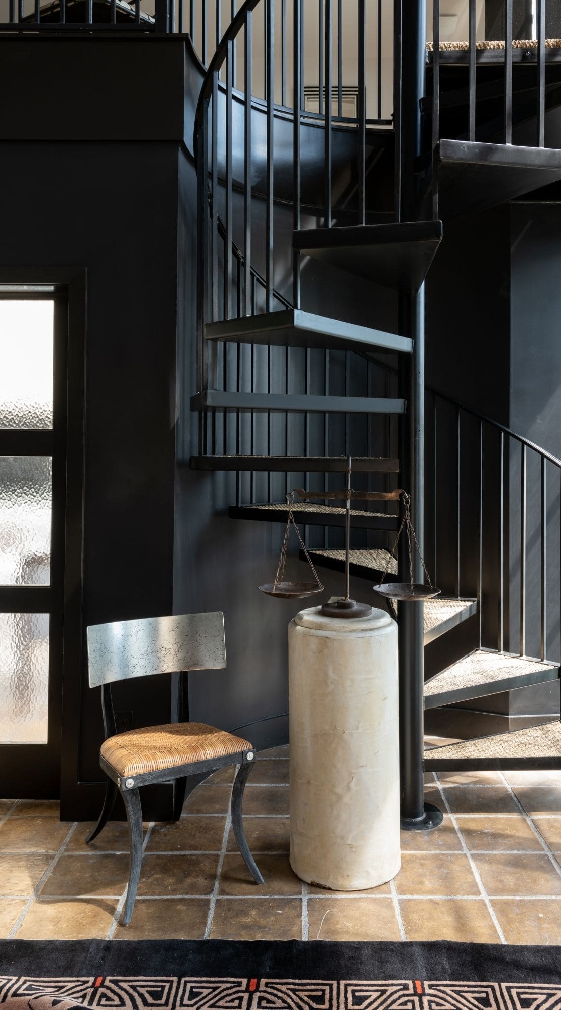
Sunken Living Room Space
We wanted the sunken living room space to have a cozier feel, so we chose a Broadloom carpet in a fun antelope print from M&M Carpets for the floors and these TruStile Barn Doors with beautiful hardware from Real Carriage Doors to separate the living room from the playroom. And since this is a gathering spot for the whole family, having enough seating was key. A custom House & Town sectional definitely gives us enough space to relax together, and a Bernhardt cocktail table balances out the long sectional and is perfect for displaying our collection of coffee table books. For additional table space, we chose this tulip shaped Carl Moore Italian marble table. You can never go wrong with this classic style table, but we love the movement the marble gives the table.
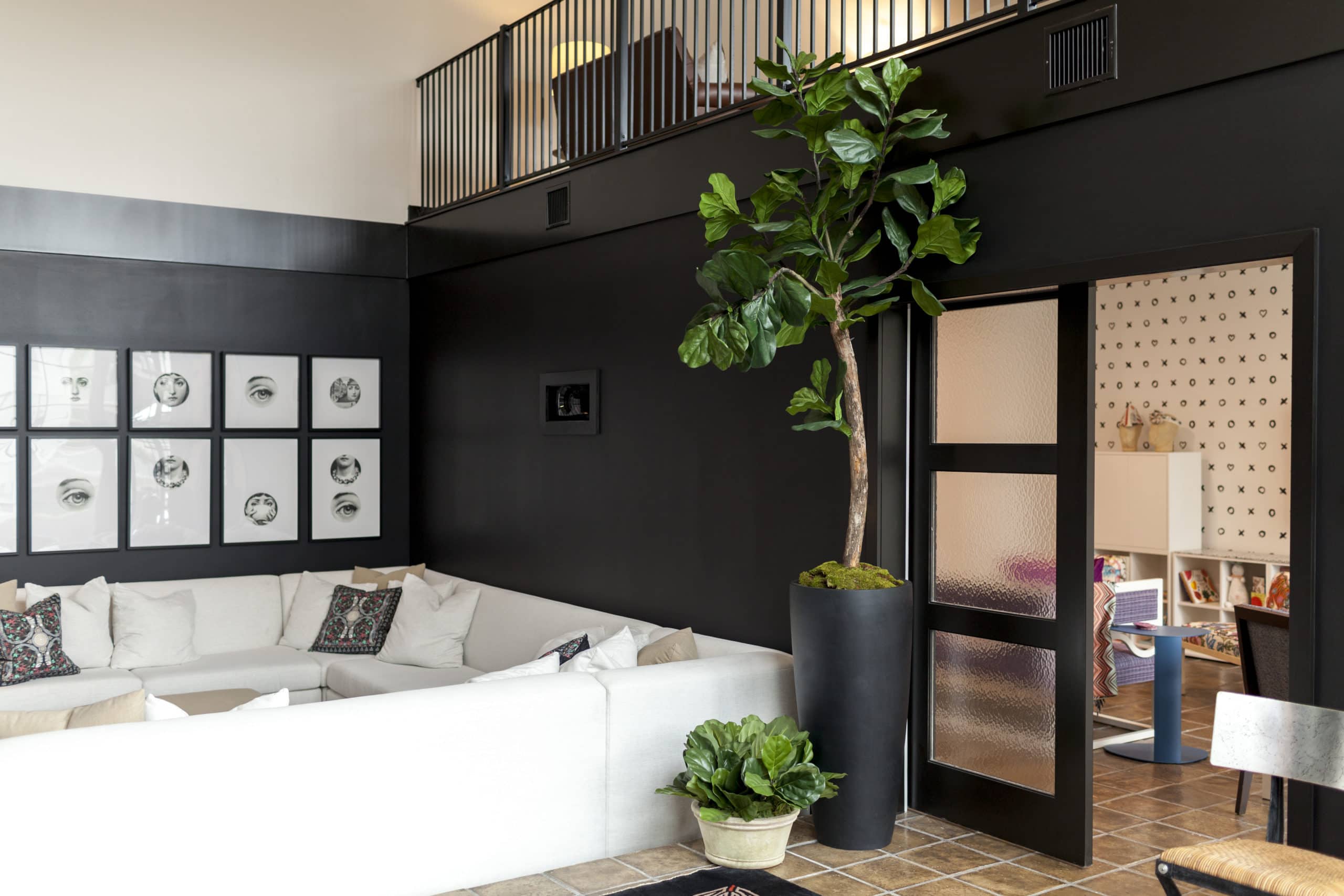
Playroom
The playroom builds on the color scheme we used in the adjacent family room. But we added muted/dusty hues, fun graphic patterns, and natural textures to make it more playful…like a gold snake shaped pull from Scout Design that was painted a dusty clay/rose color and used on the barn doors. Although this serves as a kids space, the design elements will be equally fun and sophisticated for years to come. This is definitely a space the girls have loved and been able to grow into! We used the same stained Saltillo tile on the floors and the beautiful Vetrazzo by Laura U Classic Black counters. These are easy to clean which is great for any accidental messes that may occur…because we all know messes happen. For the walls, we selected this fun “X & O” print aka Hugs and Kisses wallpaper from Milton & King!
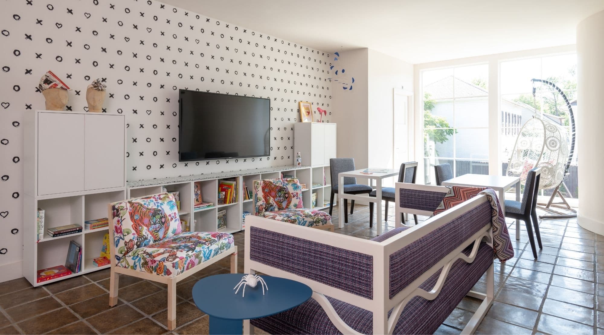
Soft & Moody Sophistication
Thank you for sharing with us Blair! I’m in love with the design and I can’t wait to share more of the home with everyone soon! Check out the BLVD website for more updates and keep an eye out on our Facebook page for exciting announcements! XO|LU


