Change is one of life’s guarantees. And change can be a wonderful thing! From the adventure of raising a family to the joy of a new travel adventure, we were made to adapt.
One of the great joys about being a designer is that we see the changes our clients go through as we work together. We have been there as clients get engaged (while not there for the proposal!), and we’ve changed plans from mancaves to playrooms. Whether they’re constructing a new home, designing a nursery or doing renovations, there is something magical about being a small part of their journey.
Today I’m thrilled to be giving you a look inside a glamorous high rise condo we recently completed for one of our favorite clients. This is the fifth home we’ve helped them with (we just completed their sixth!). It’s been exciting to walk with them through different parts of their lives and travels. We loved working with them to design this glamorous high rise condo in Houston.
Creating a Home Away from Home
We’ve worked with this client for many years and understand their aesthetic. In fact, this was one of Laura’s first clients when she opened her shop, the Laura U Collection, on Westheimer over a decade ago. We know what functionality they desire in their home. They have three beautiful girls, so livable luxury that’s both family-friendly and heirloom-quality is paramount.
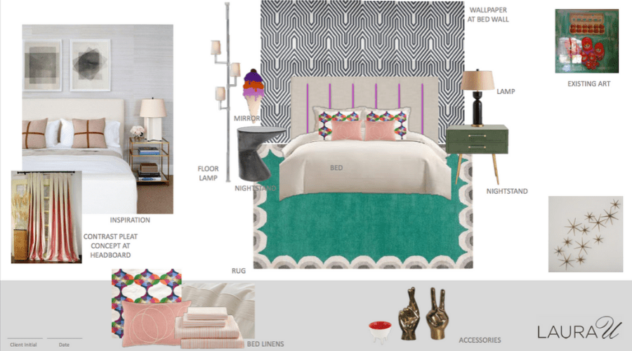
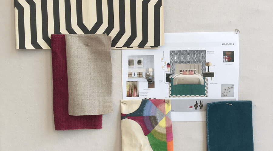
Glamorous Condo Design Inspiration
This glamorous high rise was used as a primary residence, while our client was Houston on business. If you are unfamiliar with the oil and gas industry, it is a major player in Houston’s economy and requires many professionals to travel all over the world. To make our client feel at home, we elevated the bachelor pad vibe to a space where family was also welcomed. There’s a distinct masculine feel in every room. But we also incorporated a few feminine touches like curved consoles, soft textures, and delicate details (like dot-patterned walls) into the design. That way, when the whole family is in town, this contemporary pied-a-terre feels like a space that reflects everyone’s personal tastes.
High Rise Interior Design: Meeting the Architectural Challenges
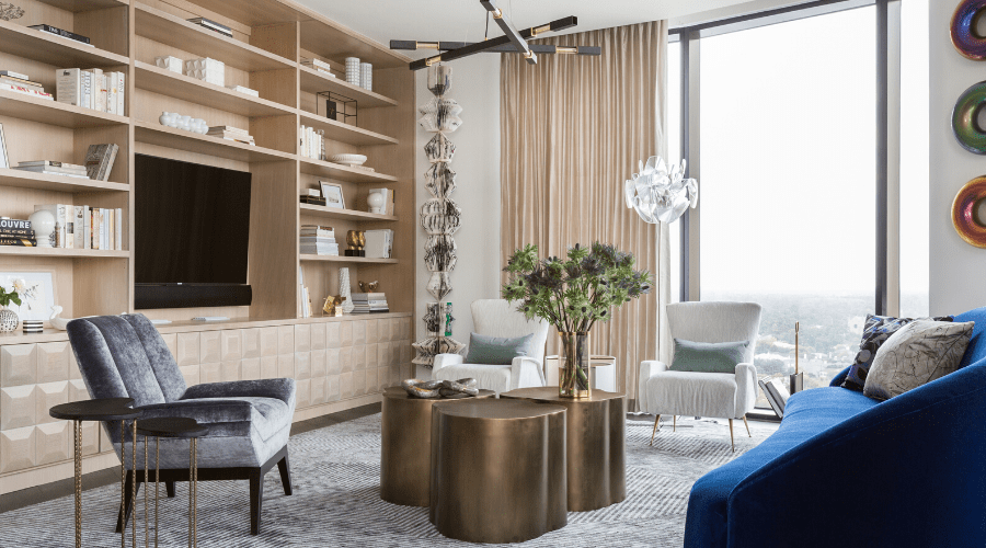
Because of the curvature of the building, finding furniture that felt right in the space was a big challenge. That’s why many of the grounding case goods are custom-made. The floor-to-ceiling curved windows were also a design challenge. We wanted to highlight the gorgeous skyline view and optimize TV viewing without sacrificing any of the natural light. Our final solution took advantage of both and the homeowners felt right at home in their new space!
Installing furniture of any kind in a high rise is challenging. You have to navigate the tight corners and know the limitations of the elevators. You have to deal with the valet and other residents constantly trying to get into the building. Luckily, we work with a professional team of movers that are excellent at navigating difficult spaces.
A Blank Slate
Our client’s glamorous high rise condo was previously the model unit for the building. It provided the perfect blank slate for their design. (It’s an interior designer’s dream to have a clean slate to work with!) The architectural finishes specified by the developer were beautiful, so we didn’t need to update those. We added custom mill work in a few areas and renovated the powder room to customize the space to meet our client’s needs.
Inspired by Art
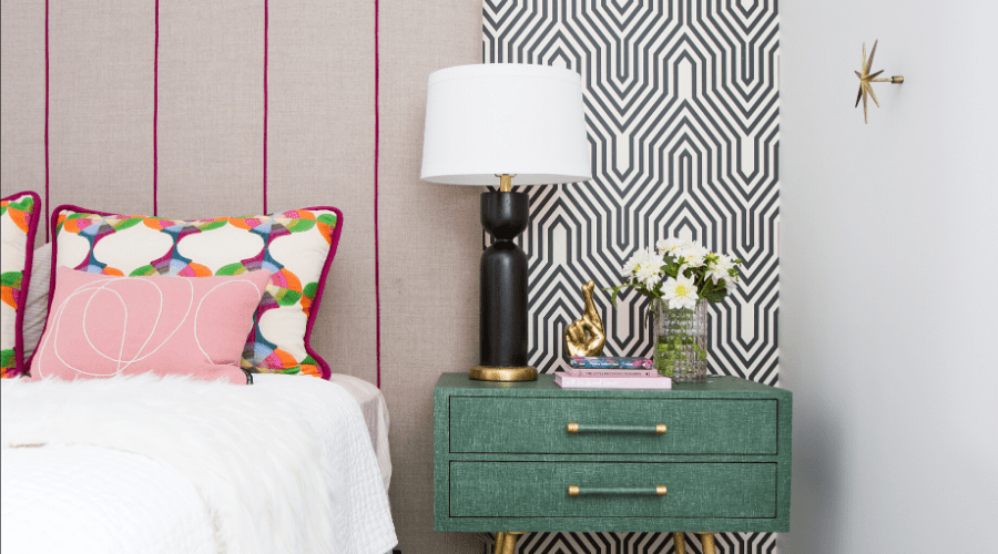
Our client’s amazing art collection was the focal point of our design. The interior color palette incorporated cozy, moody colors to make this space truly feel like home. Each room has its own personality and showcases our client’s art pieces. Throughout the condo, we paired their existing art with lots of wallpaper to bring in warm tones and textures. The combination of bold colors and unique wall coverings played up the sophisticated, chic feel and transformed the space!
Living Room
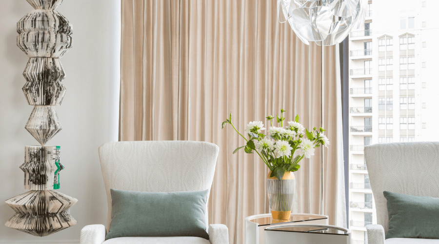
This totem art piece by Karen Hawkins we found at Laura Rathe seemed to be made for the living room wall. It fit perfectly in the corner by the custom built-in console and hutch designed by the Laura U designers. After creating architectural drawings of the piece, they worked with Richard at El Dorado Woodworks (a true artisan!) to fabricate the piece. The result is stunning and even better than we imagined!
Dining Room
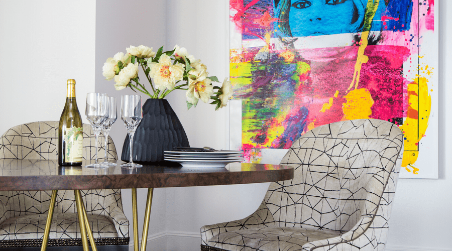
I love bold artwork and this piece is a showstopper. The geometric Pierre Frey fabric on the custom dining chairs complements the lines of the painting without competing for attention. Bright gold metallic table legs and studded Samuel & Sons trim on the chairs add visual texture. It’s an edgy, modern, playful dining room that’s sure to spark conversation.

Kitchen
Classic black and white with a touch of gold is one combination I’ll never get enough of. The gold pendant lights from Dimond Home brighten up the space and add a warm contrast to the cool stainless steel appliances. And the curved back and delicate dotted fabric on the Vanguard Furniture stools soften the crisp lines. This glamorous high rise kitchen is beautiful and functional!
Hallway
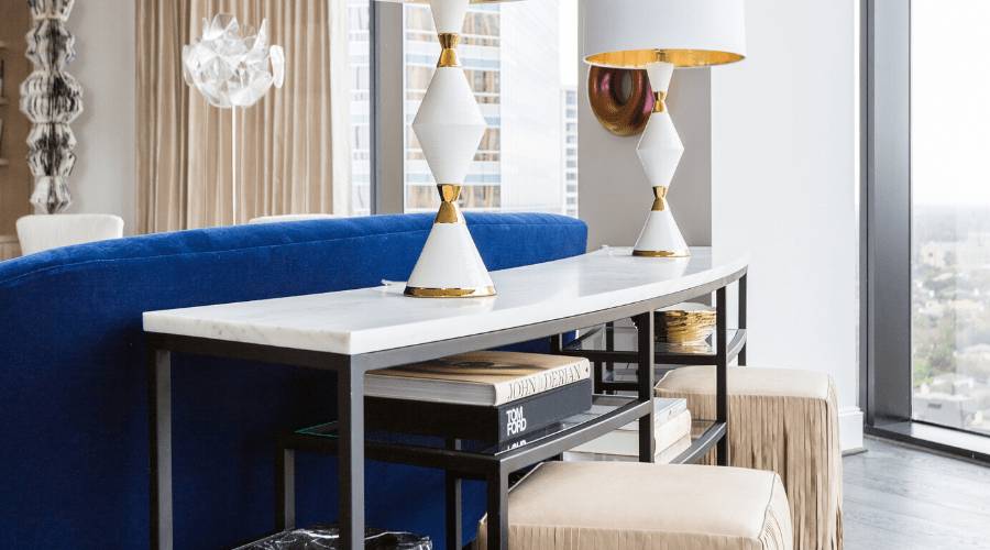
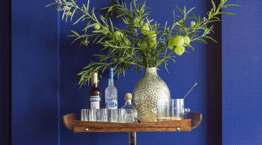
Hallways connect one space to another. The hallway in this glamorous high rise is anything but simple! A cobalt Arte wall covering layered with gray lacquered dots adds visual texture and provides a beautiful backdrop for this bar cart from 1stdibs. The bar cart gives our clients plenty of room to keep their bar ware within reach to make their guests the perfect cocktail. Crystal pieces elevate the bar cart and add touch of vintage glam. It’s a space Don Draper would love!
Master Bedroom
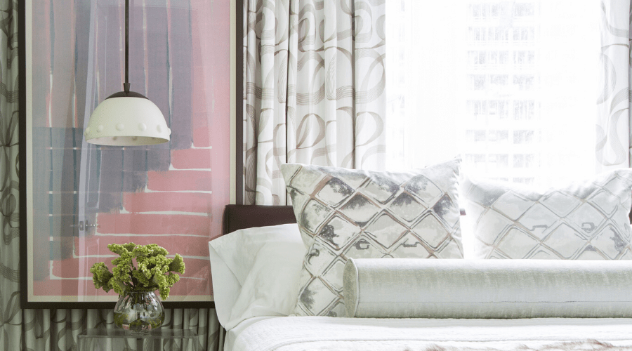
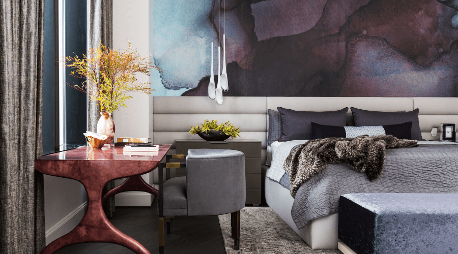
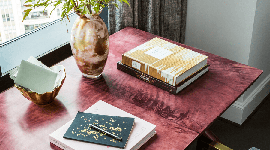
Master bedrooms that blend masculine and feminine styles are my favorite. In this glamorous high rise master bedroom, we paired deep, rich colors with organic shapes and textures. The gentle curve of the aubergine desk and custom headboard soften the masculine color palette. A contemporary light fixture from Yliving moves your eye down the wall and complements the sleek, modern lines of the design. The result is a sophisticated, perfectly balanced bedroom.
Powder Bathroom
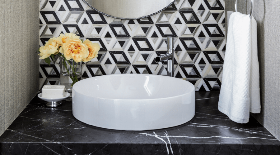
The powder bathroom in this glamorous high rise is stunning. It quickly became one of our favorite rooms! The Phillip Jeffries wallpaper picks up the neutral tones in the black and white Kelly Wearstler for Ann Sacks tile. It softens the dramatic contrast without taking attention away from the tile pattern. The fresh yellow blooms liven up the bathroom and add a delicate, feminine touch.
Glamorous High Rise
This glamorous high rise effortlessly blends luxury with functionality. A neutral color palette with natural textures throughout the condo provide the perfect backdrop for their art collection. Bright pops of color show off their personality and transform this high rise into an sophisticated, timeless space. It’s the perfect sanctuary for our clients on their extended stays in Houston.


