Most clients already have a few meaningful pieces they’d like to keep, even if they are renovating the entire home or moving to a brand-new space. One of those pieces might be a painting that captures the atmosphere of their favorite place to travel, an heirloom armchair that feels (but might not look) just right, or a table with stunning materials and proportions. Good design will never sideline the things that matter to you. Your design team will study them, decide how to update or integrate them as is, and builds a room that feels current while keeping your personal history intact.
How to Incorporate Treasured Pieces Into a New Design
Start by Deciding What Stays, What Goes, and Why
We start by considering what should stay, what should go, and why. Sentimental value matters, but so do function, scale, and condition. If a painting is non-negotiable, we plan the wall, sight line, and lighting it deserves. Depending on condition, we might recommend that a professional examine it before hanging.
If a dining table is the keeper, we size a rug to its footprint, select chairs that clear the apron comfortably, and make sure guests can move around it without squeezing. If an armchair, ottoman, or stool is meaningful to you, we assess the cushioning and upholstery to ensure it meets your needs and new aesthetic. That might mean structural repairs or swapping out the fabric for something that makes more sense in the updated space.
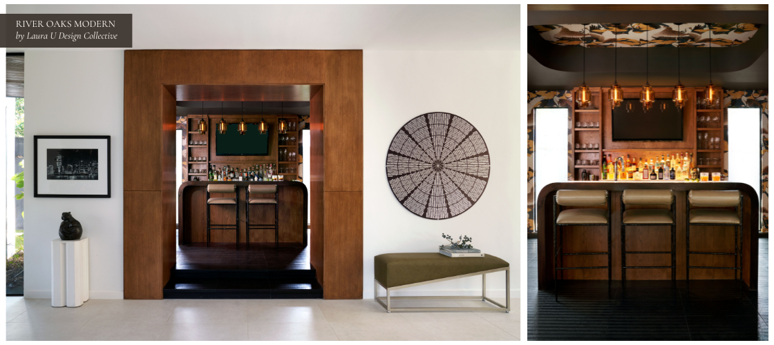
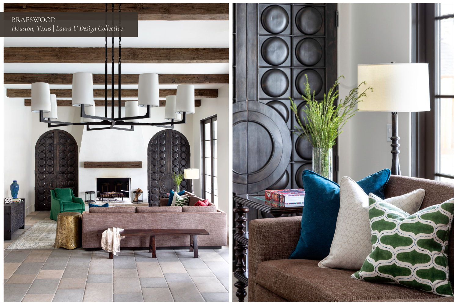
In our River Oaks Modern project, we repositioned many of our client’s existing pieces but also added new ones. The bar is an excellent example. Pieces from the homeowners’ art collection, an asymmetrical bench, and an extra-wide door casing flank the entrance to this moody space. In her article for The Houston Chronicle, Cowen effuses that this “could be the most gorgeous home bar in Houston.”
Decide What Leads and What Integrates
When a piece matters, we give it a clear role in the room. As noted above, large-scale art typically leads: it sets the palette, draws the first glance, and anchors the composition. Furniture more often integrates. It supports the flow, adds function, and ties finishes together.
We place focal pieces where they’re naturally seen, align sight lines to them, and light them properly so color and detail read cleanly. Meaningful furniture is handled differently. We reupholster, adjust stain, refine scale, and position it where it’s genuinely useful. The intention here is clarity, not volume.
As Melissa Grove notes, “If a client really loves something that they currently have, we always make sure that it either becomes a focal point in the case of art, or it seamlessly integrates with the new design.”
This approach ensures sentimental pieces feel intentional in the updated space. The history of your family remains, but the room still looks and works like “now”.
Allow Favored Art to Produce the Palette
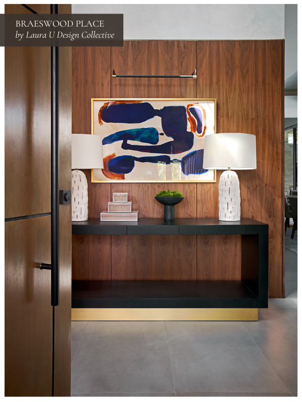
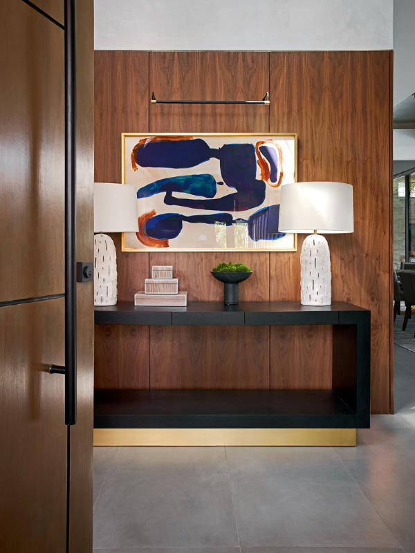
When a client’s favorite piece is art, we pull the room’s palette from it. Take the entryway at Braeswood Place. This grand entry is very warm, with walnut paneling and a custom pivot door that reveals it. The dynamic abstract artwork floating above the console table is part of the homeowners’ existing collection and helped define a Southwest sunset-inspired palette throughout the home.
We study two to three tones (one that leads, one that supports, and a neutral) that keeps everything grounded and not too overpowering. If the colors are strong, nearby upholstery will typically be softer in tone but more textured so the painting pulls you in. If the work is soft and tonal, we might introduce deeper jewel tones, interesting patterns, or bold objects.
As our COO Melissa Grove puts it, “For art, we can use the color palette to determine the rest of the furnishings in the room. Especially if this is a client’s absolute favorite piece.”
Collaborating with partners, we also address framing and glazing. That can mean replacing cloudy glass with low-iron, UV-protective glazing and selecting a frame profile that complements the piece without weighing it down. Of course, placement matters just as much: we position the work on a true sight line and set lighting to avoid glare, so the art is clearly readable from day to evening but not at risk of degradation from intense exposure.

Build Architectural Support When It’s Needed
Some pieces work best when the space in which they live was actually made for them. Custom millwork and built-ins make an enormous difference in these situations. If needed, we design shelves for pottery collections, add a niche to frame a piano, or align built-ins with existing trim so smaller works can stand on their own without a lot of filler.
Depth, height, and clearance are planned with maintenance in mind as much as presentation. Cords are tucked, sconces are placed where they won’t cast awkward shadows, and light is evenly distributed. When the architecture backs the piece, it stops feeling like an afterthought and more like an intentional integration.
Calibrate Scale and Circulation Around the Keepers
Existing pieces naturally set the baseline for the size of other artworks, decorative objects, and furniture. We adjust everything else to preserve balance in the space and ensure easy movement throughout.
We check door swings and passage widths, then size rugs to connect seating comfortably without forcing anyone to perch at the edge. Where traffic circulation is tight, we refine the silhouettes of accent furniture (slimmer arms, open bases, legs instead of skirts) so the room feels generously spaced even when square footage isn’t.
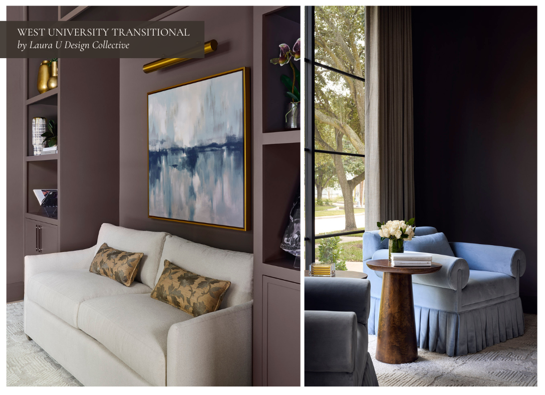
Of course, in some cases we actually alter the “keepers” themselves to ensure they have enough space in the room to which they have been allocated. For example, our clients at West University Transitional adored the armchair pictured above, but the chair couldn’t fit through the entry to the study with its existing silhouette. To make it work, we fashioned arms that could lift off without looking obvious. We ended up with this stunning cornflower blue velvet chair with a pleated skirt and generous arms.
If Needed, Plan a Rotation Instead of Crowding the Room
Most homes have more beloved pieces than can be displayed at once, especially in their art collections. Instead of crowding, we plan rotations if there are too many pieces to enjoy simultaneously. A painting might anchor the living room in spring and shift to the dining room come fall. A vintage side table might float between spaces depending on the season or the mood of the house.
Rotation keeps a room feeling fresh without constant reinvention. It’s also practical: proper storage, padded and labeled, protects finishes and makes these swaps easy to manage.
Reframe and Rehang Paintings, Drawings, and Prints for Real Impact
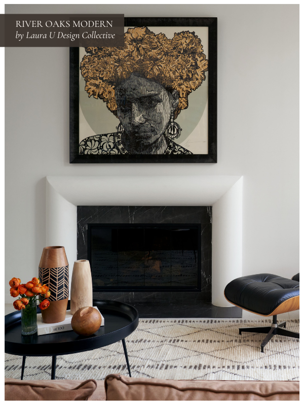
Many rooms change quickly with smarter framing and better placement. For example, this piece from our client’s collection was instantly at home above the remodeled fireplace in our River Oaks Modern project. This space also includes a classic Eames chair and a pool table with walnut accents plus a red felt playing surface.
When needed, we replace yellowed mats, spec linen liners where scale demands it, and move from ornate profiles to cleaner ones when the art is being overshadowed. Then we hang at a comfortable eye level, leaving proper clearances from sconces, switches, and moldings.
Where a wall-center mount competes with furniture, we center on the composition instead: a console, a fireplace, or the first view through a doorway. We set lighting to wash the work evenly and avoid hotspots, so color, texture, and brushwork are clearly communicated.
Light for Color, Texture, and Real-World Use
Existing pieces look their best under thoughtfully layered lighting. We balance overhead fixtures with lamps and sconces at eye level so wood grain, textiles, and art can be read clearly. Warm, dimmable light sources keep things flexible from morning to night.
We place sconces to avoid catching reflections on glazed works. We choose bulbs that render color accurately. Lighting is infrastructure, after all.
Refresh Furniture Through Reupholstery and Restaining
When a client loves a piece of furniture, we seek ways to make it feel fresh again. Often, that means reupholstering, restaining, or both. A dated fabric can be swapped for a tailored linen, a soft mohair, or a performance textile that fits the new palette. Wood tones can also be adjusted; say, from an orange-leaning cherry to a cooler walnut, or from a glossy lacquer to a soft satin finish.
Our goal isn’t to disguise the original piece but to bring it forward into the new design. By refreshing the finish and materials, the furniture feels aligned with the updated space without losing its story.
“For furniture, we work a lot with reupholstery or staining to ensure their current furniture works with their updated design.”
—Laura U Design Collective COO and DesignDash Co-Founder Melissa Grove
We also evaluate comfort and scale. If the seat height is slightly low or the cushions have lost their structure, we make small adjustments that bring the piece back to life. This is our way of honoring what clients already love: making it work beautifully in their new home.
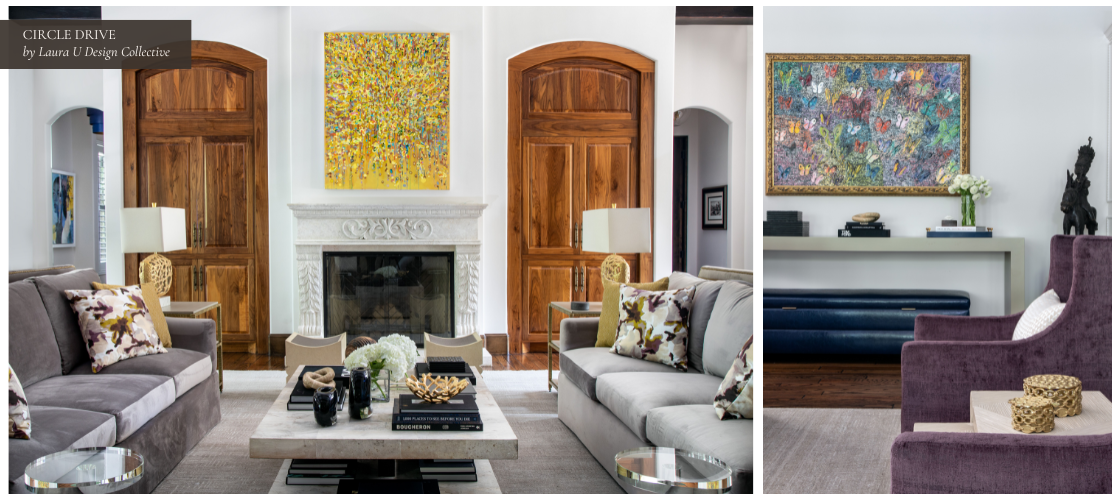
Circle Drive shows exactly how pre-existing art was integrated and expanded with new pieces to set the home’s tone, palette, and mood. For example, the homeowner’s existing statues pair well with new contemporary items in the dining room. In the Circle Drive living room, many existing furnishings were reimagined through reupholstery and refinishing to feel fresh in a new scheme. The sofa was reupholstered in Jab Anstoentz fabric, while the chairs were reupholstered in Designers Guild fabric, both of which elevated the feel and added color.
Preserve the Patina Where It Adds Value
Patina is context. It’s a record of time, and, in many cases, that’s worth keeping. However, it must read as age not as neglect. A softened sheen on an armrest, darkening at drawer pulls, a bit of honest wear along a table edge are details that add depth and help older pieces sit comfortably next to newer work. What we likely wouldn’t keep are water rings, failing varnish, lifted veneer, or anything that snags fabric or weakens the structure.
We start with a conservation mindset. Stabilize first, then refine. That might mean evening out sun-fade with a light toner, reviving a dulled surface with hand-rubbed oil or wax, or re-dyeing leather so the color feels intentional again. Where the finish has failed, we refinish selectively and match tone and sheen to the species and the room’s palette. Hardware receives the same care; it’s replaced if necessary but often cleaned or buffed. This way, the piece can retake its rightful place without screaming, “I’ve been redone.”
As ever, the goal here is to preserve the character that tells the piece’s story and correct the damage that distracts from it. Kept patina should feel deliberate and compatible with the new design. There’s a big difference between a distracting stain from a party and a bit of wear from years of enjoying a piece.