For the past several days, we have been showing you the journey of designing this beautiful art-filled home in Houston’s Southampton neighborhood. The day has finally arrived when we are happily revealing all the rooms from our Dunstan Project.
Our clients were hoping for a modern change form their former, and more traditional, residence. They found exactly what they were looking for in this home, built by Convington Builders. The white facade and clean-lined architecture is a bright departure from the neighborhood’s Georgian homes. But this doesn’t mean the home feels uninviting. With its massive windows and open main floor, guests are immediately welcomed through curb appeal.
Art-driven Design at Dunstan
Originally from Houston, our clients own a home in Santa Fe as well, and they were determined to bring the artistic vibrance of New Mexico into their newly adopted modern aesthetic. The design scope included all new furnishings and the clients were thrilled to rely on our team to manage these details. Where we collaborated most closely was in the fine art.
Look for These Pieces
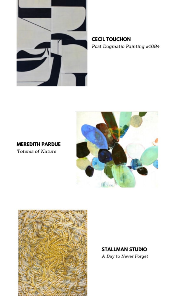
Being avid art collectors, the homeowners wanted a cohesive interior design that was art-inspired. Going room by room, you will find delightful vignettes, mesmerizing dimensional pieces, and massive works. Every art selection you see was specifically considered for this home. We approached the design as an essential complement to the power of their collection.
The Foyer
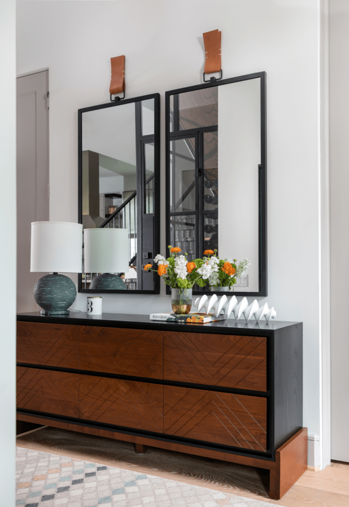
An easy going vintage rug from Matt Camron immediately brings your attention to the relaxed elegance you will find throughout the interior. A custom-made Lawson Fenning platform chest sits in this bright and airy entrance, but your eyes are drawn to a duo of handsome Casamidy mirrors. The saddle straps add a well-built strength to the delicate nature of the glass.

The Living Room
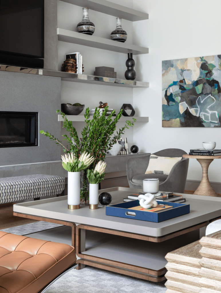
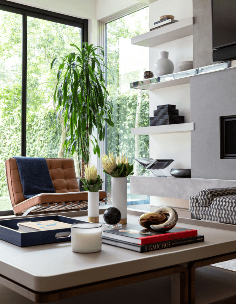
Since the living room is going to be the center place of all the get-togethers in the house, it had to be welcoming and supportive of large groups. We achieved this with soothing neutral colors that would make the place inviting, while at the same time giving warmth and sophistication. The room features a light slate-colored Kravet Niagara Sofa, chairs upholstered in Kast Fabric and a stunning cocktail table from Roberta Schilling. The Barcelona chair’s tan color is a treat to this room – an iconic shape in a welcoming shade.
The table lamps by Arteriors in linen and the Carol Piper rug in sand are ethereal examples of tonality. The Cecil Touchon painting from Laura Rathe is a masterpiece that catches the eye upon entering and pairs well with the client’s Terrell James’ work. This art piece was actually selected by our design team for the home. Touchon is a Texan now working in Santa Fe, and the clients were already well aware of his work. That is one of the best parts of the design process: knowing what our clients want before they express it.
The Dining Room
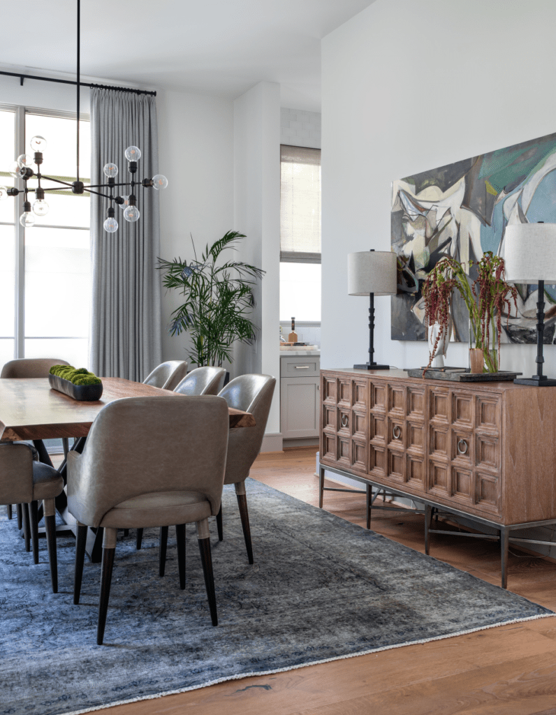
Our clients love to entertain, so having a beautiful and functional dining room was a must. It also needed to be a space where fabulous artwork was allowed to shine. This formal dining room is anchored by an Italian dining table in solid walnut from Bontempi Casa. This heirloom quality piece provides expansive space for dining with friends and family.
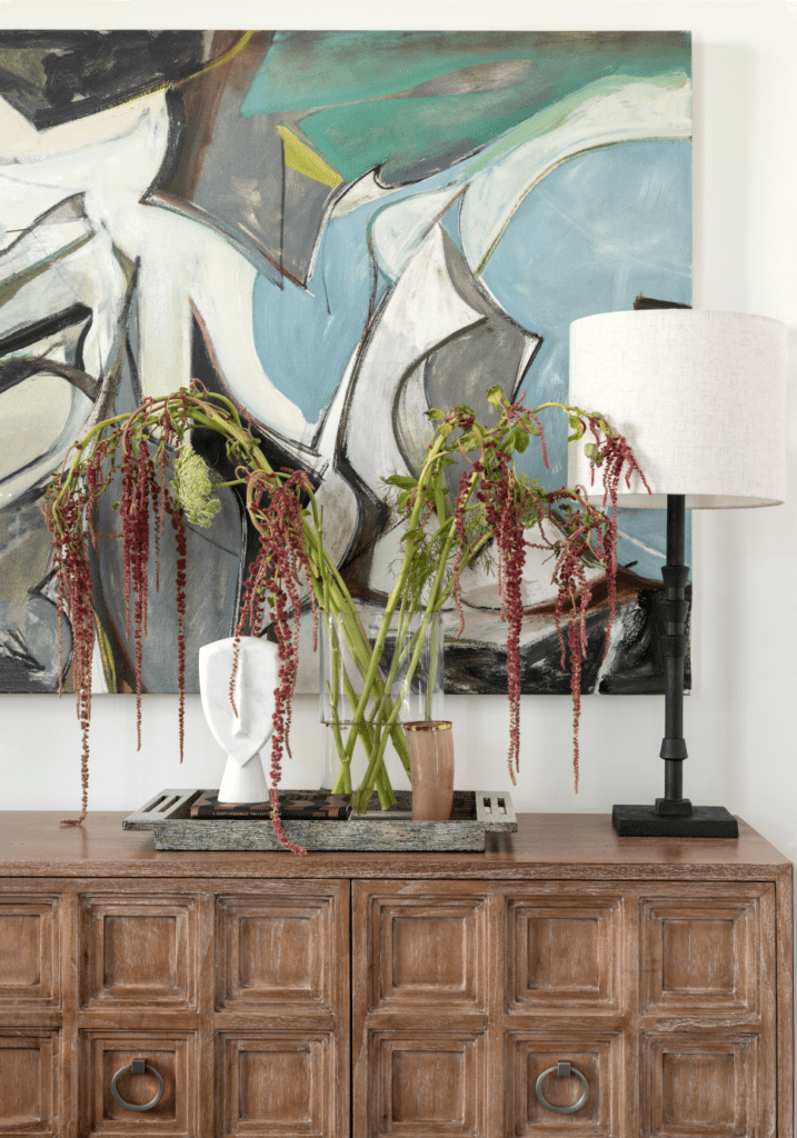
Although the rustic console from Ambella Home is a more traditional touch, it contrasts beautiful with the artwork. The console is a tiered cabinet with 3 doors and works well with the piece from Michael Kennaugh. Whenever traditional furnishings are paired with modern flair, the look is timeless. This is why so many contemporary homes benefit from one lone Louis XIV chair or why country cottages look chic with abstract art. It is unexpected and ultimately, very pleasing to the eye.
The Kitchen and Breakfast Room
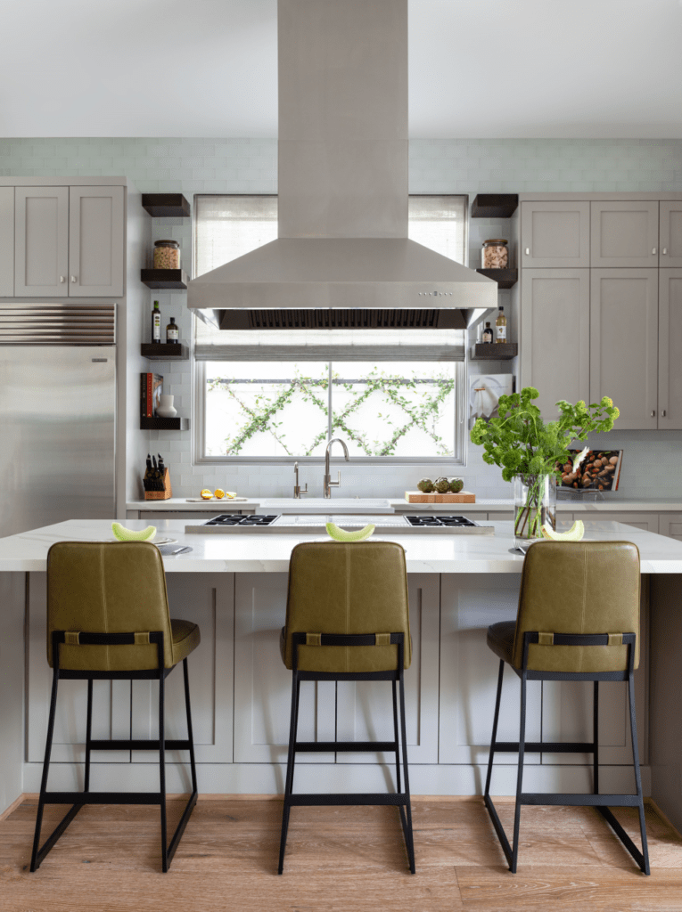
We incorporated subdued shades in the kitchen, keeping in mind our clients’ love of sleek lines and comforting hues. When our clients purchased the home, the kitchen was well-appointed, but lacked the warmth they were hoping for. It was simply too contemporary. The cactus-colored leather bar stools from Lawson Fenning contrast with the white cabinets and walls.
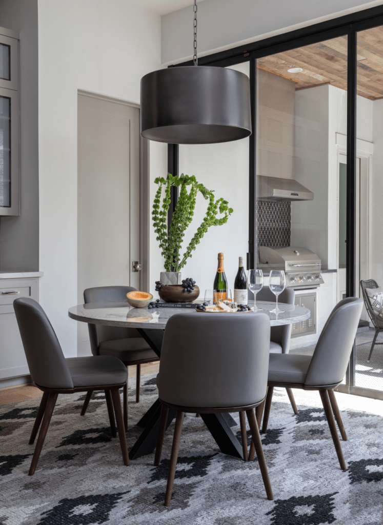
We used a combination of darker and lighter shades in the breakfast room. The cabinetry from the kitchen carries into this space, creating visual cohesion. Notice how the black pendant light, iron base of the table and the rug from Loloi contrast with the white walls, white tabletop and chairs. We love this moodier look, compared to the bright kitchen. Because this room welcomes natural light, the dark shades absorb the sunshine. And the space still looks airy and effortlessly lightweight.
For breakfast tabletop, we wanted something to complement the iron base, something unique that would play well with the wood. And our choice was a marble tabletop. You will see that the base, made by our friends at Iron Accents, is called upon in the study as well.
The Master Bedroom
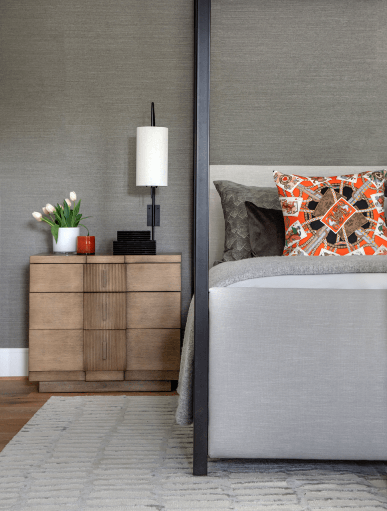
The bed from Robert James in Pindler and PIndler fabric adds an angularity to the room while the chandelier, from Kelly Wearstler’s Circa Lighting collection, lends an edgier personality. Again, this tension and contrast doesn’t play it safe, but remains warm because of the materials, textures, and shapes of the pieces. The sloping curves of the light fixture marry a sensual tone with the bed’s straight-forward angles.
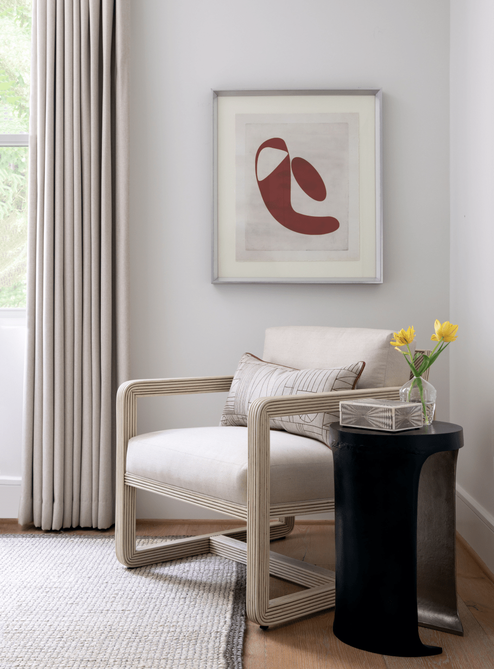
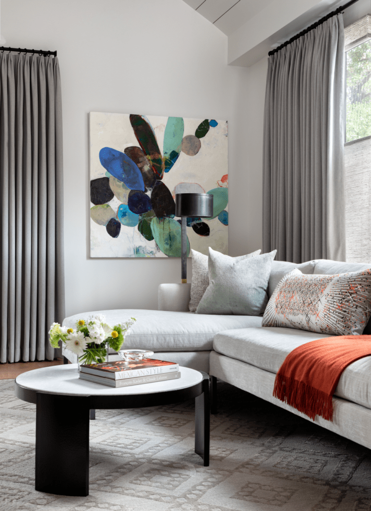
The master sitting room takes advantage of scale with a soft sectional from our friends at James Craig Furnishings. The painting from Meredith Pardue was brought in by our senior designer, Shannon, to show the clients what kind of piece to install. This painting really works in this space – it seems to be the perfect size! The cocktail table from Arteriors is just another effortless addition to use the space to its full potential.
The Covered Cabana
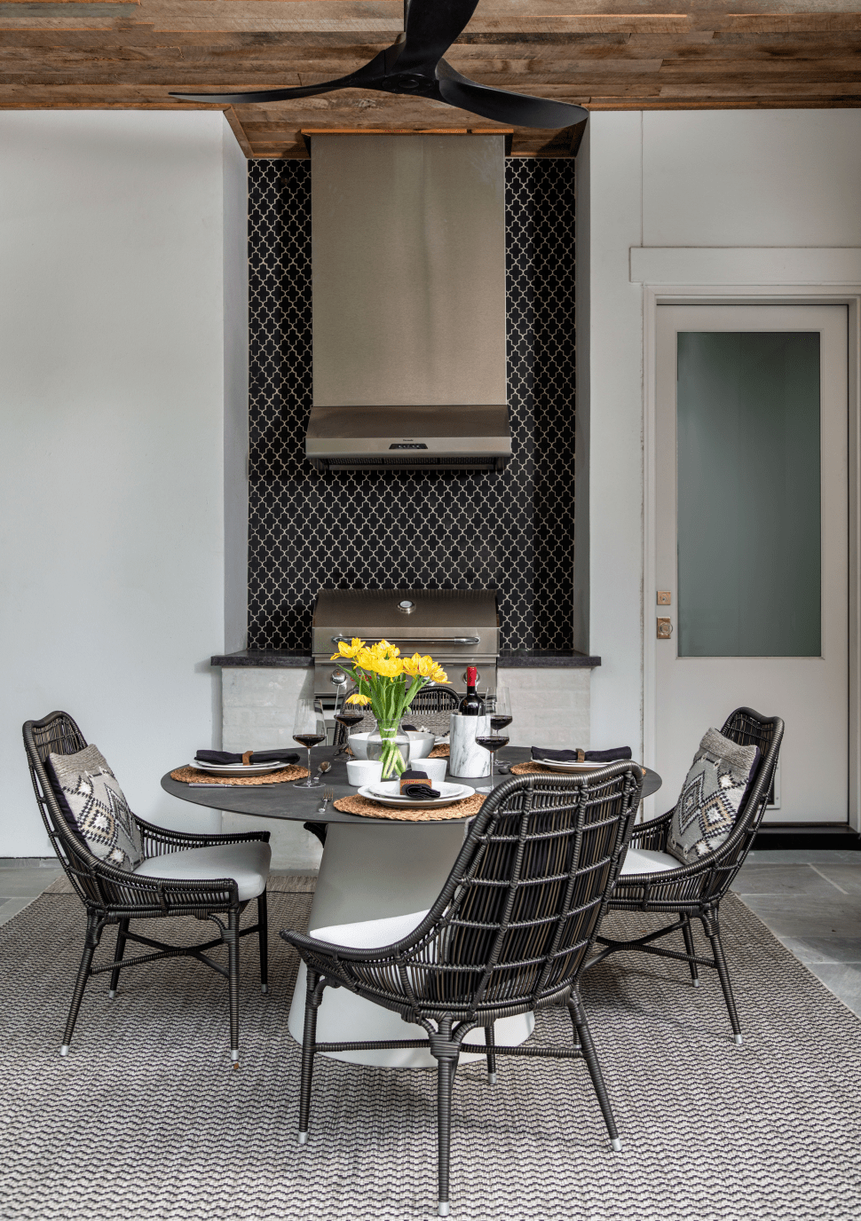
The cabana was meant for the homeowners to have a quiet evening or to enjoy their time looking at the rain, which happened during our photoshoot! We had about 40 seconds to take this shot and we must say that photographer Kerry Kirk really outdid herself here. This is why we decided to go for Palecek lounge chairs and floor lantern. These are comfortable, quite interesting in their wrapped design, and oh so chic.
The Guest Bedroom
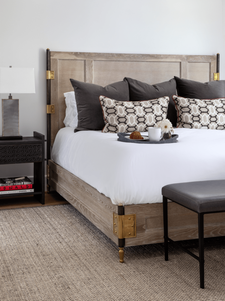
The rustic bed from Century Furniture, from the Carrier and Co collection, is the centerpiece of this guest room. The hardware details are such a treat and if you had a little bounce in it, like we did at market, you would have rushed to buy. And the wood grain? Beyond words. While these embellishments may take us out of the modern territory, it works here. This guest room is a cozy haven with a lounge chair from Palecek and the comfiest bench from James Craig.
