Over the past several weeks, we’ve been detailing the journey of building the Regentview residence. Today we we’re sharing a full reveal of this light, bright, and contemporary home.
Nestled in the forested trails of Terry Hershey Park, this custom new construction home marries the beauty of the outdoors with modern, sustainable design. Working alongside the award-winning Frankel Building Group, our goal was to strike a balance between sleek and contemporary with comforting warmth. Wood, natural stone, and swathes of subdued purple refine more industrial elements for remarkable balance.
We’ve written before about the client’s love of color, especially her consideration of purple as a neutral. Throughout the home, thoughtful expressions of bold color blend seamlessly with rich shades of aubergine and plum. Our design team was definitely converted – purple is a neutral!
Let’s dive into the interior design details of the mid-century inspired Memorial home.
Entry Interior Design
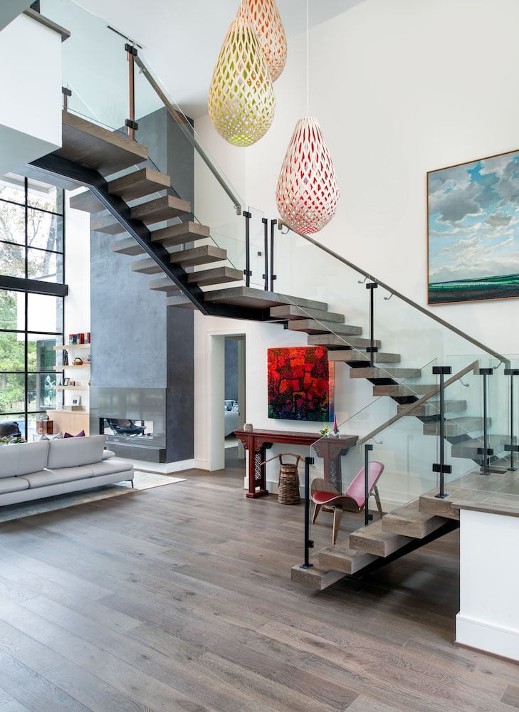
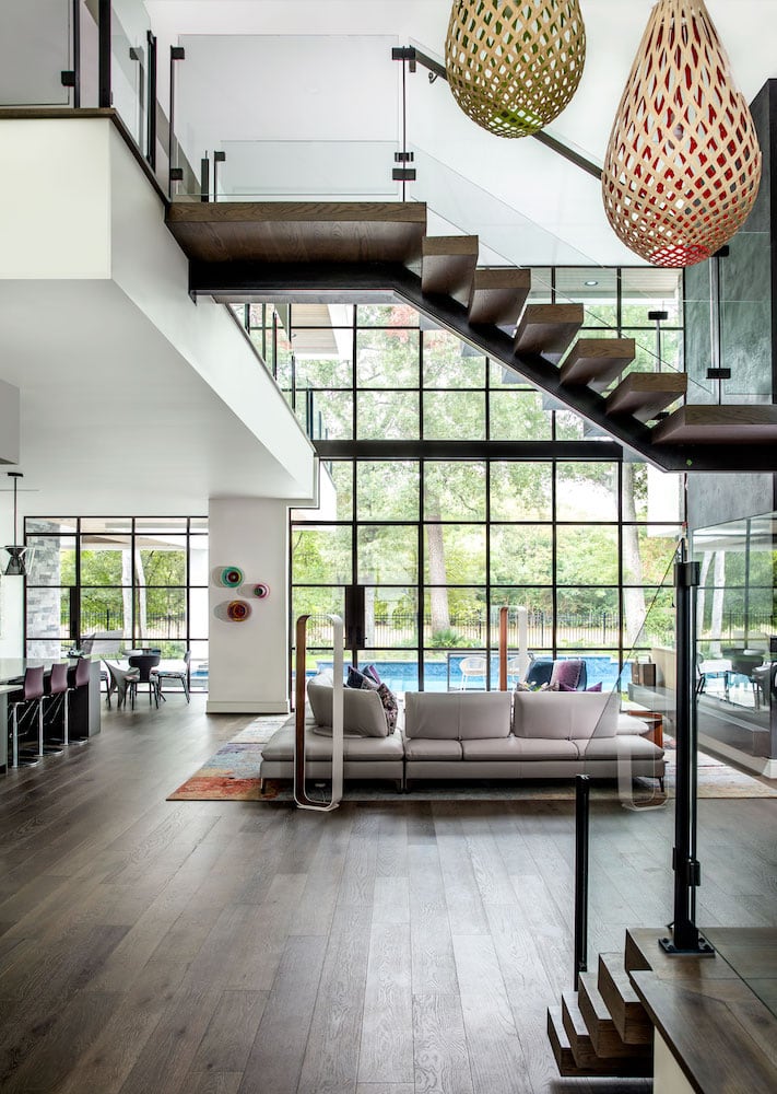
Upon entering the home for the first time, you are bathed in natural light. The massive windows create a long sight line to the pool and park beyond. The entry also features a wonderful trio of David Truebridge pendant lights, a part of the client’s extensive art collection. Handmade from pliable wood, the lights are inspired by woven baskets. The light casts fun shadows and brings a nice pop of color to the space. An iconic potato chip chair designed by Charles and Ray Eames ties in the bold painting and the antique console.
Dining Room Interior Design
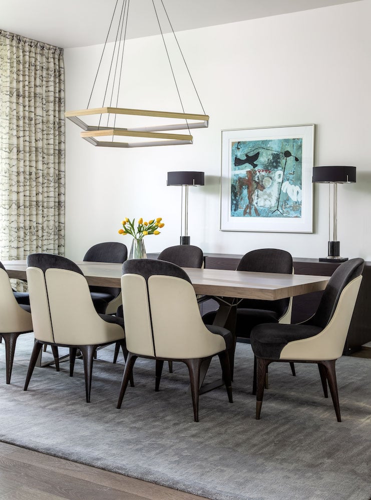
The formal dining room faces the front facade of the home and is one of the first spaces you see from the entry. Laura found these Theodore Alexander dining chairs at High Point market last spring and immediately knew they were perfect. The chairs’ constrasting tones pair wonderfully with the clients’ custom Roche Bobois table. A Studio Endo chandelier from 1stdibs matches the sculptural look of the entry staircase and is a beautiful complement to the black and cream dining chairs. For the rug and console, we shopped with the clients at our favorite showrooms. We selected a light charcoal-colored rug from Postmodern Traditions and handsome console from Cantoni Trade.
Kitchen Interior Design
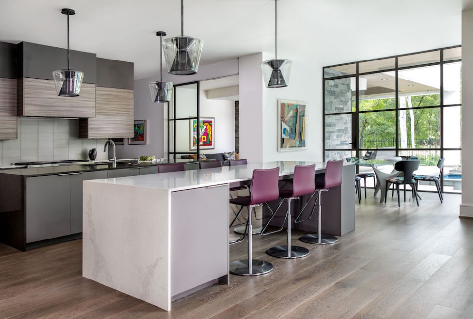
The family are big entertainers and the kitchen where they gather is the the heart of their home. Benedittini cabinets offer plenty of storage space and double islands with Caesarstone tops provide dedicated spaces for both prepping and eating. The four Berlin pendant lights from Troy Lighting brought cohesion to the space.
Blair thought the perforated metal inserts with the glass tied in nicely with the windows. The pendant lights have presence without feeling too heavy. Since there are four of them, this was crucial to the interior design of this Memorial home. The industrial-inspired feel of the lighting with the charcoal wood cabinetry make a balanced partnership.
Family Room Interior Design
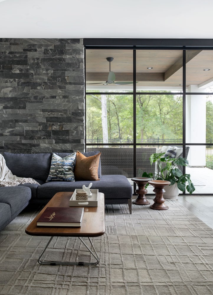
The gorgeous stone wall in the family room wraps around from the outside. Large Miesian windows allow in plenty of natural light. These Herman Miller walnut stools are the perfect match for our client’s existing coffee table. Both her grandfather and father worked at Herman Miller, so our clients have a beautiful collection which was a major influence on our design.
Laundry Room Interior Design
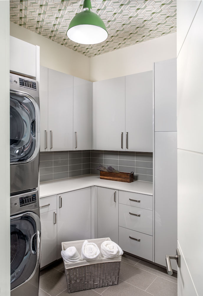
Touches of green in the wallpaper on the ceiling and the light fixture are not what you’d expected to see in a laundry room. For our client’s, this is their taste of home. They have lime green countertops in their home in Michigan and wanted to bring that here to Houston.
Study Interior Design
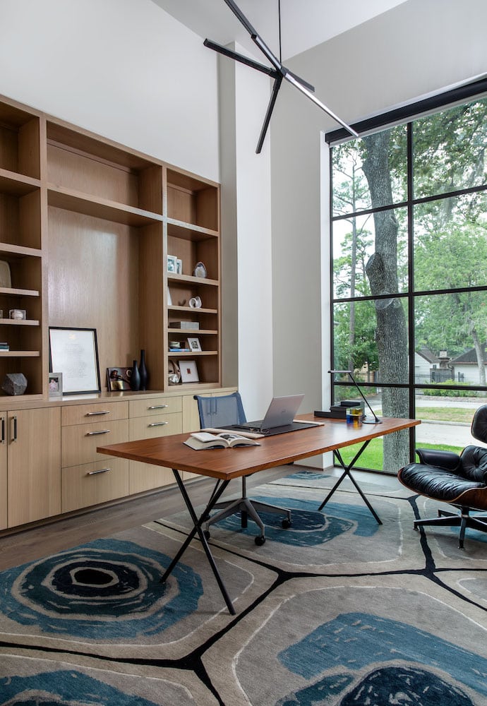
A vintage black Eames lounge chair and Herman Miller desk take center stage in the study. Different wood tones add warmth and soften the crisp lines of the light fixture and desk legs. While shopping with design team, our client fell in love with this Postmodern Traditions contemporary rug. They felt immediately drawn to it and I love the hint of playfulness it adds to the interior.
Living Room Interior Design
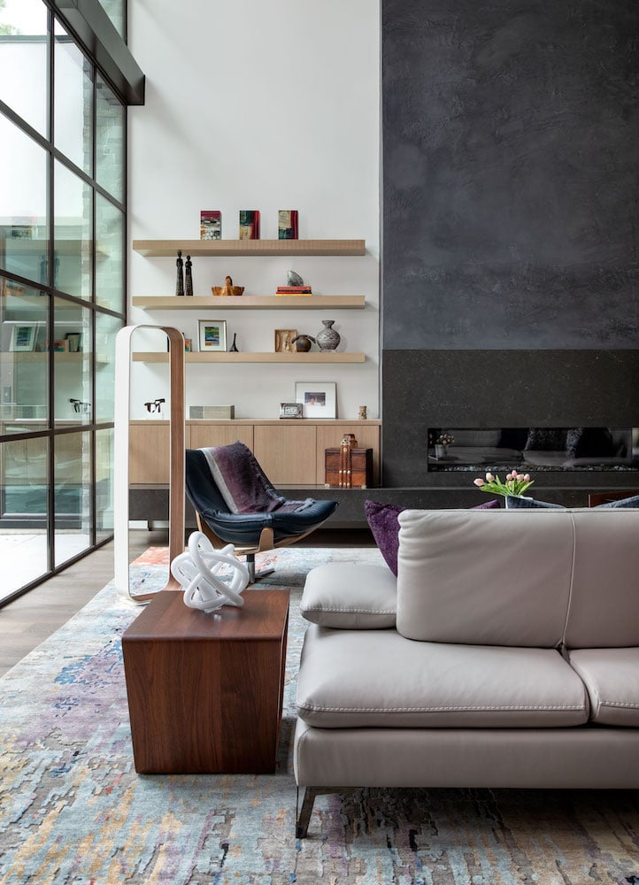
In the living room, there are three distinct vertical planes. Our challenge was figuring out how to bring visual interest to this double height space without overdoing it. We choose a moody plaster from Segreto Finishes for above the linear fireplace. It’s a dynamic finish but not as heavy as stacked stone. An 80% custom wool rug from Postmodern Traditions brings in the client’s favorite color, purple. We agree with her that in more subtle hues purple can be a neutral. It’s the perfect finishing touch for their living room.
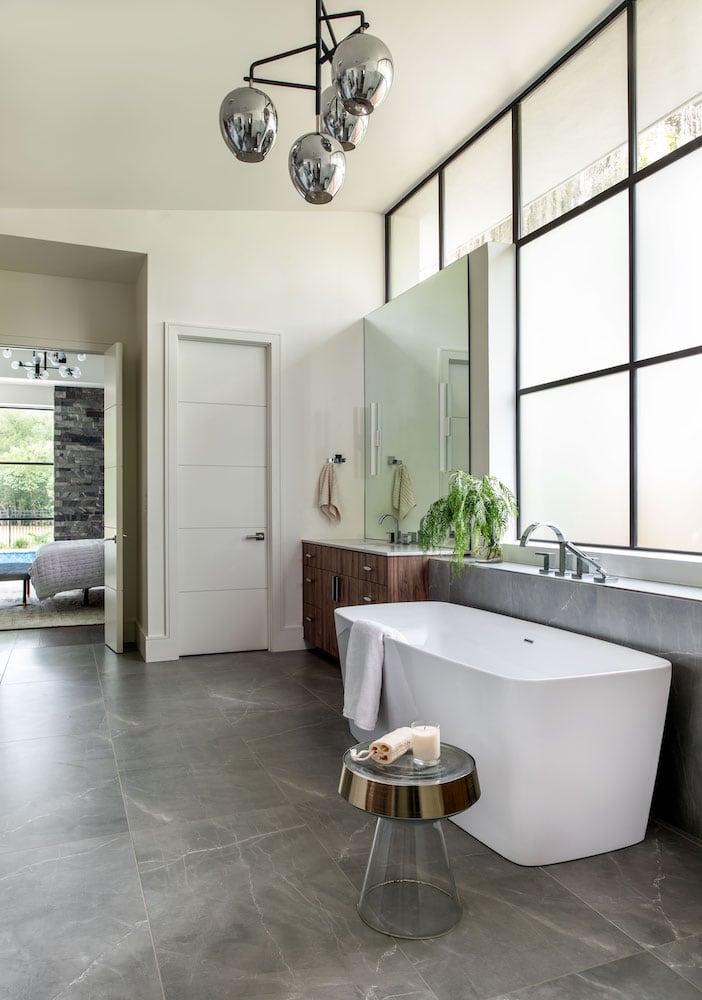
Master Bathroom Interior Design
Using the porcelain tile on the floor and bringing it up to the fixtures draws your eye up the wall to the large windows. The sloped ceiling angles in light while still providing privacy. A Hudson Valley Lighting fixture with a high-shine chrome finish complements the cool tones of the tile. It adds glamour in a more understated way.
Master Bedroom Interior Design
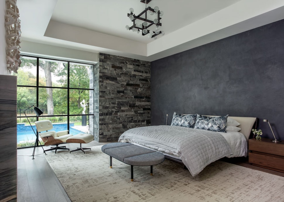
In this interior design project in Memorial, the bath tile choices drove the color scheme for the master bedroom. We chose the same Segreto Finish plaster that we used in the living room for the accent wall in their bedroom. The finish has dimension, movement, and picks up the cool steel blue-gray tones of the tile. Custom nightstands anchor the Cantoni Trade bed on the wall and bring warmth to the room.
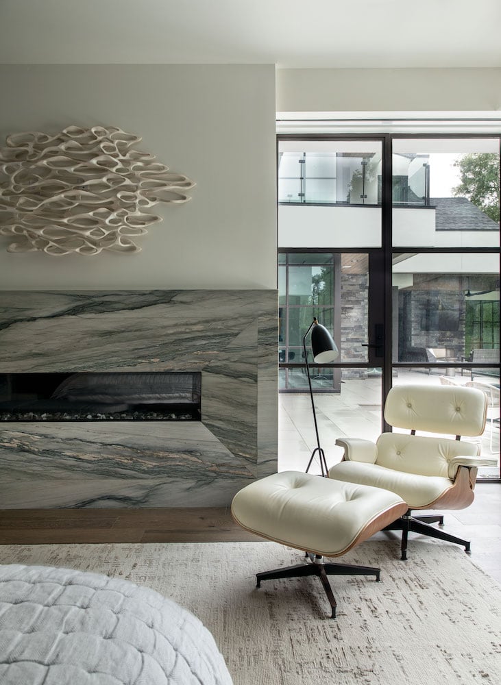
A white leather Herman Miller Eames lounge chair and ottoman in the corner with a grasshopper lamp creates a cozy spot by the fireplace. We selected a stunning white, black, and gold marble from Aria Stone Gallery for the fireplace surround. A contemporary rug from Postmodern Traditions (which I actually have in my own home!) grounds the design.
Boys Bathroom Interior Design
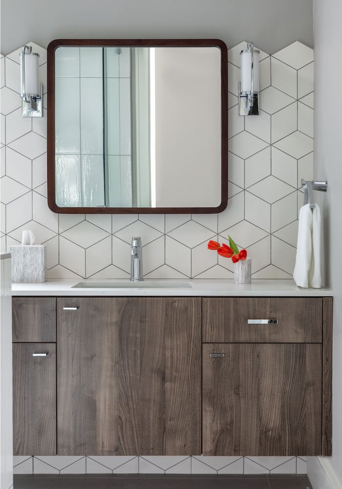
A gray and white color palette accented with rich wood cabinetry gives this bath a masculine feel. The bath was designed with their older son in mind when he comes home to stay for the weekends and holidays. We chose a Ziggurat tile from La Nova to create a one-of-a-kind tile backsplash.
Boys Bedroom Interior Design
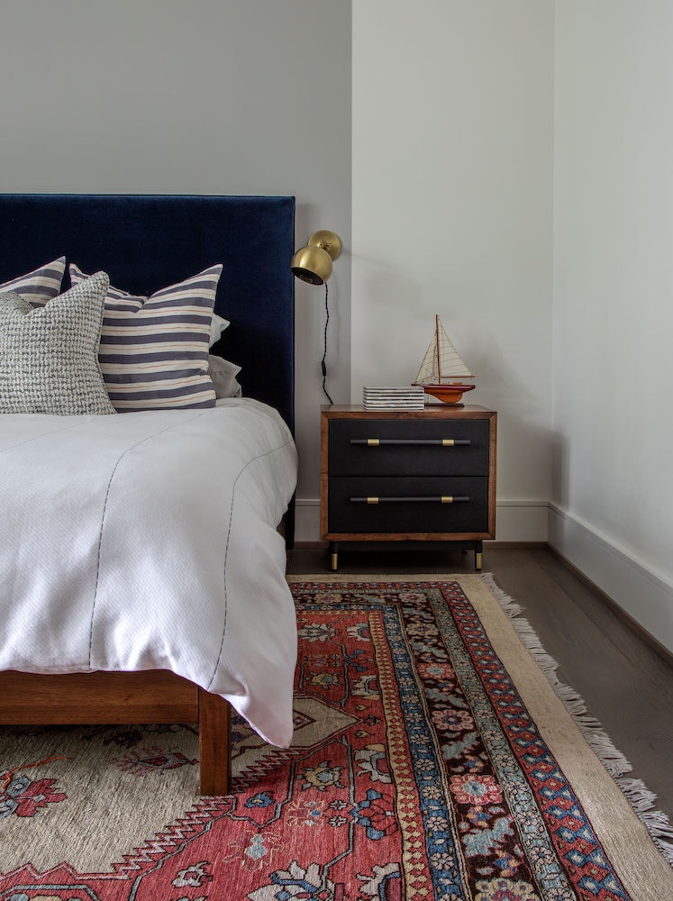
The look in the boys bedroom is contemporary, but with a vintage rug the room feels worldly and collected. To create cohesion between the bathroom and the bedroom, we used the same gray paint color. The fun painted gray headboard detail is carried up the wall and painted across the ceiling. Rebecca Atwood pillows pick up the colors in the rug and make just the right statement on the clean white bedding. The gold metallic finish of the Isaac sconce from Schoolhouse adds beautiful contrast to the velvet headboard.
Girls Bathroom Interior Design
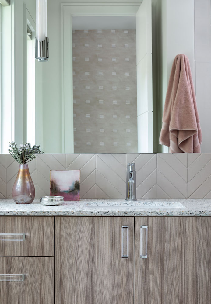
For the girls’ bathroom in this Memorial interior design project, we wanted the space to feel sophisticated and modern. Contemporary cabinet hardware mirrors the elongated wall sconces from Hudson Valley Lighting while the Walker Zanger chevron tile backsplash creates movement.
The Vetrazzo Fair Pearl we selected for the counters is reminiscent of the mid-century design aesthetic and is a gorgeous textural neutral. Neutral and blush shades with a pearly iridescence make it feminine and natural fit for our client’s bathroom. (When I was designing my collection for Vetrazzo, I fell in love with this and put it in the kitchen of my Dryden home!)
Girls Bedroom Interior Design
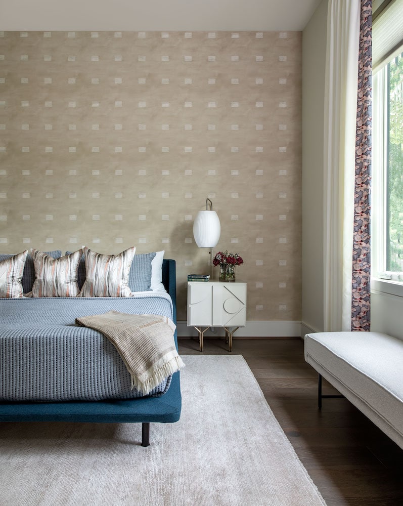
Per the client’s request, we split the bedrooms for balance – two feminine and two masculine. The Rouse Phillips fabric on the drape inspired the room’s palette. We sourced this gorgeous fabric through SUPPLY, one of our favorite fabric and wallpaper vendors based in Austin. The soft feminine lines in the pillows and softer textures blend with the more masculine tan tones. It’s the perfect balance of feminine and masculine. A cigar wall sconce over the nightstand provides a beautiful contrast to the geometric shapes on the wallcovering.
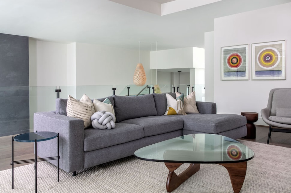
Art Gallery Wall Interior Design
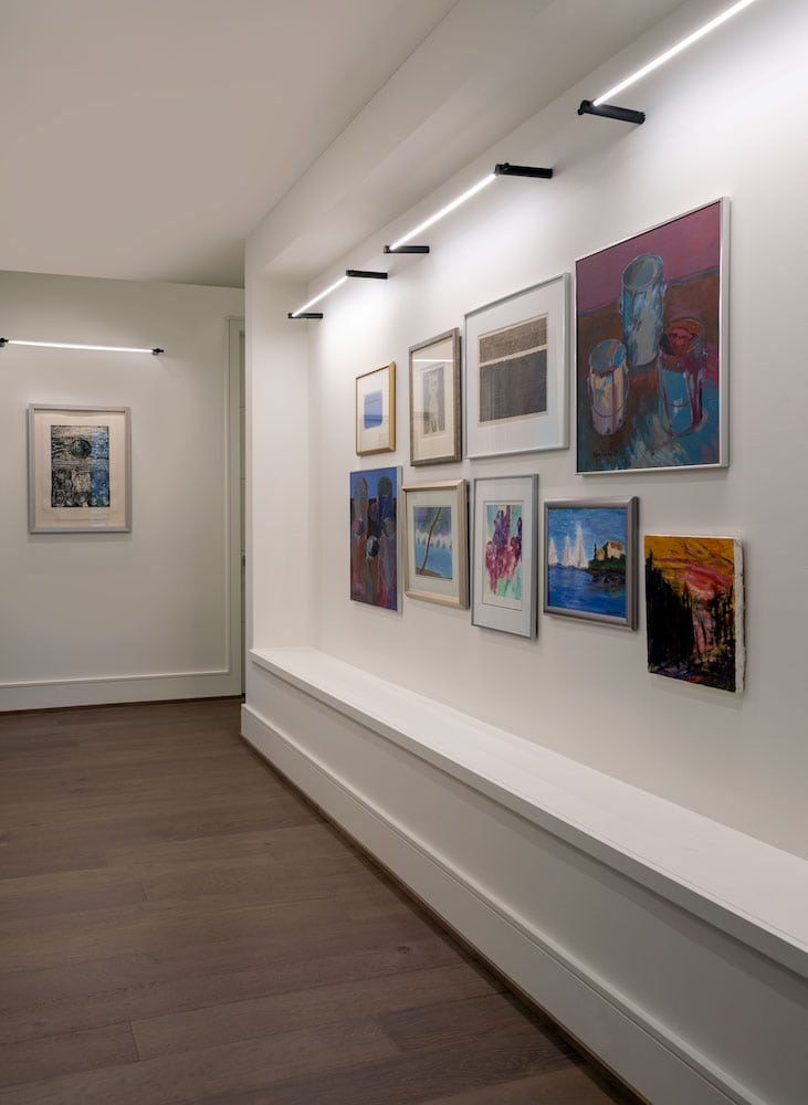
The second floor features an art gallery wall. The homeowners are patrons of the arts and the wife’s family owns an art gallery in Michigan. All of their art pieces have a personal connection to the artist. The client’s collections of antiques and art are sprinkled throughout the home and infuse a heavy dose of personality into the design. To complement our client’s collection, we worked with Laura Rathe Fine Art to source additional pieces.
Upstairs Media Room Interior Design
The upstairs media room is designed for mom and her daughter to watch movies. We wanted a serene, relaxing space with comfortable seating. The soft purple sofa and gray womb chair are perfect for them to curl up in when they’re watching movies. Despite being on the second floor, you still feel connected to the rest of the home. The homeowners sat there every night and watched the construction of their new home.
Rear Powder Bathroom Interior Design
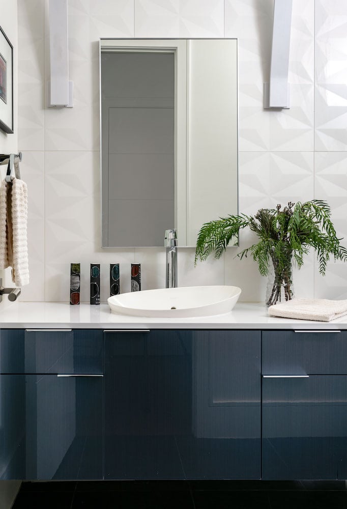
The rear powder bath is a study of contrasting shapes. The minimalist wall sconces and mirror create beautiful lines of symmetry offset by the dimensional tile from Walker Zanger. A fun, curved sink softens the crisp lines and the blue lacquer on the cabinets is amazing!
Black and White Powder Bathroom Interior Design
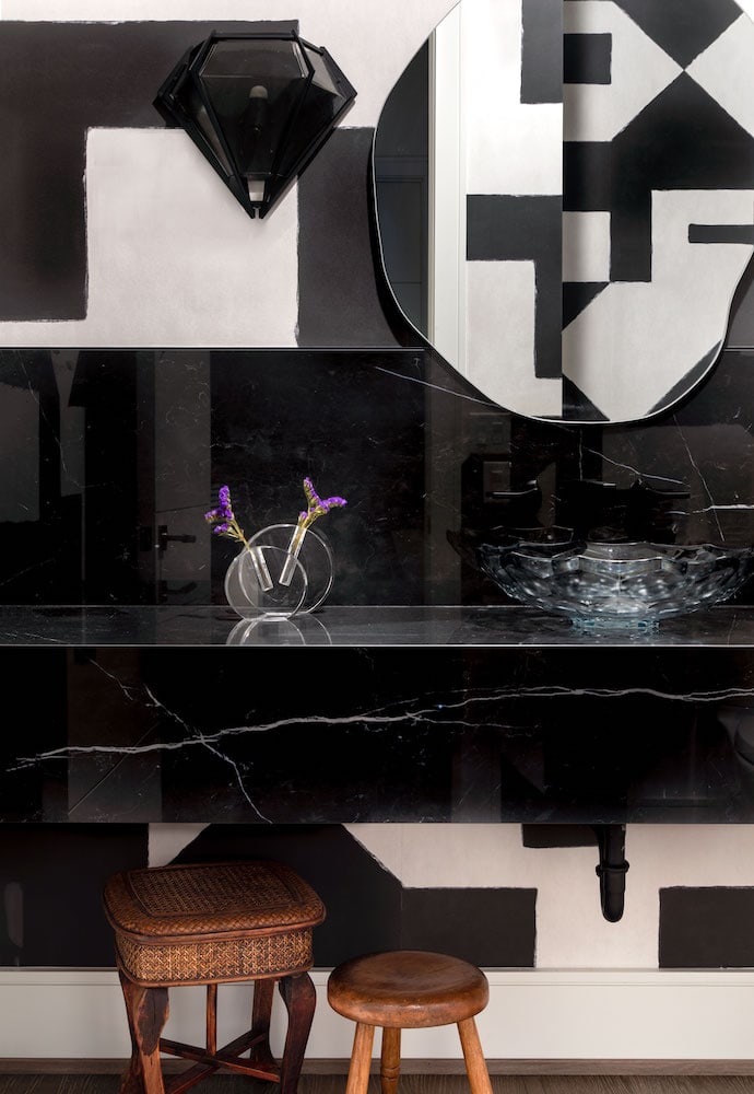
I love how the Gabriel Scott wall sconces in this black and white powder bath resemble the shape of a gemstone. They add glamour and elegance in a modern, unexpected way. The organic shaped mirror with painterly lines looks beautiful against the hard-lined geometric wallpaper. A floating stone porcelain counter gives this powder bath a clean, modern feel without making the space feel heavy.
Another Memorial Interior Design Project in the Portfolio
I hope you enjoyed the full reveal of this new construction interior design project in Memorial. From the moment you enter the home, you can feel the beauty of nature surrounding you. We couldn’t have brought this gorgeous, sustainably designed home to life on our own. A huge thank you to those who helped us create this fabulous home!
Custom Building and Design: Frankel Building Group
Custom Interior Finishes: Segreto Finishes
Photography: Kerry Kirk Photography


