Past projects for this couple have drawn inspiration from their travels abroad — particularly throughout East Asia. Incorporating rich textures, reflective surfaces, unctuous colors and frenetic, engaging patterns made for an electric final design in the couple’s River Oaks, Houston pied-à-terre. Between the Timberloch and River Oaks projects, one might notice that whimsy meets balance and warmth meets boldness in each room. The couple’s desire for imaginative, evocative social spaces is clear in both the River Oaks pied-à-terre and in this home’s formal dining room. Ever willing to take aesthetic risks, this forward-thinking couple has offered the design team at LUDC many opportunities to explore. For the Timberloch dining room reno, the goal was to “update the space with the help of deep, saturated tones.” The space was also updated through “pattern mix and textural variety,” Laura U explains. Discover the ways in which the LUDC team drew inspiration from Modernist design — e.g. Carlo Scarpa — and Eastern traditions in this dining room remodel.
INSPIRATION FOR THE TIMBERLOCH DINING ROOM RENO
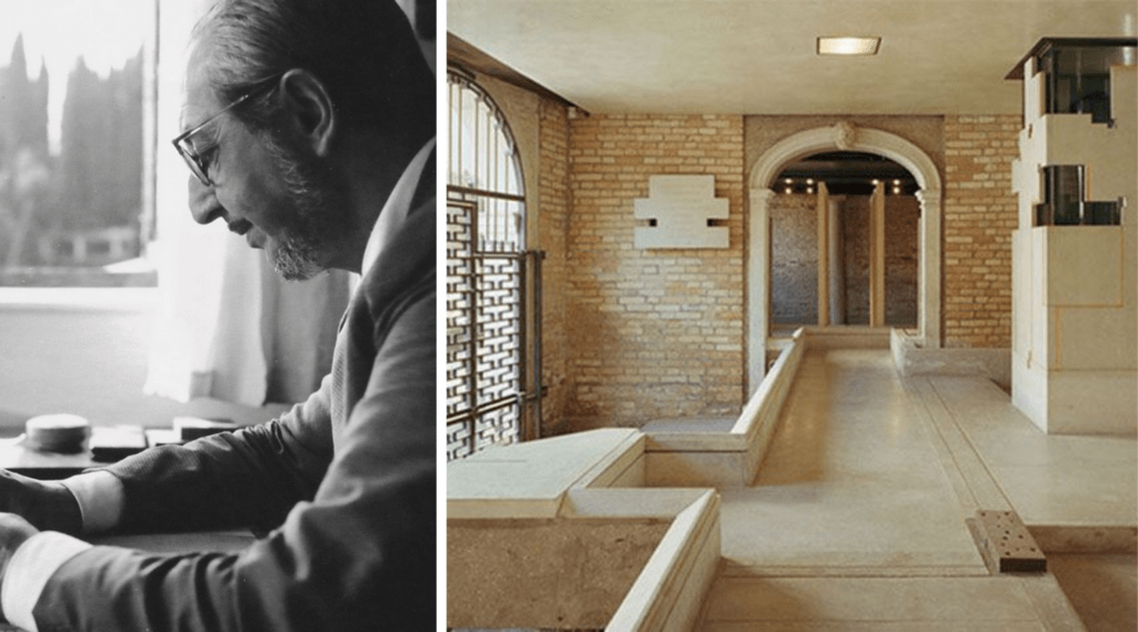
Modernist Design Icon Carlo Scarpa
As with other projects for this couple, the Timberloch dining room redesign drew on the artistic traditions of East Asia. Rather appropriately, this project also referred back to the work of legendary Modernist Italian designer Carlo Scarpa. Scarpa’s style — which has inspired LUDC’s founder Laura Umansky throughout her career — perfectly fits the Timberloch dining room. Though much of Scarpa’s architectural and landscape design work was drafted and realized in Italy, he was also strongly drawn to Japan. Though not technically considered part of the Arts and Crafts Movement of the 19th and 20th centuries, Scarpa embodied much of the movement’s ethos. Intentional design and respect for the craftsman are apparent hallmarks of Scarpa’s career — two values held just as closely by the LUDC team. This ethos is perhaps best represented in Scarpa’s lifelong exploration of different crafts — particularly those of rich and storied traditions.
Respect for the Craftsman, Interest in the Versatility of Materials, and Regard for History
The Understanding Italy article “Carlo Scarpa: Architect/Designer” notes that the 1920s and ‘30s were an especially significant period for the designer. It was during these two decades that Scarpa developed his unique perspective. He chose to reject “standardized design principles” and “rigid conventions.” Scarpa did so in favor of a “sensitivity to materiality” and desire to push materials “beyond their typical capabilities.” Throughout this period, Scarpa learned the ins and outs of glass-making under the tutelage of master glass-makers in Italy. After this period of study, he accepted a position as creative director at Venini Glass Works.
Scarpa’s experimentation with glass and other industrial materials later provided him “with the palate to manipulate architectural detailing and form.” Across decades, Scarpa recognized — and harnessed — the unique beauty offered by the juxtaposition of historic architecture and materials with their modern — and often industrial — counterparts. In his later life. Scarpa embarked on a number of preservation projects as explained in the Understanding Italy article. Preservation professionals have “lauded [Scarpa] for his sensitivity to” the depth of tradition in historic buildings.
How the Timberloch Dining Room Remodel Embodies Carlo Scarpa’s Design Sensibility
Romantic, personal and sentimental but thoroughly modern and forward-thinking, Scarpa’s designs continue to inspire countless professionals in the field both stateside and abroad. A century after Scarpa began his career in earnest, his attention to detail and willingness to dive into new materials remain relevant. His blending of historic and modern elements still inform many designs of our time. Scarpa’s respect for history and support for thoughtful preservation also served as inspiration for the Timberloch dining room. As in Scarpa’s many 20th century designs, the Timberloch dining room reno — and the couple’s River Oaks pied-à-terre — seeks to join the historic with the modern, allowing one to support the other while still shining independently.
TYING TOGETHER THE TIMBERLOCH DINING ROOM RENO
. M A R R Y I N G T HE F L O O R A N D C E I L I N G T H R O U G H C O L O R A N D P A T T E R N .
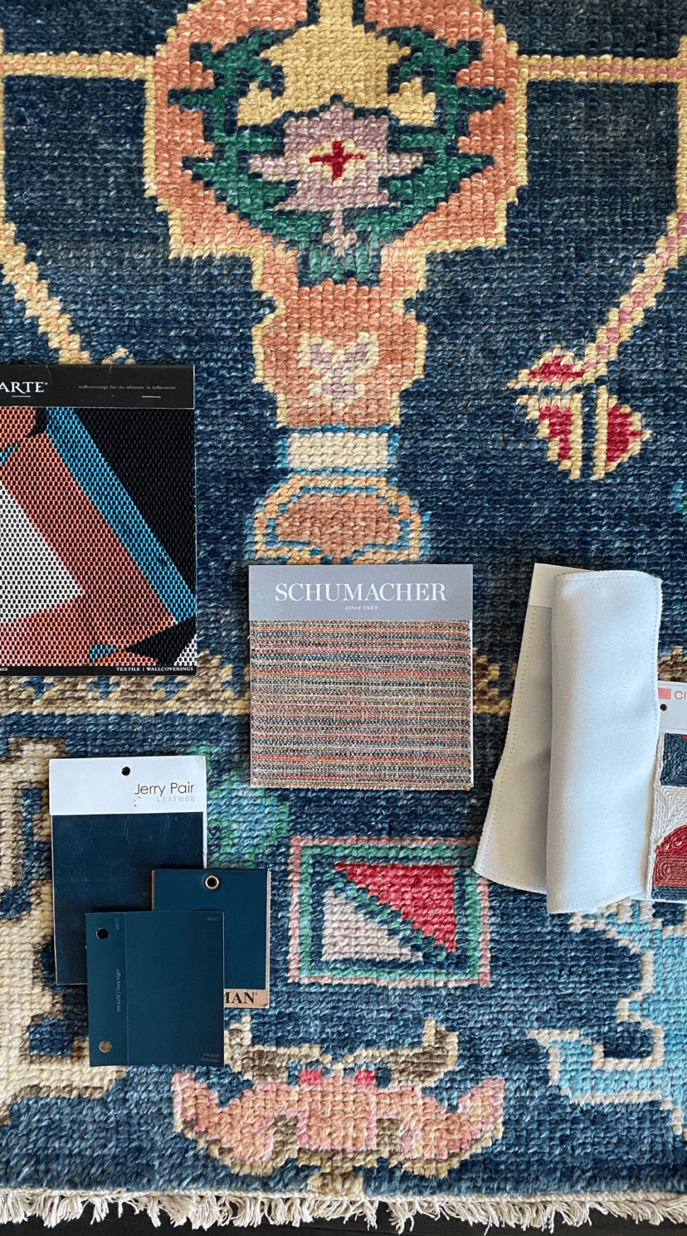
Vibrant color was the guiding force for the Timberloch dining room reno. An Arte mural papers the tray ceiling above the dining set. The covering feels fresh and contemporary — much like a Frank Stella or Neda Vena piece. However, it simultaneously manages to recall the mind-bending work of Wifredo Lam or the operatic nature of Wassily Kandinsky’s “improvisations.” Segreto Finishes applied the mural, a rather appropriate choice. The company describes its own murals as “organic…and soothing, [with] contemporary palettes of today’s design aesthetic.” Dark nearly-navy blue walls are both timeless and on-trend. The latter is demonstrated by the fact that Sherwin Williams named “Naval SW” their 2020 color of the year. Sherwin Williams describes colors like Naval SW as creating “a calm and grounding environment infused with quiet confidence. This type of atmosphere is clearly embodied in the Timberloch dining room reno.
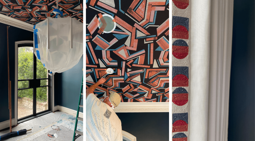
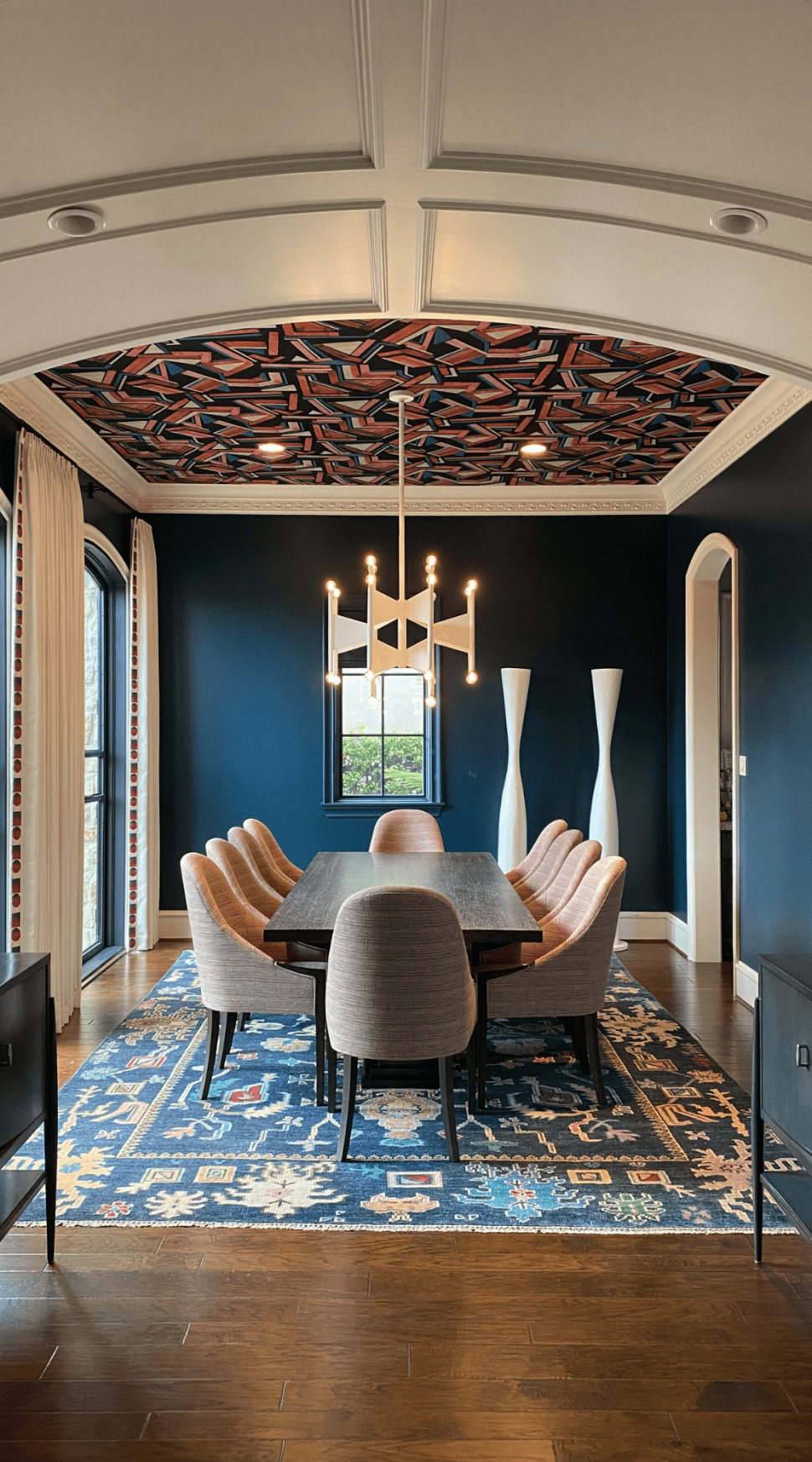
The exact paint color chosen by the LUDC design team is actually another Sherwin Williams paint. “Dark Night” is a moodier, deep teal just as much at home in this space as in an Art Deco study. This bold cross between deep navy and emerald green feels particularly apropos in a space inspired by Carlo Scarpa. The piped embroidery lining the cream-colored drapes creates the perfect pathway from the bold, modern ceiling down to the traditional rug. The rug’s design directly reflects the shape of the ceiling. This is most notable in the rug’s wide rectangular exterior border. Reflecting this program of shapes offers cohesion between the two planes. Traveling upwards to bridge the divide between earth and sky is a repeated theme of monastic and other historic East Asian art and tradition.
Referencing History through Furniture
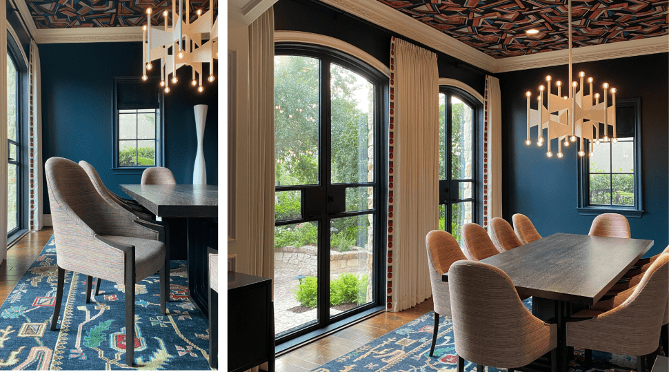
Dining chairs, twin sculptures, mounted wall sconces and a stunning chandelier pull colors and shapes from the rug and ceiling. Burnt sienna shades gracing the wall sconces recall the rich tones of the Japanese maple. The leaves of the Japanese maple are a constant motif in screens, architecture and textiles of the country’s past. Ebonized wood of the twin sideboards offers a bit of Japanese flair. This is particularly so in the combination of richly lacquered tabletops and matte drawers and doors. One can feel both the influence of Scarpa and of the 18th century tradition of shou sugi ban in the dining table as well. With its visible grain and less heavily stained surface, the table evokes both sensibilities LUDC chose a sculptural Kravet dining table for this space. Kravet’s table was designed by Michael Berman, who was actually inspired by Carlo Scarpa in developing this line. The shoji-reminiscent iron lattice detailing of the exterior doors — which open into the garden — continue this distinctly East Asian aesthetic.
And through Lighting and Architecture
The cream-colored chandelier and twin vases recall an almost Cycladic sensibility. This is appropriate inspiration for a space joining history and modernity. The period was a continuous reference point for many modernist artists. Julia Fiori explains this in her article for “These 5,000-Year-Old Sculptures Look Shockingly Similar to Modern Art” Artsy.net. Quoting scholar and author Pat Getz-Preziosi, Fiori writes that modernist artists and designers were compelled by ancient Cycladic vessels and sculptures. This was because they combined “gleaming white marble and painstaking workmanship.” The “essential forms” of Cycladic objects offered a “calm force” while maintaining an alluring “mystery” that proved irresistible to contemporaries of Carlo Scarpa. Calm force, mystery and workmanship are all visible themes echoed by the Timberloch dining room. The white arches of the windows and doorways provide a soft Mediterranean feel in an otherwise rich and moody space. Interestingly, the chandelier appears to tie the Mediterranean influence into the East Asian influence of the dining room. It pairs the shell white of the twin vessels and painted arches with graphic wing shapes evocative of orizuru. Orizuru — for those unfamiliar — are Japanese origami paper cranes. Today’s designers — particularly Japanese architect Hiroshi Sambuichi — are often inspired by the dynamism, delicateness, intricacy and gentle power of origami.
Balancing Bold Statements with Subtle Details for a Big Finish
All in all, the Timberloch dining room remodel successfully balances energetic colors and bold statement pieces with crisp, sophisticated lines and sculptural details. In this space, Laura U — as described in her own words — achieved the three elements vital to an effective and enduring design. The space feels simultaneously open and cozy as well as day-to-night transition through the implementation of layered, dimmable lighting. The Timberloch dining room also offers copious visual interest through textural variety. Most of all, the space truly “reflects who [the clients are], tells [their story] and sparks a conversation.”


