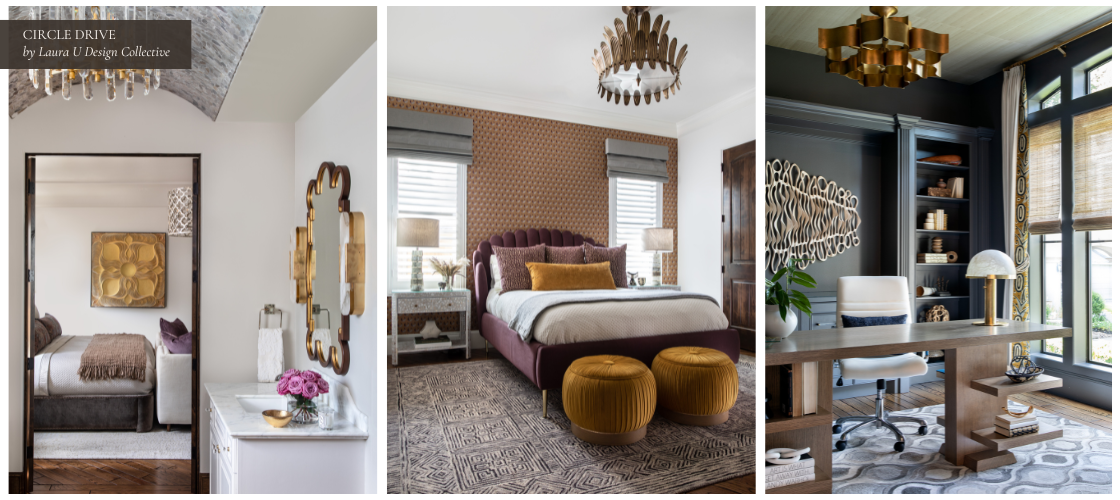
Getting furniture and artwork scale right is what separates a room that feels intentional from one that feels hastily or haphazardly improvised. While you might think all you need to know is the number of inches on a spec sheet, designers also think about proportion, circulation, sight lines, and how the eye travels when one steps through the door. Selecting the right scale for furniture and artwork is part math, part editing, part relating.
You can measure perfectly and still miss. Rooms have quirks, both architectural and decorative. Windows pull you in one direction. A fireplace insists you center over it, even if it’s not centered on the wall itself. Appropriate scaling acknowledges all of that and still gives people a comfortable place to sit, talk, and move.
Here’s How Designers Determine the Scale of Furniture and Artwork in Residential Interiors
Start With Proportion, Not Specific Pieces
It’s important to start with the room itself. Measure wall lengths, ceiling height, openings, and the paths people actually walk to access important elements of the space. Sketch the conversation area, the dining area, and the passages in between.
Then test which areas can support this program without feeling crowded. Referencing recommendations shared by BIID designer Hedayat with Homes & Gardens in 2021, Sarah Warwick notes that size takes precedence because it shapes how we perceive the room’s volume. That sounds obvious until a beautiful silhouette arrives and completely overwhelms everything around it.
This is also where a little skepticism helps. If a single piece forces you to compromise every other choice, it is probably the wrong piece.
Select the Right Size Sofa
The sofa is usually the largest movable object in a living space, so its length needs to be deliberate. According to Sarah Warwick in Homes & Gardens in 2021, you might aim for a sofa that is about two thirds of the wall behind it. Designer Bee Osborn, quoted in the same feature, often aims closer to half the wall to leave space for lamps and side tables. Both ratios can work. The architecture and your seating needs decide which feels natural.
Depth matters just as much. If a loungey 40 inch seat overwhelms the footprint, buying a shorter version of the same model won’t fix the problem. According to Lucy Searle, Editor in Chief at Homes & Gardens in Warwick’s 2021 piece, the answer is to change the profile. A more upright, traditional frame often sits lighter in a modest room. Use also matters. According to Amanda Meade in the same feature, a big corner configuration can suit a TV room, while two sofas facing each other serve conversation better. For open plans, Emma Sims-Hilditch notes that an L shape can mark the living area without adding a wall.
Color shifts visual weight too. According to designer Caitlin Miller in Homes & Gardens in 2021, pale gray helped her maximize seating without letting the sofa dominate a space with warm woods. This small decision changed how the whole composition felt from across the room.
Leave Plenty of Room to Move
Scale is the object and the space around it. Doors should open fully. Two people should pass without sidestepping each other. Side tables should be within easy reach from every seat. According to Amanda Meade, quoted by Warwick in 2021, bulky arms can obstruct flow and block sight lines more than clients expect. That is the kind of frustration you notice daily, not just during a photo shoot.
Do a quick walk test. Turn and sit. Reach for an imagined glass. If you bump a corner or have to lean too far, your scale is off. Fix it on paper so you don’t fix it later with returns.
Pair Furniture Form to the Architecture
Low ceilings often ask for lower backs so the room feels taller, but this isn’t a hard and fast rule. You can always edit window treatments and wallcoverings to make the space feel more grand and vertically oriented if a particular seating arrangement seems to suit the space.
Remember, opposites attract. Strong grids and sharp corners benefit from a few curves to soften the geometry. None of this is fussy. It is simply listening to what the room is offering and responding in kind.
You can push against the envelope a little as long as you give something back. A taller cabinet may work under a high transom if the nearby seating sits lighter and the lamp heights pull the view down again. Again, proportion is a conversation, not a rule carved in stone.
Select the Right Size Rug to Ensure Your Furniture Doesn’t Feel “Toy-Like”
Undersized rugs make furniture feel toy-like, but there’s an easy fix for that. According to Martha Stewart in Heather Bien’s 2025 feature, “Make sure your rug extends underneath at least the front feet of all furniture… This avoids a dollhouse look.” In larger rooms, stretch farther so the grouping sits on one visual field. In smaller rooms, keep pile low so doors clear and people can easily walk around the space while you preserve coverage.
If you are between sizes, lean larger. The edge of a rug can do more to connect a seating group than one more side table ever will. Plus, it adds texture, warmth, and pattern that supports the overall palette of the space.
Test the Plan Before You Buy
Tape is such a valuable tool. According to Kristin Harrison in Martha Stewart in 2025, a spatial plan saves you from buying the wrong thing twice. Put painter’s tape on the floor at the actual dimensions and live with it for a day. Stand at the entry in the late afternoon when shadows lengthen and check the outline again.
Walls benefit from the same rehearsal. According to Laurie Anne Gonzalez on her studio blog in the 2025 article “How to Choose the Right Size Art for Your Space,” “When in doubt, tape it out. Grab some painter’s tape and outline the size you’re considering directly on your wall.” Step back. If it looks much too small from across the room, it probably is.
Size, Place, and Hang Art With Intention
Art usually pulls the eye first, so give it presence without tipping the balance. According to Laurie Anne Gonzalez on her studio blog in the 2025 article “How to Choose the Right Size Art for Your Space,” “Your artwork should be about 2/3 the width of the furniture it’s hanging above.” Gonzalez shares additional wisdom about placement. She writes that “If the art is above furniture (like a sofa or bed), center it relative to the furniture—not necessarily the wall.”
Account for the frame. Those extra inches often complete the field above a sofa or headboard. As for height, Gonzalez suggests that you place the center around 57 to 60 inches from the floor, or set the bottom edge six to ten inches above the furniture. Adjust for ceiling height and for how you actually approach the room. If a fireplace or console defines the view, cue the art to that composition rather than the geometric middle of the wall.
Mix Scales on Purpose
Rooms where everything sits at the same height feel boring because the eye needs not travel. Variety adds movement for the eye and a sense of depth that is especially valuable in smaller interiors.
According to Cathleen Gruver in Martha Stewart in 2025, having a few bigger pieces with a few smaller ones feels calmer than a crowd of underscaled items. One tall lamp beside a low chair. A petite stool next to a substantial console. These shifts create a cadence you notice even if you cannot name it.
This is also where editing pays off. If three small objects are fighting to make the point that one larger object could make cleanly, let that single piece win. Confidence is clarity.
Consider the Lightness of Leaner Lines
In compact rooms, lift pieces off the floor. Legs create a slim shadow line so the flooring feels continuous and the room looks calmer. According to Heather Bien in Martha Stewart’s 2025 feature, designers favor furniture on legs because it “helps visually extend the lines.” Keep comfort through seat depth and pitch, then trade bulky arms and skirts for slimmer profiles.
Place the heavier items where they won’t clog movement. According to Danielle Perdue in Martha Stewart, “Keep larger, visually heavier pieces like bookcases or sofas up against the wall” so the center stays open. If a closed cabinet is essential, choose a shallower depth and a recessed toe kick. Pair it with something light nearby like a tripod lamp or a leggy chair so the room feels easy to move through.
Be Smart About Sectionals, Chaise Depths, and Dividing Space
Scale a sectional to the wall and the walkway, not just the seating count. Start with length. A useful benchmark is to keep the main run somewhere around half to two-thirds of the wall it faces so side tables and lamps still have room to breathe. Then check the chaise. Treat that projection like a second footprint: it should leave a clear path in front of doors and along the travel route to the next space. Thirty to thirty-six inches of pass-through usually feels comfortable in everyday use. If you can’t achieve that clearance, you likely need a shorter chaise or a different configuration.
In open layouts, a sectional can signal where the living area begins without a single extra partition. An L-shaped sectional paired with a set of armchairs is excellent for larger living rooms and open-concept spaces where the living space must be clearly delineated from the kitchen. But in smaller rooms, let the sectional replace the sofa-plus-chair setup rather than compete with it. Push it to the perimeter, float a light table in reach, and test the “tail” of the chaise with tape before you buy.
Assess Color, Contrast, and Apparent Size
Color changes how big a piece feels, which is why measurements are never the be-all-end-all. Lighter upholstery tends to sit back and feel smaller. Deeper tones push forward and claim more attention, which means occupying more mental space. Of course, this changes when working with monochromatic spaces.
The architecture and daylight will also help determine what size furniture a room can comfortably accommodate. If you’re unsure, lay fabric on the piece at home in late afternoon and look from the doorway.
Final Checks Before You Commit

Stand at the entry and let your eye travel around the room without forcing it to do so; be natural. Do you notice the right thing first, or does a single object steal attention for no good reason? Sit in every seat and reach for a surface. Can you place a glass without leaning? Look toward windows and fireplaces. Are they clear, or blocked by arms and backs?
Walk the paths and turn on your heel. If anything nicks your shoulder or ankle in this dry run, it will in real life too. As always, reach out to a design team to take all the guesswork out of scaling furniture and artwork in your interior.