We’ve all seen those picture-perfect catalog spreads: coordinated furniture sets, matching lamps, rugs that tie everything together in the most predictable way. While polished, these rooms can feel a little too perfect; they lack the soul, texture, and layered personality that make a home feel truly lived in. If you’re using all matching pieces everywhere, you aren’t really designing; you’re shopping for ready-made sets.
Designers are experts at transforming a space from catalog-worthy to magazine-worthy. They create rooms that are curated, dynamic, and full of visual interest. Character over coordination is the point. Here’s how to achieve that. If you’d like a bit more help after reading, reach out to our team at Laura U Design Collective.
10 Ways to Make Your Space Feel More “Magazine” and Less “Catalog”
Mix, Don’t Match
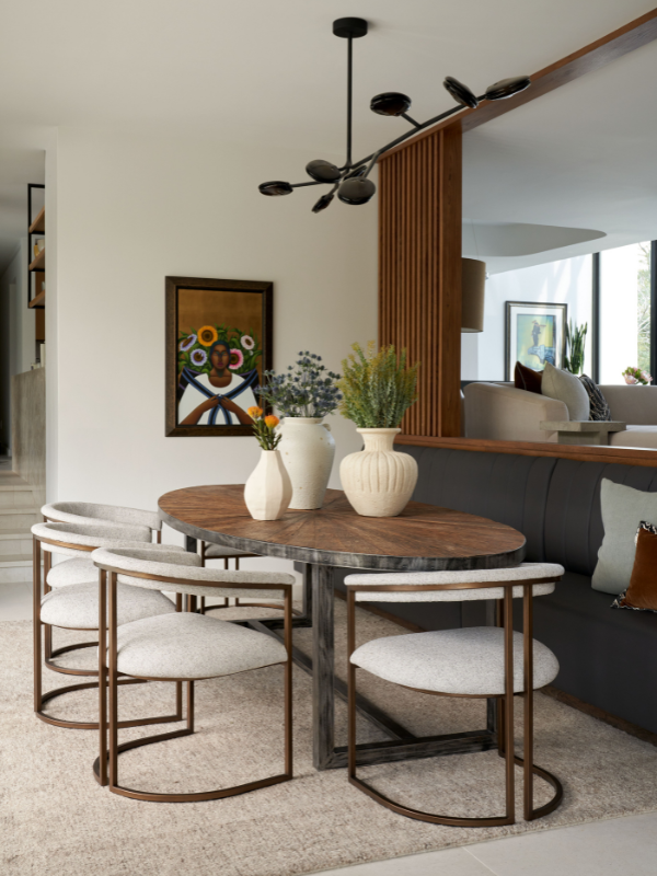
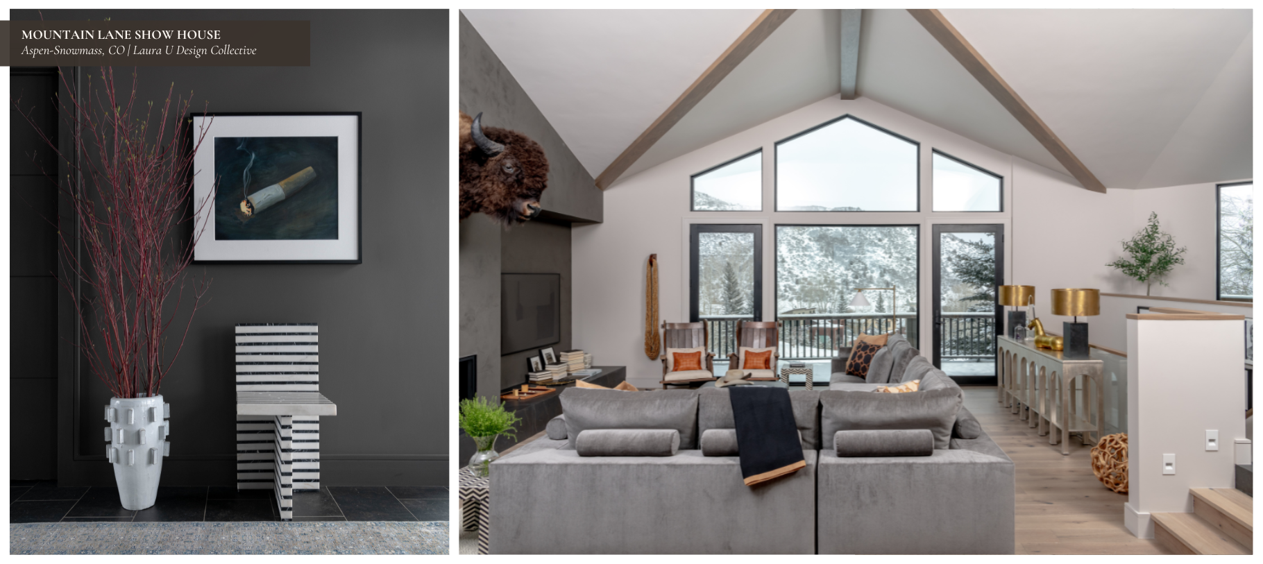
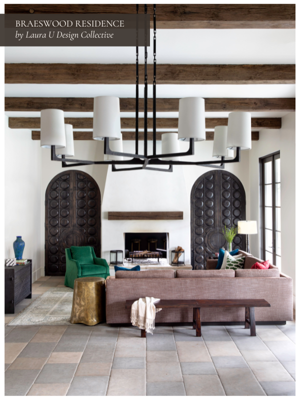
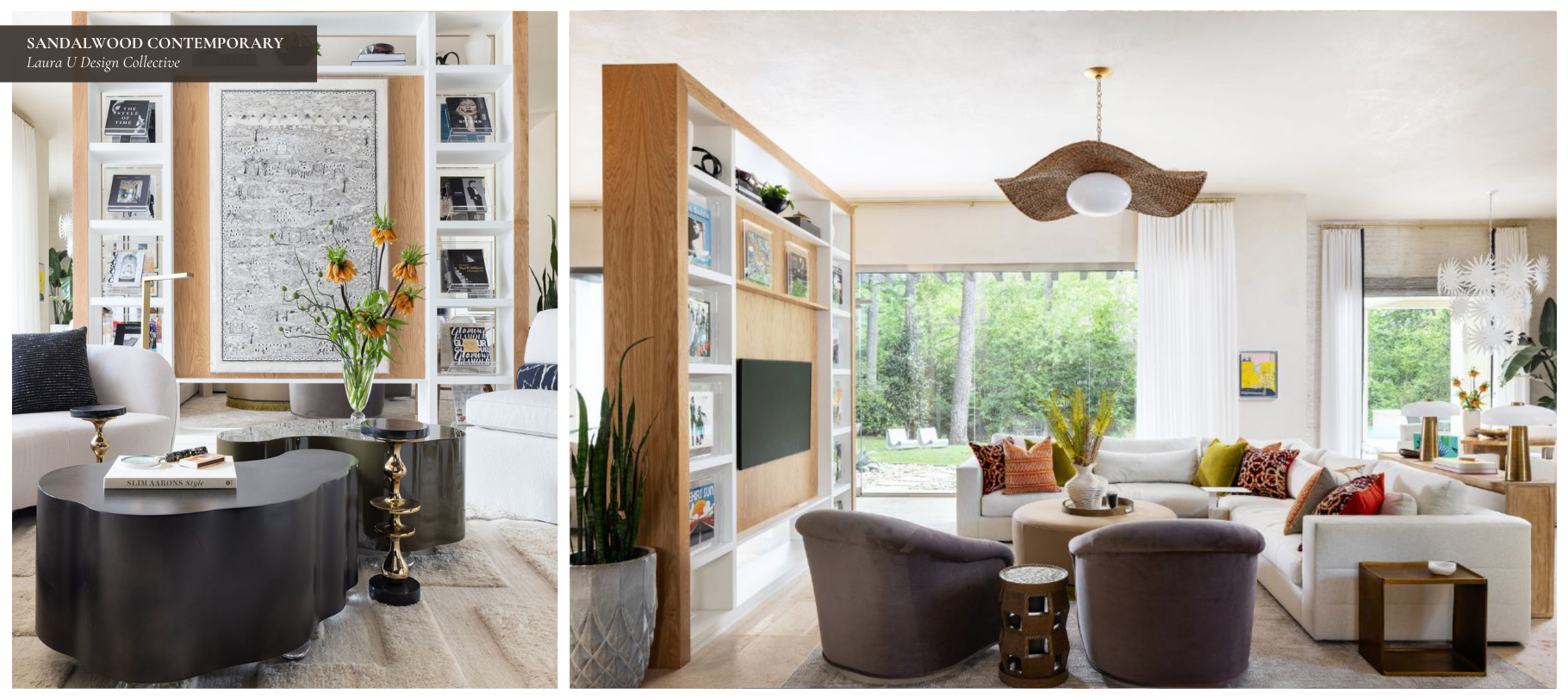
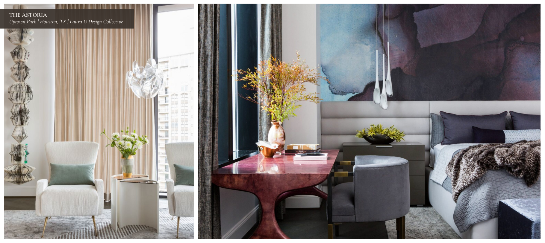
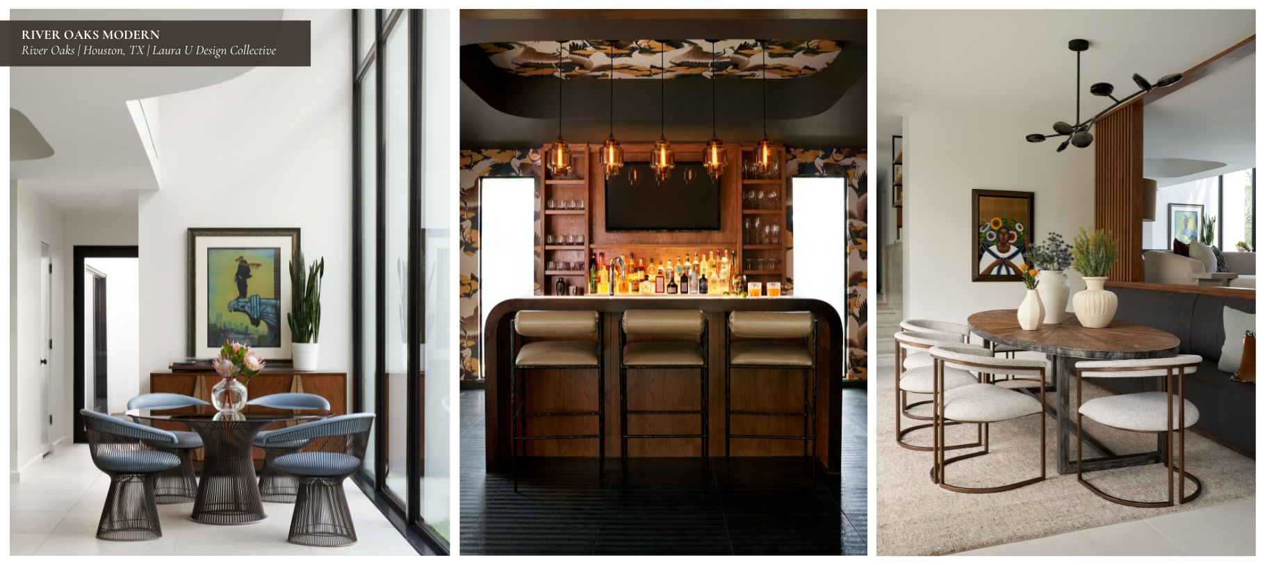
One of the fastest ways to make a room feel staged is to stick with matching sets that require very little imagination to incorporate. Designers intentionally break this up. They might pair a vintage cocktail table with a sleek modern sofa, or layer a handwoven rug under a clean-lined dining table. By introducing different textures, finishes, and silhouettes, the space garners depth and a collected-over-time look.
This approach also gives you the opportunity to select pieces that each have their own unique presence. When everything matches, nothing stands out. When there’s contrast, the eye travels through the room and finds interesting areas to land. A walnut console with an iron mirror immediately feels more layered than a bundled set bought together. You don’t want it to feel like all pieces in your home were purchased at the same time.
Designer Tip: Choose one anchor piece, like a statement sofa or dining table, then build around it with complementary, not identical, pieces.
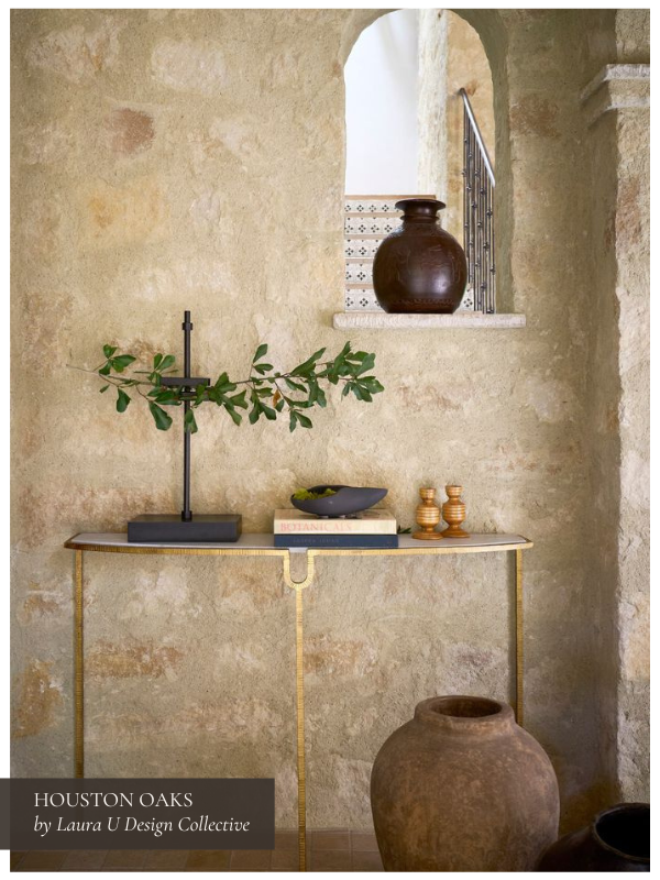
Layer Textures and Materials
To that point, remember that a curated space is built in layers. Designers combine wood, metal, linen, velvet, glass, and natural fibers to give a room warmth and dimension. Those subtle shifts in texture prevent a space from falling flat.
Think beyond textiles. A matte plaster wall next to a polished marble console or woven basket creates gentle contrast that adds character without crowding your space. Mixing reflectivity helps, too. Rooms that boast both matte and high-shine surfaces feel alive because they change with the light throughout the day. These nuances are what make a room feel considered rather than simply assembled.
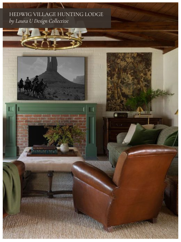
Add Personality Through Art and Accessories
Catalog rooms often fall flat because they avoid personal touches. Designers use art, books, collected objects, and greenery to add individuality. Whether it’s an oversized painting, a sculptural lamp, or a stack of well-loved design books, these pieces make a room feel lived in.
Accessories are not afterthoughts. If a space is a story, accessories are the punctuation of each sentence. Sure, you could read a story without punctuation, but it wouldn’t be clear, well-communicated, or lyrical. Punctuation matters; it captures a writer’s unique style while ensuring you actually understand what’s going on. A single ceramic on a shelf can say more about your taste than a matching trio of decor items. Art, especially, reflects the owner’s identity.
Designer Tip: Mix high and low. A striking painting can sit beside a thrifted vase or vintage bowl and feel right at home.
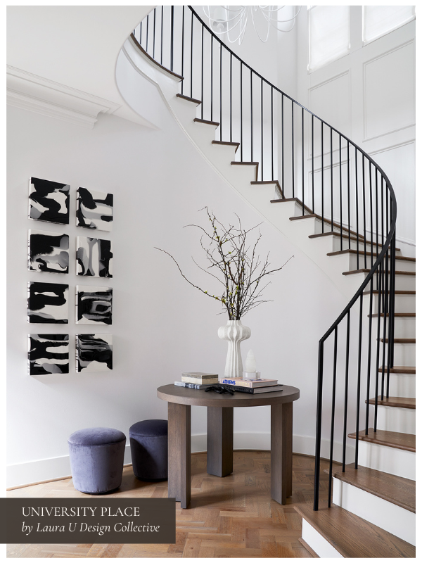
Vary Scale and Proportion
A room full of furniture at the same height feels quite static. Designers create rhythm by mixing tall and low, wide and narrow, soft and structured. A slender floor lamp beside a low lounge chair, a petite stool next to a substantial console, a narrow book tower adjacent to a deep sofa. These shifts in proportion give a room movement and intention.
You do not need big architectural elements to get this right. Even changing the heights of objects on a console can create a visual beat that guides the eye through the space. As we explain in our post “Here’s How to Style Shelves Like an Interior Designer in 2023,” how you place items of different heights and weights also matters. LUDC Senior Designer Shannon Smith notes that “By starting with the tallest, largest or heaviest objects first, homeowners are able to anchor their design. Then, they can fill in the surrounding areas with smaller companion pieces.”
Embrace the Imperfect with Gusto!
A little asymmetry goes a long way. It helps a room feel more human-made and keeps guests interested in the space. There is also evidence for this from perception research. Marco Bertamini and colleagues reported in 2019 that people reliably preferred symmetry for faces and abstract shapes, yet in more complex scenes, like landscapes, the perfectly symmetrical versions were liked less than the natural, slightly irregular originals.
That matches similar work by Reber, Schwarz, and Winkielman, who argued in 2004 that we favor what is easy to process, but only to a point. Once everything is instantly legible, interest declines because there is nothing left to resolve. Gestalt research helps explain that mechanism. Our visual system groups, completes, and looks for order. A small imbalance gives the eye something to resolve without tipping into chaos. That is one reason mild asymmetry can feel engaging rather than messy.
In practice, this is fairly simple. Offset an artwork a bit. Mix chair styles around a table. Let one lamp stand alone without a mirrored partner. These moves keep the eye moving and the room relaxed.

Honor Your Home’s Unique Architecture
A curated room works with the architecture. Designers read sight lines, scale, and flow, then let those realities guide the furnishings. A strong archway might ask for a sculptural chair just inside the opening. Classic paneling might call for simpler upholstery so the millwork can breathe. When the architecture is respected, the design feels inevitable rather than decorated.
Ignoring the envelope of the room is a common reason spaces feel “catalog.” The pieces may be beautiful on their own, but without harmony with the walls, windows, and circulation, they look placed rather than composed.
Curate Over Time
Rooms that feel personal rarely appear fully formed. They’re developed in stages. Designers plan the big moves, then leave space for discovery. A great sofa and a table you love might come first. The right vintage mirror or a ceramic found on a trip can arrive months later. This slower rhythm keeps a space from reading like a single shopping session and gives it the kind of depth you can’t fake.
Start with the pieces you’ll touch every day. Seating that fits your life. A dining table with a surface you enjoy. Once those anchors are in, live with the room for a moment. Notice what you reach for and what you avoid. If a corner sits empty, maybe it needs a reading chair and a small lamp rather than a plant you’ll never water. If the shelves feel thin, add books you actually read and one or two objects you care about. No sets. No filler.
Seasonal shifts help too. Heavier linens in winter, breezier textures in summer. A framed photograph swapped in for a while. Small changes keep the room fresh without disrupting the foundation. Over time, these choices add up. The space starts to sound like you.
Edit with Intention, Not Austerity
Curation isn’t just about adding. You also need to know what to remove so everything else can feel natural. Designers edit early and often. Surfaces do not need to be full. Walls do not need to be covered. Leave a beat of quiet between focal points so the eye can rest. That pause is part of the composition.
Begin with one area. A console. A coffee table. Clear it completely, then add back only what earns its place. Vary height and scale, but stop before the story turns noisy. If two pieces do the same job, let one go. Store the rest and rotate later if you miss it. The goal is clarity, not austerity.
Negative space is not emptiness. It frames the work you’ve done. A stretch of bare wall can make a single artwork feel considered. A simpler window treatment can let the architecture do more. When you edit with intent, the room reads as confident and calm, even if the palette is rich and the textures are layered.
Shift the Visual Center to Off-Center
Many rooms default to one obvious anchor in the middle. Sofa centered. Bed centered. Table centered. There’s nothing wrong with balance, but a predictable center can make the composition feel flat. Designers sometimes move the weight a touch off axis. Not to create disorder, but to give the room a second read.
Try this in small steps. Pull the sofa a few inches off the architectural centerline and let a sculptural chair carry more presence to one side. Place the main pendant slightly forward so it frames the view from the entry rather than hovering over a table like a target. Angle a reading chair toward a window instead of the television so the sight line leads out, not back.
Art can handle this role as well. Hang a large piece where it intercepts the first view into the room, even if that means it isn’t perfectly centered on a wall. The goal is to guide movement and attention through the space, not to lock everything to a single midpoint. When the visual center can shift as you walk, the room feels lived in rather than staged.
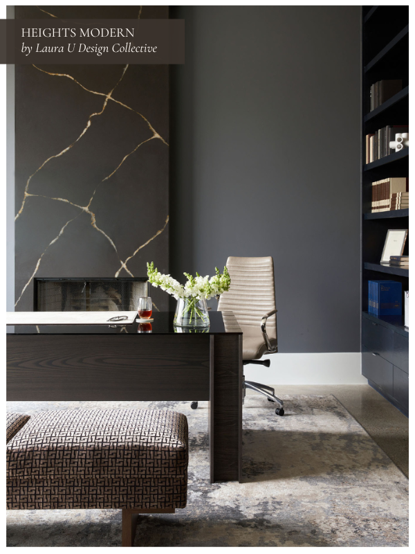
Select Organic Materials That Feel Diverse and Dynamic
Nothing breaks the “catalog” spell faster than real material character. Think wood with visible grain, stone with dynamic veining that wanders, or a plaster finish that catches light.
Choose one or two honest materials and let them set the tone of your space. A solid wood dining table that will collect nicks over time is often better than a flawless veneer you’ll worry about. Limestone or soapstone can handle a ring or two and still look handsome. If the budget calls for a manufactured surface, pair it with a natural texture nearby so the contrast feels deliberate rather than disguised.
Avoid over-coordination. If the floor is glossy, consider a matte cabinet finish. If the sofa fabric is smooth, add a chunky throw or a woven stool. Let the palette contain a few close relatives rather than exact matches. You want the home to feel like a place you live, not a set you pass through.
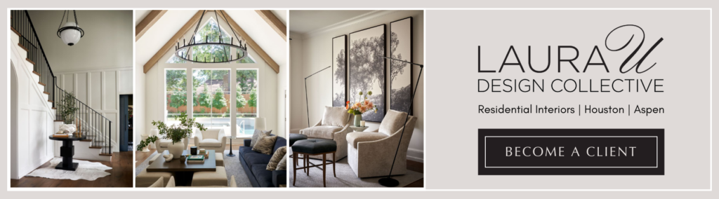
Develop a Curated Interior with Laura U Design Collective
If you’re ready to kick catalog-style furniture sets to the curb and create something truly yours, work with Laura U Design Collective. We design layered rooms and commission custom furnishings that fit your architecture and the way you live. Our team handles the sourcing, detailing, and installation so the result feels collected, not coordinated. Get in touch, tell us how you want to live, and we’ll build the room around that.