We’re revisiting an oldie but a goodie on the Journal today, courtesy of our wonderful Rice clients. When we first designed their home in 2011, our approach was bright and youthful. When the clients came to us again last year, they were finally ready to address a few spaces not included in our initial design. While small, these simple updates have made a huge impact – just in time for spring.
This splendid home has retained its timeless style, but even great design evolves. Our interior design refresh and remodel approach remained bright, but as our clients have grown, their tastes became more high-contrast and modern. We decided to update: the master bath, the main living area, and the “man cave”. Let’s take a look at these areas before and after the transformation.
Modern Updates for a Master En Suite
. T I M E L E S S F I N I S H E S .
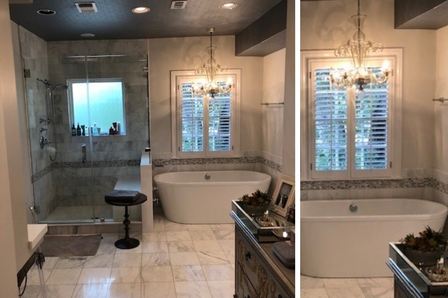
In 2011, we did not touch the master bathroom. It was already functional and spacious. But upon seeing it in 2019, we had to agree with the client…it was time for an update!
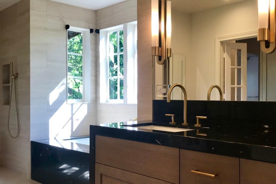
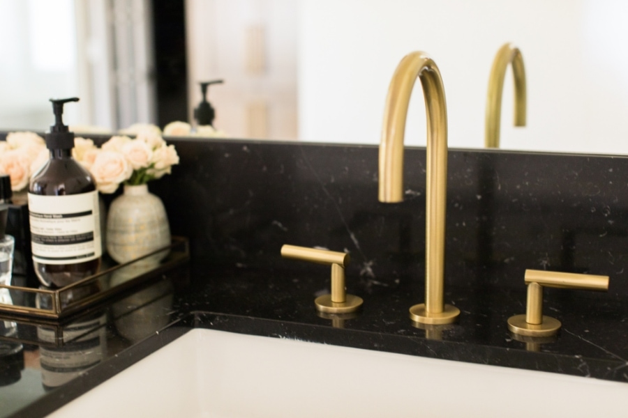
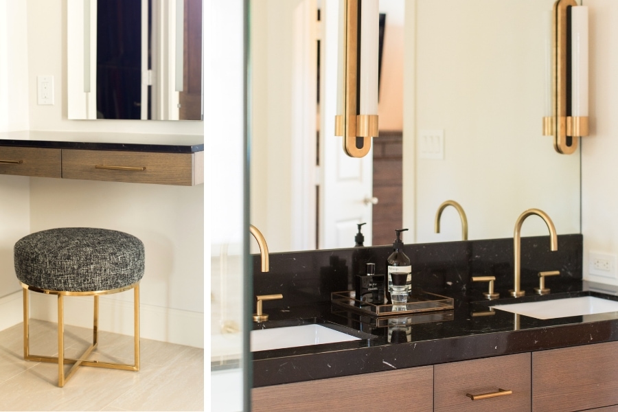
Master bathrooms are a fun challenge to design. You are creating a private place that has to be convenient and exquisite, all while withstanding daily use and constant moisture. The goals for the bathroom uplift were: update the fixtures, optimize the natural flow of light, and minimize the girlishness.
We worked with Stetzer Builders on both the master bath and mancave shelving design. With a focus on client experience, a goal we share, Erin Stetzer and her team are fabulous, service-driven, and talented. Together, we brought in more natural light by re-working the flow. This also allowed us to brighten the space and increase storage.
The client shared so much inspiration with us over Pinterest and Instagram. These are great tools to help you identify what you’re trying to achieve in any sized project. We also shared photos from our portfolio to help them refine this new look.
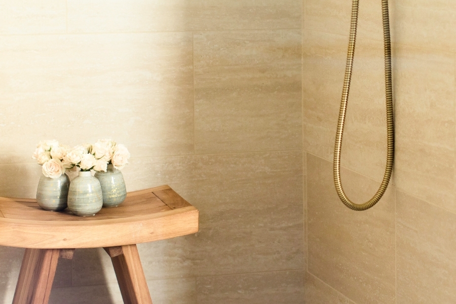
We created a wet room to house both a large tub and rainwater shower. The innovative plaster ceiling is perfectly waterproof and gorgeous, so the homeowners aren’t sacrificing aesthetics for functionality. With this new configuration, we were able to set aside a new space for a vanity and stool. We selected a lovely stool from Zuo Home and upholstered in an Architex fabric.
Small Changes to the Most Important Spaces
. U P G R A D E D E N T E R T A I N I NG .
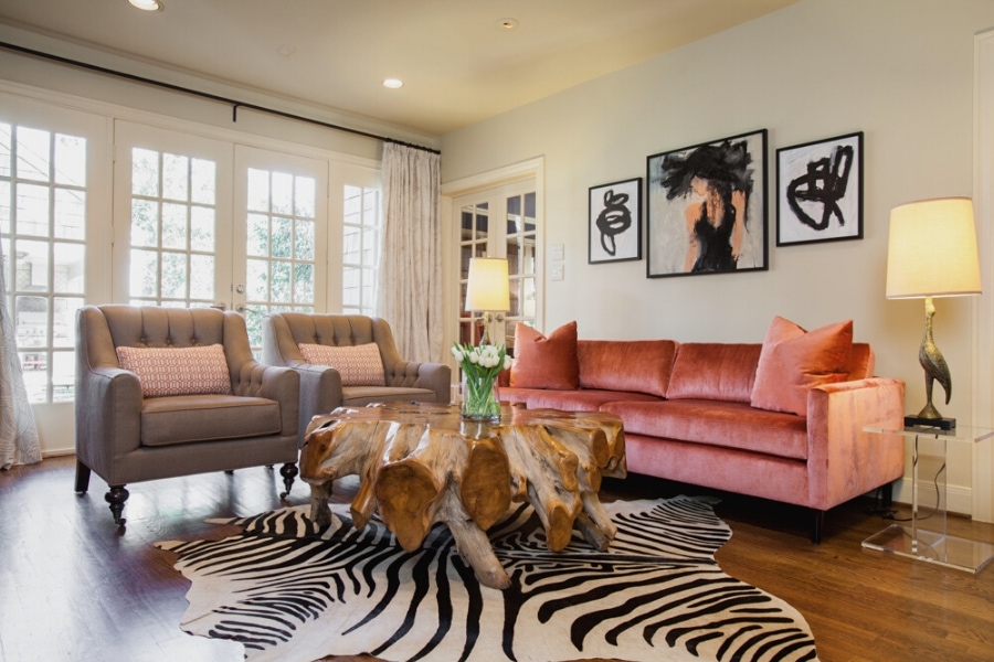
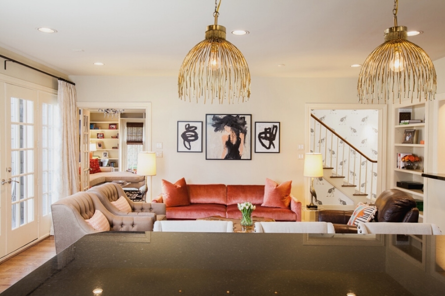
The living room of 2011 had a wild feeling – in a good way! The unexpected pairing of blush-hued velvet and petrified wood was embraced with a high contrast touch of black and white. We loved this room. But for the design refresh, we opted for a more subtle turn: neutral shades, additional seating, and a larger, more functional cocktail table.
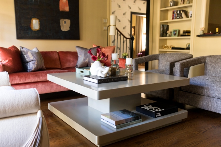
We also replaced the artwork. Original art from Mecox hangs above the salmon-colored sofa in the living room to make a fresh, new style statement. It casts a contemporary spell, making the entire space feel more mature.
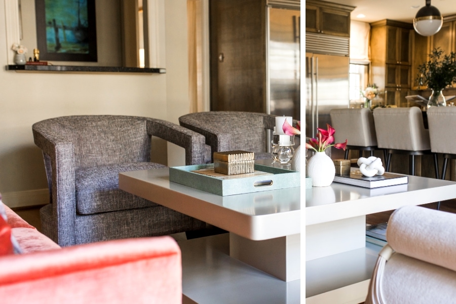
Placing a cocktail table in the living room is not a matter of size and color only. You have to think about scale and use and durability over time. Our lead designer, Shannon, selected this large cocktail table from Perigold, and added two smaller tables that are easier to move during parties. You can never anticipate how your guests will gather. It’s nice to have options when it comes to platforms for drinks and small bites.
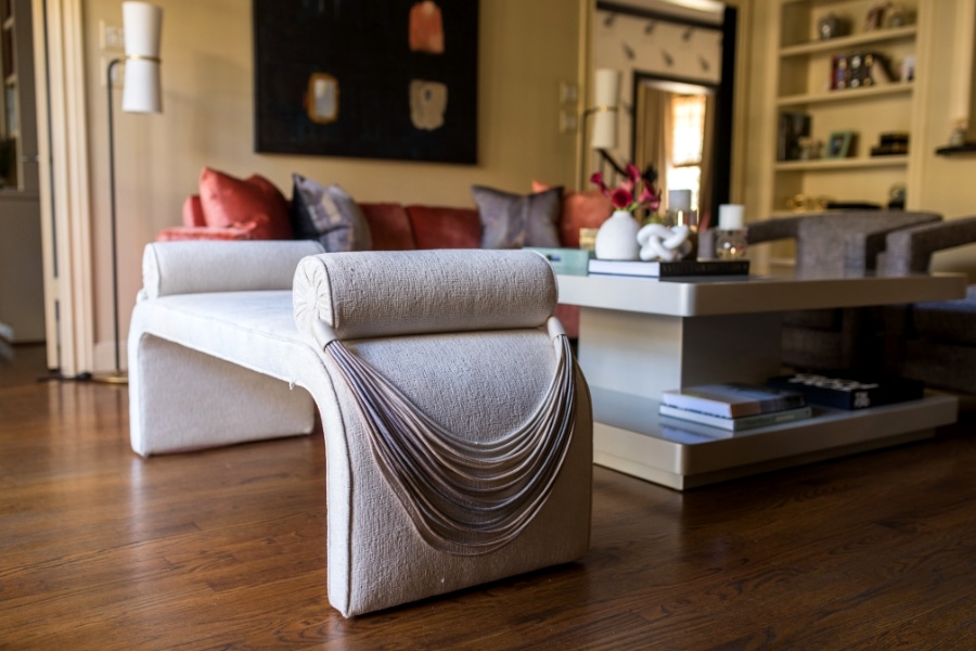
Shannon imagined this new area would be sophisticated and stylish, so that meant a bespoke piece you simply cannot find anywhere else. She reupholstered a fabulous bench in a soft Kravet fabric and added Samuel and Sons tie backs, elevating the curves of the bench’s frame. There is something regal and aristocratic about this new bench design!
We also brought in new armchairs from Bernhardt Hospitality. We reupholstered them in a slightly dark shade of the large cocktail table in a patterned Pewter. This new setting has imbued the space with a lightness and warmth that is first and foremost functional for gatherings of any size.
Illuminating the Kitchen
. N E W P E N D A N T S , N E W L I F E .
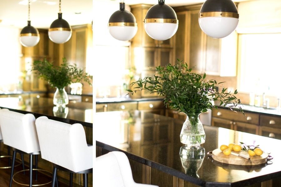
A home is not a home without a high-performing kitchen that fits how the homeowners prefer to dine, entertain, and even work. We have maintained an earthy, grounded look with an application of ash-wood, oak and mahogany shades, varying across the cabinetry and floors. What we really needed to address were the pendant lights.
Three large pendants from Circa Lighting bring all the modern touch this kitchen needs. Their brushed brass and black combination is on-trend, yet timeless, and their bottom globes emit a softened light. It is a timeless pairing that will certainly keep the couple happy until their next interior refresh. The only other update we made here were the new barstools which were upholstered in Houles fabric from David Sutherland.
Retreat to the Mancave
. A P L A C E O F O N E ‘ S O W N .
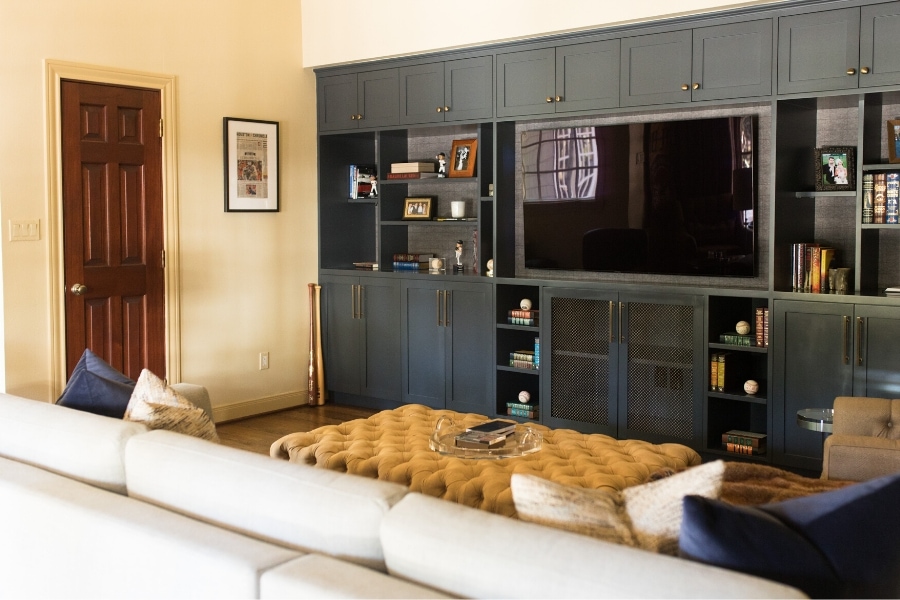
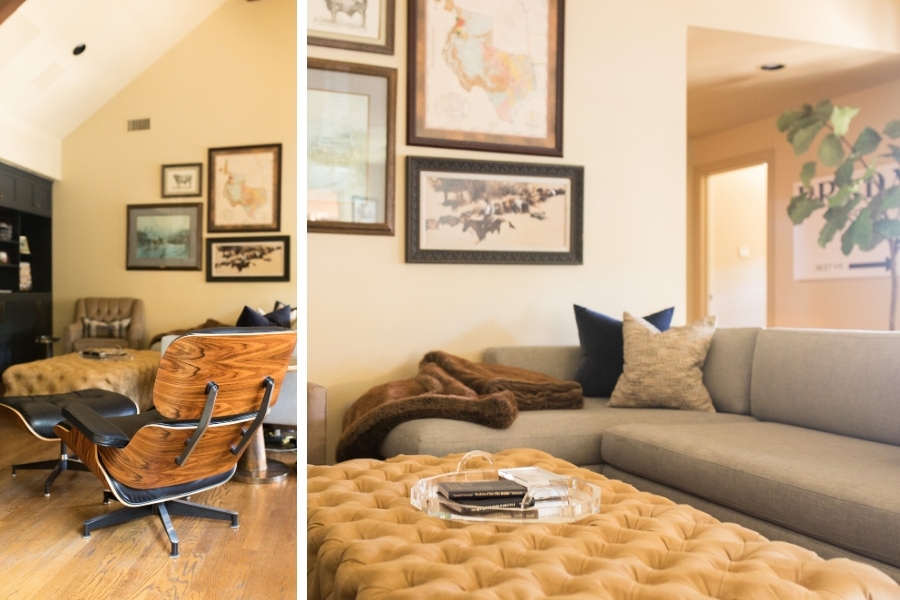
Oh, the mancave! The design is simple and relaxing with a focus on soft, functional space – even the ottoman can be used as a cocktail table.
This room isn’t hidden away in a basement or on an upper floor. In fact, you can find this space just off the first-floor mudroom. There is a classic Eames lounger, perfect for reading the paper or a design magazine. The feel is modern, not too stuffy, but thoughtful. This is a wonderful area for hosting small party, to simply enjoy a beer after work, or gather with cocktails to watch the Oscars.
There are posh elements, like the cocktail table with its gilded top and stained wood base, sourced from Arteriors. The side table is from John Richard and has acrylic top, eliminating the visual density of the sectional.
A Few Small Updates = A Major Impact
. R I C E B L V D .
Our home is a comfort zone where we end up relaxing after the hustle of daily life: taking care of children, being at the office, networking, happy hours, business travel…it’s such a whirlwind. And yet, we’re wired to seek comfort, giving ourselves peace and a break from the rush of life. Just as boxers head to their corners to recuperate after each round, a home also allows us to revitalize our energies to start another day with a refreshed mind and soul. Home is where we increase and intensify the energy from within by designing it in a way in which we love to live.
The interior design refresh and remodel of this home is the sophisticated update our clients were hoping for. It is a reflection of the wonderful, stylish people they’ve become over the years (and frankly, always were). We cannot wait to see how their style evolves in the next decade!


