Our Favorite Kitchen Remodels to Inspire Your Project
Many say the kitchen is the heart of the home. Though this was certainly true before the COVID-19 pandemic struck, it appears even more apropos nearly two years later. According to recent surveys, 85% of American adults changed the way they prepare and eat food during the pandemic. Another survey found that 44% cooked at home more often. The same survey found 31% tried new recipes and 23% experimented with new techniques during and after the pandemic. 25% of those surveyed spent more time cooking with family in 2021 than before the pandemic hit. Clearly, our kitchens are one of the most important spaces in our homes. They not only produce the meals we eat, but also serve as the hub for dinner parties, date nights and other memorable experiences. As one might imagine, the COVID-19 pandemic also exposed many of the aesthetic and functional flaws in our outdated, underused kitchens. The “2021 Renovation Trends” report published by Houzz in June notes that spending is up and kitchens are at the receiving end. According to the Houzz study, “home renovation spend has grown 15% in the last year to a median $15,000.” Kitchen projects have represented “the most popular among renovating homeowners” during this time. The Houzz survey found that “investment on major remodels of large kitchens jumped 14% to $40,000 in 2020.” If you too are planning a kitchen remodel either this year or next, follow below for some inspiration from our project archives. We detail six of our favorite kitchen remodels to inspire your next renovation.
From the Archives: A Review of Our Favorite Kitchen Remodels
. # 1 R I V E R O A K S T R A D I T I O N A L R E M O D E L .
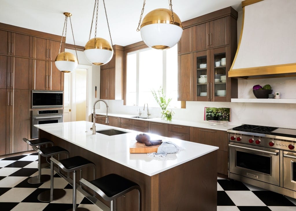
Part of a whole home remodel, the kitchen in this River Oaks home honors the history of the iconic Houston neighborhood. Simultaneously, it provides more than enough space for entertaining. The owners of this River Oaks traditional home wanted to preserve the house’s traditional elements without sacrificing modern amenities. Because the home’s owners entertain frequently at their River Oaks estate, high-traffic areas like the kitchen were updated first. The kitchen was in relatively good condition before our remodel. It boasted a number of special features both the design team and the owners wished to remain in situ. As such, our team chose minor updates over a gut remodel.
How We Updated This Traditional Yet Timeless River Oaks Kitchen
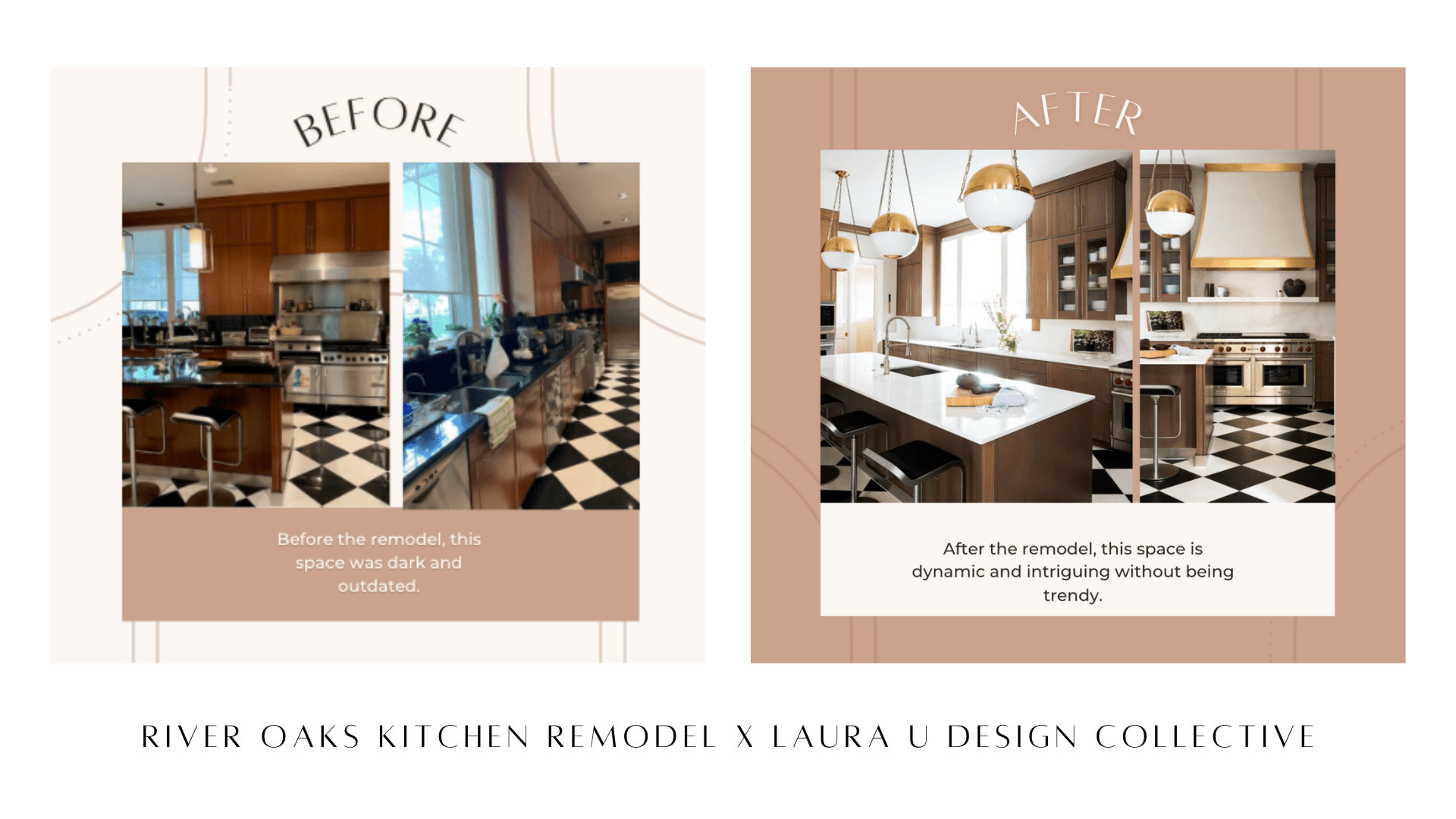
Original millwork, checkered floors and rectangular island remain, while much of the lighting program and many of the appliances were switched out. LUDC Founder & CEO Laura Umansky, Senior Designer Shannon Smith and Design Assistant Britian Matherne collaborated with a variety of vendors on this kitchen. Laura, Shannon and Britian worked with Hudson Valley Lighting to choose the gorgeous orb pendants. The team also worked with Segreto Finishes to create the stunning hood pictured above. Other partners in this project include Lonestar Custom Construction & Remodeling as well as Shelton Builders.
Shelton Builders helped our team refinish the existing cabinetry and island in a more contemporary oak shade. They also floated a series of glass-front shelves beneath the original set of closed cabinets to break up this homogeneous block. To brighten the space, the LUDC team also replaced the black countertops, surfaces and backsplashes. We chose a milky white tone that reflects the Hudson Valley pendant lights and Segreto hood. Wolf Professional appliances make this updated space as functional as it is fabulous. The new stainless steel appliances match well with chrome hardware of the sink faucets and cabinet pulls. All in all, our team chose to honor vintage features like the checkered floor while updating outdated elements like the appliances and light fixtures. Our River Oaks remodel demonstrates that sometimes minor alterations make all the difference.
Why We Love this Kitchen Remodel
This kitchen remodel is especially significant to the Laura U Design Collective team because the home’s owners exposed us to Anderson Ranch. The innovative arts center was one beneficiary of our Mountain Lane Show House opening in Aspen. Learn about the rest of our River Oaks renovation here.
. # 2 R I C E R E S I D E N C E P R O J E C T .
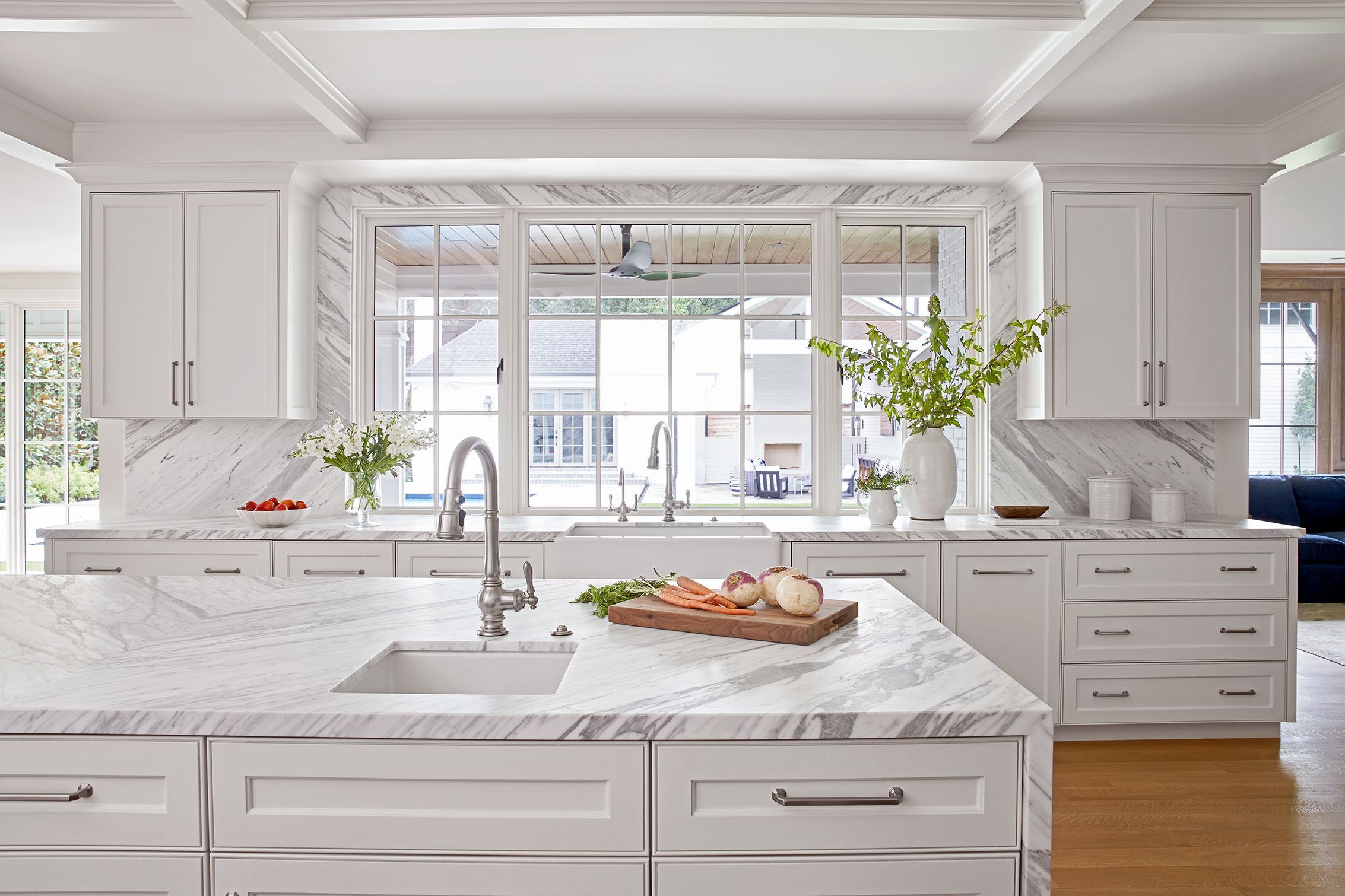
In our Rice Residence kitchen remodel, we preserved the original monochromatic aesthetic but elevated and modernized it for the young family who owns this house. Initially, pale wood cabinetry, beige backsplash and red/white granite countertops in this 1930s kitchen created a yellow cast that washed out the space. Recessed overhead lighting further flattened it. From a discordant, monotone space into a bright, dynamic interior, the LUDC team completely transformed this kitchen.
How We Updated This Monochromatic Kitchen Near Rice University
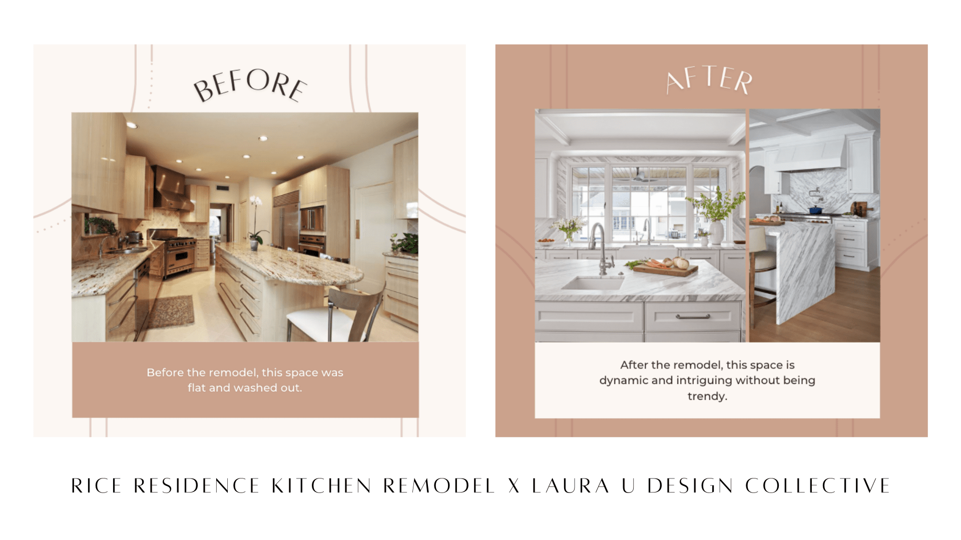
We created a coffered ceiling through custom millwork that reflects the cabinetry and vent hood. Our team also widened the window that overlooks this home’s pool area. To maximize work space, we replaced the peninsular kitchen island with a kitchen island bar complete with prep surface and sink. To make the space even more functional, we installed a pot filler faucet – also called a pasta arm – just above the stove’s burners.
One of our favorite alterations to this space was replacing the granite countertops and ceramic backsplash with marble slabs. Our team traveled to five different stone yards before finding the perfect look at Aria Stone Gallery. We chose a gorgeous gray-grained marble for the countertops, waterfall kitchen island and each backsplash. The striations of the oven’s backsplash – which is the same stone as the island and countertops – almost create a chevron pattern. These marble slabs offer a subtle dynamism to this monochromatic space. They also beautifully offset the stainless steel stove and chrome accents while effectively framing the window. By pairing these contemporary marble slabs with classic elements like the coffered ceiling, we created a space that is both modern and timeless.
. # 3 V I S C A I N O R E N O V A T I O N .
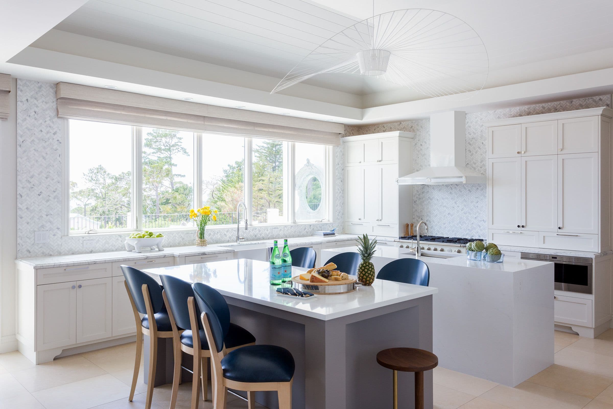
The bright and airy kitchen pictured above is from our Viscaino project in Pebble Beach, California. This project’s Conservatory actually swept the 2021 Luxe RED Awards, taking home a top prize for Wow-Factor Room. Find out more in our recent post “LAURA U DESIGN COLLECTIVE: TOP INTERIOR DESIGNER IN HOUSTON TX.” Representing our first Pebble Beach interior design project, the Viscaino home was built by Groza Construction in the Del Monte forest near Big Sur. Surrounded by the landscape of coastal California, this space needed an update that matched the energy of both its setting and its owners. Designers Blair Usnick and Lexie Terry achieved this balance as they headed the Viscaino kitchen remodel. In doing so, they chose to alter the layout, add lots of storage and update the fixtures.
How We Updated This Coastal Kitchen Near Big Sur
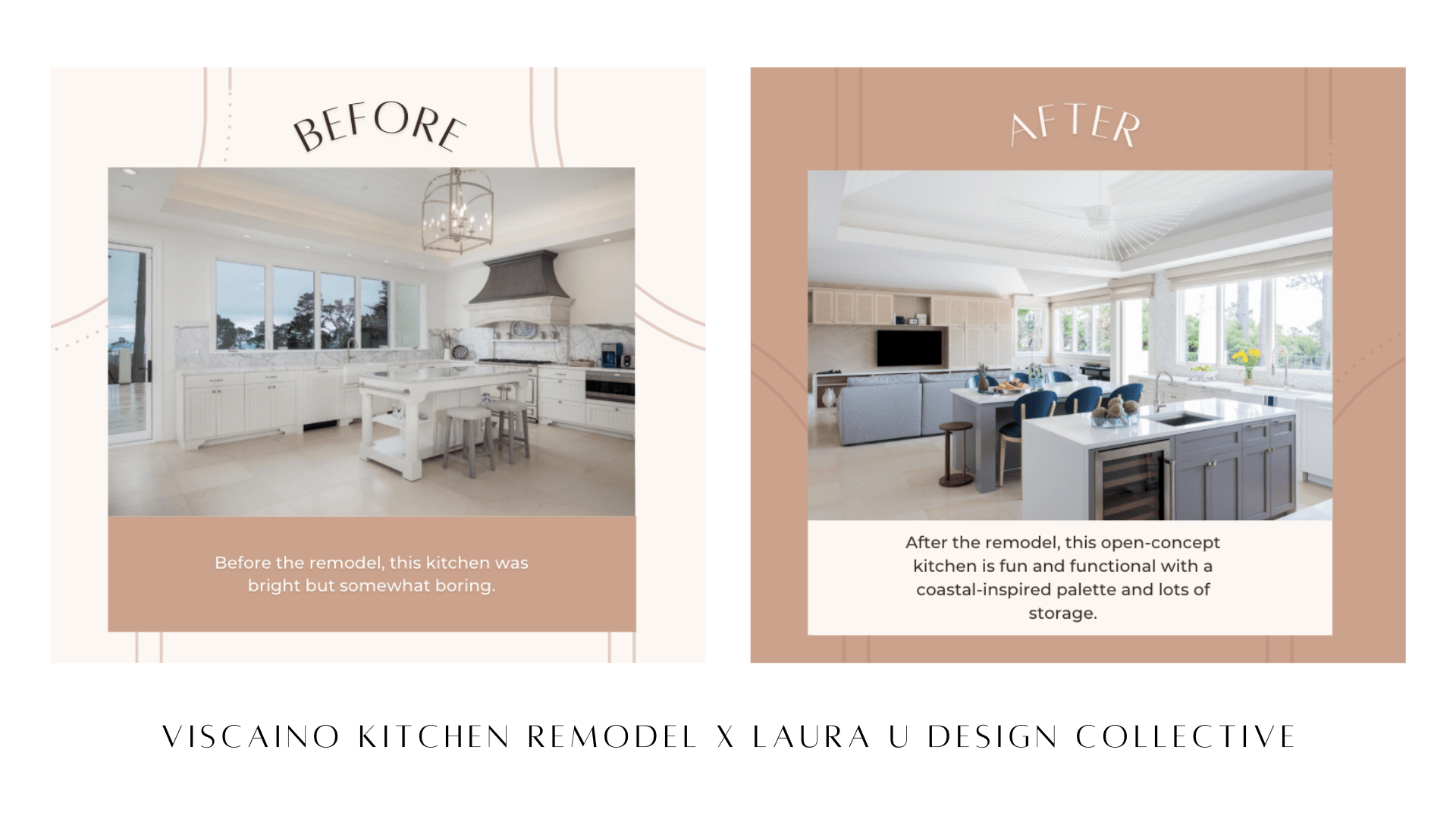
Before our designers started in on this kitchen remodel, the space was poorly utilized. With only one island, the kitchen lacked sufficient storage and provided little space to sit. As we noted in our project reveal post, this layout simply could not work for the family of five that occupies this home. To mitigate these issues, our designers chose to replace the existing island with a pair of islands. The island closest to the stove boasts a prep sink, large workspace, wine fridge and storage. Another island – located closest to the small sitting area on the opposite side of the room – offers seating for six or seven casual diners. Berman Rosetti crafted the stylish custom-made bar stools pictured above while the counter stools are from Herman Miller.
Given the clients who own this home are entertainers and art collectors, we wanted to infuse the kitchen with a bit of flair. A sculptural Fan Light from Lumens adorns the tray ceiling, replacing the existing cage pendant light. Opposite the two islands, a speckled backsplash adds a bit of color and shine to the serene space. Learn more about this exciting project here.
. # 4 R E B A R E M O D E L .
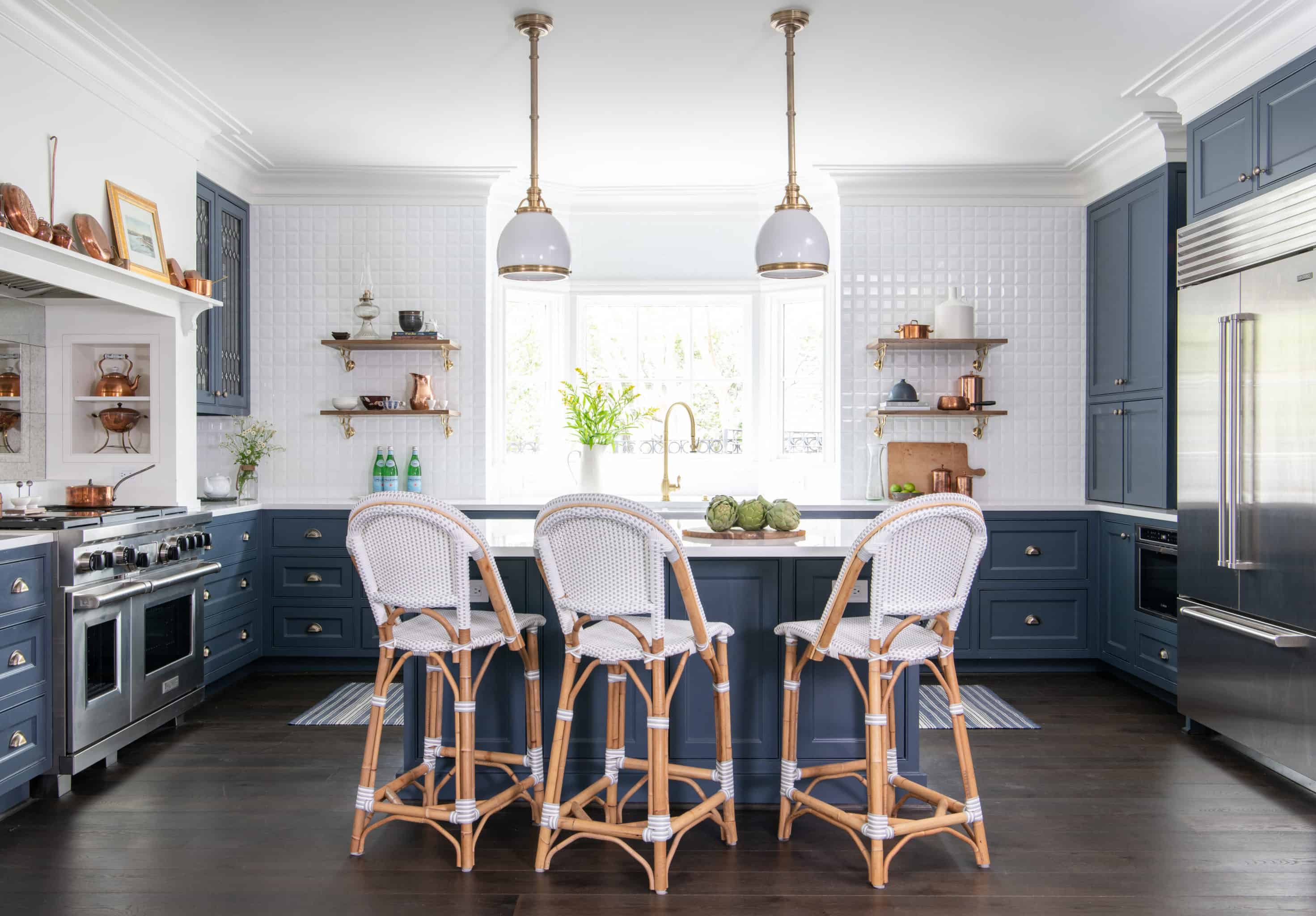
Next on our list is the Reba Residence kitchen remodel. A classic home in Houston’s River Oaks neighborhood, the current owners actually considered demolishing the existing structure. A mishmash of updated and outdated spaces, this house was originally built in the 1930s. However, it sustained a number of additions and renovations over time. Upon consulting with LUDC, the owners of this River Oaks home chose to redesign their space with help from an architect and design team.
We worked with Newberry Architecture and Blue River Custom Builders to take the house down to its studs. With their help, we redesigned the entire home to both honor its history and fulfill the needs of its current owners. In doing so, we chose vintage-inspired finishes and furnishings while improving the flow and function of each space.
How We Updated This 1930s River Oaks Kitchen
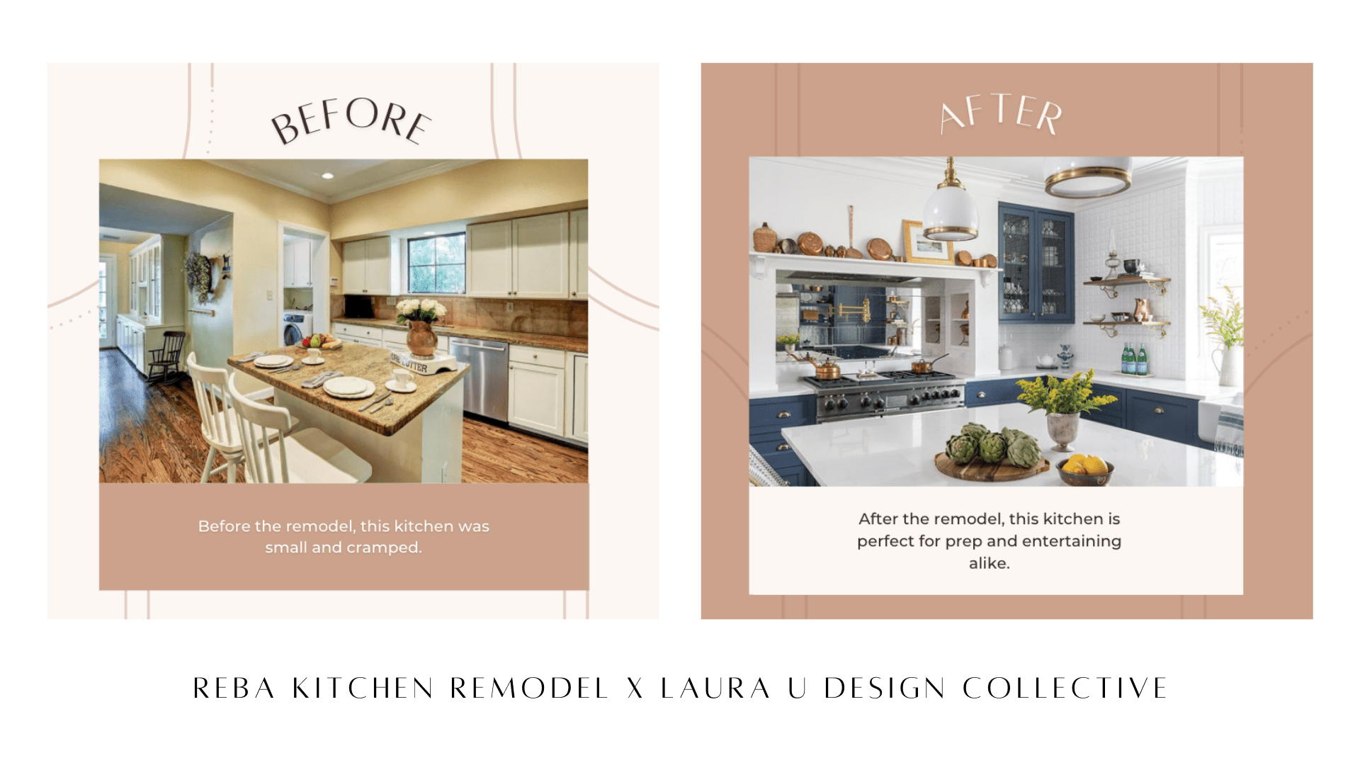
The kitchen is one of the shining stars of this renovation. What began as a simple kitchen with a small island and limited counter space transformed into a glamorous space with lots of allure. We updated everything in this gut remodel. From replacing appliances and expanding the window to altering the layout and adding more storage, this kitchen was completely transformed. As you can see in the images above, before our team tackled this kitchen, it was cramped and uncomfortable.
To make this space more functional, we altered the layout. Keeping a single side open to the living space, we added two walls of storage, counter space and appliances. A central island provides additional surface area for prep work as well as a casual dining space. Abandoning the yellow walls, red-toned floorboards and gold granite, we opted instead for a more polished aesthetic. We replaced the recessed overhead lighting with milk glass and brass pendant lights. A mixture of blackened brass finishes and copper hardware age the space just enough. At the same tine, the navy and white paint job adds the perfect degree of contrast. Learn all about our whole-home Reba Remodel here.
. # 5 N O R T H B O U L E V A R D S H O W H O U S E P R O J E C T .
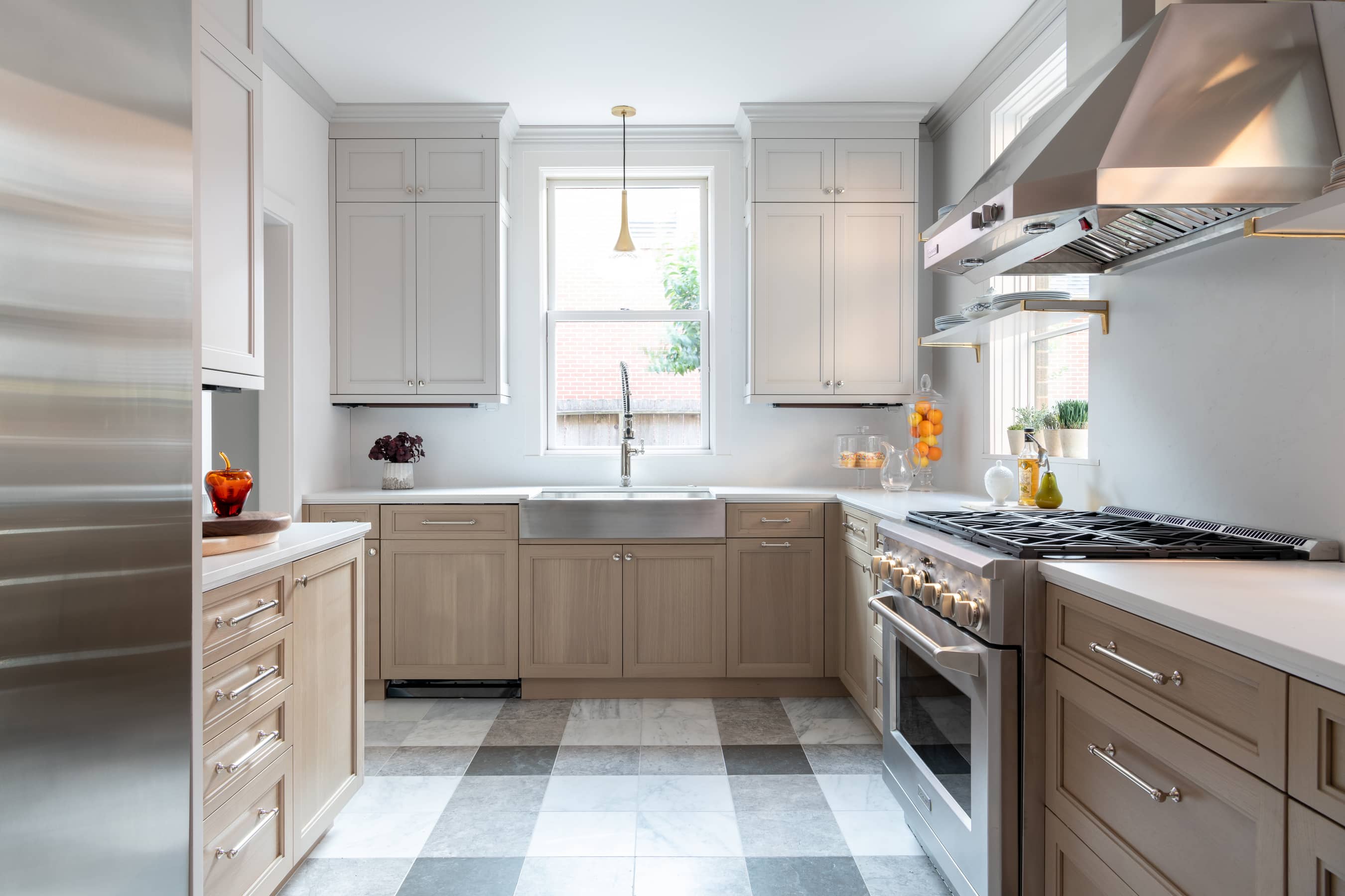
One of our most special projects to date, the North Boulevard home was our founder Laura Umansky’s first show house. This year, we announced our second show house in Aspen-Snowmass, Colorado. We have termed this home the Mountain Lane Show House. You can learn all about it here. A 1925 Tudor Revival in the historic district of Boulevard Oaks, this home was an enormous project for Laura, our team and Laura’s family. After ten months of renovations, the home was transformed from an outdated antique into an absolute reflection of Laura’s style and her family’s needs.
How We Updated This Century Old Boulevard Oaks Kitchen
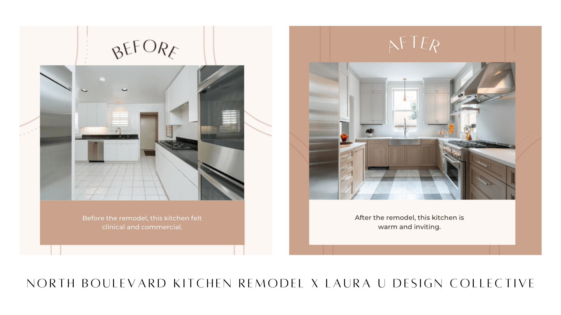
As we noted in our review of the project, “the original kitchen was tight, with an awkward flow for entertaining.” Laura and the LUDC team chose to gut the kitchen and start from scratch. During the remodel, this kitchen was fitted with Monogram appliances and custom-made Bentwood cabinetry. The award-winning Houston-based Schenck & Company restored the kitchen’s original floors where possible and installed new French Oak flooring just outside the kitchen.
What began as a disjointed space became a cohesive interior full of natural light and lovely accents. Gingham-inspired flooring adds character while molding around the cabinets points to the home’s history. Both style and storage are maximized and the flow and function of this space have been greatly improved.
. # 6 M A J E S T Y R O W R E M O D E L .
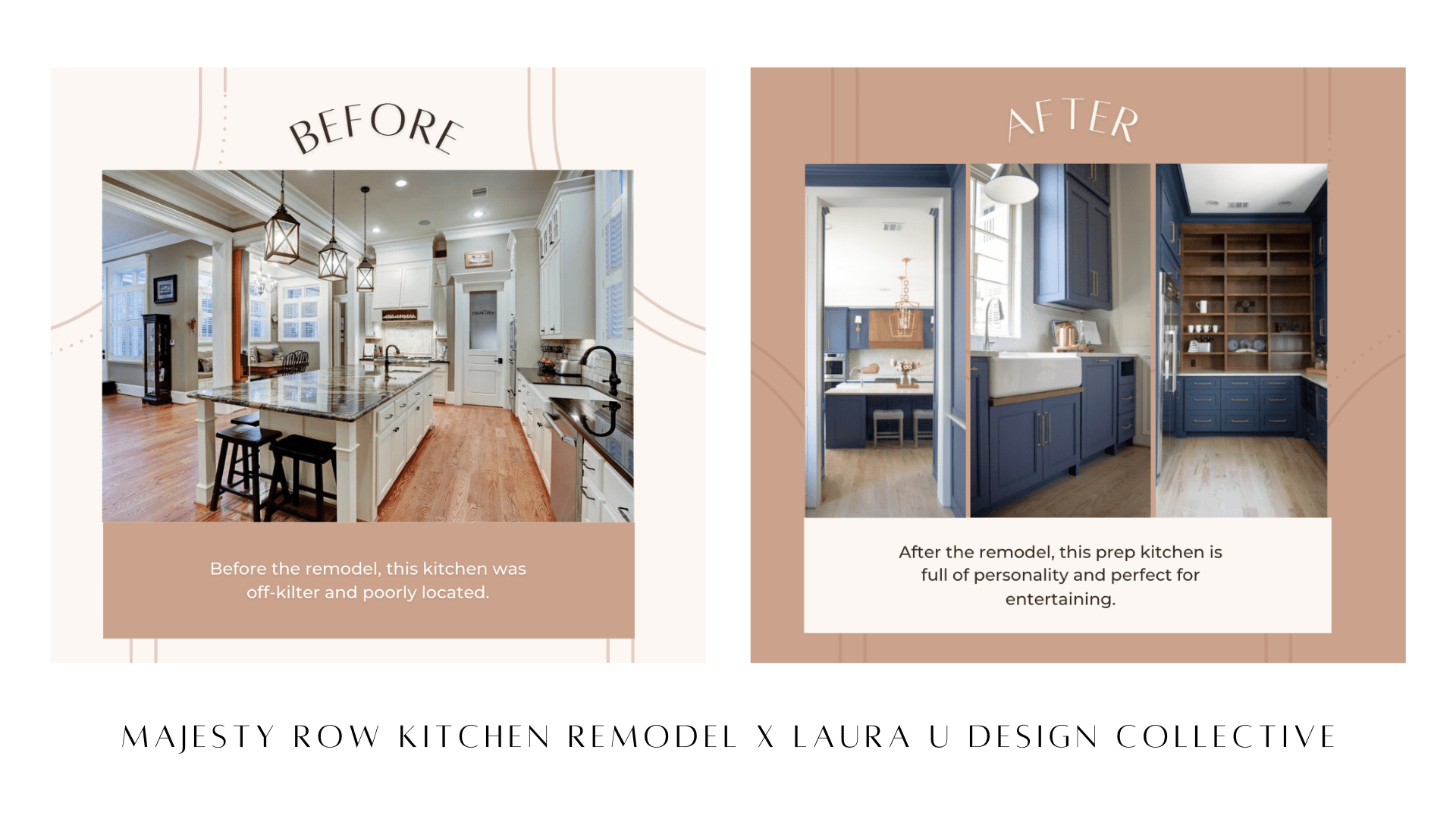
Last on our list is the Majesty Row Remodel, which involved quite a bit of reimagining. Though there are a couple other gut remodels on this list, this East Shore renovation was one of the most involved. Before we began our renovation, the flow of this home was awkward and the kitchen was off-kilter. The kitchen’s location – relative to the living room and dining room – made entertaining guests a challenge. To solve both problems, we moved the kitchen fifteen feet from its original location and added a day pantry beneath the staircase. Given the owners love to host, we also added a prep kitchen, complete with a fridge, countertops and lots of storage.
How We Updated This Off-Kilter Kitchen in East Shore
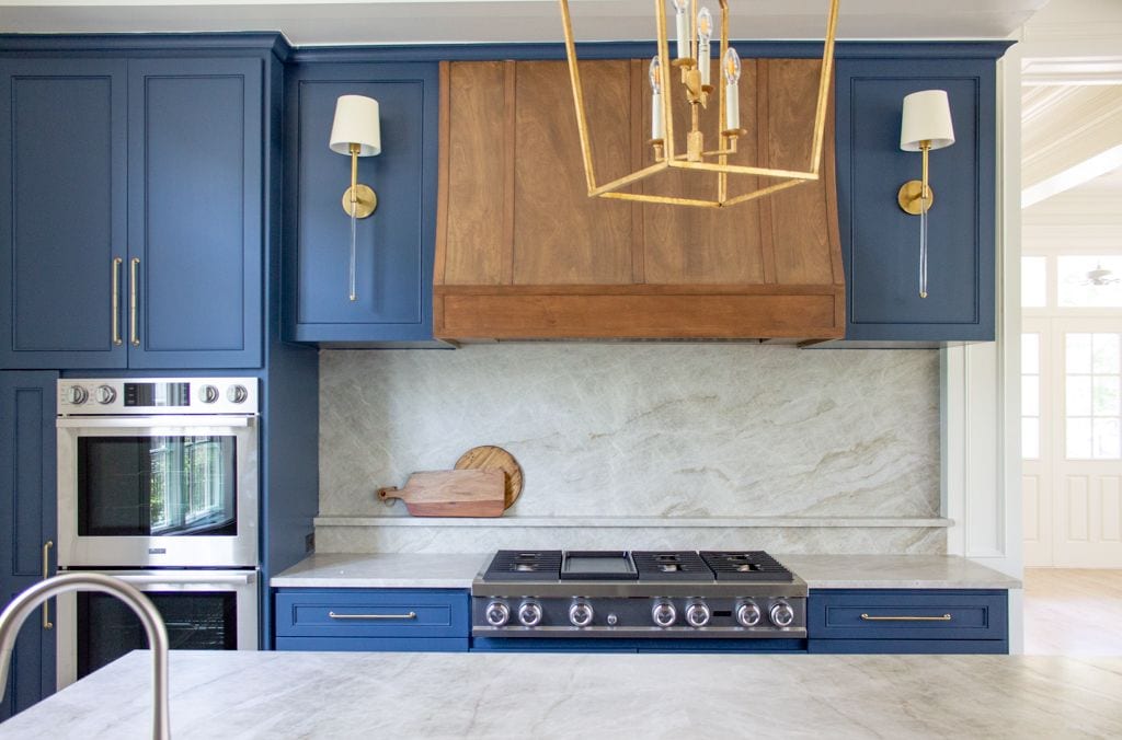
To improve the main kitchen’s flow and functionality, we updated the lighting program and replaced outdated appliances. By layering lighting with a variety of wall sconces, pendant lights and task lamps, we made the space brighter and easier to use. We also cut new windows to let in even more light.
As for aesthetics, we replaced dark accents with warmer copper and brass. We painted the cabinetry and kitchen island a rich navy that pairs perfectly with the stone backsplash and countertops. Our team added paneling to the walls that works well with the updated vent hood. All in all, this kitchen remodel resulted in a brighter, bolder space that better fits the needs and style of its owners. Learn more about the project here.


