Art is central to interior design. In this blog we will explain why using art in interior design is important, as well as introduce our latest project: Circle Drive. The art collection in this Bellaire, Texas home is a testament to the client’s taste. It reflects her admiration for culture, color and the emotional connection that unites them. For this project, we worked around the client’s existing art collection and added a few more pieces to bring the entire home together cohesively.
The Importance of Using Art in Interior Design
Reinforces Positive Emotions
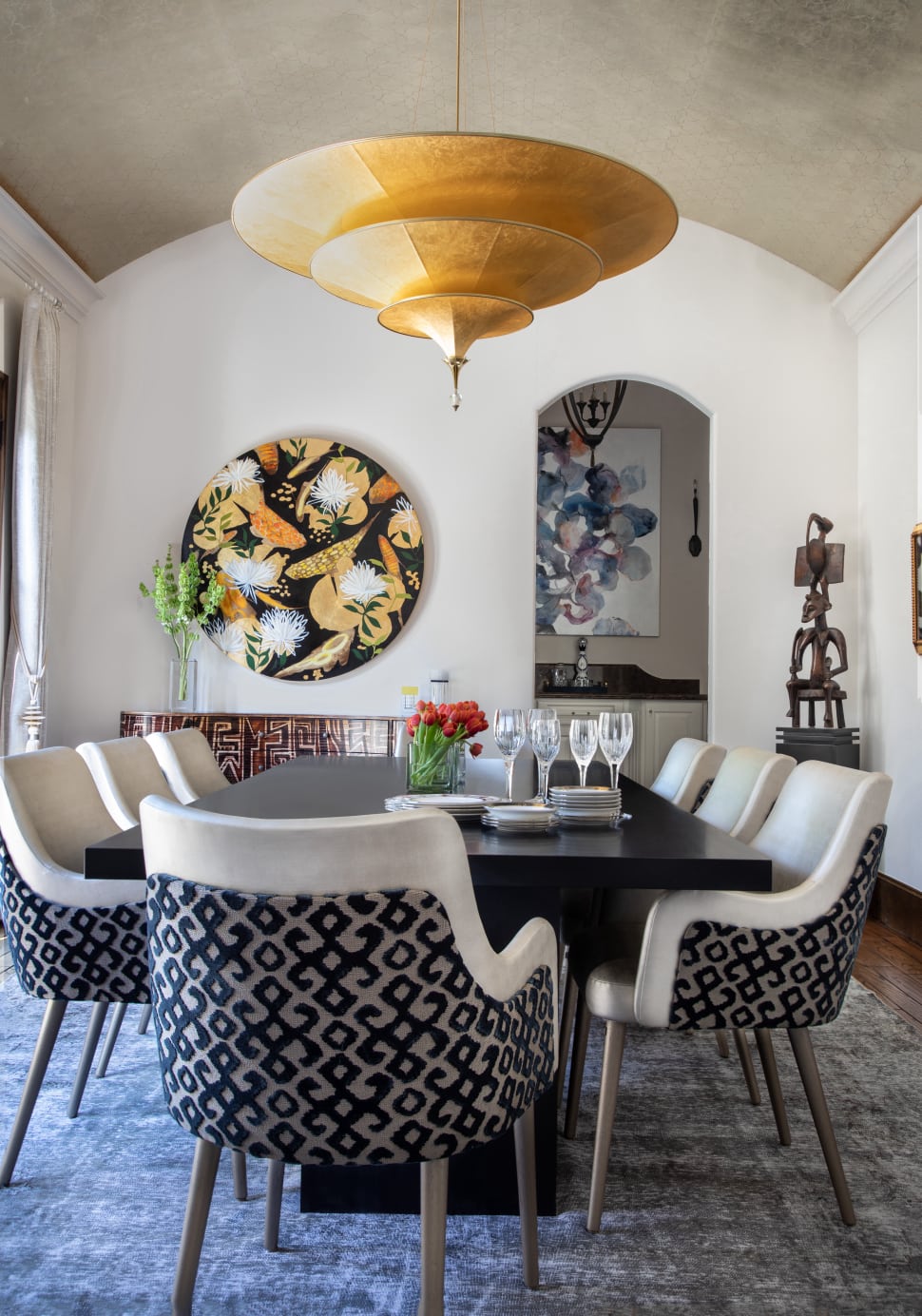
Each element within a home’s interior should be either meaningful or functional — or both. Art — whether a dynamic kinetic sculpture, a contemporary oil painting, or a charcoal study from centuries past — should evoke emotion in the homeowner. Art chosen for a residential property should strongly represent the homeowner’s own experiences. It should also reflect their happiest or most influential memories, and the atmosphere they hope to create within each room of their home. Art in interior design should function as a vehicle for peace and tranquility within a serene, meditative space. Conversely, art chosen for a social or creative space should be more energizing and instigating.
Above all, art chosen for any home should offer emotional support to the homeowner and their visitors. In fact, using art in interior design in non-residential settings has been used to promote healing. Extensive research, including a 2017 study published in the International Journal of Qualitative Studies in Health and Well-being, supports this method. This study reviewed the impact of art on patient experience — including mental and emotional well-being and physical recovery while in hospital.
Researchers found that “although visual art occupies the background in patients’ experience of hospitals, it influences patients’ experience of safety, comfort, time and identity…[and] contributes positively to health outcomes.” Today — as millions of people across the world “social distance” and “self-quarantine” — art is essential. Art can provide both a sense of connection to the outside world and an opportunity for reflection within oneself.
Complements an Existing Design Aesthetic
Art is not only essential as an emotional support tool, but also as an element of design within the home. Colors, tones, and textures can all be pulled from the room’s decor and reflected in the space’s art — or vice versa. The right work of art can either brighten and open a space or warm and anchor it, depending on preference. The size of an art piece can also complement the scale of a room and the furnishings within it.
Some artwork can even reflect light and bounce it around a room. This enhances the appearance of other decor objects and finishings within the space while making the space feel bigger. Mary Corse’s untitled series of monochromatic white paintings — all of which sparkle due to her application of glass microspheres — offer one example.
Provides a Focal Point
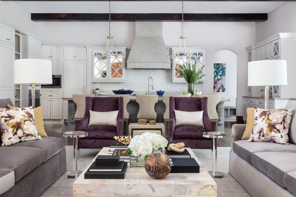
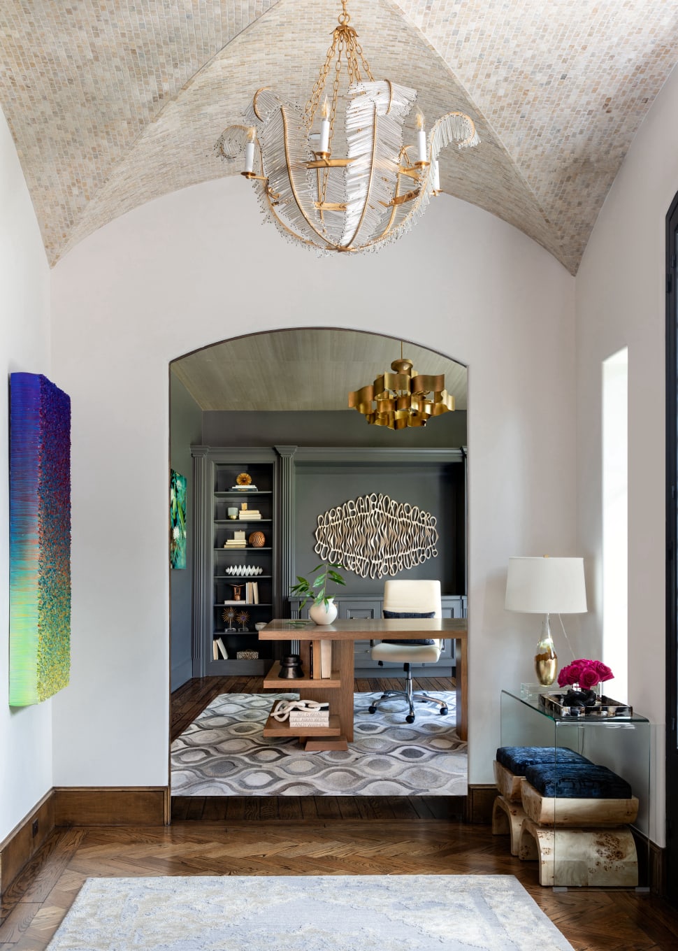
Using art in interior design can create conversations and focus attention. This technique is explained in the brief “Using Large Scale Art to Make a Powerful Statement.” Whether a glossy photograph or a textural painting, art introduces visitors to both the homeowner’s interests and each room’s intended purpose. An exciting piece of art peeking through from one room to another encourages conversation and movement around the house as well. This is visually represented in the photos of the Circle Drive Living Room and the Mud Room. Here, a portrait encourages movement from the living room onward.
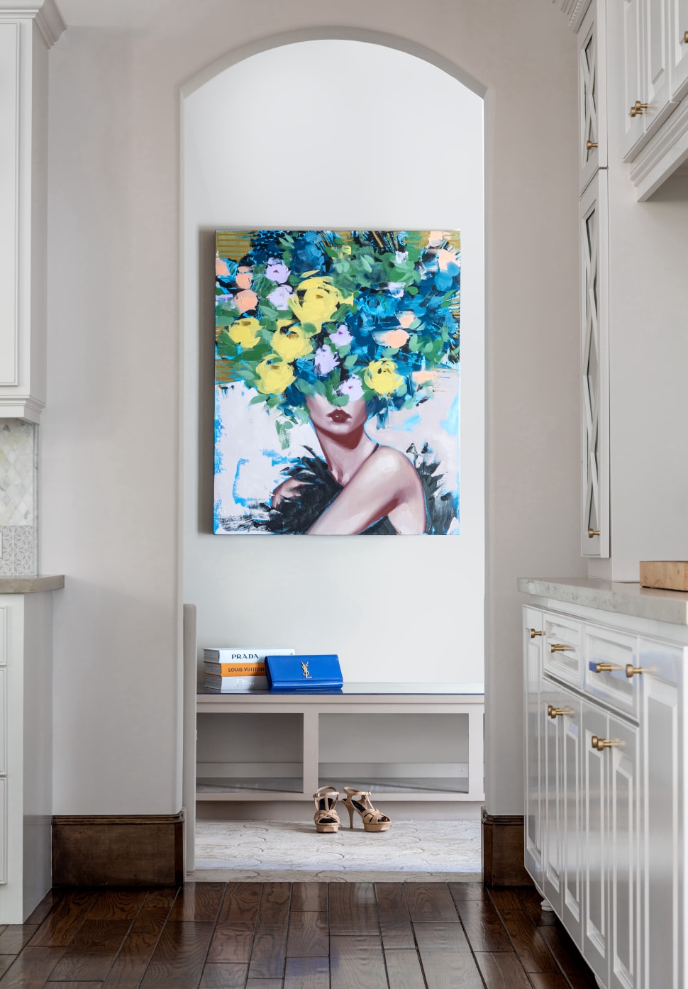
Each piece of art can act as a conversation starter or guide in and of itself. However, each should also function in conversation with other pieces around a room or throughout the home as a whole. An art consultant will typically choose pieces that respond well to each other but also stand out individually from surrounding decor.
Balances the Space
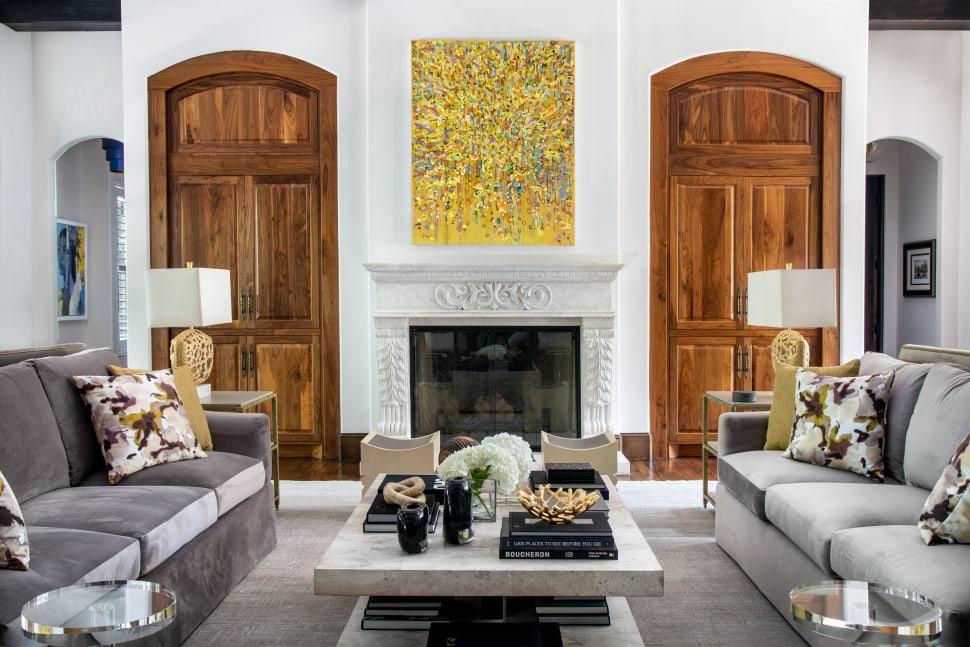
Using art in interior design helps balance a space by offering pieces of varying sizes, shapes, weights, and color schemes. A large painting hung over a bed can anchor the space and reinforce the axis line. In this case, the axis line would be that which follows from the ceiling down to the painting and finally to the bed. Using a large painting as the focal point in a bedroom — or above any significant piece of furniture throughout the home — creates symmetry.
Asymmetry, another element of balance in interior design, is also achieved or enhanced through the addition of artwork. For instance, one might emphasize scale and weight in a space through the addition of a monumental sculpture. This sculpture can then be complemented by the smooth lines and pale wood of a low Mid-Century Modern coffee table, thus creating asymmetric balance.
Conveys the Homeowner’s Personality and Priorities
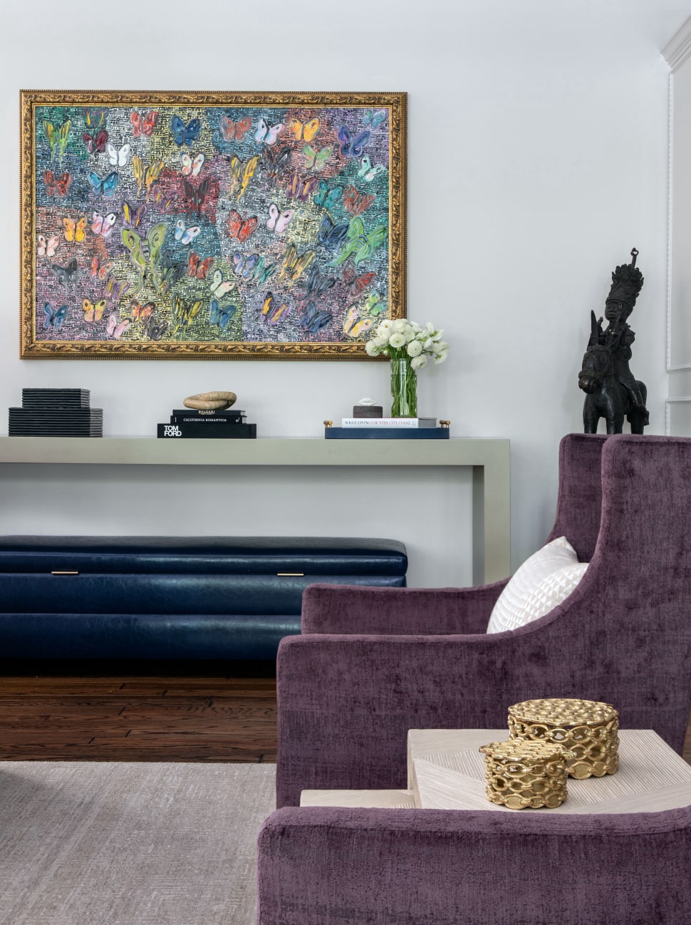
A homeowner’s art collection offers visitor’s an encapsulated window into both the homeowner’s personality and priorities. Dynamic, colorful pieces might communicate a lively, vivacious personality. Conversely, muted, thoughtful pieces might communicate a more reserved but philosophical disposition. A homeowner can also communicate their priorities by using art in interior design. Perhaps the majority of their collection represents emerging artists, representing the homeowner’s focus on promoting little-known, but cutting-edge work. On the other hand, a home filled with pieces that offer views to the natural world communicates the homeowner’s focus on sustainability.
The Art at Circle Drive
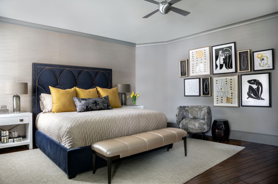
The art throughout the Circle Drive house is largely colorful, innovative, evocative, and organic. Art brought in by the design team includes pieces by Hunt Slonem, Zhuang Hong Yi, and Jason Hallman and Stephen Stum of Stallman Studio. Pre-existing pieces include prints by Matisse and Picasso, as well as several contemporary paintings. The interior of the home reflects the homeowner’s desire for an ethnic, worldly vibe and highly textural but glamorous space. Using art in interior design here meant responding to the touches of velvet, burl wood, and gold throughout the home. It also required responding to the home’s bold but calming blue, purple, and neutral color scheme.
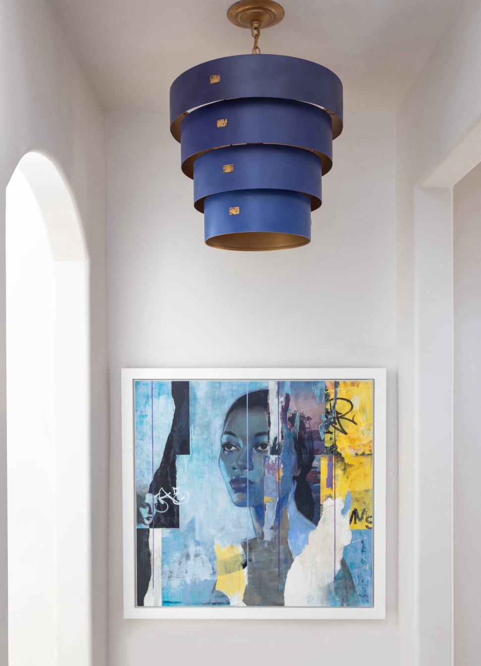
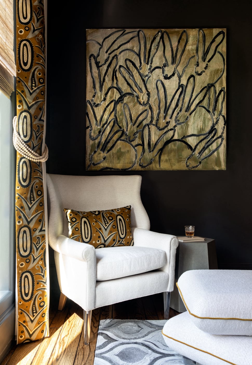
Several pieces of art — such as the portraits in the stairwell and in the mud room — bring dynamism and personality to the home. Others — like the purple butterfly piece by Slonem in the living room — reflect the homeowner’s favorite colors. Throughout the home, art was used to create balance. Symmetry was achieved in the living room through the addition of several large-scale pieces. Other pieces — like the rabbit piece by Slonem in the house’s office — were used to respond to existing interior elements. Overall, the art chosen for the Circle Drive home adds excitement, personality, and texture. This complements a space that juxtaposes the antique with the contemporary and the glamorous with the organic.
Overview of the Artists
Hunt Slonem
Award-winning artist Hunt Slonem is well-respected internationally for his distinct style of painting. Critics compare Slonem’s work to the late modernist work of Anselm Kiefer, Julian Schnabel, and other neo-expressionists. Slonem’s career is punctuated by four decades of grants, fellowships, and other awards. These include a 2015 Medal of Merit from the Russian Academy of Art and a 2013 Award from the Horticultural Society of New York. Slonem was also the recipient of three MacDowell Fellowships in the ’80s.
Slonem’s recent work is largely inspired by the natural world — especially his sixty pet birds. His most frequent and well-liked subjects have included rabbits, tropical birds, and butterflies. Slonem’s practice is multi-faceted and diverse, including work across multiple disciplines. Known in part for his paintings, Slonem is also held in high esteem for his large-scale sculptures and his restorations of abandoned historic homes.
Zhuang Hong Yi
According to the artist’s profile on ArtNet, Zhuang Hong Yi currently practices in both China — his country of origin — and Europe. His work has received wide critical acclaim for its focus on environmental issues. Zhuang Hong Yi’s paintings often feature repeating floral motifs and other organic elements. These elements are often set at odds with imagery from urban environments. They are used by the artist to reinforce his concerns about increasing urbanization of China. They also represent deforestation across the globe and ongoing destruction of natural resources.
Like the pieces produced by Stallman Studio, Zhuang Hong Yi’s paintings are often sculptural in nature. Zhuang Hong Yi frequently uses directional and vaulted impasto to communicate the energy of his pieces. However, Zhuang Hong Yi often turns to collage to communicate the messages in his work. Zhuang Hong Yi’s “Flowerbed” series plays with light and weight. He achieves these juxtapositions by layering delicately folded origami flowers made from rice paper under loosely-bound pigment and acrylic paint.
Jason Hallman and Stephen Stum of Stallman Studio
Hallman and Stum combined their names, their styles, and their techniques to create Pacific Northwest firm “Stallman Studio.” According to the duo’s site, “they find inspiration from patterns and gradients in the natural world.” The site also notes that “while creating, one works as the right side of the brain and the other the left.” While each artist has a distinct style all his own, the pair work together seamlessly. Stallman is currently pioneering a new technique whereby he dissolves the barrier between painting and sculpture, creating tension, depth and dynamism.
Hallman’s work reflects the yin-yang of his simultaneously additive and subtractive technique. Hallman builds up a layered topography of acrylic paint as his first step, after which he carves into the work. The goal of this final step, Hallman explains, is to “reveal layers and visions from the past.” The work provided by Stallman Studio is always engaging and evocative.
An Interview with Our Art Advisor, Maura Parro of Laura Rathe Gallery
For this project we worked with Maura Parro from Laura Rathe Gallery here in Houston. We interviewed Maura just this week to find out more about the pieces we selected for this home, as well as what you can expect when you commission a piece.
Maura Parro (on Hunt Slonem’s piece “Hair Streak”): In Gillian’s piece, “Hair Streak,” Hunt uses strong color in this iconic butterfly composition. This piece worked well for Gillian. It had some of the beautiful yellows and plums long with black accents, complementing other artwork, furnishings and accessories. Gillian wanted to have the art command the wall, so we added a beautiful ornate gold frame.
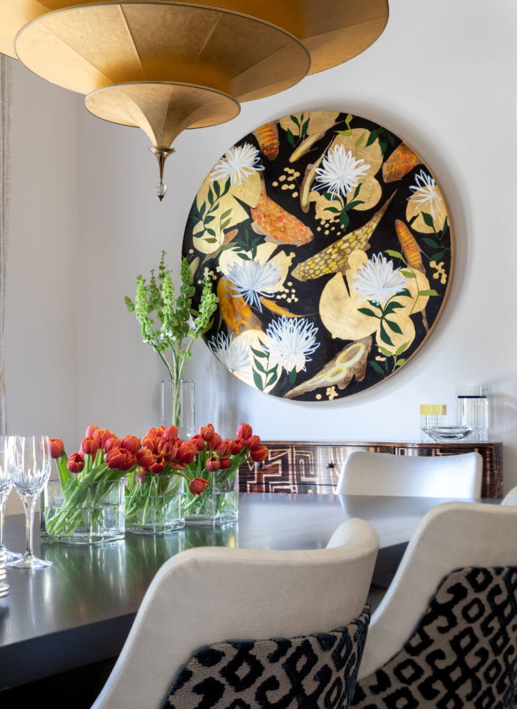
Maura Parro (on the commissioned Zhuang Hong Yi piece): In Gillian’s Zhuang commission of a tulip flowerbed, the art exhibits gradations of yellows, greens, purples and blues…many of the same colors which are in the Slonem piece, along with some other works which are visible in Gillians office.
Laura U Interior Design: How do you work with a client’s existing art collection? What do you take into account when adding to it?
Maura Parro: When a client has existing art in the same space I definitely want it to complement the other works. As a whole, the art should be cohesive and bring the entire narrative of the space together. By experiencing the existing art in the space I can glean the kinds of themes, genres, and color palette that the client is drawn to, allowing me to make suggestions for art additions. I strive to find art that the client loves…art that brings them joy!
Laura U Interior Design: Our client commissioned the Zhuang Hong Yi piece. How do commissions work?
Maura Parro: Commissions are quite common with artists, allowing the client to specify the size, color palette and composition of the work to fit perfectly in their space. In this case, Gillian had seen the Zhuang Hong Yi piece that inspired the commission in her home, and she loved the beautiful blues, purples and yellows in the art, especially appreciating the gradation of color as it moved through the piece, however, the original piece was too big. It then became a matter of having the artist create a very similar piece in a smaller size. With a commission, the client places a deposit for the artist to begin with the balance due on completion. Commission works generally take about 4-10 weeks.

