Home to a young family – two Rice University alums and their boys – the Rice Residence was built in the 1930s. After its whole-home remodel, this 5,414 square foot home now boasts four bedrooms, two half baths and three full baths. Guests will also find a large living area, period-appropriate bar, grand entryway, stunning contemporary kitchen and utility room. Though the homeowners purchased Rice a few years ago, they decided to completely transform it in a full-scale renovation last year. Our goal for this project was to create a comfortable, classic yet clean home with excellent flow. Some spaces – like the kitchen and laundry room – are quite crisp and contemporary while others are fairly traditional. While much of the home’s interior was inspired by their love of the university, many elements pay homage to early and mid-century modern design. We wanted to capture the ideal Rice University home design for this lovely residence. Ideal for entertaining yet serene enough for quiet time alone, each space in this remodeled Houston home is warm and inviting. From the bar’s custom millwork to the kitchen’s stunning marble backsplashes, this home’s interior is both exquisitely tailored and delightfully whimsical. Join us for a virtual home tour of the newly remodeled Rice Residence below.
A Brief History of Rice University and the Rice Village District
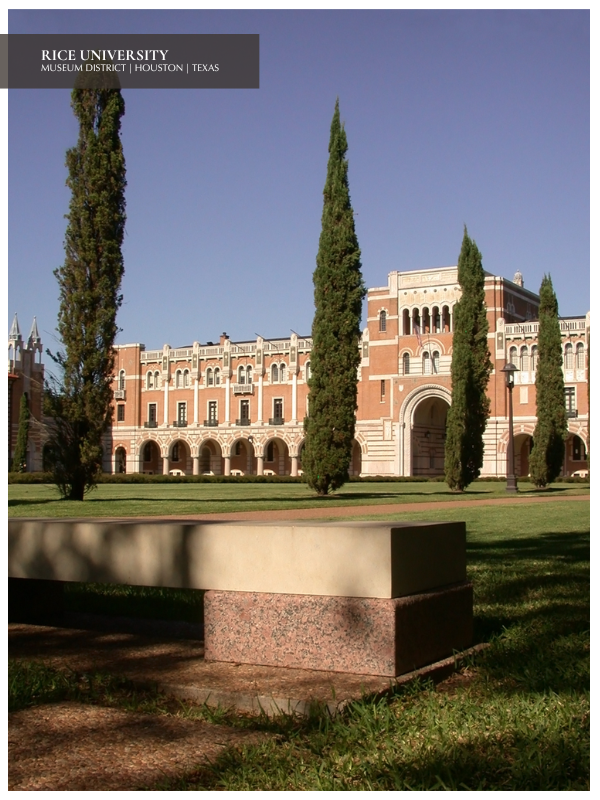
Shortened to Rice University in the 1960s, the Houston college was originally known by a different name. Upon founding, Rice was known as the William M. Rice Institute for the Advancement of Literature, Science and Art. Founded in 1912 following the death of wealthy Massachusetts businessman and outspoken segregationist William Marsh Rice, the university originally accepted only white students. Surprisingly, women were encouraged to enroll and accepted students could attend free of charge. In the early 1960s – around the time of Rice’s name change – the university governing board sued the institute.
The governing board urged the institute to alter its charter so non-white students could attend Rice. Shortly thereafter, the first black Rice student was admitted to one of Rice’s doctoral programs. Decades later, Rice serves as a model of racial diversity in the Texas university system. According to Michael T. Nietzel In a recent article for Forbes, “more than half of Rice’s students identify as a racial/ethnic minority.” Earlier this year, Rice decided to expand enrollment in the interest of creating “a more diverse body of students.”
“EXCELLENCE, OPPORTUNITY AND IMPACT” AT RICE UNIVERSITY
Speaking with Nietzel in a phone interview, Rice President David Leebron elaborated on the school’s new initiative. He believes this expansion will strengthen the university’s three “deeply embedded values [of] excellence, opportunity and impact.” Rice’s excellence and impact are widely acknowledged both across the United States and internationally. In 2010, Rice was ranked first in the world for its contributions to materials science research. The university was ranked 136th internationally in the 2022 Times Higher Education World University Rankings. U.S. News’ annual “Best Colleges” guidebook for 2022 named Rice 17th nationally and first in Texas, highlighting the school’s innovation and ethnic diversity.
With a focus on scientific research and education, students at Rice enjoy an unusually low student to faculty ratio. They also enjoy access to a steady flow of research dollars. Public policy, medicine and computer science are just a few of the many celebrated departments at Rice. Over the last hundred years, the university has matriculated dozens of Marshall and Rhodes Scholars. It has also produced a number of prominent CEOs, Fortune 500 company founders, noted astronauts and Nobel Prize winners.

LIVING NEAR HISTORIC RICE UNIVERSITY IN HOUSTON, TEXAS
Our clients are not only alumni of the university but also residents of the area. Surrounded by oak trees, incredible architecture, high-end boutiques, galleries and award-winning restaurants, the Rice Village District is a boon to Houston. This walkable, family-friendly Houston district dates to the 1930s when the Rice Residence was also built. Elegant yet whimsical, Rice Village is frequented by both locals and tourists alike. A stone’s throw from the Village District is the Houston Museum District. The Houston Museum District is home to nearly twenty museums, cultural centers, galleries and other organizations that support the humanities. Both the Rice Village and Houston Museum Districts have featured in film. The shopping district served as one of several settings in the 1994 movie The Chase. Notable members of the Museum District include the Houston Museum of Natural Science, the Houston Museum of African American Culture and the Rothko Chapel.
Visitors to the Houston Museum District may also encounter cultural centers like the Czech Center Museum and the Asia Society Texas Center. Both celebrate Houston’s diversity. Referencing a new WalletHub study in her article for Houstonia Magazine, Catherine Wendland notes that Houston is actually “the most diverse city in America.” Houston proper received high marks across the five diversity categories that make up the rubric of this survey. The Texas city received a total of 71.87 points from the 100 available. It ranked towards the top of the list in terms of cultural, economic and household diversity. Runners-up include Jersey City, New York City, Los Angeles and Dallas – our Texan neighbor to the north.
Introducing the Rice Residence Whole-Home Remodel in Houston, Texas
As mentioned above, we recently converted the remodeled Rice Residence from outdated and impractical to timeless and ideal for a family of four. Our team chose a transitional style for this Rice University home design. LUDC updated the interior, altered the flow and transformed the entire space to reflect our clients’ lifestyle and aesthetic. Deep blues, mixed metals, smoky walnut, wooden paneling and tile flooring all embody the warmth, innovation and burgeoning modernity of 1930s-era design. Home to a casual family that loves entertaining, 1930s-inspired furniture and finishes were actually a perfect fit for this Rice University home design. Strong silhouettes, bold lines, geometric patterns and minimal yet intentional furnishing can be found throughout the Rice Residence. These elements recall the work of iconic 1930s designers like Eugene Schoen, Russel Wright and Gilbert Rohde. The greatest concentration of these vintage elements can be found in the study, primary bedroom and living room.
By contrast, utility spaces like the kitchen, laundry room, pantry and bathrooms are brighter and more contemporary. Still, they each touch on the home’s history with subtle references in the hardware, flooring and light fixtures. Rice Residence’s entryway provides a window into what’s to come. It is a distillation of the interior’s three key inspirations: the home’s vintage flair, the family’s personalities and the clients’ love of Rice University. Today, this Rice University home design embodies both the vintage charm and clean contemporary look our clients love. Enjoy a virtual home tour of the newly remodeled Rice Residence below.
WHAT IS TRANSITIONAL INTERIOR DESIGN?
For those unfamiliar with transitional interiors, Anna Kocharian explains in her article “Here’s Everything You Need to Know About Transitional Design” for Apartment Therapy. Quoting designer Renee Di Santo, Kocharian writes that “‘transitional style is a measured balance of various characteristics of traditional and modern design.’” Transitional spaces combine “‘curves with straight lines, [are] airy and polished, and…textured but not cluttered.’” At the Laura U Design Collective, we craft and curate spaces that embody “livable luxury.” Both focused on striking the perfect balance between form and function, transitional interior design and livable luxury go hand in hand.

Join Us for a Virtual Home Tour of this Rice University Home Design
We will begin with the entryway in our virtual tour of this 1930s whole home remodel. Next, we will proceed from the entryway to the kitchen. From the kitchen, we will head into the bar and dining room before venturing into the living and music rooms. From the living and music rooms, we will take you to the private wing of this home. The private wing includes the children’s bedrooms, the primary suite and a powder room. All communal entertaining spaces are located on one side of the home while all private spaces are on the opposite side.
AN ARCHITECTURAL STAIRCASE WELCOMES GUESTS IN THE RICE RESIDENCE ENTRYWAY
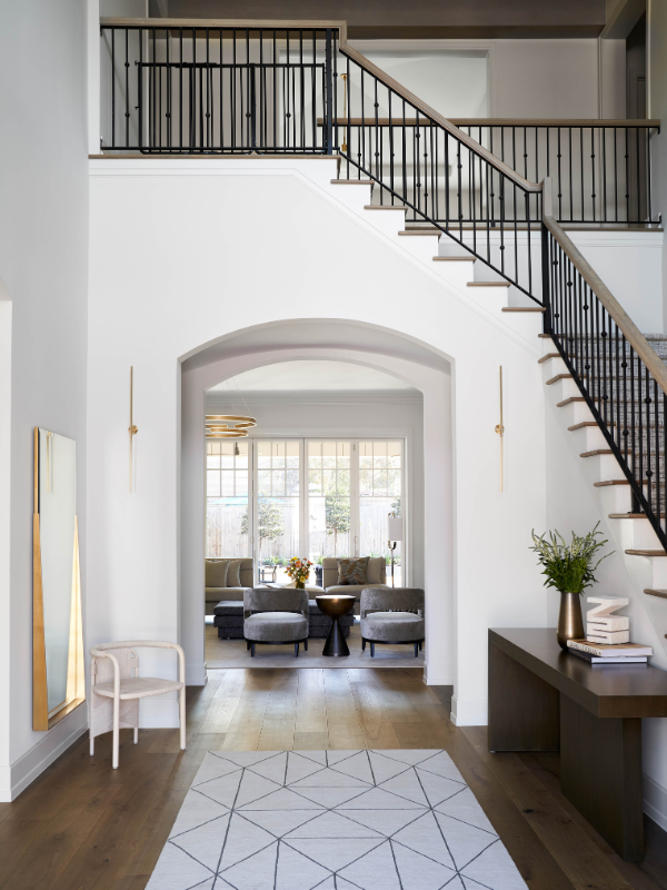
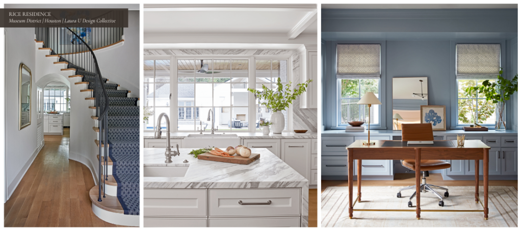
Simple black metal balusters add a bit of industrial flair to this gently curving staircase. At the same time, a diamond hatch pattern stair runner from M&M Carpet softens the effect. One of several in a series, Cookie Ashton’s large-scale mixed-media painting Beachcomber hangs in the gallery hallway – visible from the ground floor. The local artist has developed an interest in architecture and interior design throughout her career. Bold, dynamic and organic, Ashton’s works appear rendered solely in alcohol ink but develop a more painterly quality upon further inspection. Beachcomber was acquired by the LUDC team from Laura Rathe Fine Art.
Those who have read previous project reveals and virtual home tours will know that we often work with art consultant and gallerist Laura Rathe. For example, those who read “The Importance of Using Art in Interior Design” might remember seeing pieces by Hunt Slonem and Zhuang Hong Yi. Pieces by both artists were sourced by Laura Rathe Fine Art for the Circle Drive project. Across from the staircase, a classic silver-leaf Louis Philippe mirror from Made Goods creates the illusion of a wider hallway. Naturally, we proceed from the Rice Residence entryway to the kitchen.
DYNAMIC MARBLE SLABS WOW IN THIS CURATED KITCHEN
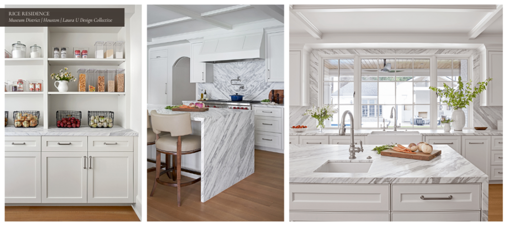
In “Our Favorite Kitchen Remodels to Inspire Your Project,” we celebrated the Rice Residence kitchen remodel, which was part of this whole-home Houston remodel. Laura and the team chose to preserve the original monochromatic aesthetic of this kitchen. However, we elevated and modernized it for the Rice alums and their kids. What began as a discordant, monotone space transformed into a bright, dynamic interior. This seamlessly connects to the rest of this Rice University home design. We opted for blackened and antique brass in other rooms of the home. In this space, however, our team chose brushed silver hardware that matches the kitchen’s stainless steel appliances.
As we note in the aforementioned post, our team created a coffered ceiling through custom millwork that reflects the cabinetry and vent hood. The team also widened the kitchen window and surrounded it with a stunning marble backsplash for added impact. We replaced the peninsular kitchen island with a kitchen island bar complete with prep surface and sink. Our team also installed a pot filler faucet above the stove’s burners to make prepping weeknight dinners even easier. The faucet’s antique-inspired silhouette nods to the history of this 1930s Rice University home design. Lastly, we added a pantry just off the kitchen. This perfectly organized pantry also boasts the kitchen’s gray-veined marble countertops detailed below.
Choosing the Rice Residence Kitchen’s Statement Marble
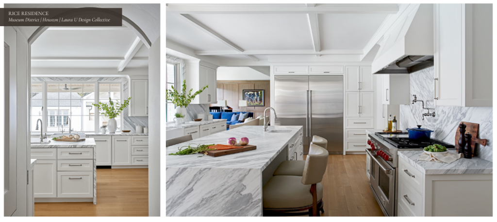
One of our favorite alterations to this space was replacing the granite countertops and ceramic backsplash with marble slabs. Our team traveled to five different stone yards before finding the perfect look at Aria Stone Gallery. We chose a gorgeous gray-grained marble for the countertops, waterfall kitchen island and each backsplash. The striations of the oven’s backsplash – which is the same stone as the island and countertops – almost create a chevron pattern.
These marble slabs offer a subtle dynamism to this monochromatic space. They also beautifully offset the stainless steel stove and chrome accents while effectively framing the window. By pairing these contemporary marble slabs with classic elements like the coffered ceiling, we created a space that is both modern and timeless.
Furniture and Finishings from the Rice Residence Kitchen
When designing kitchens for clients who love to entertain, the LUDC team often opts for high-performing Sub Zero Wolf appliances. In the Rice Residence kitchen, we installed a full-size fridge and a gas range with a double oven. To pair with the marble-clad waterfall island, we added a set of classic counter stools. With an Art Deco edge, these David Phoenix Saint Giorgio dining chairs from Hickory Chair are the perfect ode to the home’s 1930s origins. We chose a Truffle finish for the wooden frames and Kravet fabric for the cushion upholstery. As mentioned above, we sourced the gray-veined marble from Aria Stone Gallery.
EARLY AND MID-CENTURY MODERN TOUCHES DELIGHT IN THE BREAKFAST ROOM
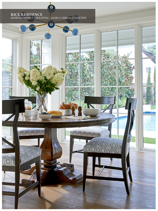
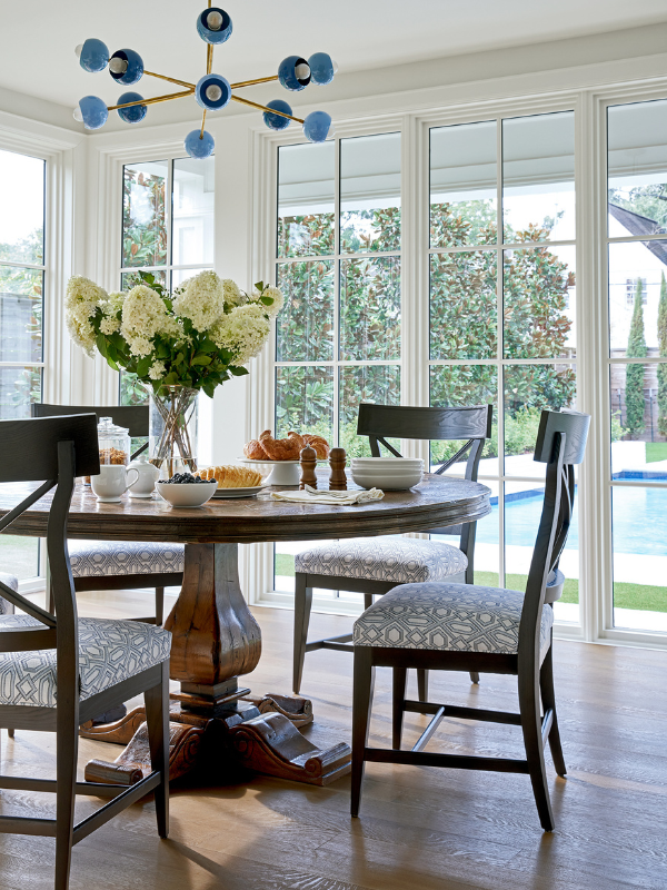
With its floor to ceiling windows and views to the manicured backyard, this breakfast room is full of warmth and sunlight. From a sputnik style light fixture to diamond print upholstery, we adore the mid-century and early modern accents in this space. In true transitional fashion, we paired sleek Jordan Side Chairs from Vanguard with the clients’ own scrolling foot solid wood table.
We also carried the blue and white Rice-inspired color scheme into this cheerful nook. Our team actually reached out to Louisiana-based Sazerac Stitches to create the perfect custom color scheme for this breakfast room’s Orion Chandelier. The Wedgwood colorway of David Sutherland’s Diamonds Are Forever performance upholstery fabric was chosen for the dining chairs.
A MODERN TAKE ON A CLASSIC CANDLEABRA TAKES CENTER STAGE IN THE DINING ROOM
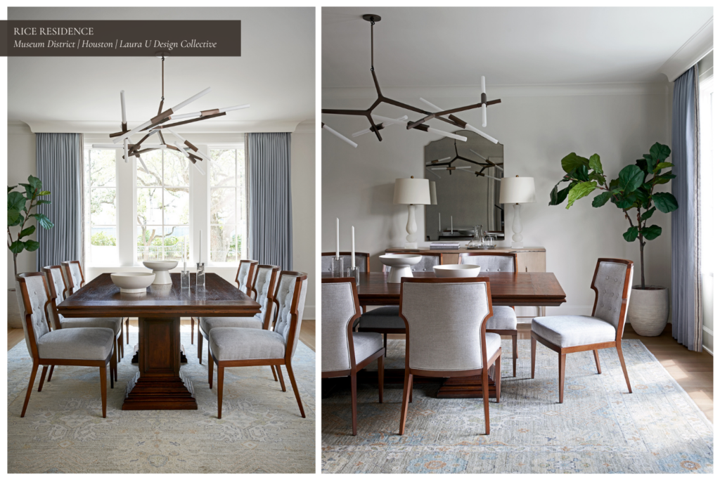
For the next leg of our Rice University home design tour, we head into the dining room. Mid-century and early modern touches abound in this space as well, with some inspired by the eras and others featuring antique and vintage elements. A mixture of different wood tones and metallic finishes make this space feel both eclectic and curated. At the same time, a variety of silhouettes emphasizes the transitional nature of the Rice Residence dining room. For example, we love how the dining buffet’s silverthorne finish and the chestnut color of the chair frames play off each other.
Similarly, the bronze Agnes Chandelier pairs well with the gilded gold outline of the arched cathedral-style Norma mirror from Gabby Home. Intriguingly, the modular Agnes Chandelier designed by Lindsey Adelman was “originally conceived as a candelabra.” While notable in every space within the Rice Residence, our blue and white color scheme is more subtle in the dining room. To this point, the area rug and ID Collection Casamance drapes in Bleu Acier add icy blue to the space. The tufted Bolier & Co Atelier Dining Chairs in Cement contribute a cream color. As in the breakfast room, the dining room table predates our whole-home remodel.
ART DECO DESIGN ELEMENTS AND CUSTOM MILLWORK SHINE IN THIS BEAUTIFUL BAR
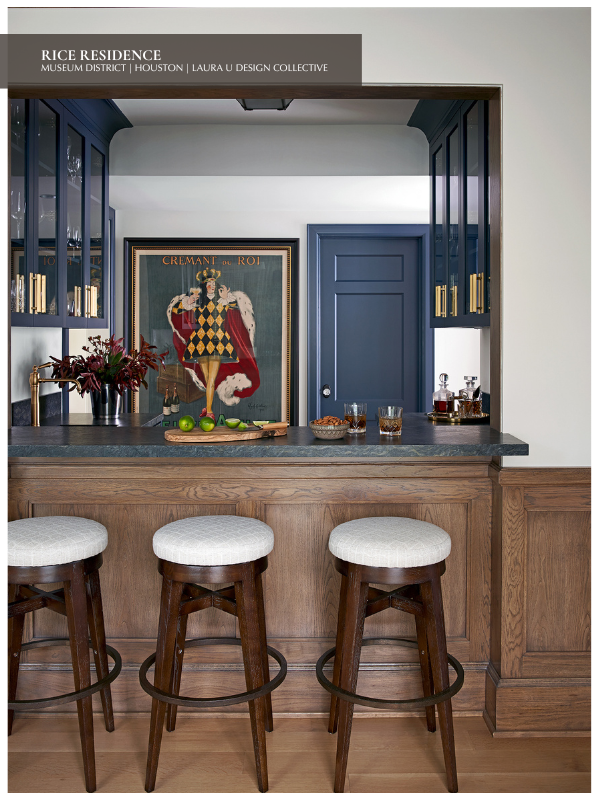
The Rice Residence bar and wine cabinet is one of our favorite spaces in this Rice University home design. With bold brass hardware and a handsome stone countertop, this bar is truly a statement space in the beautifully tailored home. For the leather-effect countertop, we chose tungsten blue quartzite from Walker Zanger. Millwork in the bar and in the kitchen were conceived jointly by our Laura U Design Collective team and Newberry Architecture.
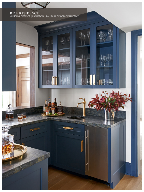
We contributed the design and elevations while Newberry provided on-site drawings. The dark stained wood, quartzite countertops and glossy blue cabinets make this space a true reflection of the home’s history. Art Deco-inspired bar stools and flush mount light fixtures in antique zinc with frosted glass shades from Circa Lighting nod to the 1930s. To finish up the space, we chose fabric from Kravet for the bar stools.
COMFORT MEETS SOPHISTICATION IN THE RICE RESIDENCE FAMILY ROOM
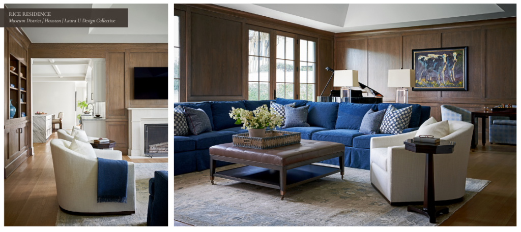
Designed with comfort and style in mind during our whole-home remodel, the Rice Residence family room is rich, elegant and ideal for entertaining. We arranged the space in several zones, with a music room, game space and lounge area all available to guests. Again, light fixtures, accents and furniture pieces all draw from early and mid-century modern periods of design. With exquisite millwork from our team, the wood paneling in this room is instantly recognizable as a mid-century modern motif. The blue and white palette that carries from one room to the next is perhaps most saturated and sophisticated in this space.
The Rice Residence Family Room Recalls Life at Home in Mid-Century Modern America
From the club chairs to the sectional, all the living room furniture is deep-seated – one element that embodies our ethos of “livable luxury.” Quite fittingly, the club chair was first invented by French furniture makers in 1929, achieving peak popularity in the 1930s. The comfortable club chair offered an alternative to the stuffy, stiff-backed armchairs that once dominated the market. While living rooms were historically considered formal spaces, “family rooms” were conceived during the mid-twentieth century as casual spaces.
In her article “The Invention of the Family Room” for JSTOR Daily, Erin Blakemore explains. She notes that family rooms were initially thought of “as a locus for the equal, easy interaction between parents and children.” It was lauded as “a kind of utopia of easy living.” At the time, the family room “‘challenged formerly inflexible class lines’ by abandoning the formality of the stuffy parlor or living room.” Dating to the 1940s and ‘50s, the family room was one of the first spaces “oriented towards leisure alone” in middle-class American homes. Club chairs chosen for the Rice Residence family room not only reflect the period in which the house was built. They also reference this changing approach to interior design and life at home in this Rice University home design.
Furniture and Finishings from the Rice Residence Family Room
For the Rice Residence family room, we chose a sectional from Mr. & Mrs. Howard for Sherrill Furniture upholstered in a blue velvet Kravet fabric. The Vanguard Tucker cocktail ottoman positioned before the sectional was finished in the company’s Havana Stain Finish and accented with antique brass casters. Swivel chairs from John Brooks and Lane Venture Tub Dining Chairs can be found throughout the space. Each club chair was upholstered in fabric from Kravet – one set in a soft beige and the other in subtle blue plaid. Console lamps from Circa Lighting, a heritage-inspired game table from Theodore Alexander and a fireplace surround from Materials Marketing round out the space. Throw pillows upholstered in geometric fabric from Schumacher and Allan Knight recall the home’s original Art Deco interior.
A SERENE STUDY ENSURES OUR CLIENTS ENJOY WORKING FROM HOME

Another of our favorite spaces in the Rice Residence is this serene blue and white study with warm wooden accents. As in the family room, a monochromatic statement wall is the center of attention in this home office. For this room, we chose light fixtures inspired by the industrial elements and streamlined silhouettes of mid-century modern design. These include the Archipelago 3 Surface Pendant in blackened brass from Allied Maker and wall sconces from Hudson Valley Lighting. The standing lamp is from Rose Uniacke and the table lamp is from Circa Lighting.
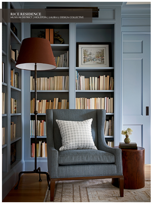
Furniture includes a Lawson Fenning Niguel Desk, an A. Rudin lounge chair and a Lawson Fenning side table – all hewn from natural walnut. Soft finishings include semi-sheer Roman shades cut from a geometric blue and white patterned Fabricut fabric and Kravet-upholstered pillows. Lastly, a rug from Matt Cameron frames the desk.
ELYSTAN SCONCES IN THE FORMAL POWDER BATH DRAW INSPIRATION ROMAN AN ANTIQUE SCOTTISH CANDELABRA
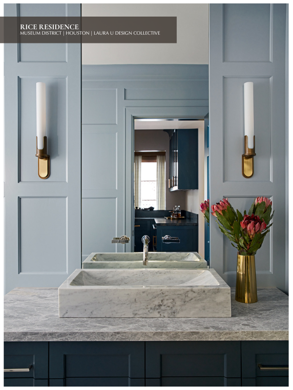
Downstairs, the formal powder bath boasts antique-inspired wall sconces that recall the dining room’s Agnes Chandelier from Lindsey Adelman Studio. Both were actually inspired by antique candelabras. For the Elystan sconces, Michael Amato drew inspiration from an antique brass candelabra he found in an old Scottish church. The Elystan sconces are almost a metaphor for this home’s transitional style. They combine a sleek opal cylinder with frosted glass and a brass base that recalls the pricket of an antique candelabra. We sourced the Elystan wall sconces from Urban Electric.
A LOCKER -THEMED MUDROOM HONORS RICE BASEBALL AND MASCOT
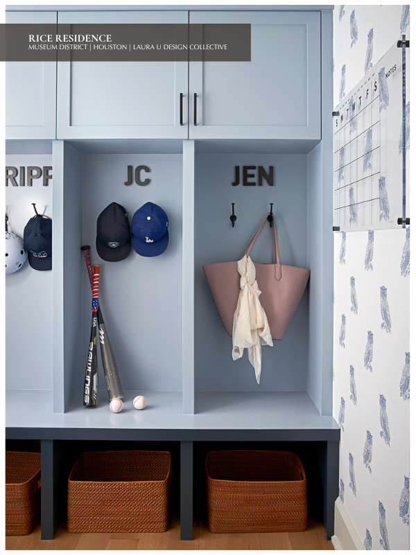
In addition to a dozen varsity NCAA Division I athletic teams, students will find more than twenty different clubs and intramural sports at Rice. According to the University website, club sports include everything from women’s rugby and men’s water polo to coed fencing and sailing. Intramural sports like badminton and floor hockey are also popular amongst students at Rice. The school’s baseball program is especially accomplished. We love that our Rice Residence clients chose a locker-room theme for their mudroom – even staging the space with a pair of baseball bats! The laser cut locker names were sourced from Woodland Manufacturing(personalization removed for privacy). The lucite calendar came from Salt Lake City-based Etsy shop GirlFridayAcrylics. Of course, the star of this space is the owl-printed wallpaper, the coloring of which reminds us of a classic blue on white toile.
Of course, this Otus the Owl wallpaper in Cadet Blue from Wallshoppe is a nod to Rice’s mascot. Sammy the Owl – the Rice University mascot – has a fascinating history. According to US News, the university’s mascot was stolen in 1917 by students from Texas A&M. Rice University hired a private detective to recover the owl from Texas A&M. Once found, the private detective “sent a coded message back to Rice students letting them know that ‘Sammy’ was OK.” It was then that Sammy the Owl received his name. This owl-printed wallpaper is just one example of the many whimsical design elements our fun-loving clients allowed during the whole-home remodel.
“A FAMILIAR DESIGN MADE FRESH’ UPDATES THE RICE RESIDENCE UTILITY ROOM
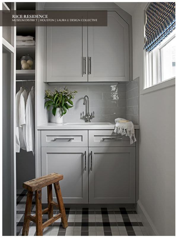
Clearly, this active family of four loves sports and spending time together, but with outdoor play comes lots of laundry. The original architect of this 1930s home placed the utility room on the first floor. However, the washer and dryer were on opposite sides of the house. This made doing laundry incredibly inconvenient for our clients. To make the utility room more practical and accessible, the Laura U Design Collective team decided to relocate it to the second floor. Now neighboring the primary suite and boys’ bedrooms, the laundry room is perfectly placed.
Perhaps best of all, the new laundry room has a window! For the window’s Roman shades, we chose F. Schumacher fabric in a geometric pattern reminiscent of that found in the study. We pulled from the subtle kitchen color palette of dove gray, off-white and silver accents for this space. As such, the wow factor in this laundry room is the patterned floor. Cement Checkmate floor tiles from Cle Tile recall the black and white checkered floors of kitchens and foyers from classic films. However, we chose Cle Tile’s Checkmate floor tiles because they offer an updated approach to the traditional oversized check. To this point, Cle Tile actually describes their buffalo check floor tile as “a familiar design made fresh.”
THE TRANQUIL OWNERS’ SUITE FEATURES A NEUTRAL COLOR PALETTE AND STATEMENT LIGHTING
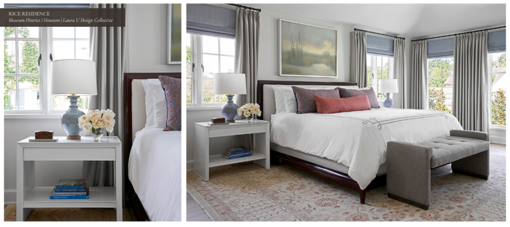
A laundry room serves as our entrée to the private quarters of this 1930s home, which includes the children’s bedrooms and the owners’ suite. The primary bedroom is warm and modern. It boasts a neutral color palette accented by pastel blues, soft grays and the occasional pop of dusty rose or violet. With its scalloped edges and winged back, the chaise lounge from Mr. & Mrs. Howard for Sherrill Furniture – upholstered in Kravet fabric – echoes vintage-inspired accents in the dining and family rooms. Other vintage-inspired elements include the two lamps and a Theodore Alexander Durant Accent Table with an almond finish cherry veneer. The domed floor lamp from Robert Abbey Lighting reminds one of mid-century Italian designs. Conversely, the HICO lamp by Paul Schneider recalls American designs from the 1930s and ‘40s with its walnut base and brass accents.
Layering pale blue Roman shades under Donghia drapes, window treatments in the primary bedroom are similar to those throughout the house. In the center of the space are a Moderne Platform King bed from Baker Furniture and a Dana Bench from Jessica Charles. The latter is upholstered in Whistler Smoke fabric sourced from Ladco Design Center in Houston. Our team chose a Southport duvet cover in the Smoke colorway from Serena and Lily for the primary suite’s bed. Lastly, an oil on canvas by Kevin Gillentine – entitled Marsh Water– was placed above the bed, flanked by two windows. Like much of the other art featured throughout this home, Gillentine’s tranquil Marsh Water painting was sourced through Laura Rathe Fine Art.
Hexagonal Floor Tiles Lead to a Soaking Tub in the Primary Bathroom
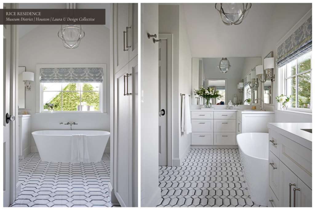
Like the laundry room, the owners’ bathroom features a statement floor – with Stone Mosaic tiles from Thorntree – and patterned Roman shades. A sculptural Gracie Large Captured Globe Pendant with a polished nickel finish and clear glass shade from Circa Lighting ties the space together. T pendant light creates a bridge between the window treatment’s classic damask pattern and the floor tiles’ graphic hexagonal design. French Horn wall lights from George Cameron Nash Vaughan flank the vanity, which sits opposite the elegant freestanding soaking tub.
A SPORTY YET STYLISH BOYS’ BEDROOM ROUNDS OUT OUR RICE RESIDENCE VIRTUAL HOME TOUR
Lastly, the boys’ bedroom captures their sports enthusiasm without deviating too much from the home’s transitional style. A simple wooden bed with beautiful exposed grain from Fourhands sits in the center of the room. Antique-inspired navy blue Campaign Nightstands from Crate & Barrel flank the bed. Accordion sconces offer a hint of mid-century modernism, reminding one of the extendable lacquered wall lights popular across Italy in the 1950s. The basketball-themed pendant light, MLB bedspread and graphic detailing on the walls keep this space fresh, fun and ageless for the clients’ kids.
Thank you for joining us on our Rice Residence Virtual Home Tour!
Interested in becoming a client? Reach out!


