Upon purchase, the Garnet Residence’s 4 bed, 7 bath, white-on-white and contemporary interior was a bit too stark for the new homeowners. We worked with them to design a home filled with timeless elements, bespoke furniture, and soothing color palettes. Soft finishings — elevated with textural variety — cut into the monotone atmosphere of the original design. Overall, we sought to refresh the home by grounding it in warm woods and cozy, upholstered spaces perfect for lounging and entertaining alike.
Each room in the Garnet Residence offers gentle lighting, touchable surfaces, and a number of nods to nature. Combining these three elements makes the home truly special — and ideally suited for the homeowners and their family. This project was especially exciting because of the many custom pieces Laura U designed in collaboration with House + Town and El Dorado Woodworks. The home boasts custom furnishings in the family room, family hall, kitchen, primary suite, guest suite, game room and media room. Follow below to learn more about how warm romantic interior design took center-stage in the Laura U-Garnet Residence project.
Southside Place, Houston, Texas — Verdant and Family-friendly
East of Bellaire, Southside Place in Houston, Texas offers families a rich experience — both inside their homes and outside in the community. According to realtor Paige Martin of Houston Properties, the quaint town of Southside Place “spans 10 blocks of picturesque tree-lined streets.” The area boasts a “close-knit community” which hosts “annual block parties, holiday parties, and other events.”
Homes in Southside Place vary in age and architecture. The town boasts both contemporary luxury homes and “vintage bungalows from the 1930s and 40s.” In her article “Southside Place is a ‘Gem’” for the Jewish Herald-Voice — a Houston-area news outlet — Cathy Scherer describes Southside Place as “unique, cozy-living neighborhood” where many residents make “life-long friends.”
The affluent, perfectly walkable area reportedly has “a small town feel in a big city.” Throughout any weekday — but especially on the weekends — Scherer writes that people are always “strolling through the neighborhood.” Residents are constantly out and about — “either walking their dogs, taking their children to school, or on their way to nearby shops and restaurants.”
To better fit into the family-focused, tree-lined neighborhood — and to more accurately represent their aesthetic and values — the Garnet Residence homeowners asked Laura U to infuse their contemporary home with character.
Take a Tour: Warm Romantic Interior Design in the Garnet Residence
Designed by Architectural Solutions and built by Stonehenge Classic Homes in 2014, the Garnet Residence required a family-friendly update. The redesigned Garnet Residence swaps harsh, contemporary design for a vintage-inspired — yet utterly fresh — romantic interior. The neutral, blush and putty color palette creates a zen backdrop for cozy upholstery, warm metallics and soft but dramatic lighting.
A mix of geometric and organic shapes represents the juxtaposition of nature and gentle glamour in the newly-renovated Garnet Residence. Most rooms in the home are feminine and warm-toned. However, several — like the game and media rooms — offer a more masculine edge. The intricate patterns of soft finishings and the dimmable light offered by overhead fixtures balance out this edge. Tour the Garnet Residence room by room below.
Entering the Home
Entryway
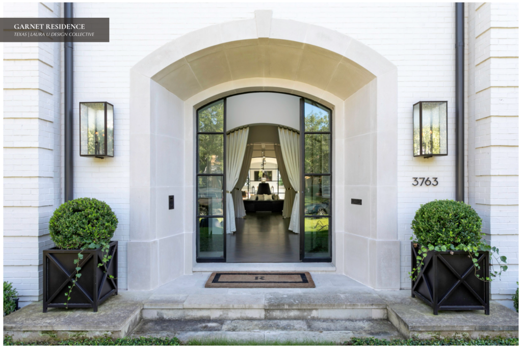
The previous designs of both the entryway and stairwell were fairly lackluster. Both were cold and bright but lacked texture and interest. To infuse the entryway with life, custom planters from Iron Accents were added. Before the drapes and roundelette were added to the family room hall, one could see straight through the entrance to the back portico.
Stairwell
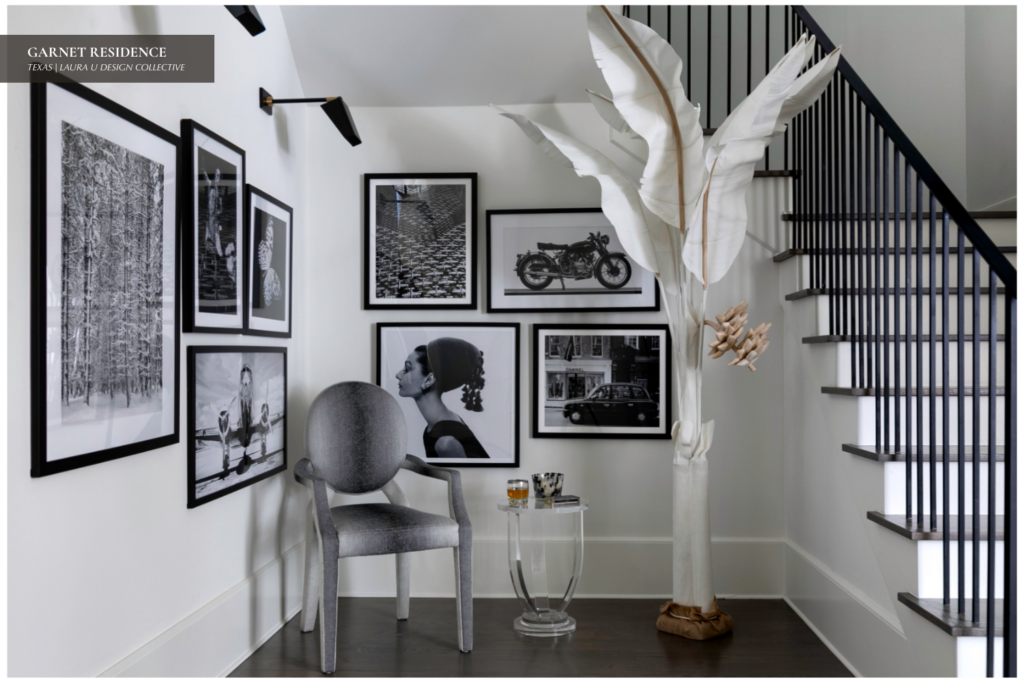
The stairwell transformed from a one-note space to a dynamic, engaging area of the home. For their redesign, Laura U Interior Design created a customized black and white art gallery based on the client’s interests. The gallery wall offers both character — with fashion, music and travel photos — as well as much-needed depth to the space.
The Daily Dream Decor Article “The Gallery Wall Trend is So Popular Right Now” recommends including a gallery wall in any room. It particularly suggests adding a gallery wall to any space that needs a touch of “contrast and personality.” A purple-gray and white ombre Moss Studio “John” chair sits in the corner. The weight and scale of the two gallery walls is offset by the soft colors of the organic sculpture near the staircase.
Family Room Hall
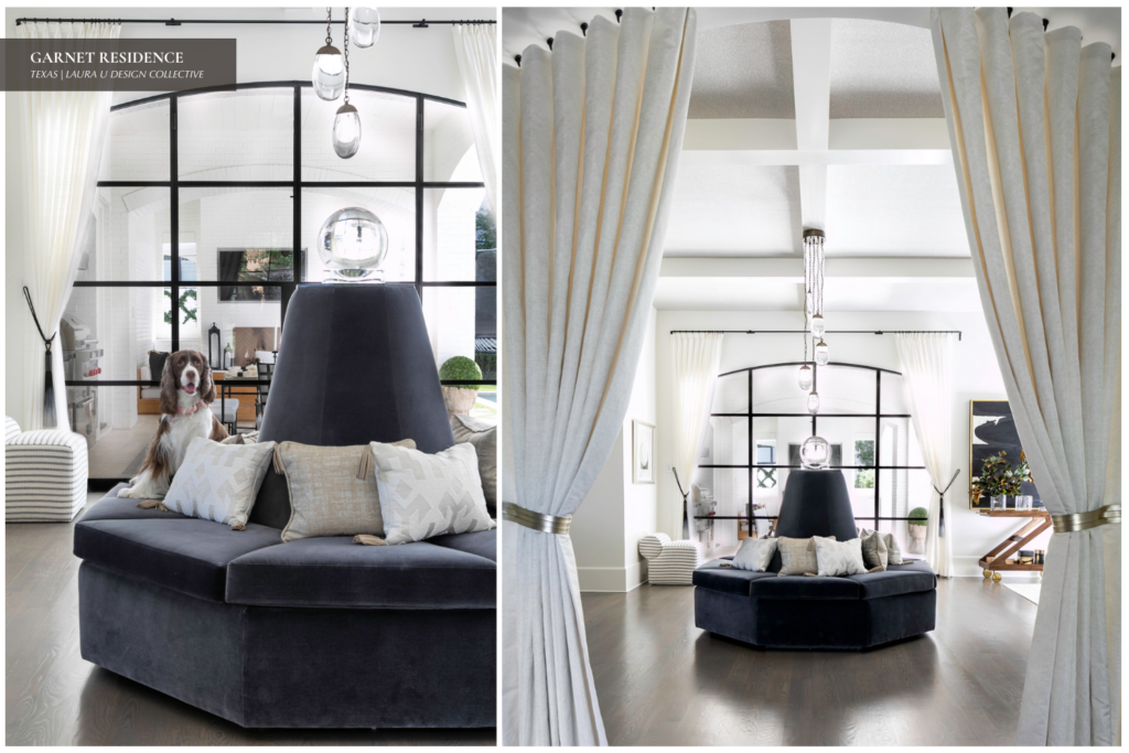
A hexagonal 1930s-reminiscent banquette sofa sits in front of the large iron muntin. The roundalette — custom-designed by the Laura U team and El Dorado Woodworks — was beautifully upholstered in Designers Guild fabric. This banquette sofa is perfect for the present moment.
In his article “Furniture Trends in 2020” for Architectural Digest, David Nash writes homeowners and designers are increasingly seeking out “seating that fosters collaboration.” Interest in round sofas and bench seating over the last year seems to “point to a collective desire to make more meaningful connections.” These connections are forged “with our friends and colleagues—and our furniture.”
Nash expects antique and vintage-inspired furniture to continue gaining popularity in upcoming months. He notes that the “classic shapes” of vintage furniture “create rooms that feel exuberant, layered, and full.” To make the space more symmetrical, two pairs of cream-colored drapes float above separate doorways.
One is set against the back window and another sits above the doorway that leads into the entry. Exceptional lighting was a must in this wide, open space, but hanging fixtures was a challenge.

As such, Laura U enlisted the help of lighting company Ochre to design a custom canopy to fit the existing beams. The waterfall chandelier bounces light around the room while drawing eyes upwards towards the ceiling. Combining the richly textured banquette and soft curtains with the warm-toned chandelier resulted in an atmosphere of comfort and warmth.
Upstairs Landing
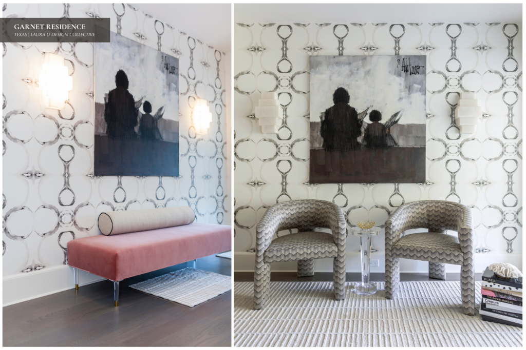
A custom-designed stair runner by Laura U team and fabricated by River Oaks Rug Cleaners accents the steps leading to the upstairs landing. The delicate hatched pattern of the runner offers a preview of patterns featured in the upstairs landing.
It primarily foreshadows the chevron upholstery of the Moss Studio armchairs. The walls of the upstairs landing boast a stunning Lindsay Cowles wallcovering — style 71514-1 Ivory Brown — reminiscent of a kaleidoscope image.
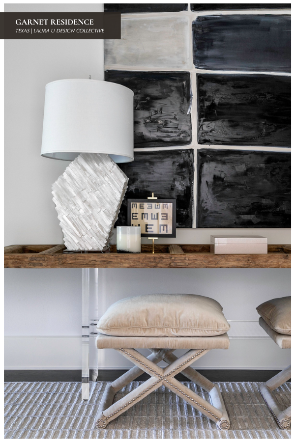
Stacked, marble-esque wall sconces add textural interest without taking attention away from the wallcovering. A woven Madison Lily rug — with a sand base and white ribbing — contrasts beautifully with the dark-stained wooden floor. A pair of tri-leg, chevron-patterned Moss Studio Jenni chairs make the small space functional while the Aldo Luongo painting provides atmosphere.
Common Spaces
Kitchen and Breakfast Nook
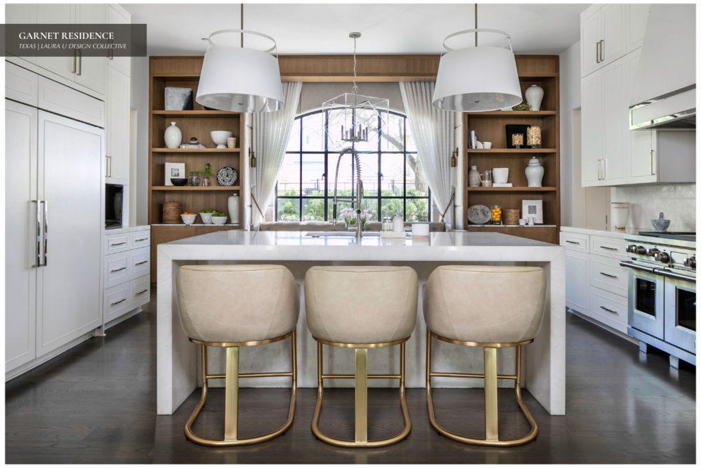
The previously all-white kitchen was updated to reflect a sensibility of Danish Modern meets vintage glamour. The primary goal of this kitchen renovation was to warm up the stark space with warm-toned woods, metals and upholstery.
Built-in wooden cabinets were custom-designed for the home by El Dorado Woodworks. Wooden shelving opposite the bar/island sits open and unglazed for a contemporary — yet homey — feel. A marble mantle — custom designed by the team at Designer Stone Center — works well with the kitchen runner from Madison Lily.
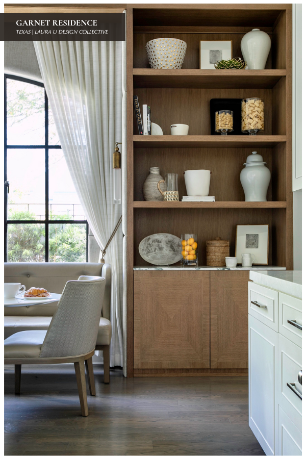
Holly Hunt fabric covers three upholstered chairs — custom-fabricated by House + Town for the Garnet home. The drapery panels surrounding the window are from Kravet, accented with Sacho tie-backs.
Upholstered panels flank the window of the breakfast nook to soften the space and make it feel a bit more like a boutique hotel. Sconces from Apparatus add extra light to the space, complementing the natural sunlight that pours in from the windows.
Formal Dining Room
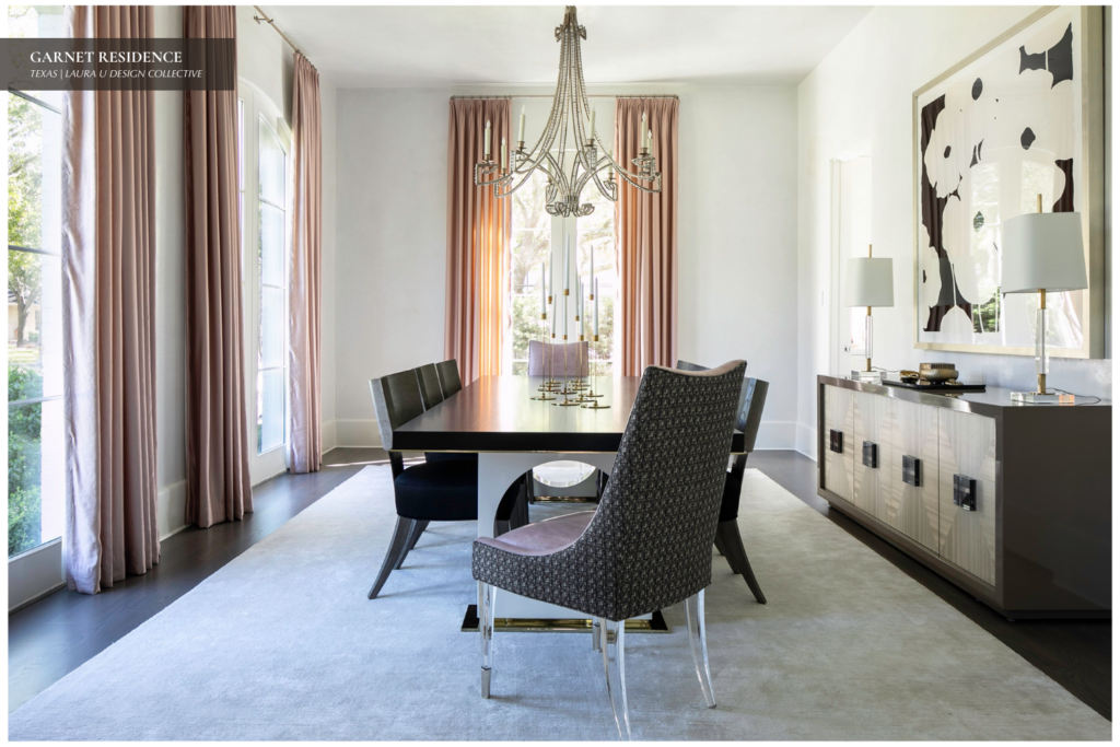
A framed edition of one of Donald Sultan’s classic “Poppy” prints hangs above the sideboard, flanked by two Area table lamps. The print was purchased from McClain Gallery. Eight Bernhardt dining chairs encircle the rectangular dining table. Two host chairs feature a pale lilac interior, reflected perfectly in the long-line blush-colored curtains.
The exterior of the host chairs — a dark purple-brown Donghia fabric — meshes well with the upholstery of the six other dining chairs. Sets of acrylic legs attached to the host chairs are reminiscent of the crystal chandelier and the clear accents on the table lamps. Finally, a Holland and Sherry rug provides the perfect amount of depth when set against the dark brown stain of the wooden floor.
Fireplace Room
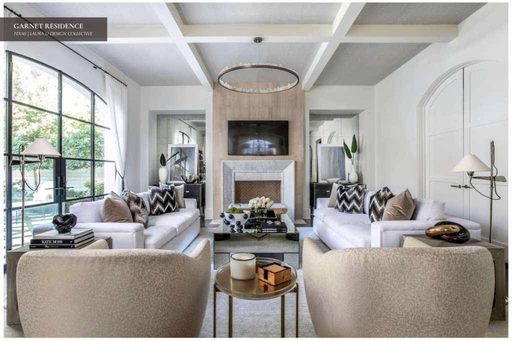
The single ring “Prometheus I” chandelier by Christopher Boots offers light and warmth to the space with its quartz crystal and brass construction. Laura U added accents to the space to make it softer and more romantic. These elements include new art, pillows in Allan Knight and Schumacher fabrics and scattered accessories.
All seating was custom-reupholstered. The sofas were upholstered in Kravet fabrics while the chairs were covered in a soft gold Donghia fabric. The two fabrics perfectly correspond to the bronze and gold hardware of the table lamps, chandelier and tables.

Coffee table books, a ceramic Kelly Wearstler “POP” bowl and several small black sculptures sit atop various surfaces. Each ties in perfectly with the neutral color palette of blush, putty, black and white. The putty color carries from the armchairs at one end of the room to the chimney breast and overmantle of the fireplace.
The wood covering of the fireplace’s overmantle — designed by Maya Romanoff — interacts seamlessly with the designer stone slip. Circa floor lamps, a Phillip Jeffries metallic ceiling wallcovering, Sho Modern end tables and Donghia tie backs finish off the space.
Formal Living Room
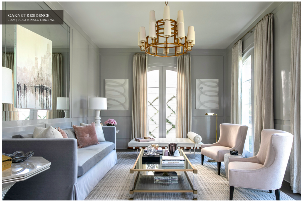
In this serene and sophisticated formal living room, we layered soft neutrals with tailored textures to create a space that feels both polished and inviting. We emphasized symmetry and balance — pairing sculptural blush-toned chairs with a sleek, tailored sofa and grounding the room with a geometric-patterned rug.
The custom, tonal wall panels subtly frame the space, while curated artwork and a sculptural gold chandelier lend just the right amount of drama. The result is a refined retreat designed for elevated entertaining.
Private Rooms
Primary Suite
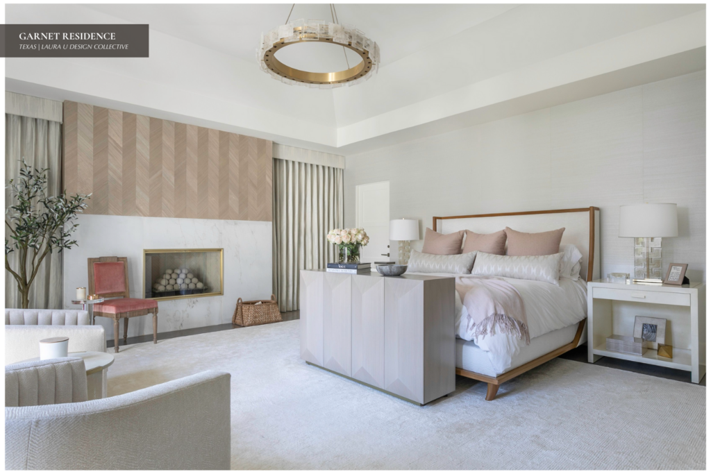
The Maya Romanoff chevron wood paneling above the fireplace recalls the paneling above the fireplace in the Fireplace Room. Stacked fireplace spheres tie in the circular shape of the single ring chandelier. A clear acrylic Liora Drink Table matches the glass of the fireplace.
Similarly, the blush of the velvet Schumacher upholstery on the vintage chair meshes with the bed’s pale pink linens. Eyes follow to the custom console at the foot of the bed. The console emerged from a collaboration by Laura U and El Dorado Woodworks to hide the TV when not in use.
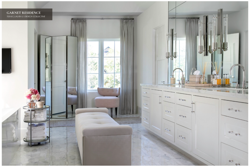
The primary bath retains the majority of its original fixtures. Laura U updated the space through the addition of a Madison Lily rug.
Guest Suite
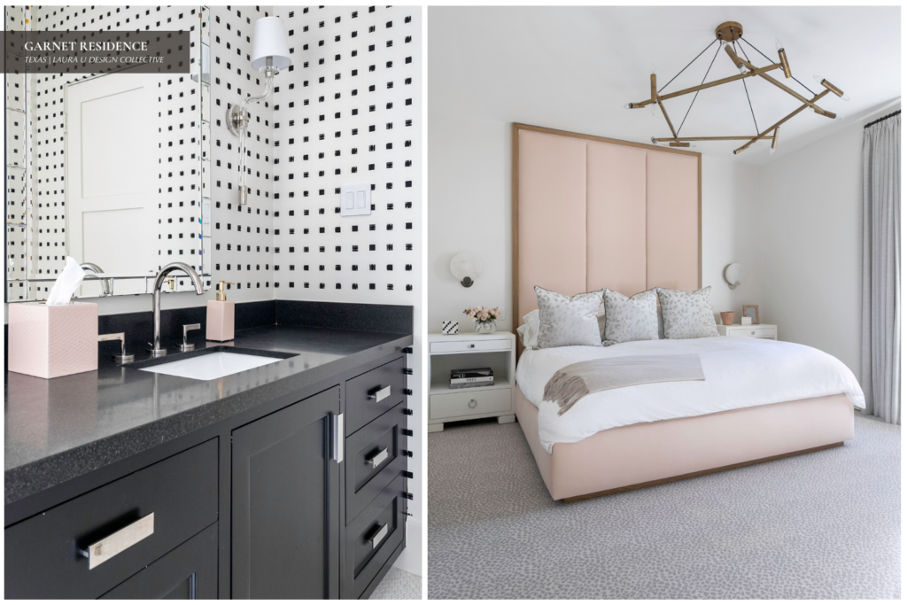
The guest suite has a more youthful feel than does the primary suite. However, the guest bed and bath easily retain the sophistication of the rest of the home. Laura U and House + Town worked together to produce the custom pink headboard behind the guest bed. Lighting from Aerin — the disk wall sconces — and Circa Lighting — a chandelier — adds depth and interest.
A Stark rug graces the floor while Zinc fabrics cover the pillows. The guest bath features a black granite countertop and brushed aluminum hardware. The dainty black and white square tiled walls provide the perfect backdrop for the black, white and pink color palette of the bathroom.
Overall, the Garnet Residence evolved from a bright, overly-contemporary space to one awash with culture, history, warmth and tranquility.


