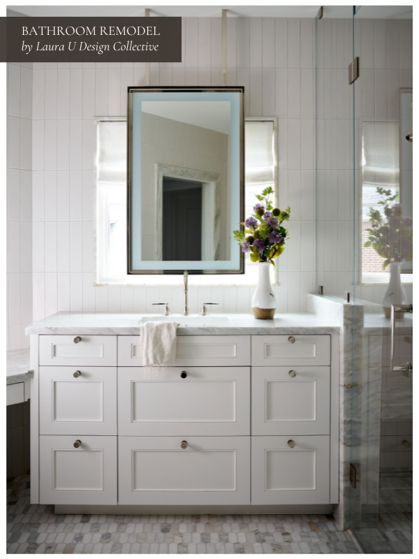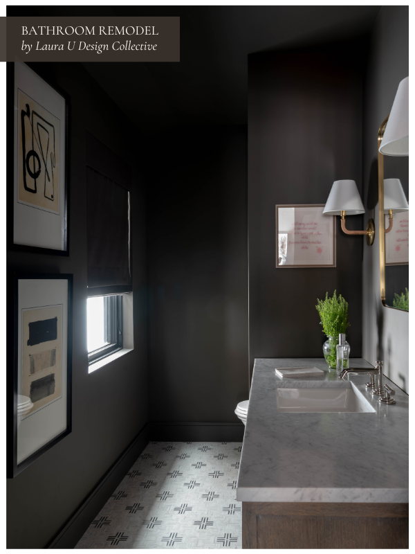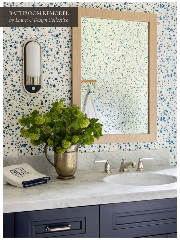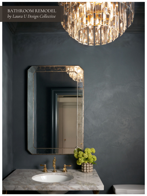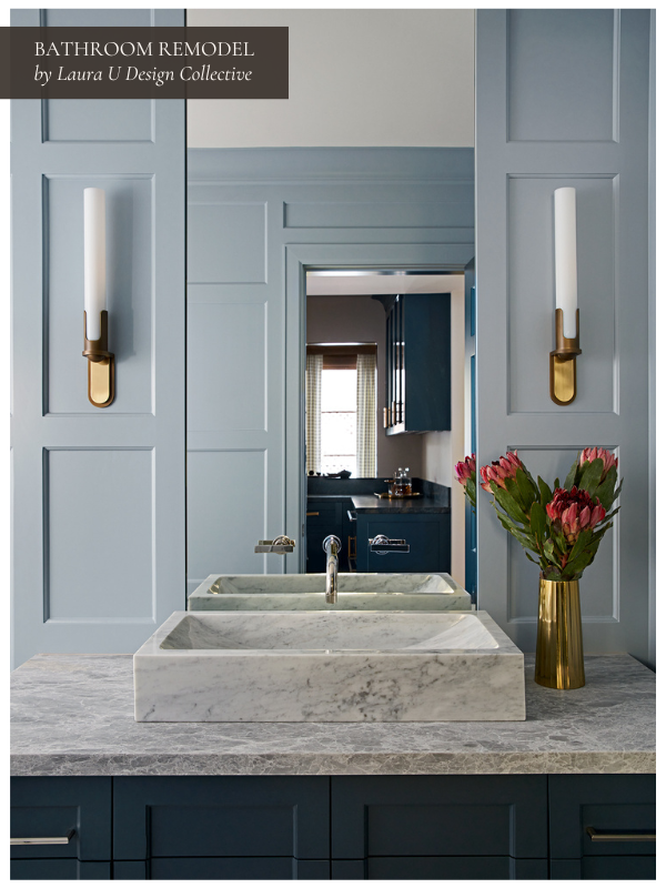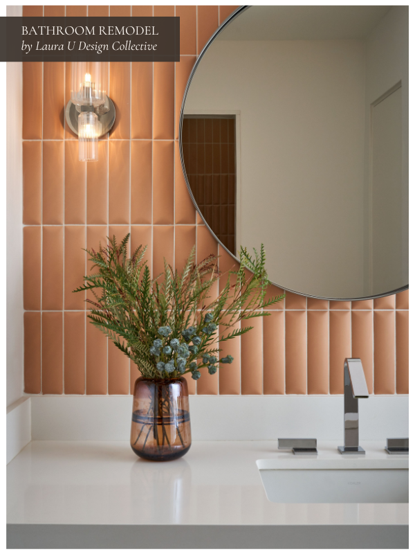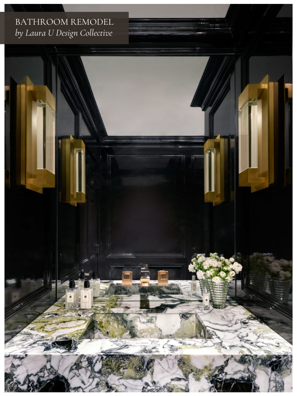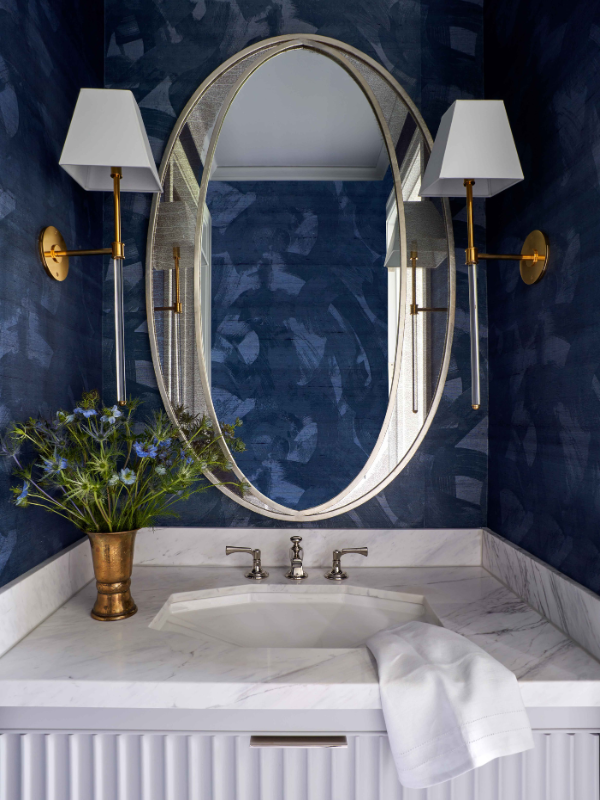
Designing a bathroom can be daunting. After all, materials must stand up to high humidity and daily use. No matter their size or location, every bathroom should be both durable and beautiful. Bathrooms — especially primary suites — can offer spa-like tranquility when designed properly with carefully selected materials, appropriate color palettes and ideal layouts. With the right inspiration and a bit of professional help, homeowners can create the bathrooms of their dreams. As you pursue a bathroom renovation of your own, consider ten bathroom renovation ideas inspired by recent LUDC projects. We hope the bathroom remodel ideas outlined below put you on the right track for your own project!
10 Bathroom Remodel Ideas to Inspire Your Next Project
Pebble Beach: From Traditional to Modern in California

First on our list of bathroom renovation ideas is the primary bath from our Pebble Beach project in California. Owners J and C approached the bathroom remodel of their Pebble Beach home’s primary bath with comfort, durability, and function in mind.
The couple sought to accommodate the many needs of their young family without giving up on style. This involved transforming the space into one of “livable luxury” — choosing pieces that would perform and last over time. Storage was also a must for their family — an element that truly shines through in the after photo of the primary bath displayed below.

Subtle Contrasts, Graphic Details and Quality Materials Create an Air of California Cool in This Pebble Beach Primary Bath
When remodeling this bathroom, the biggest design risk taken was the large format stone tile — chosen in a deep atmospheric slate. One might worry that the dark, large-scale tile would clash against the light walls and porcelain tub. However, the contrast actually ties in with other elements of the space. This is especially apparent in the black and white design of the shower and the vanity countertops.
A tiered disk metallic chandelier over the bathtub bounces light around the space. The disks create a sense of dynamism to an otherwise tranquil, open space. They also echo the shape of the freestanding bathtub. The color of the fixture mirrors the soft, graduated beige of the graphic wallpaper while also tying in the texture of the marble shower. The large, armoire style vanity provides juxtaposition between contemporary graphic carving and soft pastel coloring.
A mix of textures offers depth to the space. We achieved this through the black glazed bench in the shower and the gold rimmed vanity mirror. The moody gray stone floor and brushed silver chandelier further the effect. Thoroughly modern pulls and other hardware elevate the bathroom without contributing any fussiness. The renovated spa-like escape now offers the homeowners a soothing space ideal for both solo meditation and intimate togetherness.
Takeaway Tip from Pebble Beach: Rely on statement lighting to create a sculptural moment in your soothing primary bath.
North Boulevard: Historic Home Bathroom Remodel
Glamour without the Gilding in Our North Boulevard Primary Bath

In 2018, Laura expanded and updated the previously dated, closed-off bathroom in her Tudor Revival North Boulevard home. Each room in the Houston, Texas home evolved to better represent Laura’s more contemporary taste.

We replaced clunky bronze fittings with sleek, silver-toned pulls and hardware. The neutral pale pinks and soft whites of the shower trim, bathtub and cabinets respond effortlessly to the chosen tile designs. Both the subtle chevron pattern of the shower’s upper tile and the classic subway-style tile are stunning additions.
The hexagonal natural stone tile interfaces beautifully with the smaller-scale pattern of the Escher-esque bathroom floor tiling.
Punchy Pink with a Vintage Feel in Our North Boulevard Guest Bath
Next on our list of bathroom renovation ideas is the primary bath from our list is North Boulevard Show House’s cabana bath. Initially, North Boulevard’s guest bath featured dark woods and a small cabana with mismatched tiles.
The shower was closed off from the rest of the bathroom, making the space feel much smaller than it actually is. A monochromatic space filled with varying shades of beige, this bathroom was drab and lifeless before our remodel.

After our remodel, the North Boulevard guest bath feels bigger and brighter. The curbless shower, vessel sink, recessed shower caddy and white horizontal tile modernize the bathroom. The floral motif Mathilda wallpaper — in midnight and mint — and soft pink paint offer softness to the space.
We didn’t want to completely replace the effect of a maximalist wallpaper. Multicolored sea glass counters (from Laura’s Vetrazzo collection) complement the pink paint and the bold wallpaper.
Pale Pink from the Primary Bath Goes Bold in the Guest Bath
The new wallpaper in this bathroom remodel replaces the old with the same degree of personality — simply updated for the modern space. Hadley Mendelsohn featured the same wallpaper in her article “Designer Bathrooms That Prove the Power of Pink” for House Beautiful.
Mendelsohn described the “contrasting turquoise” as providing an enchanting “pop” of color. This quality is equally pertinent to the North Boulevard home bathroom. Given the North Boulevard home’s bathroom palette — hot pink, turquoise and white — it could easily have fit into Mendelsohn’s “Power of Pink” article too.

Pink has found a place in the hearts of designers, industry professionals and amateur renovators alike throughout 2020. The blush shade chosen for the North home bathroom pictured above bears similarity to Benjamin Moore’s 2020 Color of the Year “First Light.”
The company describes the color as “a soft, rosy hue blooming with potential.” Benjamin Moore color specialists recommend pairing First Light with a cooler, saturated hue like their bold “Blue Danube” or “Cushing Green.” A cross between the two strongly resembles the deep turquoise color of the Mathilda wallpaper.
Takeaway Tip from North Boulevard: Carry your color palette from one bathroom to the next, but change it up a bit! Go bold in the powder room while keeping the primary peaceful.
Green Tree: Return to Mid-Century with Show-Stopping Tile
Mid-Century Modern Meets Contemporary in the Green Tree Retreat Bathroom

Next on our list of bathroom renovation ideas is this Houston Ranch-style home, which we transformed into a haven of Mid-Century design. The remodeled powder bath features brass fittings and ferrules as well as a walnut cabinet was designed by legendary German company Poggenpohl.
Gorgeous cathedral pattern walnut wood featured in the vanity is reminiscent of the British architect T.H. Robsjohn-Gibbings’ 1950s walnut and brass cabinets. The tapered, sofa-style legs add a delicateness to the cabinetry in the Green Tree home’s bathroom.

Unsurprisingly, the antique silver of the sinks’ faucets and knobs pairs perfectly with the bronze finish of the dual sconces. The two sets of hardware create a seamless transition as the eye moves upwards. This visual pathway from the dark walnut of the cabinet to the pale tones of the stone makes the room feel larger.
The soft white under mount sinks provide a delicate contrast to the pink and pale mint of the countertop and shower. For the vanity backsplash and above-mirror trim, the homeowner fell in love with Ann Sacks’ Beau Monde Glass tile.
Each tile in the collection consists of Ann Sacks’ signature stoneware, in a variety of different patterns and exquisitely cut glass. One of the primary takeaways from this bathroom remodel is that quality tiles like those from Ann Sacks are definitely worth the splurge.
Art Deco Aligns with Mid-Century Modern in the Green Tree Guest Bathroom

The guest bath in the Green Tree home offers its residents another Mid-Century Modern oasis. This time, the bathroom remodel includes Art Deco elements. The sharp, linear handles of the antique silver faucet echo the delicate lines of the new Ann Sacks tile surrounding the squircle mirror.
Dark-stained walnut in the vanity echoes the cabinets behind it — also designed by Poggenpohl. An armed double globe wall sconce adds to the Mid-Century feel. The frosted milk glass of the sconce’s globes is an especially poignant touch because frosted milk glass was beloved by designers of the period.

The reflective deep blue-gray of the Ann Sacks Ribbed Moon Tiles pairs perfectly with surrounding brass and walnut features. Approaching an optical illusion of sorts with its sheen and concentric ribbing, the Ann Sacks tiles elevate the space without detracting from surrounding elements. The dark blue-gray coloring of the tiles nods to 1930s Art Deco — a period very much in vogue this year.
Conversely, — but in perfect harmony — the concentric circles and half moon shapes recall elements of abstract and Op art of the 1960s and 70s. The tiles’ glazing bounces light around the space. This is a much-desired effect for smaller guest bathrooms.
The tile follows into the guest bath’s shower flanked by classic white tiles and a recessed shower caddy. Overall, this bathroom reno demonstrates how effectively darker colors and moody metallics can both visually anchor and expand a space.
Takeaway Tip from Green Tree: Tile is a stunning and super durable alternative to wallpaper in a full bath.
Mountain Lane Show House: A Functional Yet Fabulous Family Home
The MLSH Primary Bath Before Our Bathroom Remodel

Next on our list of bathroom renovation ideas is the primary bath from our Mountain Lane Show House in Aspen, Colorado. Laura and the rest of the LUDC team recently wrapped up the renovation of this home from the 1990s. This primary bathroom was nonexistent before the renovation.
We also added a 5 feet addition – transforming it into the perfect retreat for Laura and Michael. Once cramped and filled with outdated design elements, Laura’s primary bath is now bright and warm, artistic and timeless.
Gold Accents, Statement Lighting and Architectural Details Wow in the Primary Bathroom
In a virtual tour, Laura takes viewers from the “dark but soothing” primary bedroom into the primary bath. She points out the Kohler faucets, satin brass and gold-finished hardware, fluted tile, organic chandelier, and frosted glass shower doors.

This space boasts a number of vintage-inspired design elements. These include Ann Sacks Terrazzo Renata Tile in the Brulé colorway, Kohler Kathryn Sinks and a Kohler Imperator Freestanding Tub. The tub was inspired by Roman architecture and an original design from the late 1920s. Similarly, the sinks were inspired by a Kohler exhibition held at the Met around that time.
Adding texture while bouncing light around this primary bath, the Ann Sacks Terrazzo Renata tile was inspired by Old Italian terrazzo. Laura loves this tile because “it’s kind of a throwback, but still feels really current.” The fluted tile is very on-trend in 2022.
From furniture to lighting, we saw fluted design elements all over High Point Market last fall! Because the fluted tile from Ann Sacks references historic architecture and traditional tile-making techniques, it is as timeless as it is timely. Plus, the neutral colorway and slight sparkle is perfect for a serene primary bath.
Homeowners often avoid vintage or antique elements in their primary bath. They assume these elements will degrade when exposed to high humidity or splashes of water. Contemporary pieces like the Kohler sinks, tub and Ann Sacks tile are vintage-inspired but incredibly durable.
Industrial Elements and Floor-to-Ceiling Tile Keep the Girls’ Bathroom Chic and Clean

Laura’s girls needed their own bathroom in the Mountain Lane Show House. It can be difficult to kid-proof bathrooms without sacrificing style. While wallpaper and designer house paint might not be the best decision for teens and tweens, tile is the perfect choice.
To keep the girls’ bathroom chic and clean, Laura opted for top-to-bottom tile and a trough sink from Kohler. As Laura explains in a virtual tour of the home, the tile “feels indestructible but is also beautiful. The kids could throw toothpaste everywhere [and it would be okay].”
Takeaway Tips from Mountain Lane Show House: Find ways to incorporate vintage and antique-inspired elements without compromising on durability. Consider a bump-out to make smaller spaces more functional.
University Place: Taking a Houston Home from French Transitional to California Casual
A Previously All White Powder Room Embraces Organic Elements

The powder room was once an all-white space with uninspiring accents. To update this space, we opted for organic, sustainable elements that make the room more playful, striking and elegant all at once. We replaced the beaded rectangular mirror with a mango wood circular Blake Mirror from Arteriors. Behind the Blake Mirror is Sedona Wallpaper in Multicolor from ElWorthy Studio.
Originally rendered by hand in ink, charcoal pencil and watercolor, this repeating half-moon motif is printed on matte finish luxe vellum wallpaper. ElWorthy Studio is renowned for its production of FSC certified eco-friendly wallpaper.
Our team sourced this wallpaper from Supply showroom. By repeating the circular motif in a half-moon shape, we maintain continuity while creating dimension and dynamism in this small space.
Takeaway Tip from the University Place Powder Bath: Repeat motifs to seamlessly style bold design elements in the same space.
The Primary Bath Updates an Existing Color Palette for Contemporary Tastes

In the primary bath at University Place, we retained the original layout, streamlined design elements, and updated the existing color palette. We chose a Coco Magnolia hanging pendant with off-white finish from Palecek to replace the existing silver and transparent glass orb.

The petals of this pendant light are both delicate and striking. We replaced the tub with a sleeker version and updated the window treatments. For the windows, we chose flat operable Roman shades – also installed by Heines – in a snow colored fabric from Joseph Noble.
The cabinets were repainted in a dove gray and the hardware was replaced with flat rectangular drawer pulls. We updated the vanity counter, added a gorgeous backsplash and topped it all off with gray molding to complement the built-ins. We opted for a floating polished nickel mirror from Restoration Hardware that would not distract from the Kelly Wearstler for Ann Sacks Obelisque tile.
Takeaway Tip from the University Place Primary Bath: Like the original design scheme but know you could do better? Take cues from the existing color palette and other elements, but update them for a fresh space that achieves the desired aesthetic.
Hedwig Village: Modernizing a 1920s Home While Preserving its Romantic Charm
A Dark Primary Bath Becomes a Romantic Retreat with the Perfect Layout

Next on our list of bathroom remodel ideas is from our Hedwig Village project. Our recent Hedwig Village remodel was a collaboration between the LUDC team, Molly Solich Design and builder Cupic Custom Homes. We handled the residential design – including structural renovations and a few additions – while Molly Solich Design decorated each space.
Our clients loved this 1920s home, and wanted to preserve many historical elements. However, they wanted to update the space to function more seamlessly for their family. One major project during this whole home remodel was transforming the primary suite, the bath of which was dark and had an odd layout.

We demoed the entire space and developed a fresh design, which included an entirely new roof. As part of the project, we also increased the shower size to match our clients’ needs. We vaulted the ceiling, crafted a vestibule, and added a huge window in front of the soaking tub.
The vaulted ceilings are now complemented by warm wooden beams, under which we centered a soaking tub. Behind the soaking tub, we cut a huge window to help light filter through the space.
To tie this space in with the primary bedroom, we carefully designed millwork for both rooms. In the bathroom, we designed millwork for the vanity. In the vestibule that connects these spaces, we designed cove edging and special French curve detailing for a morning bar.
Our team opted for a morning bar in the vestibule because the owner’s study is just off the primary suite. What a perfect way to start the day!
Takeaway Tip from Hedwig Village: Create a transitional zone between the bedroom and bathroom to make mornings more relaxing.
5 Tips for Your Own Bathroom Remodel
#1 Know What You Want, But Be Open to Suggestions
If you decide to work with a professional designer for your next project, stand strong in your vision but be open to their suggestions. The designer will likely have a trained eye for ideal color combinations and textural contrasts. Be prepared but take recommendations and bathroom remodel ideas when offered. This collaboration will likely lead to an impeccably designed space best suited to your own aesthetic while tying in surrounding elements of your home.
#2 Consider Scale
Understanding scale is particularly important in bathroom remodels. This is because they are small, unusual spaces. Consult with a designer to determine the best scale for each element. All must be individually considered.
This includes everything from the floor and shower tile to the tub and light fixtures. Scale played an important part in the Viscaino project. The project featured a stacked metallic pendant light fixture above the freestanding tub.

When creating a similar program, consider the size of your bathroom before incorporating a pendant light fixture above your bathtub. Houzz’s Brenna Malmberg — in conversation with Coldwell Banker’s Luxury Interiors arm — recommends opting for chandeliers in “bathrooms that are at least 100 square feet.” If your bathroom features a number of elements, allow at least 150 square feet to properly accommodate a large overhanging light fixture.

#3 Seek Out Quality Materials
High-quality materials are essential in remodels — especially in bathrooms. This is because bathrooms experience constant use and struggle against pressure from changing temperature and relative humidity.
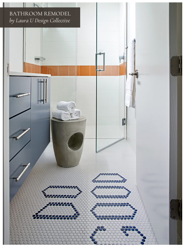
As you approach your bathroom remodel, seek out materials that will stand up to extreme fluctuations. They should be able to handle the dips and spikes in relative humidity. Each element should also be able to resist damage from dew-point humidity. Whether you are considering wallpaper for your bathroom walls or tile for the floors, bear in mind the unique challenges bathrooms pose.
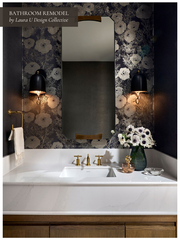
Keep in mind that while renovations are important for your own enjoyment of your home, they are also an investment. A bathroom renovation project investment should increase the value of your home, but this is rarely achieved without the use of quality materials.
#4 Have a Buffer in Your Budget
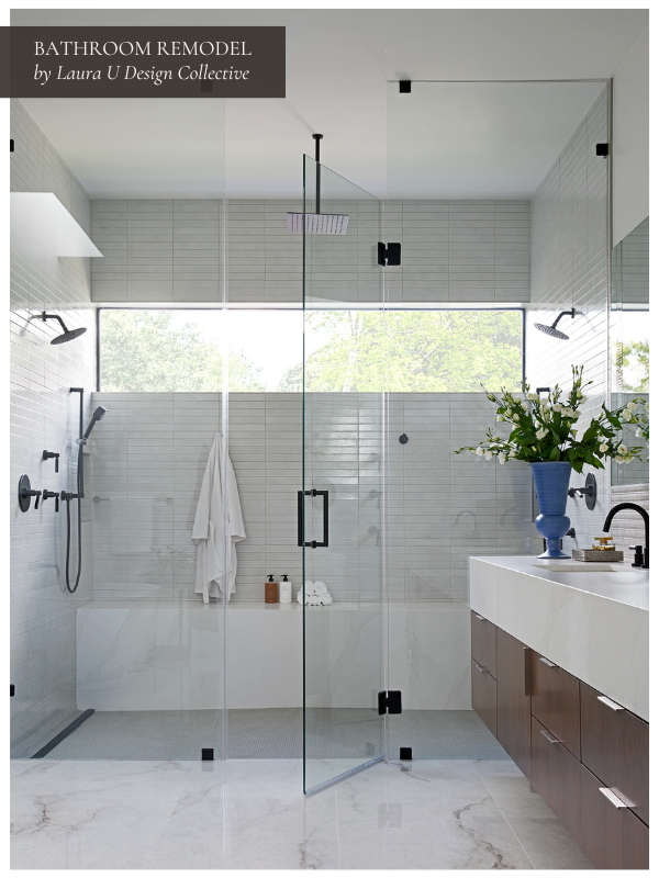
Bathroom remodels often exceed their budgets. This is especially true when completed solely by the owner without professional help. Many contractors, designers and other professionals recommend maintaining a ten to forty percent buffer in your budget to accommodate any unexpected up-charges.
In an article for Houzz, Erin Carlyle notes that “just 36% of remodeling homeowners hit their budgets in 2019.” 31% went over budget. Another 29% “had no initial budget at all.” To err on the side of caution, Carlyle encourages renovators to “buffer in an additional 25% of your costs on a remodel.” This should account for unexpected issues and keep you on track!
#5 Splurge On Something Truly Special
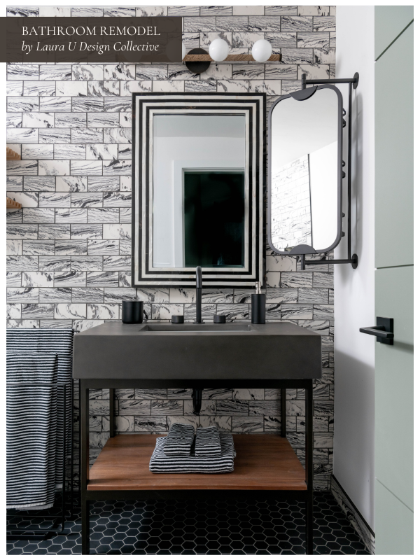
Last on our list of bathroom remodel ideas is to splurge on something truly special. Bathrooms are ideal for relaxing with candles, a glass of wine and an enjoyable book. You and/or your guests will likely be spending a fair amount of time in your remodeled bathroom. As such, consider splurging on items that make the space unique and truly special.
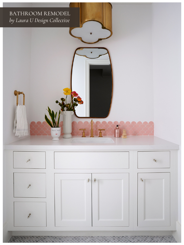
Many of the remodels described above went for enchanting Ann Sacks tiles or custom cabinets as their splurge. However, you could decide on a claw-foot tub, custom cabinetry, an intricately woven wall-covering or bookmatched finish marble.
We’d love to help you with your next bathroom remodel!
More Full Bath and Powder Bath Remodeling Inspiration from the LUDC Archives
