Pattern mixing is one of the best ways to make a home feel more personal, but it’s easy to lose control of the space if you make mistakes on scale, color palettes, and placement. A stripe, floral, plaid, block print, veined stone, or abstract artwork might be beautiful on its own, but once a bunch of them share the same space, they can compete for attention. All patterns must work together as well as with the architecture, the palette, the furniture, the art, and more.
This is your home rather than a showroom, so the goal certainly isn’t to make everything match. Rooms that match too closely feel more like model homes than interiors personalized to their residents. Every space needs contrast, texture, movement, and some asymmetry. When well-executed, mixing patterns provides all of those.
Designers typically start with the same basic considerations: color, scale, material, and placement. In an article for Elle Decor, Monique Valeris writes that textile designer Rebecca Atwood calls color “a great unifier,” noting that colors don’t have to match exactly, but they should relate to one another. In House & Garden, Evie Delaney quotes Kit Kemp saying that “scale is key in combining a multitude of patterns.”
From giving one pattern priority to paying close attention to the overarching color palette, below are a few of our tips for mixing patterns effectively.
Eight Simple Steps to Mixing Patterns Without Creating Chaos
Start with the Palette Instead of the Print
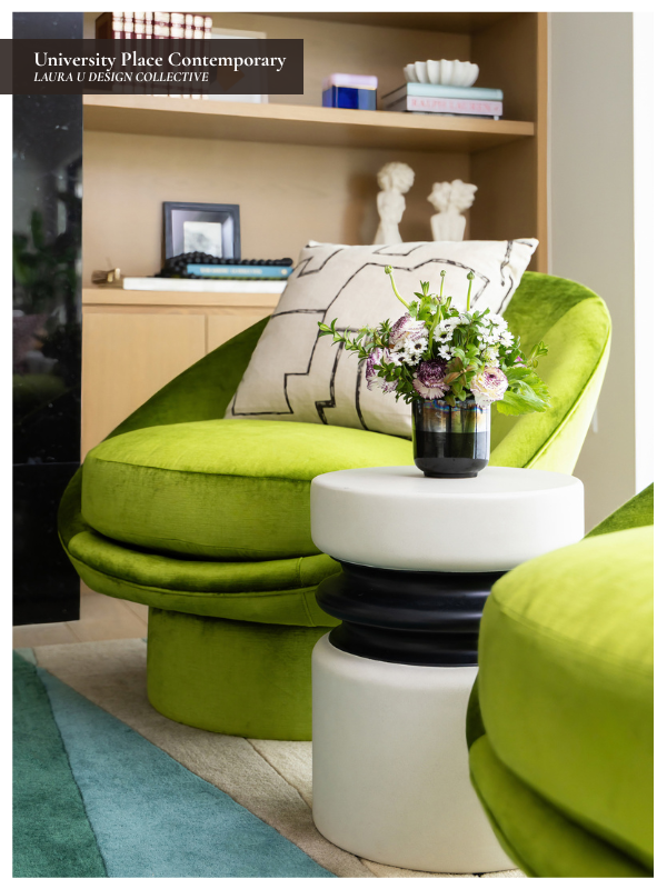
Before choosing a floral, stripe, plaid, or geometric pattern, establish the color palette for your space. Every fabric, rug, wallcovering, and pillow needn’t match exactly. In fact, overly matched rooms often feel flat and impersonal. But the colors should relate closely enough that the space feels intentionally layered rather than visually scattered.
In an article for House & Garden, Evie Delaney quotes Matthew Williamson, who recommends having “a clear palette in mind before you begin a project.” That is especially important when mixing bold patterns because color provides a framework. After you’ve selected the colors for your space, you can expand the variety of prints and patterns as long as you pull from the established palette.
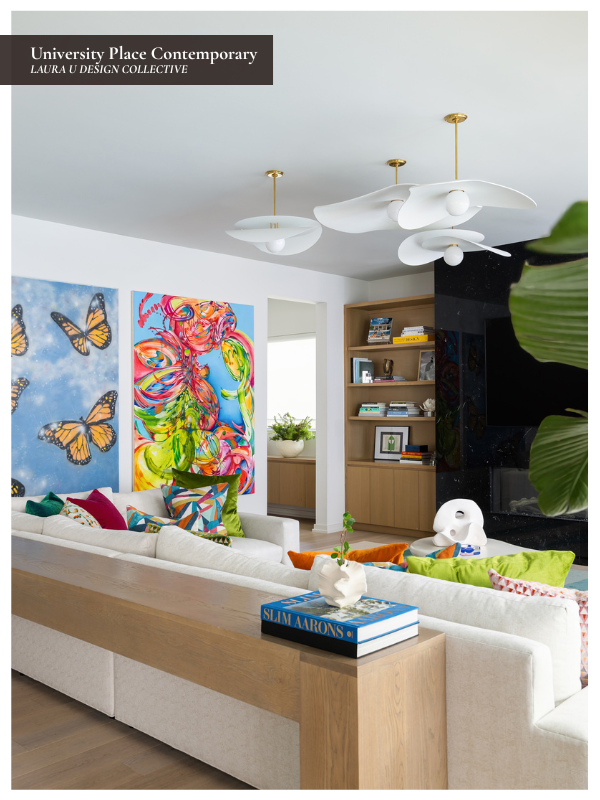
In our University Place Contemporary living room, the sofa provides a neutral foundation upon which color and pattern can be layered. The striped rug, geometric pillows, butterfly artwork, and abstract painting are all bold in different ways, but they share enough color to feel connected. Blue, green, coral, yellow, and ivory repeat across the textiles and artwork, which makes the space feel lively without becoming visually chaotic. It still feels curated.
If you are drawn to several patterns, place them beside one another and look first at the colors they share. A large-scale floral, a narrow stripe, and a small geometric may all work beautifully together if they repeat a few of the same colors. If each pattern introduces an entirely new palette, the room may begin to feel disjointed no matter how lovely each individual selection is.

Vary the Scale of Each Pattern
Pattern mixing works best when the patterns are not all the same size. If every fabric, rug, and wallcovering has a medium-scale repeat, the room will feel busy and crowded even if the colors are technically related. Our goal is to vary between large, medium, and small patterns so each one has its own role in the space.
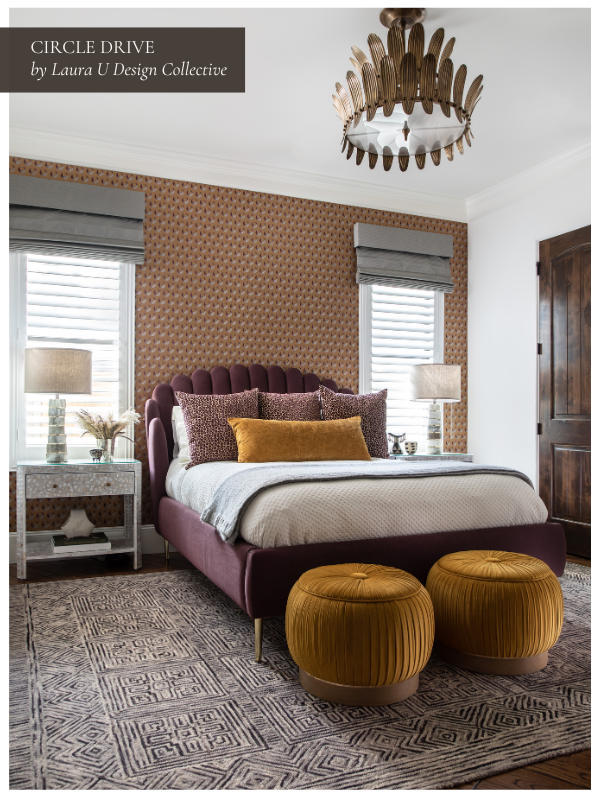
In the same House & Garden article, Evie Delaney quotes interior designer Honor Devereux, who says, “I like to mix up the scale and texture of patterns when layering them in a scheme. It allows each pattern to speak for itself without competing with one another.” In our Circle Drive lower guest bedroom, the wallcovering has a soft, repeating pattern that wraps the room, while the rug introduces a larger geometric design underfoot. The pillows and upholstered pieces add smaller points of texture and shape without overwhelming the bed. Because the patterns change scale from wall to floor to bedding, the room feels layered but still calm enough for a guest bedroom.
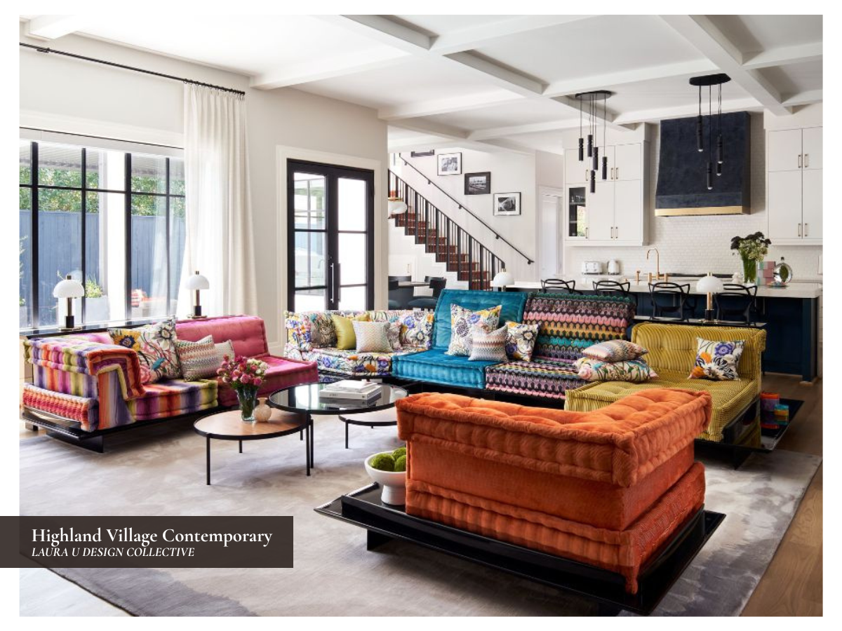
The same principle applies in bolder rooms. In our Highland Village Contemporary living room, the patterned Roche Bobois sofa commands attention, so the surrounding pieces have to be considered carefully. When one piece already has a strong, large-scale print, smaller patterns and solids around it help the room feel collected rather than chaotic.
Award One Pattern Priority
When a space hosts several patterns, one of them should usually take priority. That might be a wallpaper, a rug, a bold sofa, an upholstered headboard, or a piece of artwork. The other patterns can still have punch and personality, but they should support the strongest element instead of fighting for the same level of attention.
This is especially important when the lead pattern is large, colorful, or graces a large surface (like a backsplash, kitchen island, monumental art piece, or area rug). A patterned sofa, for example, has a very different impact than a patterned throw pillow because it occupies more visual space and is harder to change later.
If you are choosing a bold wallpaper, statement rug, or patterned upholstered piece, decide early on that it will be “the star”. Then choose the supporting patterns with that hierarchy in mind. A smaller geometric, a stripe, a woven texture, or a quieter print can still make the space more layered, but the room shouldn’t feel like every pattern is trying to be the centerpiece.

Remember That Pattern Is Not Limited to Fabric
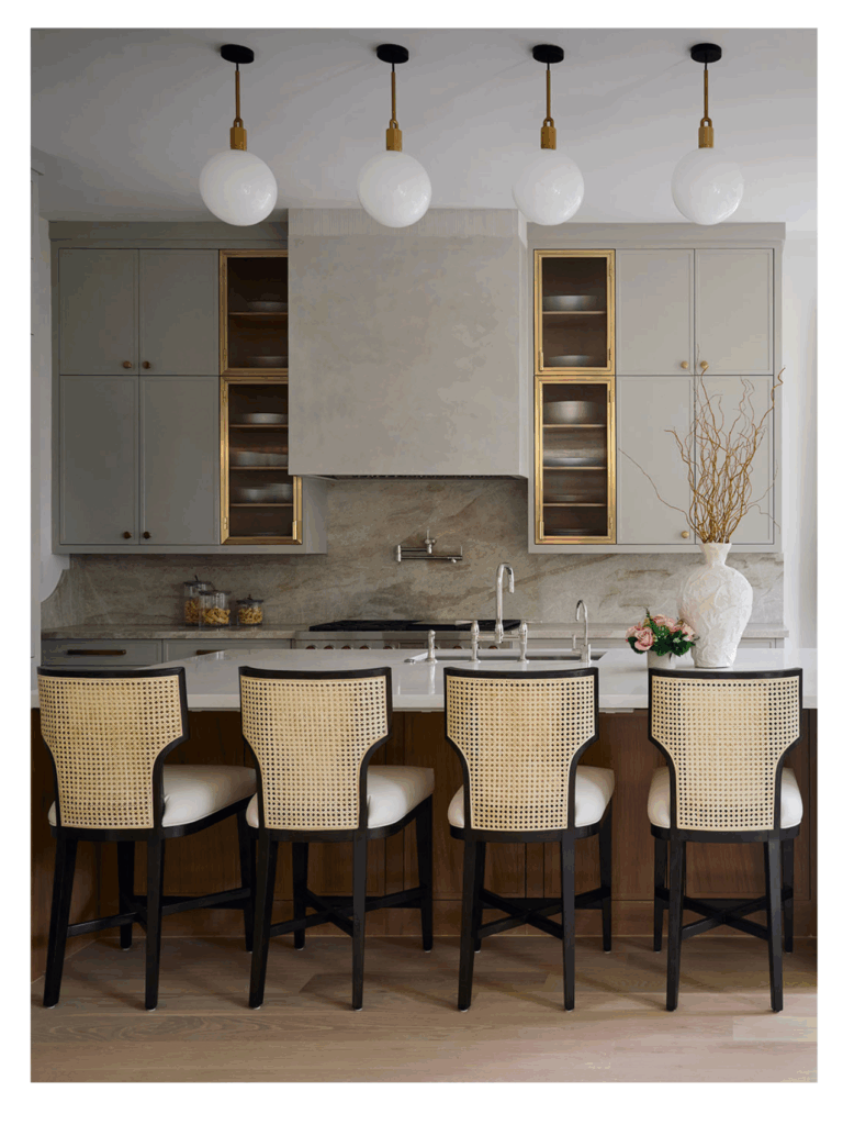
Pattern doesn’t always come from printed textiles. It can come from marble veining, tile layout, wood grain, caning, millwork, ribbed glass, wallpaper, lighting, or even the way architectural details repeat across the space. Once you start seeing pattern this way, it becomes easier to understand why a space might already feel visually active before you add another print.
Studio McGee makes a similar point in its pattern-mixing guide, noting that “a textural material, even if one color tone, can also be considered a pattern.” That’s especially true in rooms with stone, tile, plaster, woven materials, or detailed millwork. These elements may not look like pattern in the traditional sense, but they still affect how much information your eyes (and brain) must process as they move around the space.
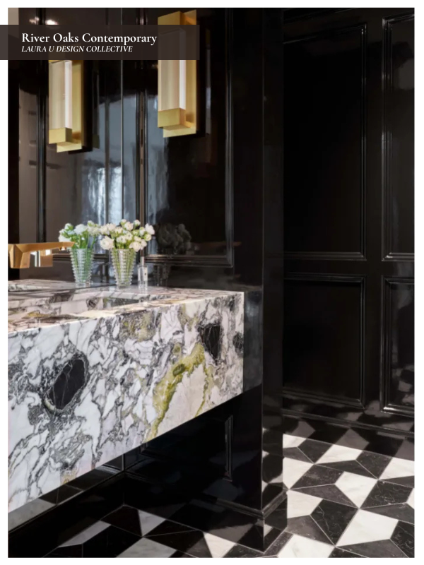
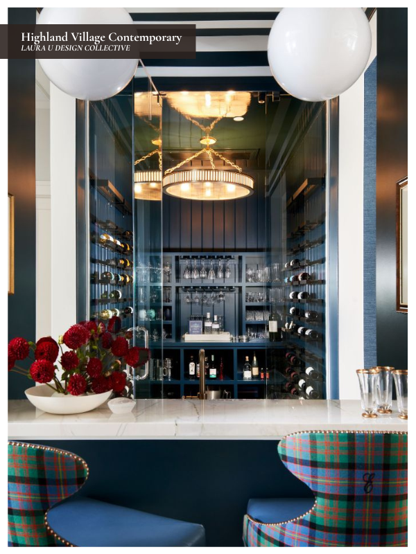
Our River Oaks Contemporary powder bath is a great example. The marble vanity, veining, wall finish, and floor pattern all contribute to the room’s visual texture. In the Highland Village Contemporary bar, plaid upholstery, striped ceiling treatment, reflective surfaces, and rich wood tones all participate in the pattern mix. Neither room relies only on printed fabric, but both show how material and architecture can create just as much interest as textiles.
Integrate Mental Pauses
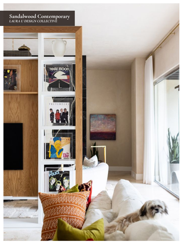
Pattern mixing works better when the space isn’t overwhelmed by it. Every surface can’t demand the same amount of attention at the same time if the patterns differ. Of course, this “rule” doesn’t necessarily apply to pattern drenching, where the same pattern occupies a large majority of surface space. In most cases, a solid sofa, a natural fiber rug, a clean lampshade, a plain drapery panel, or a neutral wall color provides the necessary support.
In House & Garden, Evie Delaney quotes Honor Devereux, who recommends creating “somewhere for the eye to rest,” even if that pause is provided by a small detail like solid trim. This is especially important in rooms with patterned rugs, wallpaper, pillows, and artwork because the non-patterned pieces are what keep the space from feeling overworked.
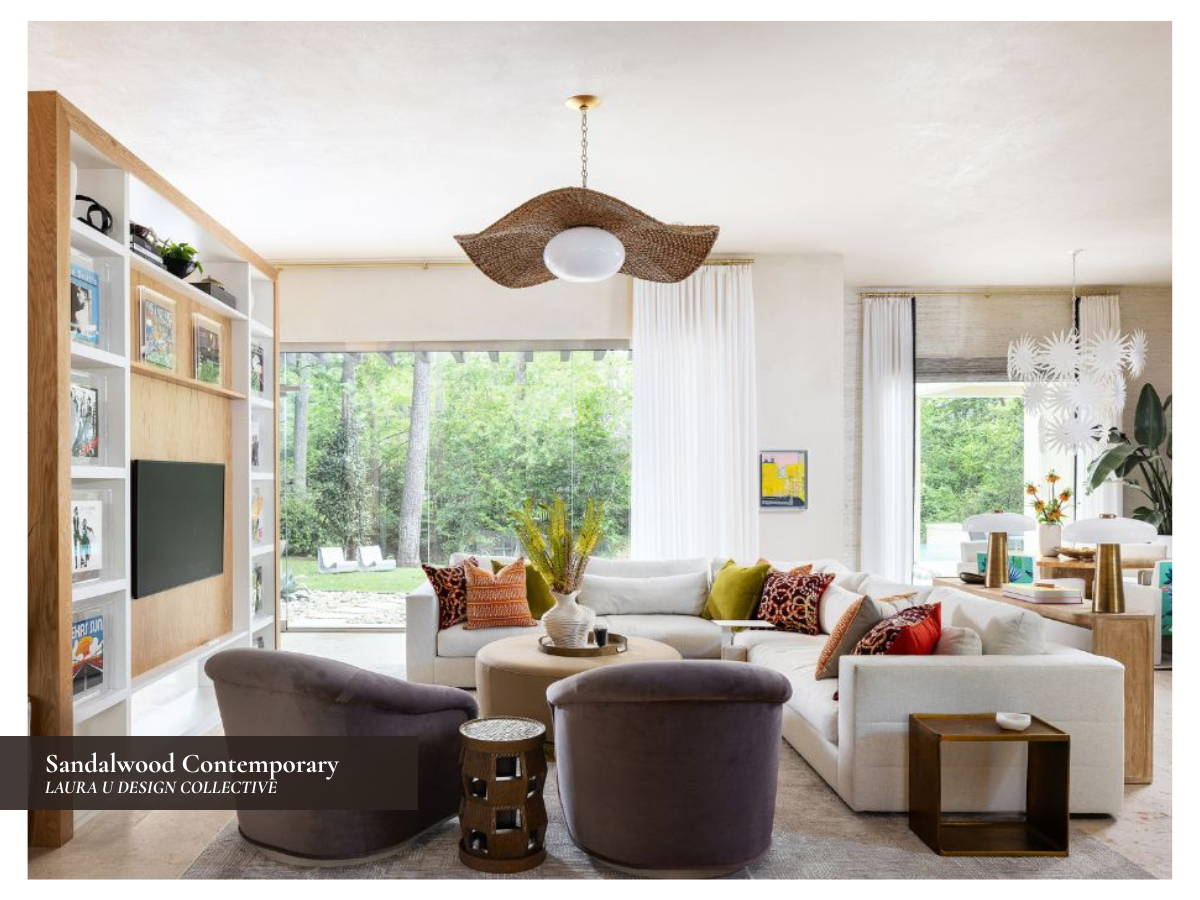
In our University Place Contemporary living room, the sectional, coffee table, and lighting are essential to the overall balance of the space. The artwork, rug, and pillows bring plenty of color and pattern, but the larger pale surfaces prevent the room from feeling crowded. The same idea applies in our Sandalwood Contemporary living room, where soft upholstery, neutral walls, and sculptural furniture ensure the patterned accents and artwork feel deliberate rather than excessive.
If a space feels too busy, you might not need to remove every pattern. If your eyes are constantly darting around instead of calmly gliding from one zone to the next, start by looking for that missing “pause”.
Start with Smaller Patterned Pieces If You’re Nervous
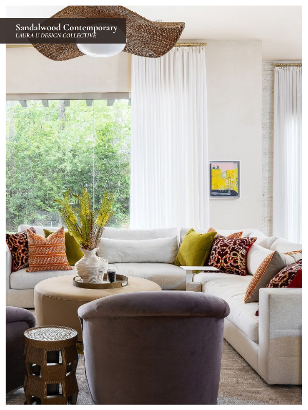
If you are hesitant about mixing several patterns in one room, start with the pieces that are easiest to change. Pillows, lampshades, bedding, small rugs, benches, and breakfast nook cushions give you a chance to experiment before committing to wallpaper, custom drapery, stone selections, or a patterned sofa you will live with for years.
Studio McGee takes a similar approach in its pattern-mixing guide, noting, “We love to keep the staple pieces subtle and timeless, and incorporate seasonal and trending patterns and colors through pillows, textiles, and rugs.” The highest-commitment pieces in a space typically need to last the longest. A sofa, built-in, or custom wallcovering should not be chosen with the same mindset as a pillow you might swap in a few months (or next week).
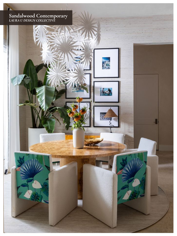
Our Sandalwood Contemporary living room and breakfast nook show how smaller patterns can still affect the full space. This space isn’t patternless by any means, but the larger furniture pieces and architectural elements are well controlled while pillows, upholstery details, art, and decorative objects bring in more variation. That approach gives the room personality without requiring every major surface to participate equally.
This is also a good way to learn what you actually like living with. A pattern that feels exciting in a showroom might feel too loud once it is in the room where you drink coffee every morning. Starting smaller allows you to test color, scale, and contrast before making a more permanent decision.
Repeat Without Making Everything Match
Repetition is important, but it shouldn’t make your space look overly coordinated. You can repeat a color, a material, a shape, a line, or a motif without using the exact same fabric on every pillow and curtain panel. You want to create enough relationship between the pieces that the room feels intentionally designed rather than assembled from unrelated decisions.
In her interview with Elle Decor, Rebecca Atwood says, “Pattern is really personal, because it tells your story.” Pattern can reflect artwork collected over time, a favorite color family, a textile brought home from travel, pieces inspired by your heritage, or just your aesthetic preference.
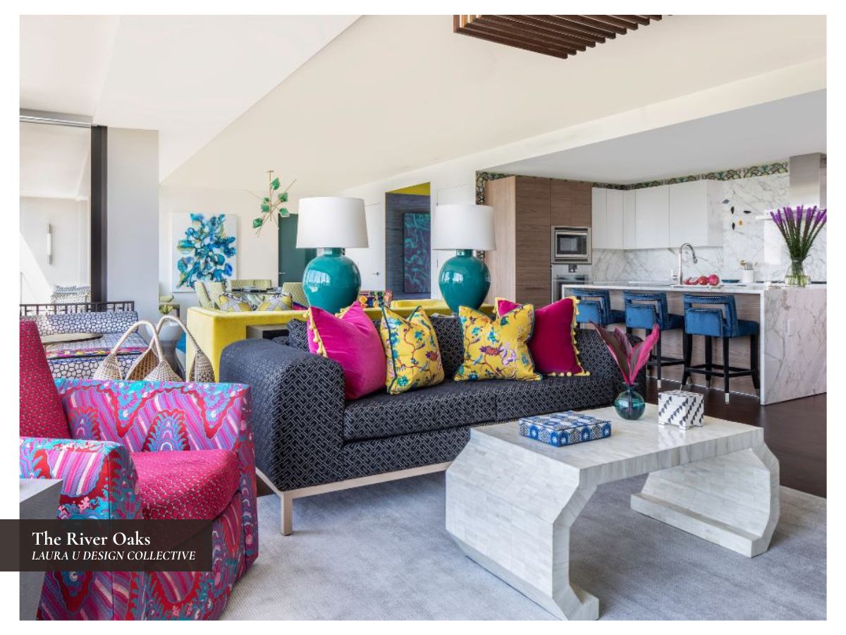
The River Oaks living area is a strong example of repetition without strict matching. The yellow chinoiserie pillow, magenta velvet, blue-and-white tray, patterned upholstery, turquoise lamp, and decorative accessories all bring different colors and surfaces into the room. They don’t match exactly, but the colors share a certain saturation and polish, so the grouping feels deliberate.
If you are working through your own space, look for connections rather than identical pairs. Maybe the rug repeats a color from a painting on the wall. Maybe a lampshade picks up the color of threads in surrounding upholstery. Maybe a stripe relates to fluting, paneling, or another architectural element. Those small connections are often enough to create cohesion.
Edit the Space as a Whole
Pattern selections should be made in the space itself rather than on a sample table alone. A wallpaper, rug, fabric, or pillow might look beautiful by itself and still feel wrong once placed near the furniture, art, lighting, and architecture. Before adding another pattern, step back and look at the full room.
Bedrooms are an excellent place to practice because pattern can accumulate quickly through wallcovering, rugs, bedding, pillows, window treatments, and upholstery but tranquility is absolutely key. In our Circle Drive lower guest bedroom, the wallcovering, rug, headboard, pillows, and ottomans all contribute pattern or texture. The palette is still controlled, though, and the patterns vary in scale, which helps the room feel layered rather than overworked.
Taking a photo of the room can help, too. Sometimes the pattern causing the issue is easier to identify in an image than it is while standing in the space. If one element speaks far more loudly than everything else, the solution might be to reduce contrast, simplify the surrounding pieces, change the scale, or remove the pattern that feels least connected to the rest of the space.
Create a Layered Home with Laura U Design Collective
Pattern mixing should make your home feel more personal, not more confusing. Once the palette is clear, the scale is varied, and one pattern takes priority, the space can handle far more visual interest than we expect. Art, rugs, upholstery, stone, tile, pillows, and wallcoverings can all participate as long as they are considered together. Of course, a designer’s eye is often what separates a successfully pattern mixed space from a chaotic, confusing one.
At Laura U Design Collective, we approach pattern as part of the full design composition. We consider how each selection relates to the architecture, furniture plan, artwork, material palette, and the way each room will be used. When those relationships are carefully managed, pattern can add energy, depth, and personality without overwhelming the home or its residents.
If you are renovating, furnishing a new home, or rethinking a space that feels too flat or too busy, our team would love to help you reimagine it with the right balance of pattern, texture, color, and personality.