A home should shift with the seasons but not through constant overhauls. Subtle adjustments that keep it feeling current are usually all you’ll need. Autumn is often linked to richer palettes like walnut browns, moss greens, and muted purples. Though these can feel overly thematic when interpreted too literally, when applied more thoughtfully, those same shades can make just as much sense in spring or summer.
The key is to select fall colors with depth, consider contrast, and select textures that work well. The colors you select should feel warm and inviting as the days shorten, yet still balanced and fresh in the warmer months. Think of these shades as modern classics that infuse your spaces with seasonally-appropriate character in the fall and adapt easily to new textiles, art, and accessories throughout the year.
Below, we share the colors we return to most and how to use them in ways that feel timeless, whatever the season.
Fall Interior Colors That Work Year-Round
Reliable Neutrals Like Navy, Prussian Blue, and Midnight Teal
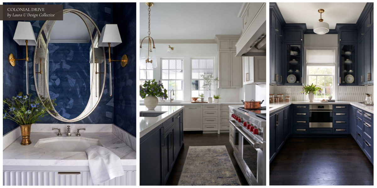
Navy is the closest thing to a year-round neutral you’ll find. It’s also one of our favorite alternatives to black; navy is dramatic but not severe, classic but not predictable. It also happens to work beautifully in both traditional and contemporary settings. Colonial Drive is an excellent example, where we used Benjamin Moore’s Hale Navy HC – 154 in the kitchen and butler’s pantry. Paired with paler colors like Little Falls, Revere Pewter, and Oxford White, this navy is incredibly versatile.
The secret to navy’s longevity is partially how well it can contrast with other materials, tones, and textures. Pair it with brass or polished nickel for a more formal feel, or layer it with pale neutrals like ivory and stone for a softer, more transitional look. Add coral or mustard accents in summer to brighten a space, and complement with any of our favorite fall textures to cozy it up during autumn.
Where We’ve Used Navy at LUDC
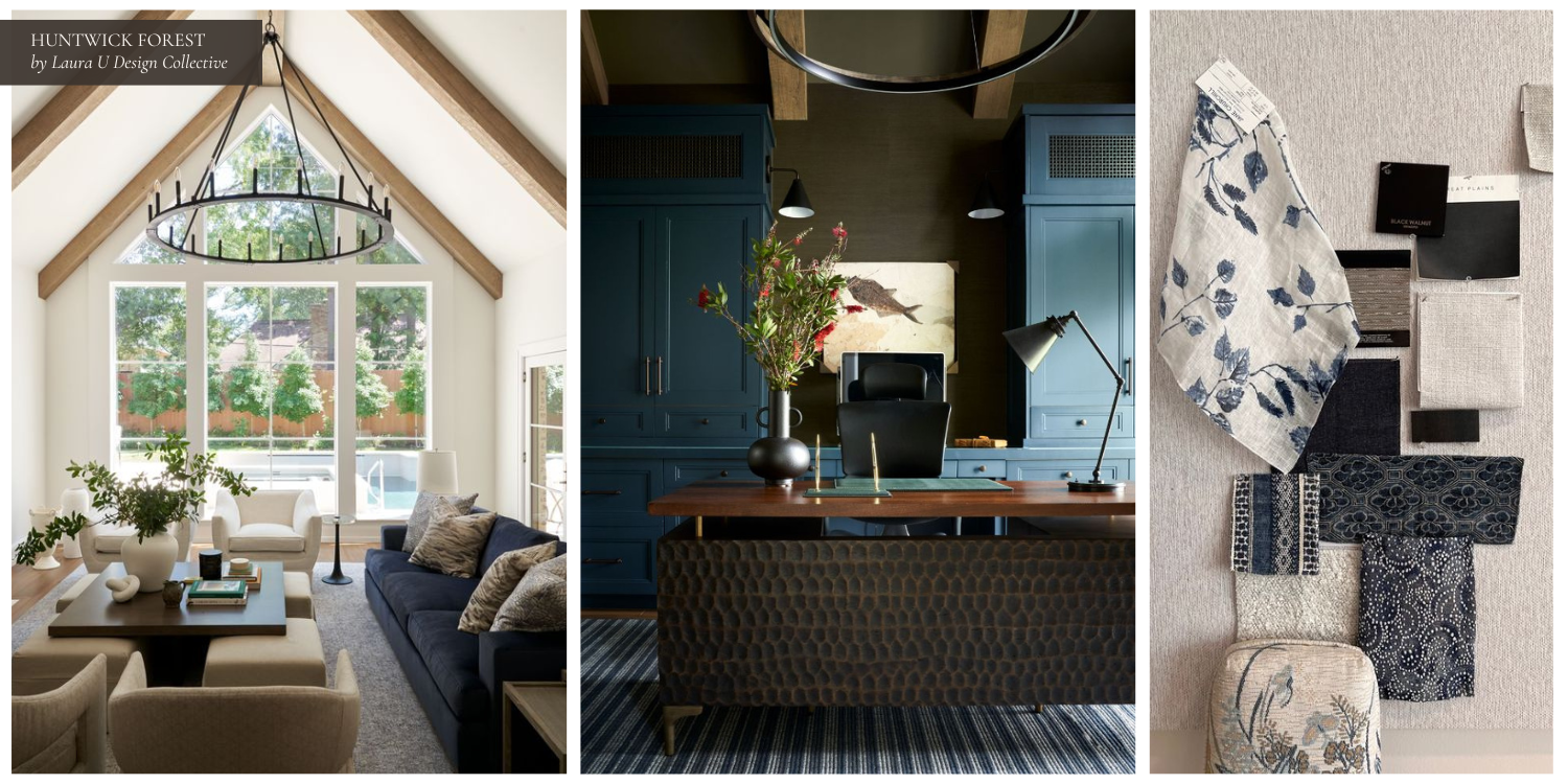
At Huntwick Forest, we used navy in two very different ways. In the study, built-in cabinetry in a saturated blue sets the tone for a room that’s tailored and masculine. The darker color sits comfortably beside the natural wood beams and textured wallcovering, and the overall effect is more tactile than overly polished.
The living area employs very similar colors and textures, yet it achieves an entirely different atmosphere due to the balance of tones and proportion in their applications. Light is the dominant feature here, and most of the palette is pale and quiet. A navy sofa punctuates that. It introduces contrast, keeps the space from drifting into monotony, and works with other darker pieces like the table to give the room structure.
Warm Wood Tones Like Walnut and Chocolate
Few materials add as much depth and character to a room as rich walnut or deep chocolate-stained wood. These tones are naturally warm, which makes them feel especially fitting in fall, but they’re also remarkably adaptable. They shift easily with the seasons through changes in light, textiles, and accent colors.
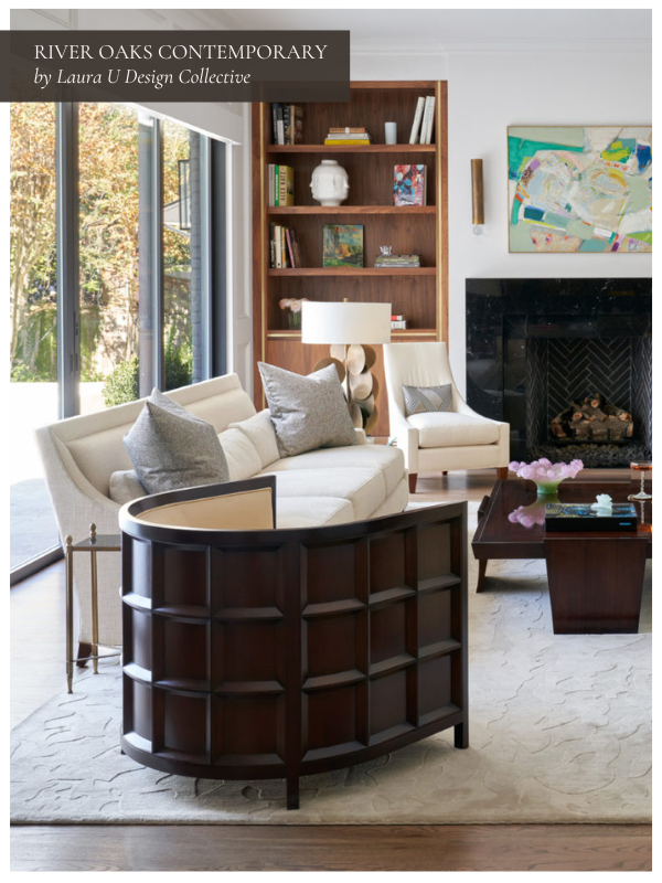
Whether expressed through architectural details or statement furniture, deep brown wood has a timeless quality that few can replicate. It adds texture and warmth to a room when the weather cools, and, as shown above at River Oaks Contemporary, it feels just as natural beside breezier palettes when warm weather arrives.
Where We’ve Used Chocolate and Walnut at LUDC
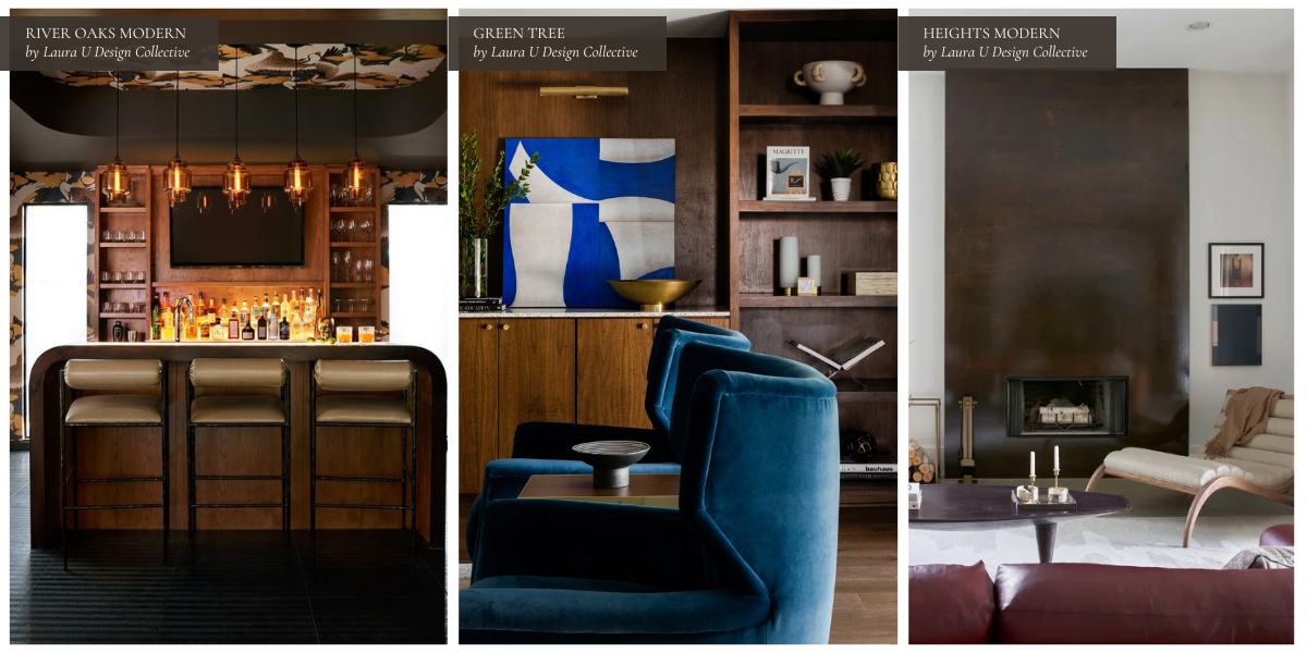
In Heights Modern, a floor-to-ceiling fireplace surround finished in a dark, burnished brown becomes the central visual element in the living space. Its tone feels right at home against layered neutrals and soft textiles in cooler months, but it’s equally compelling in summer when paired with lighter upholstery and natural greenery.

At Green Tree, walnut millwork defines a study that balances richness of material with design restraint. Paired with saturated upholstery and bold art, the wood’s tone lends the room a sense of permanence while still leaving room for seasonal change.
The bar at River Oaks Modern takes the boldest approach thus far. Walnut cabinetry wraps the space and complements brass lighting, patterned wallpaper, and amber glass shades. The palette feels layered and inviting as temperatures drop, yet its mix of materials and finishes ensures it never feels too thematic. What more could you want from a moody home bar?
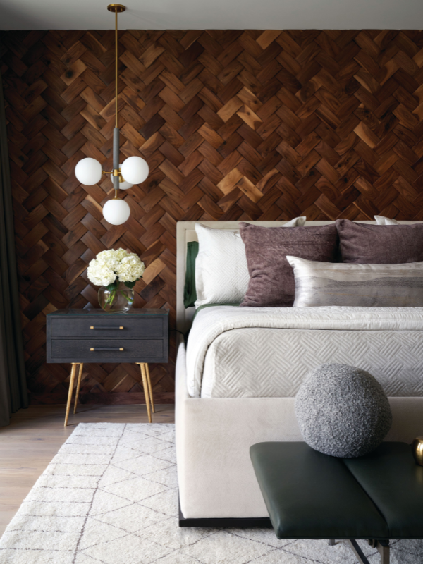
Earthy, Enduring Greens Like Moss, Olive, and Hunter
Any tones that draw from nature will be timeless and blend easily from season to season, which is why greens are among the most versatile colors you can use. Of course, the trick to using green is embracing its range; for fall, we love enduring greens like moss, olive, and hunter. They’re strong and bold enough to work well in richer palettes for cooler months and pair just as easily with lighter, airier colors during spring and summer.
Where We’ve Used Olive and Hunter at LUDC
In the guest bedroom pictured above, layered greens keep the palette calm and composed without making the space feel overly seasonal. Velvet pillows, a plush coverlet, and a soft rug from Nordic Knots warm the space, while a mix of materials keeps the look relaxed enough for warmer months. Combining different silhouettes and shapes also helps make this space feel timeless; try pairing curved silhouettes with tailored, masculine lines for an interior that bridges seasons.
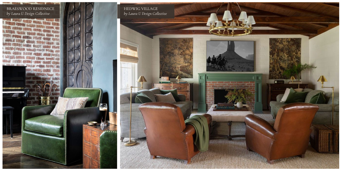
Though we don’t use greens as much as blues, beiges, grays, and browns, they do have a place in our interiors, especially when drawing from our clients’ heritage or love of nature. At Braeswood Residence, deep green leather chairs make a room built around brick, wood, and blackened steel feel rich and inviting. They feel substantial in fall and winter yet still connected to the outdoors when light and seasonal greenery return to this home’s surroundings.
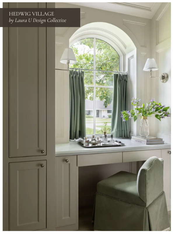
The living room at Hedwig Village shows how green can bridge traditional and contemporary elements. Olive upholstery and a painted mantel pair comfortably with warm leather and textured neutrals to create a space that’s as inviting in October as it is in May. In the main house, you’ll find paler greens assigned to velvet-upholstered chairs, bedspreads, drapes, and entire walls.
Unexpected Yet Timeless Tones Like Dusty Purple and Plum
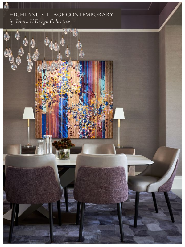
In an article for Elle Decor, Julia Cancilla advocates for “sexy, deep tones such as burgundy, plum, and mocha” this fall and we couldn’t agree more. Dusty purples might not be the first hues that come to mind when designing a fall palette, but they have a surprising level of sophistication and depth that more predictable autumnal tones can’t match. In our Highland Village Contemporary dining room, a dusty purple dining room feels moody and dramatic without ever tipping into dark or gloomy, which makes it a stunner no matter the season.
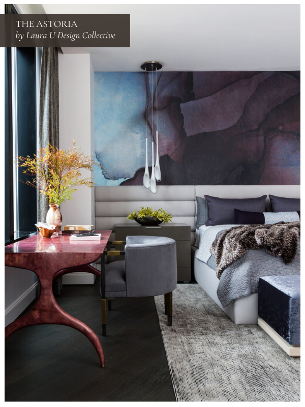
As shown above at The Astoria, these colors are most effective when paired with neutrals like warm taupe, sand, or dove gray and similar colors (pink, cooler purples, navy blue) that contextualize them. They also layer beautifully with metallics; try brass lighting or an antiqued mirror to make these colors feel even more magical. Be aware that because mauve and plum are inherently complex colors, they also read differently in changing light. This means that they evolve gracefully from season to season, but it also means that other colors should be chosen carefully to ensure the palette works well no matter what.
Modern Classics Like Charcoal
Charcoal is another one of those rare shades that works in almost any context. It’s softer and more forgiving than black but still adds definition and depth to any interior. It feels tailored and sophisticated in darker spaces and quite contemporary in lighter, more minimal ones, which is why we reach for it so often.
For fall and winter, charcoal pairs beautifully with warm-toned metals, cozy textiles, and saturated accents. Think wool throws, rust or ochre pillows, or a deep burgundy rug. In spring and summer, the same color works just as well when paired with crisp whites, pale woods, and airy linen. Swapping heavy layers for lighter ones allows charcoal to recede slightly and act as a cool, neutral backdrop for brighter, fresher details.
Where We’ve Used Charcoal at LUDC
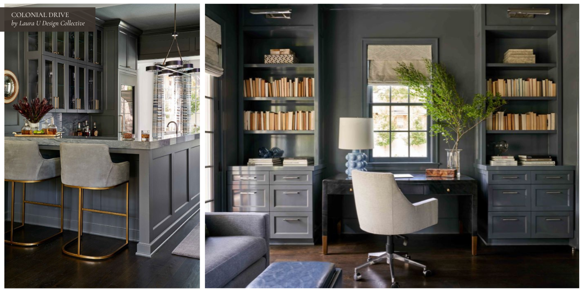
At Colonial Drive, we used charcoal in two ways. The bar, painted in Benjamin Moore’s Kendall Charcoal HC-166, feels intimate and dramatic. Guests will adore this space no matter the season, but it feels especially apropos during the colder months when layered with polished brass, moody lighting, and richly veined stone. In the nearby study, Sherwin Williams Wall Street 7665 feels equally refined when set against sleek furnishings and warm woods. The space is sophisticated but not overly formal.
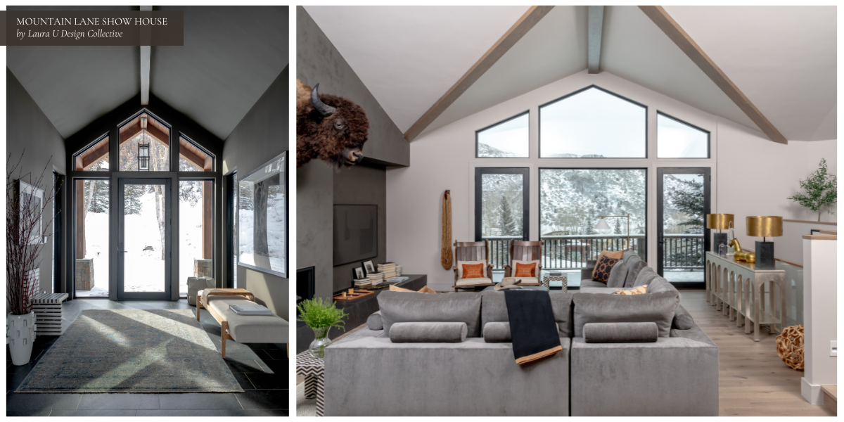
Our Mountain Lane Show House in Aspen is dark and moody, but also captures charcoal’s lighter side. A gray sectional and soft gray walls make the living room feel calm and contemporary, while the same tone in the entryway frames expansive mountain views without competing with them. When styled with cozy layers and darker accents, these spaces feel seasonally appropriate in winter; swap in breezy textiles, fresh greenery, and lighter woods, and they transition effortlessly into warmer months.
Final Thoughts: Build Your Palette with Longevity in Mind
Designing with fall tones doesn’t mean committing to a short-lived seasonal palette. With the right hues, your interiors can feel cozy and inviting in October and just as fresh and sophisticated in May. These colors work because they’re timeless, not trendy. They evolve with your space, your decor, and the seasons. If you believe that the best design decisions are the ones that stand the test of time while capturing your unique personality, reach out to our team at Laura U Design Collective.