Last week, we introduced you to Viscaino, a 7,500 sq. ft. home atop the California coastline. Befitting the impressive art collection within, the home’s style is modern and balanced. But it wasn’t always this way. At purchase, the home was more traditional and staged for sale. It lacked storage. The master bath needed a complete overhaul. The kitchen needed to be functional and accommodating for a family of five. And the communal spaces were meant to host large gatherings and intimate dinner parties alike.
Our scope of work included a full cosmetic renovation in which we collaborated with Groza Construction. This partnership was essential to successfully accomplish a project of this scale from afar. The renovation ranged from new paint throughout to adding a loft space in one of the girl’s bedrooms. We were responsible for all furnishings, finishes, and fine art advisory.
A Modern Home Before and After
For today’s Transformation Tuesday, we are sharing a before-and-after comparison of Viscaino. The home was originally built in 1962. In 2016, it underwent a massive renovation to modernize the structure. When we were brought into the project in 2018, we were amazed at how beautiful the home was. It was definitely loved.
The exterior is an inviting and bright white. A large courtyard greets visitors, ushering you to the front doors. And inside, you will find a home that embraces comfort and color, all while communicating the personalities of the homeowners.
The Master Bath
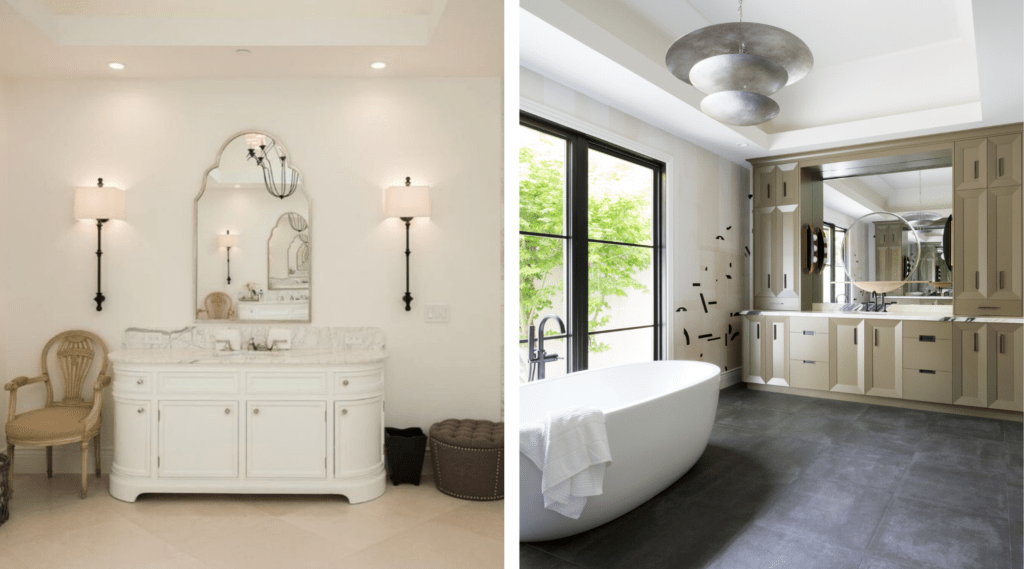
The master bath as a whole – we really went for it. One of the biggest risks within this space was selecting a dark, large-format stone tile. The space overall was very light before, so this selection could have caused the room to feel heavy. Instead, it makes the space sing and ties in with the new matte black plumbing selections and striking black veining in the vanity countertops. This was quite a departure from the original finishes and resulted in a moody en-suite that now exudes a spa like escape for our clients.
The Conservatory
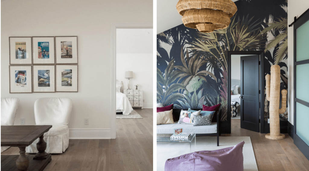
The conservatory brings the outdoors in with the playful, yet sophisticated Phillip Jeffries wallcovering. This space was designed for the girls to have a hangout space of their own. The wall opposite of the windows was completely re-imagined and now has ample storage with custom millwork and barn doors to allow for privacy.
The Dining Room
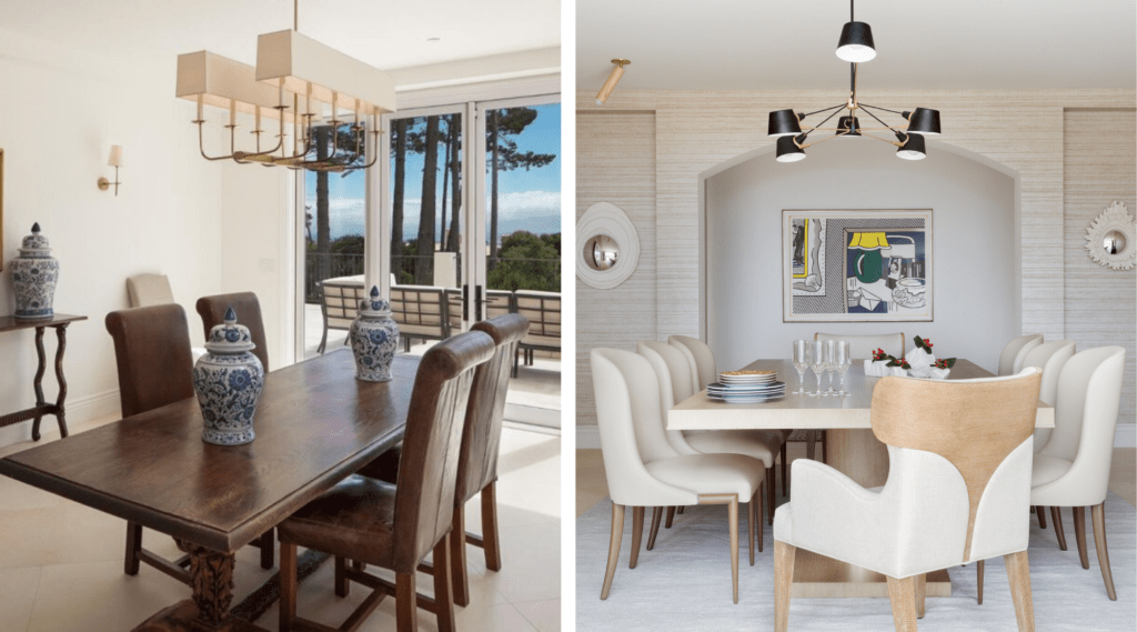
The dining room explores neutral tones and textures through the pairing of a tonal wallcovering, plaster convex mirrors, and cerused oak finishes on the table from Century Furniture. The Theodore Alexander host chairs add to the curves in the room. The client’s Roy Lichenstein hangs in the back wall, ready for any conversation.
The Formal Living Room
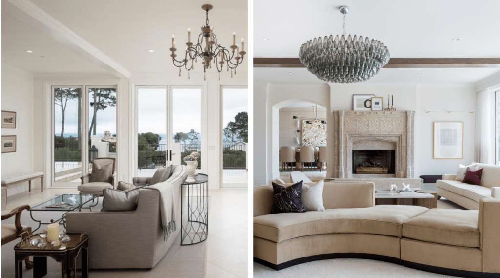
The anchor of the formal living is the custom serpentine sofa that both connects the room, but also allows for separate conversation and sitting areas. Our clients love to host, so having spots for candid talks and group gatherings was a must. We re-designed the existing beams to be more impactful, added a Venetian plaster to the walls to create depth, added a custom burl wood cabinet that balances the tones and scale of the existing stone fireplace surround.
The Master Bedroom
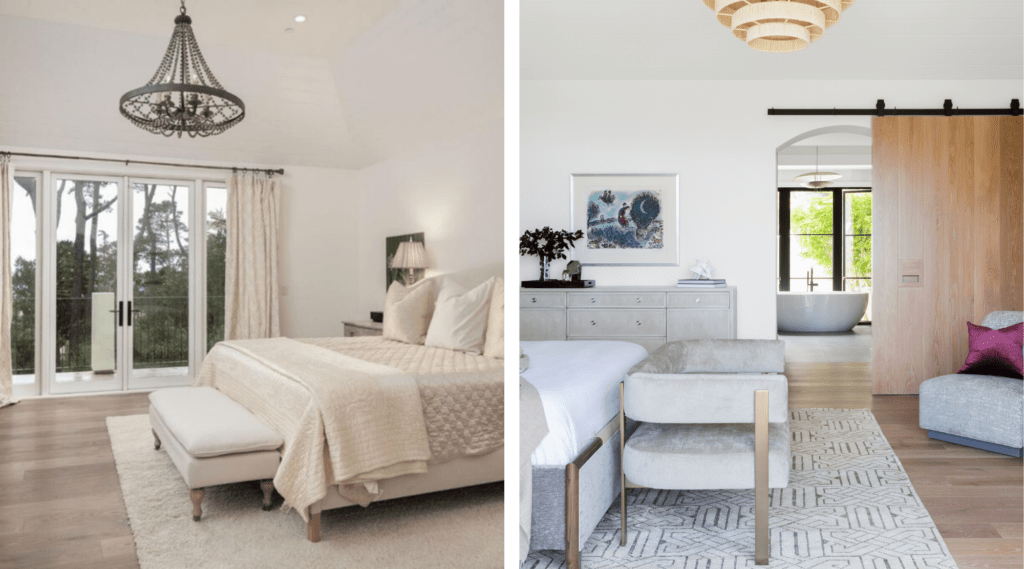
The master suite is the study of modern serenity through the utilization of subdued and contrasting neutrals. The rug is a hand knotted silk/wool blend with a geometric motif, a theme we carried into the bath. A Marc Chagall hangs above a bleached oak dresser. Every room needs something treasured, timeless, or inherited.
The Kitchen
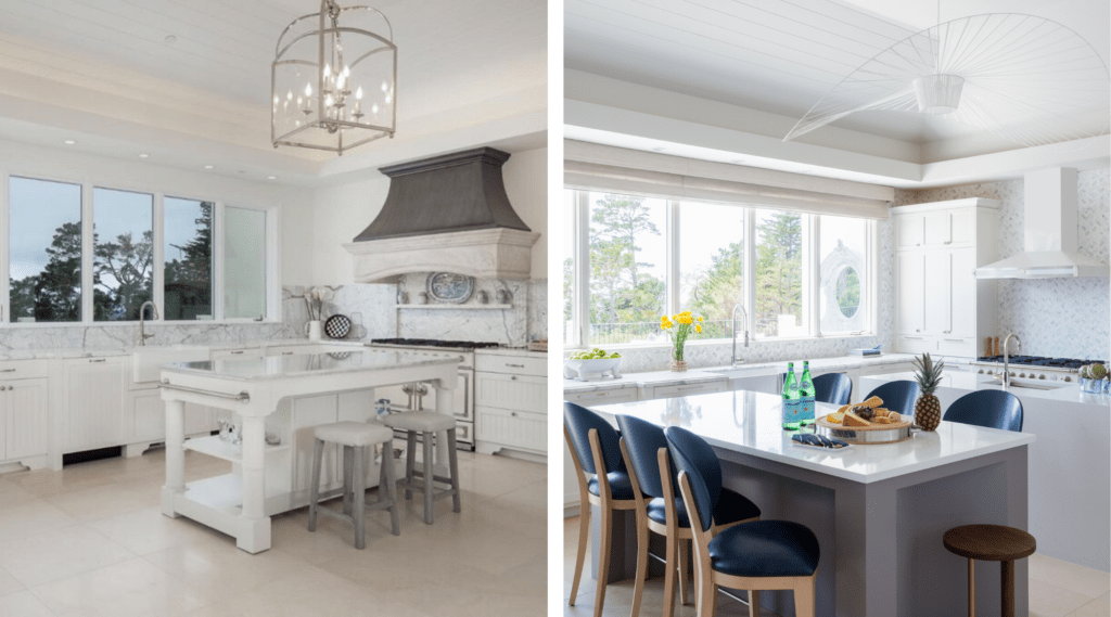
Reconfiguring the kitchen to accommodate a working island and an eating island was imperative to our client’s active lifestyle. Custom-finished Berman Rosetti counterstools provide ample, yet stylish seating and introduces the blue tones seen in the adjacent family room and powder bath. Using an Ann Sacks marble mosaic allowed for the use of cool and warm tones throughout the space.
To tour Viscaino, visit our Portfolio.


