

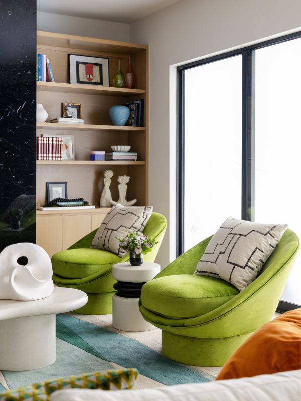
Vincent Van Gogh once said that “one can speak poetry just by arranging colors well” and we couldn’t agree more! The soft hues of blush and lilac speak to a feminine, airy space. Grays, creams and brown hues are very earthy and warm, while blues are calming and soothing.
Learning how to select colors that represent our client’s personality and then blending them to create the perfect background for the space is always so much fun, especially when it comes to using bold colors. Whether you’re using them on the ceiling or as an accent wall, color adds an extra visual dimension to the room.
Here are a few of our favorite Laura U Design Collective projects that use daring, eye-catching color pairings beautifully.
Bold Color Pairings That Make A Sophisticated Statement
Blue and Green
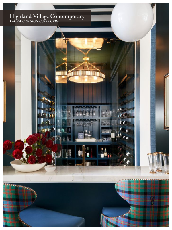
You might think that blue and green are too close to each other on the color wheel to work well, but if you throw in a complementary color like red (the direct opposite of green), it makes perfect visual sense! For proof, look no further than the bar of our Highland Village Contemporary project, which features sleek blue walls and stools upholstered in a punchy blue, green, red, and yellow plaid.
We especially love how the plaid upholstery brings the whole palette together. Plaid, tartan, and checked fabrics have such a long history in interiors, and they’re still relevant today because they can add texture, structure, and heritage all at once. In this bar, the custom plaid gives the space a worldly, collected feel while still appearing entirely crisp and contemporary. The pattern pulls from the surrounding blue millwork, adds green for depth, and brings in red and yellow so the room feels lively instead of matchy-matchy.
The HVC bar shows us that it doesn’t take equally sized blocks of color to successfully pair different hues in the same space. In this bar, the blue walls, blue bar front, blue wine storage, striped ceiling, and blue stool seats initially dominate the room; it’s almost monochromatic. Because this blue envelopes the space, it creates an almost-neutral backdrop for the green, red, and yellow of the stools’ upholstery. That cohesive background lets us use equally saturated colors in smaller doses without making the space feel chaotic.
Dusty Purple and Taupe
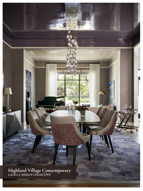
Sometimes, variations in sheen are all it takes to make a calm space spectacular. Nowhere is this more true than in our Highland Village Contemporary dining room.
Dusty purple and taupe are fairly subdued colors on their own, but changing the finish completely changes how they interact with one another. The lacquered ceiling reflects light throughout the room and gives the purple a depth that a standard painted ceiling could never achieve. Against the more matte taupe wallcovering, the contrast feels sophisticated rather than dramatic.
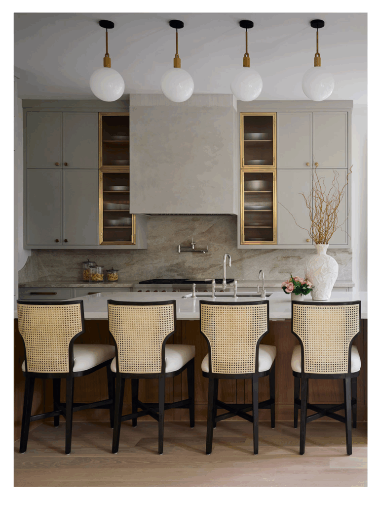

The room also demonstrates that bold color doesn’t always require high contrast. Here, the walls, ceiling, rug, and upholstery all belong to a similar tonal family. The variation comes from the way those materials reflect light. Combined with the sparkle of the chandelier and the vibrant artwork, the result is a dining room that feels layered, polished, and memorable without relying on bright colors to make its statement.
Highland Village Contemporary was shortlisted for the Interior Design Scheme, Americas Award in The International Design & Architecture Awards 2025, and this dining room shows exactly why.
Cobalt and Citrine
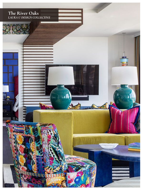
Cobalt and citrine are both highly saturated, so pairing them requires a little confidence and a lot of balance. At The River Oaks, a high-rise home we designed as a vibrant city retreat for empty nesters, those two colors set the tone for the entire living space.
Though low-profile, the cobalt coffee table is bold enough to command everyone’s attention, but the citrine velvet sofa prevents the room from skewing too cool. Together, they create a playful, energetic pairing that feels right at home in a residence defined by art, pattern, and personality. The teal lamps, cobalt barstools, graphic rug, and colorful pillows repeat those saturated tones throughout the room, so the varied palette actually feels cohesive instead of jumbled together.
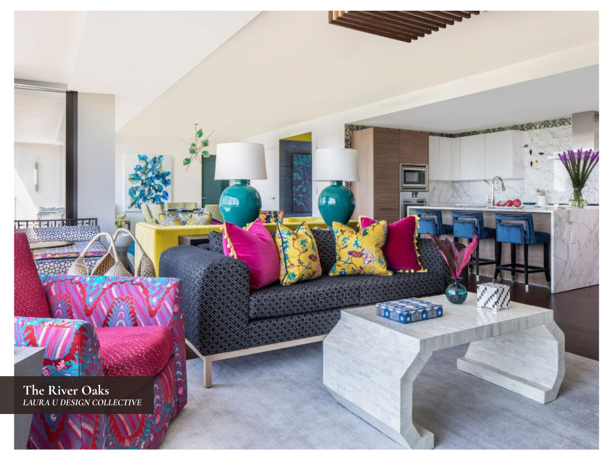
What makes this pairing especially fun is that The River Oaks is entirely unapologetic; it’s lively, it’s loud, and we love it! The home embraces bright color, intricate pattern, and an eclectic point of view from room to room. Against the walnut cabinetry, white marble, and black-and-white rug, the cobalt and citrine feel daring but they make perfect sense. This space embodies a little Bauhaus irreverence, a little Memphis flair, and a lot of personal joy.
Blue and Berry Red
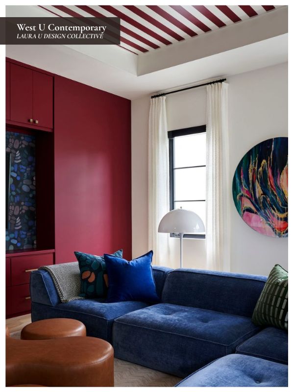
Blue and berry red are a classic pairing, but in the game room of our West U Contemporary project, that combination feels fresh, graphic, and full of personality. This room was designed for a young family with two children who needed space for games, hobbies, crafts, and everyday lounging, so the palette had to feel energetic without losing the comfort required of a family room. We also wanted to ensure it flowed visually with the rest of the home instead of feeling too much like a “kids’ room”.
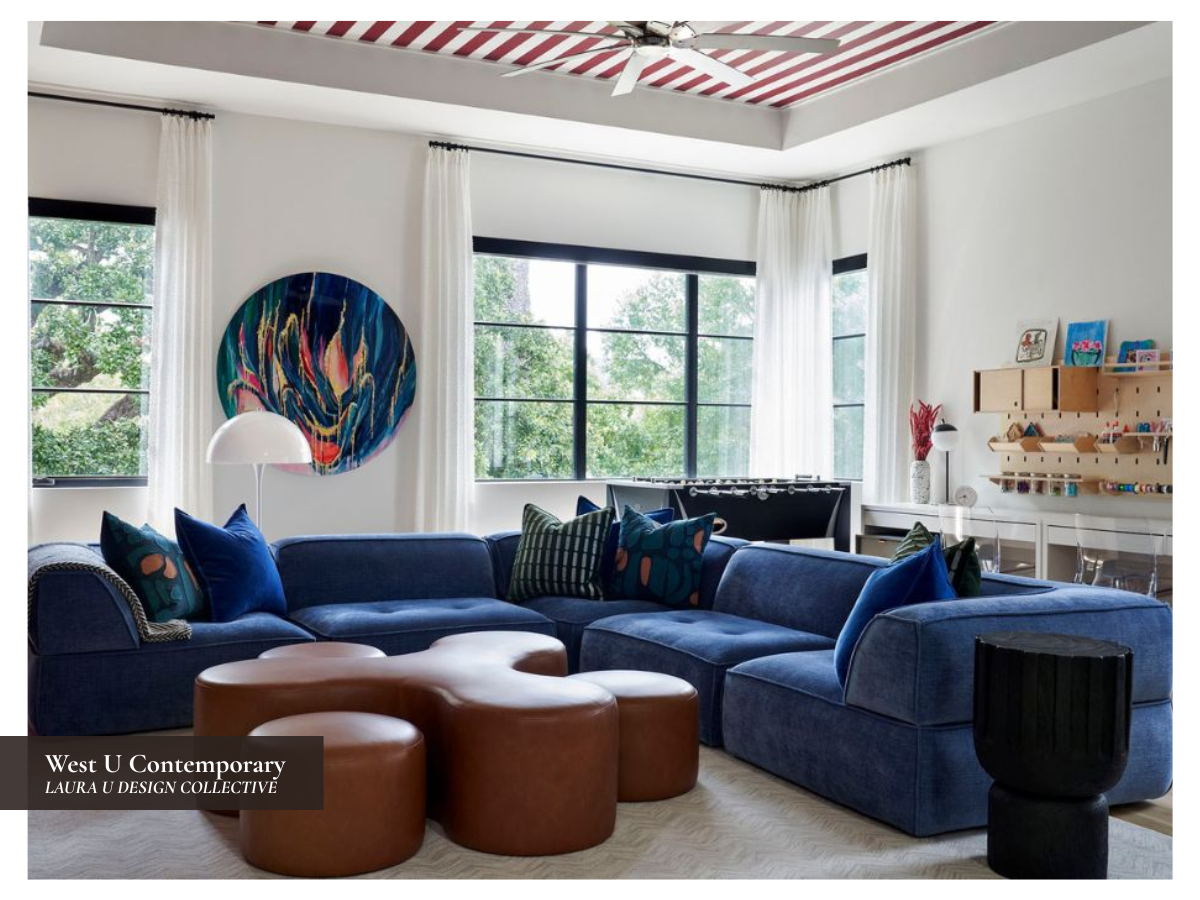
The deep blue sectional encircles the space, punctuated by a custom brown leather ottoman, while the berry red built-ins and striped ceiling add a playful architectural detail. What makes the room work so well is that the blue and berry red travel in different directions throughout the space. The red built-ins draw the eye vertically, while the striped ceiling sends that same color horizontally overhead. Blue works the same way. The sectional gives the room a generous block of saturated color, while the blue wallpaper behind the television repeats the hue on a vertical plane. Because both colors reappear across different surfaces, the palette feels integrated instead of concentrated in one corner.
This project focused on blending the wife’s edgy, quirky style with the husband’s handsome, tailored aesthetic. In this space, we’ve achieved that. The blue upholstery feels comfortable yet tailored, the red stripes are whimsical yet timeless, and the rounded leather ottomans were inspired by a fidget spinner, which is a hilarious yet elevated detail. This is a family-friendly room, but it still feels completely grown-up.
Blue, Purple, and Pink
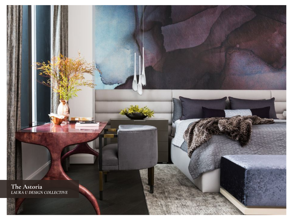
Blue, purple, and pink are close to each other on the color wheel and are also common nursery colors, so they can feel either too juvenile when saturated or too washed out when pastel. At The Astoria, we avoided both by selecting deeper, moodier versions of each hue.
The wallcovering establishes the bedroom’s palette. It blends blue, purple, plum, charcoal, and wine in a watercolor-like composition behind the bed, while the aubergine desk introduces a warmer version of the same color story near the window. The pink is not bright or sugary, which avoids the nursery intonation common to pink. Instead, it comes through as burgundy, mauve, and merlot, which makes the combination feel far more sophisticated.
This project was designed as an elevated bachelor pad that had to fit the whole family when they were in Houston. The darker wallcovering, gray bedding, and heavier window treatments give the room a masculine edge, while the curved desk, upholstered headboard, sculptural pendant, and layered textiles soften the room.
Orange and Blue
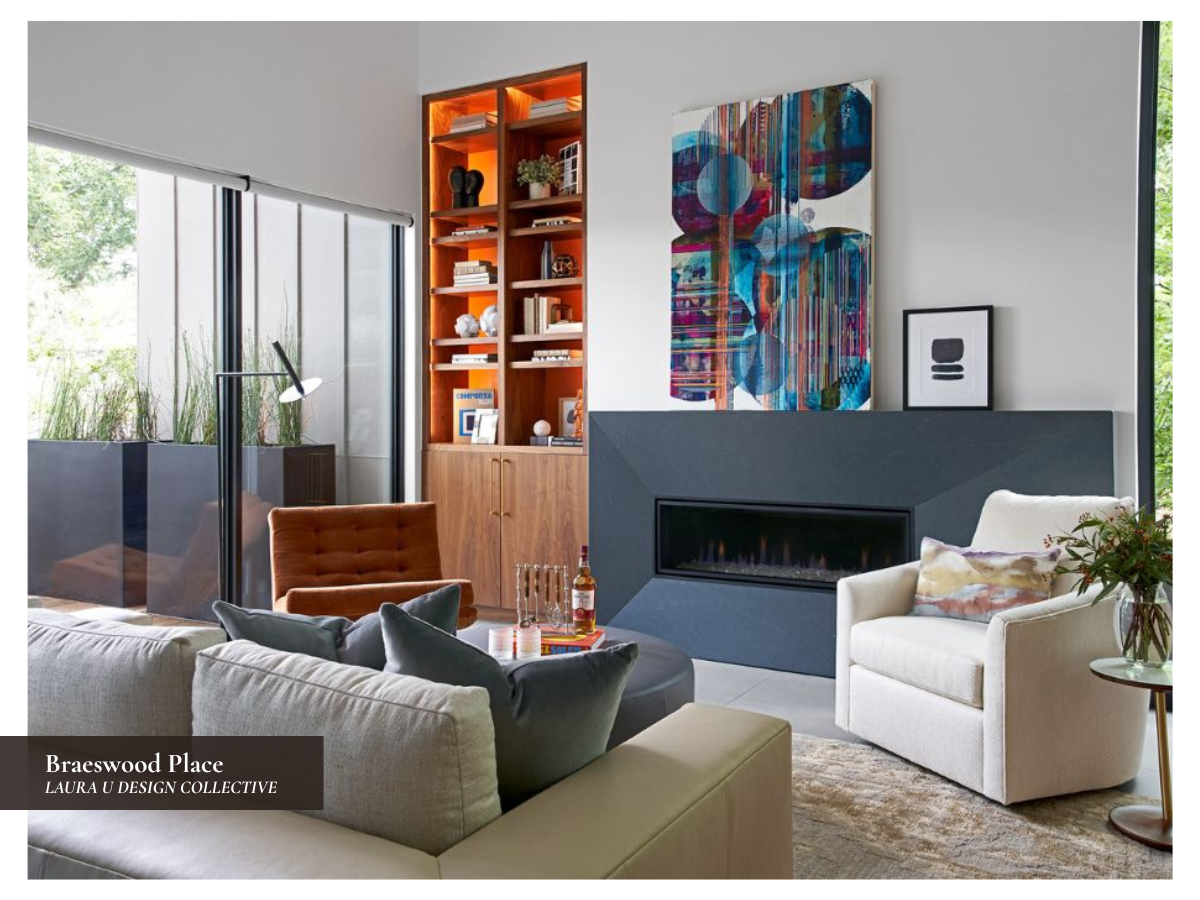
Orange and blue are direct complements, so they naturally create contrast, but Braeswood Place shows how much range that pairing can have. In this home, orange and blue appear in the living room, library, study, and pool house kitchen, but the combination never repeats itself identically from one space to the next.
That was an important design decision made by our team because Braeswood Place had to serve a large, social family with many different needs. The homeowners wanted a place where their children would love to gather, where guests could be entertained easily, and where both of their aesthetics could coexist. She loves color and pattern; he prefers a more monochromatic, modern look. Orange and blue helped us bridge those two points of view.
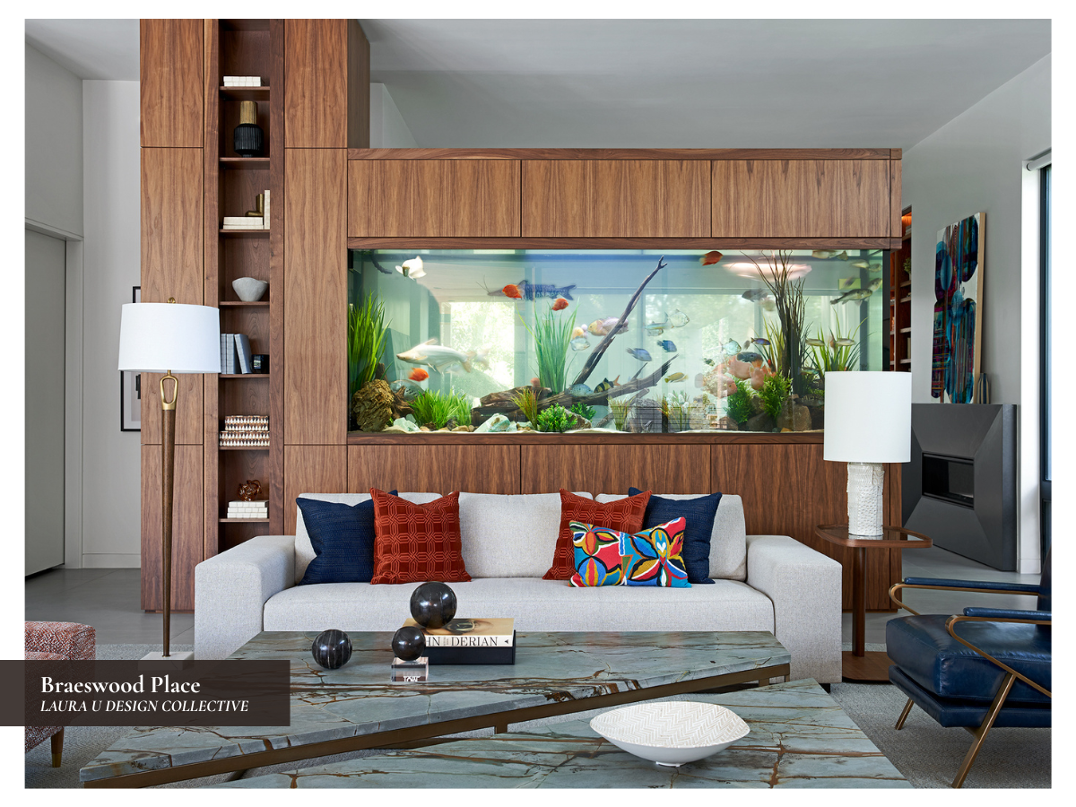
In the living room, the palette is softer and more tied to the home’s greater Southwestern influence. Deep blue chairs, rust-colored pillows, warm wood, and the fish tank room divider create a connection to water, nature, and the colors of a sunset. In the library, the orange takes on a richer tone through the chair upholstery and illuminated shelving, while the fireplace surround and blue artwork bring in cooler contrast. The study is more restrained, with moody blue-gray walls, walnut cabinetry, and orange-blue artwork that keeps the room connected to the rest of the home without making it overly bright.
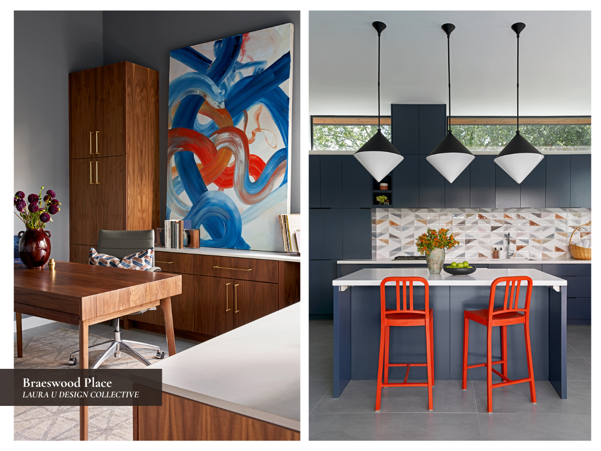
The pool house kitchen is where this pairing is boldest and most playful. Dark blue cabinetry creates a sleek backdrop for the bright orange bar stools, while the geometric backsplash repeats those Southwestern sunset tones in a more patterned way. Because the same color pairing appears in so many different forms, Braeswood Place feels cohesive without making each room look identical.
Create a Home as Unique as Your Personality with Laura U Design Collective
The key to using bold color is balance. Mixing daring hues with neutrals, natural materials, and softer tones ensures that each color-filled space feels polished instead of childish. Whether we’re working with blue and green plaid upholstery, a lacquered purple ceiling, a cobalt coffee table, or orange bar stools, we use each color to add depth, character, and personality to the home. If you’re ready to bring more color into your home, we would love to help.