Despite how elegant and enduring its darker shades can be, brown has lived in an awkward middle zone for years. Even the best brown paint colors were deemed too heavy for minimalist interiors, too dark for heritage-inspired spaces, and too muddy for maximalist homes defined by saturated jewel tones. Many of us dismissed the color brown as “dated” before it ever had a chance to be reconsidered, revamped, and reintegrated. Thankfully, that has changed and the diverse hues of this gorgeous color are back!
Over the past few years, deeper browns in particular have returned to residential interiors. Designers are using them on cabinetry, libraries, dining rooms, and millwork in place of stalwarts like charcoal and navy. Whether designing a cozy family room or a sophisticated kitchen, brown paint offers depth and richness while referencing nature in a unique way. These hues are surprisingly flexible. You truly can’t go wrong. Benjamin Moore’s 2026 Color of the Year, Silhouette AF-655, reflects that. It’s not a tan, taupe, or soft mocha. It is a true dark brown that can act as a perfectly neutral backdrop or a bold statement.
Below, you’ll find a collection of our favorite brown paint colors that match the dramatic depth and personality of Benjamin Moore’s 2026 Color of the Year, which meshes espresso and charcoal. While Pantone might be leaning towards traditional whites and lighter shades in 2026, we are all about the drama, sophistication, and integrity these gorgeous hues deliver. Some of these browns have red undertones while others are more gray; there are also “true browns.” Regardless, you’ll probably find your perfect shade in the list below!
10 Rich Brown Paint Colors We Love for 2026 and Beyond
Silhouette AF-655 by Benjamin Moore
Silhouette is a deep brown mixed with near-black gray to ensure it doesn’t skew too warm or muddy. In natural light, it looks rich and tailored. In dimmer rooms, it is moody but doesn’t fall flat like black or navy sometimes can. According to Benjamin Moore, this color “weaves rich espresso hues with refined notes of charcoal” and is “reminiscent of tailored suiting.” As for the latter, it does indeed have that masculine, tactile feel to it.
This color works especially well in dining rooms, studies, libraries, and bedrooms where a darker wall can make the space feel more comfortable and layered rather than heavy or weighed down. Pairing with warm whites, natural oak, aged brass, and taupes create a sophisticated, modern, and impactful interior without losing the historical influence. Of course, the finish matters here. Matte and eggshell allow the color to retain softness, while high-gloss pushes it in a more dramatic direction.
While this brown is not a true brown (it’s closer to gray in most settings), it was the inspiration for our article and feels much more “of the moment” than last year’s Pantone Color of the Year, which was Mocha Mousse.
Appalachian Brown by Benjamin Moore

Appalachian Brown is often described as a dark chocolate, and, in our opinion, that description is quite accurate. It has clear warmth, noticeable richness, and enough red underneath to keep it feeling inviting rather than severe. Still, the red undertone is not distracting; it doesn’t look at all like auburn or mahogany. Recommended pairings are clearly historically-inspired, with soft blues and pastel yellows chief among them.
Architectural Digest highlighted the shade for good reason. Designer Erick J. Espinoza described it as “deep, dark chocolate” with warmth that creates a cozy but polished environment. On walls, it feels enveloping but not overpowering (you’ll get a welcoming feel from this colour). On cabinetry, it brings immediate presence, but it’s gentler and sweeter than many brown paint colors on this list. Still, it is an excellent choice for rooms where you want depth and coziness. We love it as an accent in a breakfast nook or “the main event” in a primary bedroom.
Mink by Benjamin Moore
Mink sits comfortably between brown and taupe, which is part of what makes it so usable. It has warmth, but not enough to feel traditional, and depth without tipping so far to the espresso end of the spectrum. Depending on the light, it can read slightly mushroom-toned in the morning and more true-brown by late afternoon. This is why the paint formulator recommends pairing it with pale neutrals like White Sand, Moonlight White, and Silver Fox.
This is a reliable choice for open-concept homes where one color needs to move across rooms without calling attention to itself. Mink pairs well with lime stone, travertine, pale oak, and other surfaces as well as warm gray upholstery. It works nicely in living spaces and hallways where darker colors may feel overwhelming, but beige feels underwhelming. It’s easy to style with various fabrics and textures, which is wonderful.
If Silhouette feels too dramatic and Appalachian Brown feels too saturated, Mink often lands right in the middle, which is why it made our list of the best brown paint colors!
Cola by Farrow & Ball
Cola is a red, almost purple-based brown with some but not too much warmth when compared to many of the other shades on this list. Unlike darker archive colors like Tanner’s Brown or Mahogany, it does not lean cool or sooty. Instead, the red undertone gives it softness and dimension, especially in smaller spaces like a powder room or an entryway. Again, that undertone is fairly subtle and deep so it leans more purple than red and can almost look a bit ashy.
Farrow & Ball recommends pairing Cola with Joa’s White, which keeps the overall palette crisp while allowing the brown to feel intentional and luxe rather than heavy. The color is often seen on kitchen islands and cabinetry, particularly with chrome or polished nickel hardware. It feels traditional without being period-specific and works beautifully as an accent and as a main color choice.

Havana Coffee by Behr
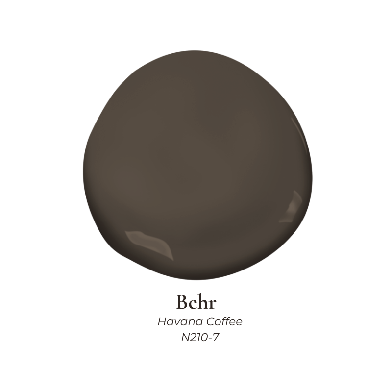
Very similar to Cola but a bit more neutral, Havana Coffee is a deep roasted brown with very little ambiguity. It reads dark and pure immediately, but the undertone ensures it feels rich rather than stark. This is not a soft or diluted shade, but it is incredibly versatile.
Behr categorizes it as part of their neutral family, which makes sense when you see it paired with lighter tones. It works especially well with pale stone, warm whites, and lighter woods that prevent the room from feeling enclosed. Havana Coffee is a strong choice for offices, media rooms, or cabinetry where contrast is welcome and the color can perform without competing with decorative finishes.
Black Bean by Sherwin-Williams
Appropriately named, Black Bean sits right on the edge between black and brown with a tinge of dusty purple. In low light, it can read almost ink-like. As daylight enters the room, the brown undertone becomes more apparent and softens the effect. A hair off its companion color Rockweed, this brown paint color has cool undertones unlike Havana and Cola.
This shade is particularly effective for millwork, interior doors, and built-ins where designers default to black or navy. Black Bean offers the same contrast but feels a bit gentler and more forgiving alongside wood floors and brass finishes despite the cooler tone. It works best when paired with lighter wall colors that allow that undertone to come forward naturally.
Bucktrout Brown CW-180 by Benjamin Moore

This writer’s personal favorite aside from The Palio, Bucktrout Brown is a historically-grounded color based on eighteenth-century iron oxide pigments. It has depth, complexity, and a slightly blackened quality that gives it authority in historic homes without feeling theatrical or out of step in modern/contemporary settings.
Traditionally used on doors, trim, wainscoting, and baseboards, this color excels in architectural applications. It pairs beautifully with plaster walls, warm whites, and antique hardware. Bucktrout Brown feels especially appropriate in older homes or spaces with traditional detailing, where modern espresso shades might feel out of place. Benjamin Moore recommends pairing this dark brown paint with Parish White, Market Square Shell (more of a green-toned taupe), Steam, and Mauve Blush (almost lavender).
Cracked Pepper by Sherwin-Williams
Another neutral, Cracked Pepper sits between charcoal and brown, which makes it useful when a client wants something dark but hesitates at full-bodied chocolate tones. It has a very faint warmth underneath its depth that becomes more visible next to organic materials and soft lighting.
This shade performs well on cabinetry, mudrooms, and accent walls. In spaces with cooler daylight, it appears closer to charcoal. In warmer interiors, the brown undertone becomes more noticeable. Cracked Pepper is a great option for homes where continuity between rooms matters and one dark color needs to work in multiple lighting conditions. Coordinating colors include White Sesame, Restoration, and Portsmouth.
Espresso Beans by Behr
Espresso Beans is exactly what the name suggests. Dark, saturated, and “beautiful with a dash of mystery,” it feels familiar without reading traditional or (worse) 1990s.
This shade works best when used deliberately. Kitchen islands, bathroom vanities, and built-ins benefit from its depth, especially when paired with light countertops or warm metals. Boasting Behr’s “One Coat Hide Guarantee,” Espresso Bean is easy to apply and holds its color well under artificial lighting. This is why it’s a dependable option for spaces used primarily in the evening.
The Palio by Backdrop
The Palio is a rich, velvety brown inspired by the historic Piazza del Campo in Siena. Very close to a true dark chocolate or coffee ground color, this brown paint is absolutely gorgeous. It has a slightly aged quality that keeps it from feeling sharp or contemporary, though it’s appropriate for any period.
Backdrop recommends pairing it with taupe-gray, terracotta, olive, and beige, all of which complement the color’s natural undertone. With an almost velvety texture, the Palio works beautifully in dining rooms, libraries, and bedrooms where darker walls contribute atmosphere (not straight-up drama). It feels collected and expressive, especially when layered with textiles, but also in more minimalistic interiors.
Want Something Close to Brown, But Not Quite?
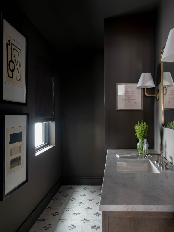
One of Laura’s favorite colors, SW 7048 Urbane Bronze, is used throughout her Mountain Lane Show House (which is also the family home). This dark gray hue sets the mood for a mountain modern home defined by contemporary art, stunning architecture, uniquely-decorated shared spaces, and a moody primary suite. It creates a sense of warmth as soon as you enter the Mountain Lane Show House, which is exactly what you want for a home in the mountains, surrounded by snow half the year! It’s similar in some ways to Silhouette AF-655 by Benjamin Moore, which blends charcoal and brown for a very versatile yet incredibly sophisticated paint color.