

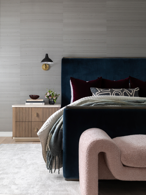
Romantic interiors often call to mind four-poster beds, floral artwork, velvet, full drapery, gilded metal, fireplaces, and warm decorative lighting. These references have long histories, but they can still suit a contemporary room when well-executed. A spare metal canopy bed preserves the height and ceremony of a traditional four-poster without decadent wood carving or heavy fabric. Floor-to-ceiling drapery can emphasize beautiful windows or create the illusion of architectural interest. Darker color palettes can make a bedroom feel more intimate, while curved furniture and richly textured materials can temper the harsher lines of modern architecture.
Several Laura U Design Collective projects approach these ideas from different directions, as is natural when one responds to the varied tastes of different clients. In our West U Transitional primary bedroom, a black four-poster, floral painting, fireplace, and full drapery share the room with contemporary lighting and clean-lined upholstery. Garnet Residence uses dramatic fabric, decorative details, gilded accents, and warmer putty and blush tones. At Mountain Lane, the primary bedroom is dark and enveloping, while the adjoining bath is pale and bright. Heights Modern is entirely different, with curved furnishings, patterned surfaces, and tactile materials within a contemporary Houston home.
Looking at these interiors together shows us that there is no one way to design a romantic space. Proportion, material, color, enclosure, and historical reference all contribute, but their concentration changes from one project to the next. A certain space might need only one overtly romantic gesture, while another can accommodate several. The questions we ask ourselves as designers are how those elements relate to the architecture around them, how they respond to the homeowners’ particular preferences, and how they support the function of the space itself.
Five Strategies That Make Romantic Interiors Feel Modern
Pair Traditional Forms with Contemporary Lines and Materials
As we recently covered in this post on the Journal, four-poster beds have been selected for romantic, palatial bedrooms for centuries, and much of their appeal comes from proportion. The posts extend the furniture vertically, so the bed relates to the volume of the room rather than simply occupying floor space. Earlier versions also boasted beautifully carved timber, elaborate canopies, and/or layers of fabric. Contemporary interpretations usually opt for preserving that height and ceremony but with less ornamentation.
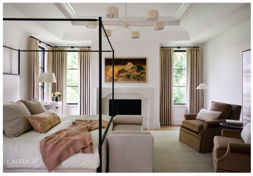
Our West U Transitional primary bedroom takes this approach. The Wesley Allen Royce canopy bed has a spare Aged Iron frame and Kravet upholstery. Kravet drapery in Oatmeal, finished with Samuel & Sons Somerset Open Braid in Oyster, surrounds the windows, while a fireplace in Segreto Venetian plaster and Ann Sacks marble introduces another element that’s both romantic and modern because of the natural material, which always feels timeless. Overhead, Currey & Company’s Monreale chandelier is decidedly contemporary.
The floral painting above the fireplace (actually a television) makes the room a little more romantic without dictating the rest of the decoration. We didn’t repeat florals across the bedding or drapery, instead opting for warm brown upholstery, pale textiles, the black iron canopy, and full window treatments.
Designer Leslie Martin discusses a similar mixture of periods in Architectural Digest, where she recommends pairing contemporary pieces with objects that have age and patina. The West U bedroom approaches that relationship through form as well as provenance. A canopy bed and fireplace bring recognizable historical references into a room with contemporary lighting, cleaner furniture profiles, and a much simpler series of decor objects.
The context of the home is important, too. We designed West U Transitional for clients with a 14-month-old daughter and another baby on the way. They wanted a serene home that could evolve with their young family, so performance materials, concealed storage, and practical planning coexist with the more romantic qualities of this primary bedroom.
Use Dramatic Drapery to Complement Existing Architecture or Create the Illusion of Architectural Interest
Drapery has an obvious decorative role in any space, though its placement can also change the perceived proportions of an interior. Panels mounted close to the ceiling emphasize height. Fabric spanning a broad wall can establish symmetry around an opening or piece of furniture. In a space without extensive molding or millwork, a large amount of fabric can introduce vertical lines and a more pronounced feeling of enclosure.
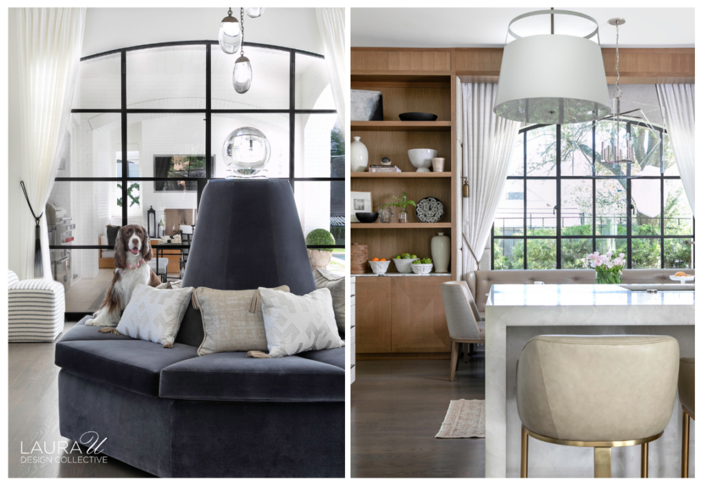
Garnet Residence gives us several perfect examples. The Family Hall had previously functioned largely as a passage between the entry and back portico. We added a custom hexagonal roundalette upholstered in Designers Guild fabric, then installed two pairs of cream drapes above separate openings. The repetition creates greater symmetry across a long interior space and gives the openings more definition. An Ochre waterfall chandelier, mounted through a custom canopy designed around the existing beams, calls your attention upward toward the ceiling.
In the breakfast nook, we approached fabric slightly differently. Kravet drapery frames the window, while upholstered panels extend vertically beside it. Our original home tour of Garnet Residence compared the effect to a boutique hotel, which is a fairly accurate description of what the additional upholstery accomplishes here. The wall has considerably more texture and visual structure than it would with just the window treatment.
Suzanne Lovell discusses this relationship between curtains and proportion in Architectural Digest. She describes drapery as “an extension of ceiling height” that can accentuate the architecture, particularly when panels are mounted outside the window trim and closer to the ceiling. Fabric can go further still. Mark Williams and Niki Papadopoulos covered the wall behind a bed and adjoining reading niche with embroidered floor-to-ceiling drapery for a House Beautiful Whole Home project. Williams says the treatment “gives depth and texture to the walls.” The scale is important here. Once fabric extends past the dimensions of a window, it starts to affect our perception of the wall itself.
Use Darker Color to Intensify Intimacy and Contrast
Romantic bedrooms need not relegate themselves solely to plush bedding and pale color palettes. A darker palette can diminish the visual separation between walls, drapery, furniture, and upholstery, especially when those materials occupy a close range of values. Lamps, windows, metallic details, and lighter adjoining rooms are then thrown into greater contrast.
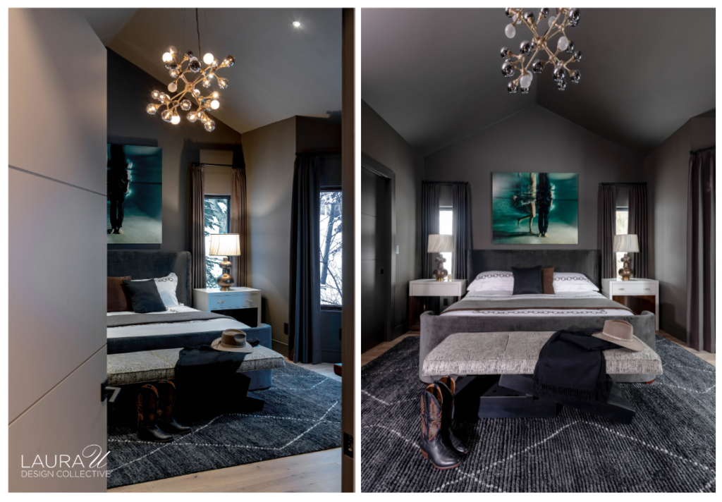
At Mountain Lane, we designed the primary bedroom and bathroom as two distinctly different environments. The bedroom uses deep gray across the walls and drapery, along with an upholstered bed, dark rug, and warm bedside lighting. Laura and the firm’s Creative Director also altered the architecture itself. A load-bearing column once divided the bedroom, and there was very little separation between the primary suite and the rest of the house. After structural work removed the column, the team constructed a vestibule at the entrance to give Laura and Michael greater privacy. Laura described her goal for the bedroom as a “dramatic yet serene and cozy space.”
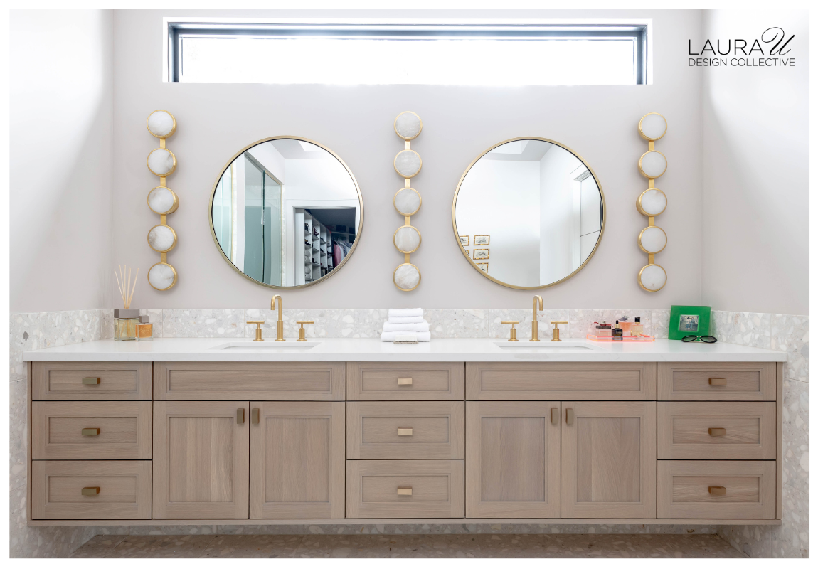
That privacy continues into the bathroom, though the palette changes substantially. The original bath was cramped and exposed to the street through a large picture window. We expanded it by five feet and replaced that window with a clerestory above the vanity. Daylight still enters the bath, but the higher opening protects privacy. Ann Sacks tile across the floor, dado, and vanity surround contributes to the much brighter treatment.
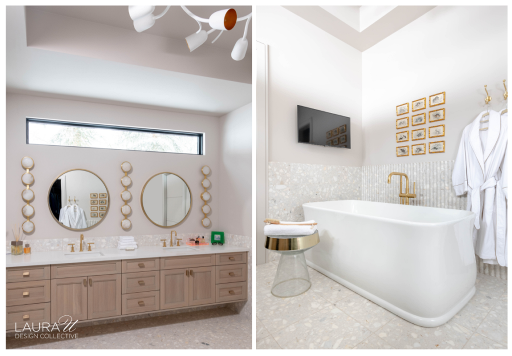
Laura discussed the contrast throughout Mountain Lane in Colorado Homes & Lifestyles, where she said, “I designed the home to have cozy, close moments where the rooms are darker and then soaring bright spaces, like the kitchen and great room.” She and Laura U’s then Creative Director considered how Laura, Michael, and their daughters actually lived in the house when making these decisions. The darker primary bedroom belongs within that over-arching progression between enclosed private rooms and brighter communal ones.
Heather Hilliard took a similarly material approach in a New York bedroom published by Architectural Digest. Blackout curtains alone were insufficient for the darker atmosphere she wanted, so she covered the walls in charcoal wool and upholstered the custom bed in gray-blue velvet. She said that, “We wanted to create a soft, restful cocoon, to provide the client with a serene space to unwind after a day at work.” Different surfaces absorb and reflect light differently, which is especially noticeable within a narrow, darker palette.
Balance Modern Geometry with Curved Forms and Tactile Materials
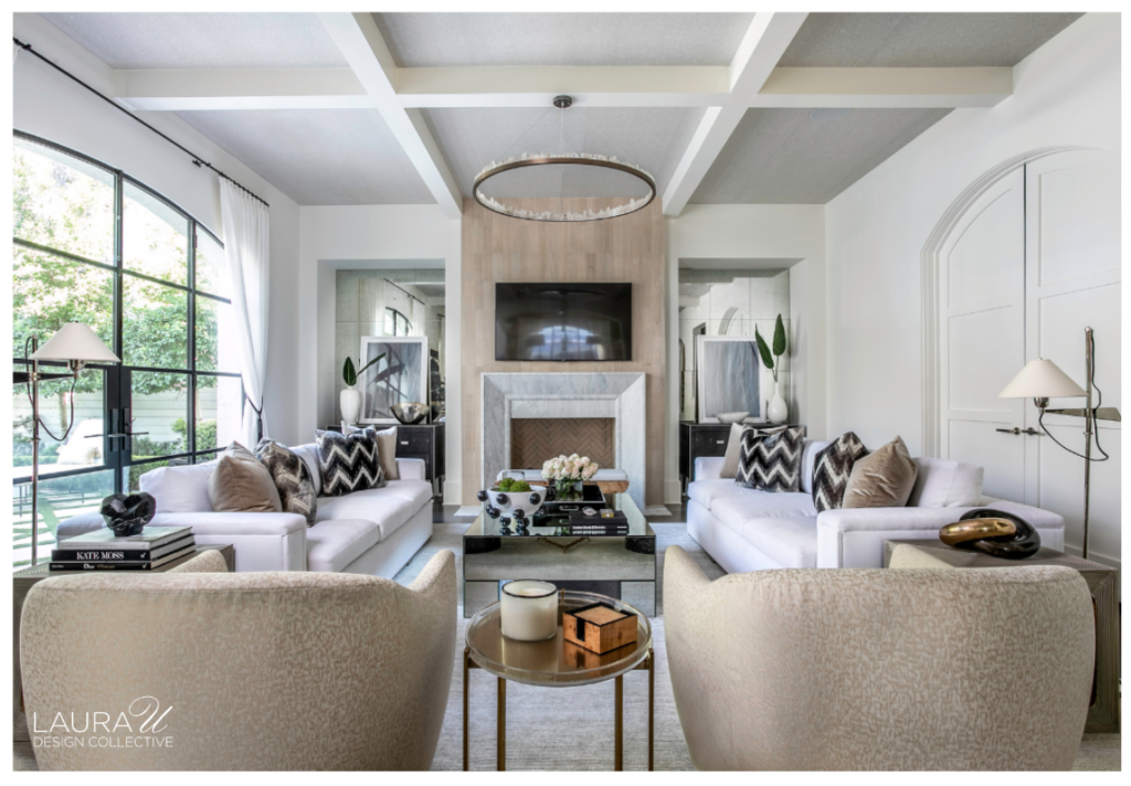
Heights Modern is a unique but much less historically referential example. The contemporary Houston house was completed in 2017, and the owners wanted its interiors to relate to the modern exterior while acknowledging the older architectural context of the Heights. Throughout the project, bold furniture, patterned wallcoverings, and statement lighting bring detail into an otherwise contemporary setting.
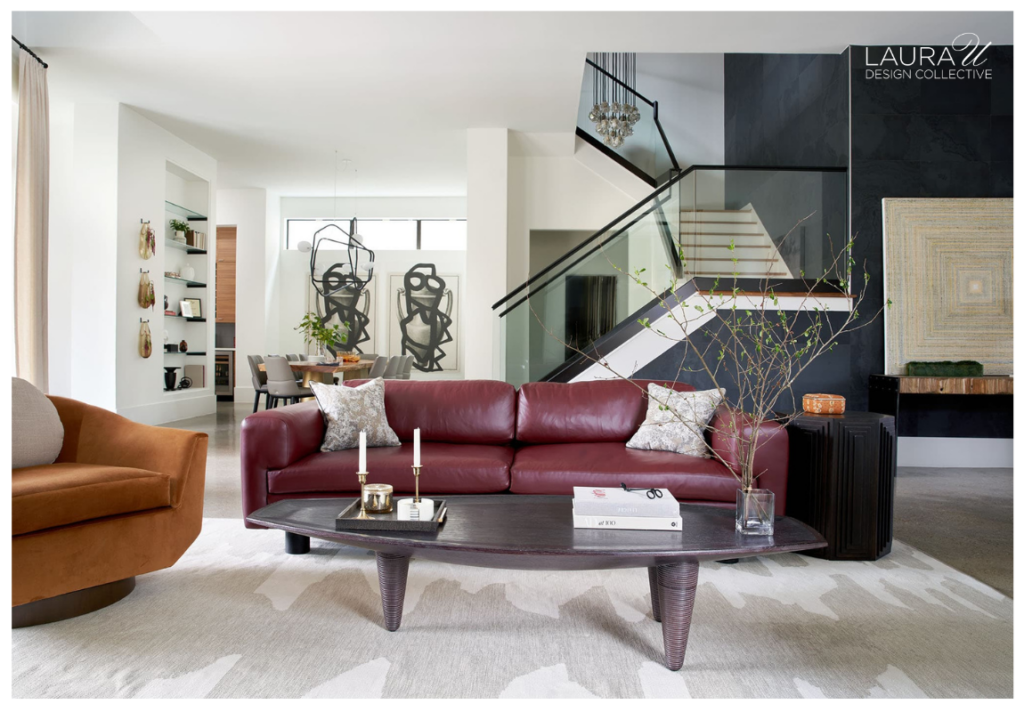
Curved furniture is especially interesting in this context because its history belongs as much to modernism as it does to more decorative interiors of decades past. ELLE Decor traces the lineage through Jean Royère’s Ours Polaire sofa, conceived in the late 1940s, and Vladimir Kagan’s curved sofa from around 1950. Kagan’s design bent away from the wall, which changed both circulation around the sofa and the relationship among the people seated there.
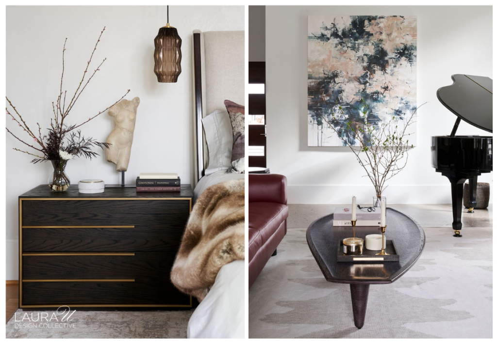
That history helps separate curved furniture from easy associations with femininity or traditional decoration. Within contemporary architecture, a rounded sofa, upholstered chair, or sculptural table can interrupt a succession of straight walls, rectangular windows, and hard-edged millwork. Textile and finish are just as important. Velvet, wool, patterned wallcovering, visible wood grain, and woven fabric introduce variation without changing the architectural contours of the house (or our perception of them).
Designers Matt Berman and Andrew Kotchen of Workshop/APD discuss a similar approach in an ELLE Decor feature on a highly modern New York apartment. Berman describes selecting each piece according to “shape, material, texture, and color” so that it “complements and softens the architectural elements.” Their material palette includes pieces with visible evidence of fabrication alongside an extremely precise modern structure.
Use the Primary Suite for Deeper Color, Fuller Drapery, and More Decorative Detail
Primary bedrooms in family homes present a particular design opportunity because their patterns of use differ from those of kitchens, family rooms, playrooms, and other communal spaces. Mountain Lane, Garnet Residence, and West U Transitional were all designed around families with children, yet their primary suites accommodate materials and decorative decisions that would not necessarily make equal sense everywhere else in the house. Mountain Lane was renovated for Laura’s family of four, Garnet received an explicitly family-oriented redesign, and the West U clients had two children under two when the project began.
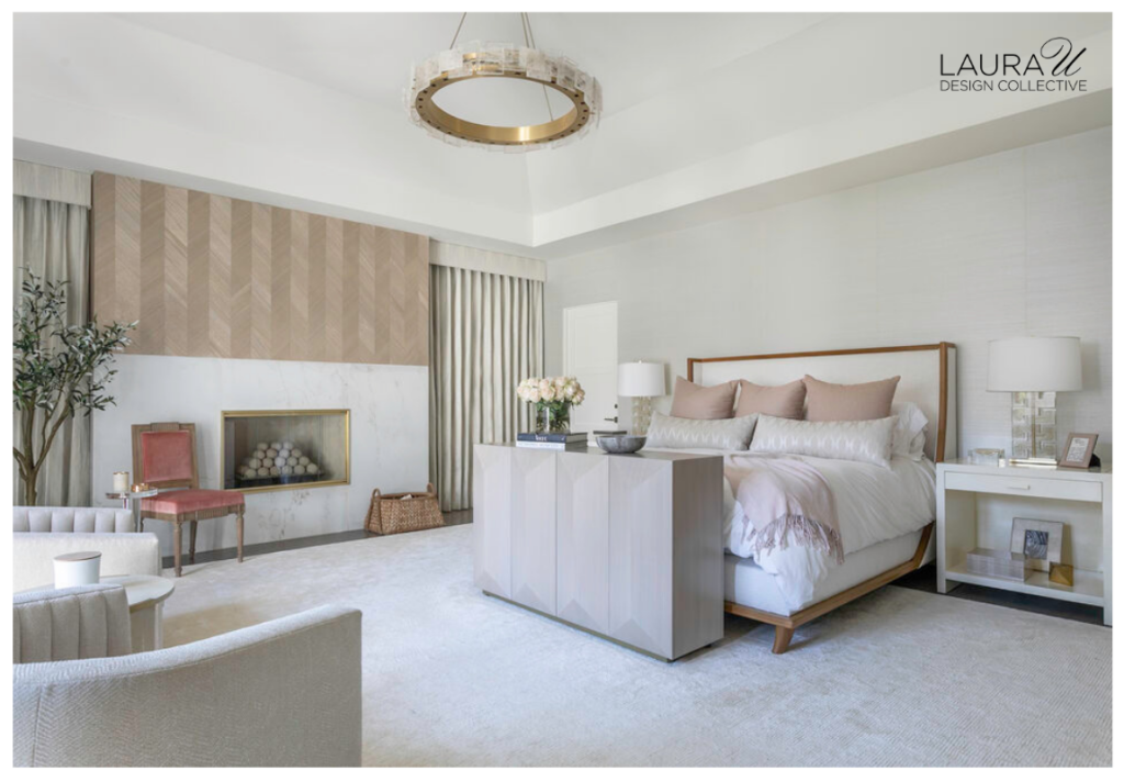
Garnet takes a softer, more feminine approach than Mountain Lane. In the primary bedroom, Maya Romanoff chevron wood paneling extends above the fireplace, a vintage chair is upholstered in blush Schumacher velvet, and pale pink linens introduce another warm tone at the bed. Laura U and El Dorado Woodworks also designed a custom console at the foot of the bed that conceals the television when it is not in use. The romantic character of the room comes through material and color alongside a fairly practical piece of custom furniture.
West U is yet another variation. Its primary bedroom uses an iron canopy, oatmeal drapery with decorative braid, velvet lounge chairs, marble, Venetian plaster, and an upholstered bench, all within a house where durability and family life informed many of the larger material decisions.
In Closing…
Mountain Lane, Garnet Residence, West U Transitional, and Heights Modern share very little stylistically. They show that romance and intimacy in interior design are not cultivated by a singular style; they are unique to the clients who will occupy the space. Mountain Lane is darker and more enclosed. Garnet introduces blush velvet, wood veneer, and vintage furniture. West U opts for an iron canopy, pale upholstery, decorative trim, and plaster. These interiors make it clear that romance and intimacy in interior design are achieved through atmosphere, proportion, texture, and calibration to the owners’ unique aesthetic.
