

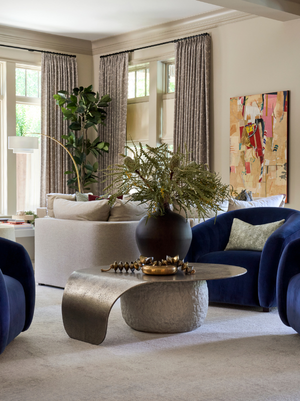
Many of our clients are deeply connected to their art collections, so our design team reflects upon, references, and incorporates those curated pieces throughout the project. Some of these considerations are practical in nature; for example, the dimensions of a monumental painting in the client’s collection might alter the placement of paired sconces or the scale of a staircase’s railing. A sculpture might need more clearance than the initial furniture plan and flow account for. The delicate watercolor series our clients adore might need to be moved from the sun-filled breakfast nook into a den where light exposure isn’t as much of an issue.
But we also want to consider art throughout the design process when the client owns a few special pieces, but there isn’t a significant preexisting collection. In cases such as these, we might work with an art advisory. They help isolate certain works and artists while we determine mood and atmosphere, scale and palette.
In an article for Architectural Digest from April 2025, Alia Akkam and Elizabeth Stamp call “leaving art as an afterthought” one of the most common mistakes in the design process. We prefer to account for artwork while there’s still time to make adjustments. Marrying art with interiors is key to ensuring the home looks and functions like a home rather than a gallery space.
Eight Design-Minded Tips for Marrying Art and Interiors
#1 Work with an Art Advisory
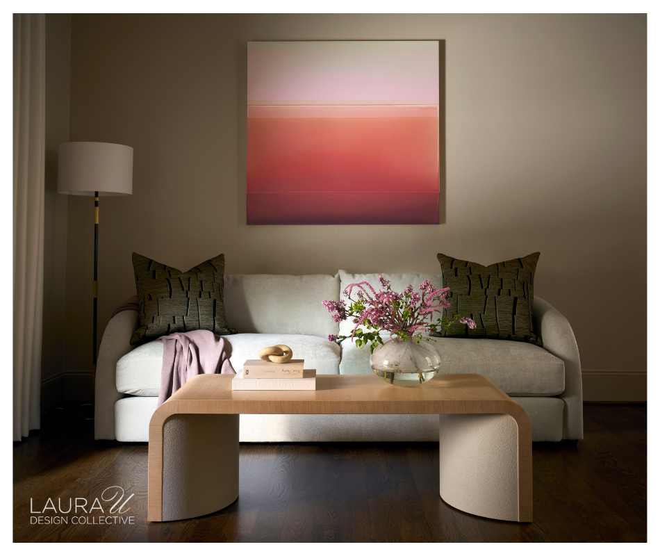
An art advisory can be especially helpful when you know the atmosphere you want before you know the artist you want. A client might have a very specific response to color, scale, subject matter, or even a sense of humor, but no interest in searching galleries artist by artist. We can give the advisory that context while we work through furniture, textiles, lighting, and wall finishes, then review individual pieces against the room as it develops.
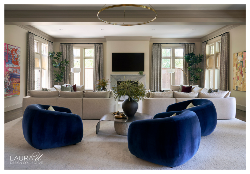
We worked with Ellio Fine Art at Hunter’s Creek, where the homeowners had clear preferences around saturated color, fashion, and playful references. Blue and cherry red were particularly important to the clients, and Ellio sourced art for the entry and hallways while our team developed the surrounding interiors. This collaboration gave us a way to approach the collection through mood, palette, scale, and placement without asking the clients to begin with a specific artist or style.
#2 Consider Delicateness When Determining Placement
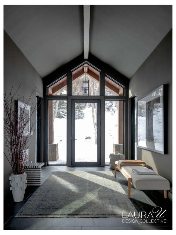
The material and placement of a piece deserve the same attention as its subject or scale. We look at whether the work is glazed, whether a surface is exposed, how close it is to the primary walking path, and whether the room introduces moisture, heat, or prolonged sunlight. At Mountain Lane, a framed work in the foyer is mounted above a sculptural chair and outside the main path from the entry door. The piece has a prominent position, but the wall placement reduces the chance of accidental contact in a busy circulation space.
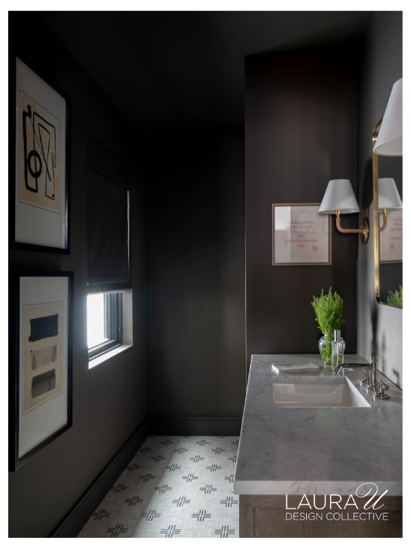
The Mountain Lane powder room is another but different example. Framed works behind glazing make sense there because a powder room does not have the shower or tub that would introduce the higher humidity of a full bath.
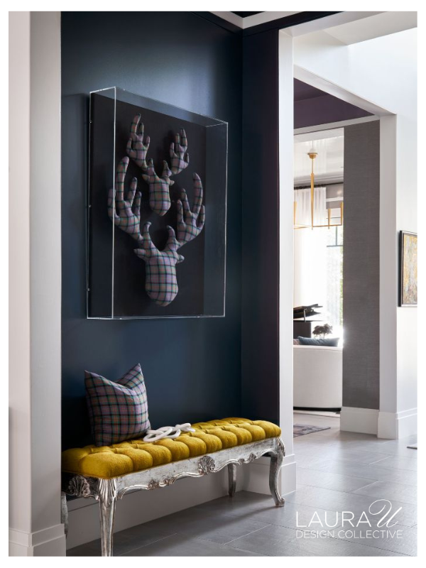
At Highland Village Contemporary, the tartan-upholstered deer-head sculptures are protected by a clear vitrine. The enclosure protects the textile surfaces without obscuring their dimensional form, so the work can occupy a circulation area without direct contact.
#3 Work with a Designer on Lighting
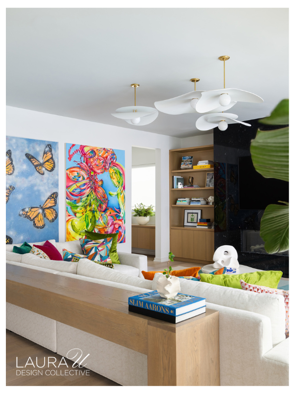
When we light artwork, we consider how much natural light filters into the room, whether glazing creates glare, how evenly a fixture illuminates the surface, and where our clients will usually view the piece. A painting might look properly lit from directly in front of it, but a recessed fixture could create a distracting reflection when viewed from the sofa or dining table. We also pay attention to bulb temperature and heat, particularly with more delicate works.
We generally recommend diffuse, low-impact illumination that spreads evenly across the artwork rather than concentrating brightness in one area. Dimming gives us another level of control in interiors where natural light changes considerably throughout the day. After the artwork and furnishings are installed, we can adjust fixture angles and intensity from the primary viewing positions in the room.
#4 Consider Shape, Color, Texture, and Mood When Pairing Art with Furnishings
Color is often the first connection we notice between art and furnishings, but we also look at shape, texture, scale, and mood. In an article for House & Garden from July 2024, Eve Delaney writes that “Colours can be drawn out of paintings” and used throughout an interior. We might work that way, or we might reference a shape or pattern without repeating the artwork color for color.
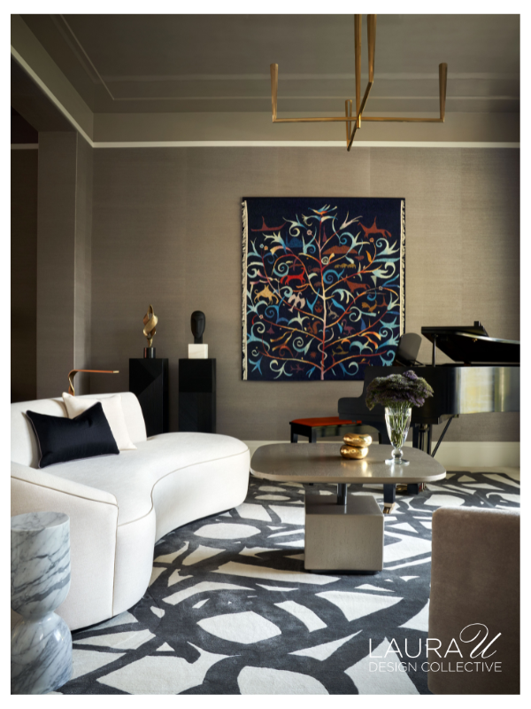
In the living room at Highland Village Contemporary, the large black-and-white rug has a branching pattern that relates to the framed Tree of Life textile on the wall. Their palettes are quite different, but the repeated organic forms connect the two. (In this project, we consulted with Laura Rathe for art advisory.)
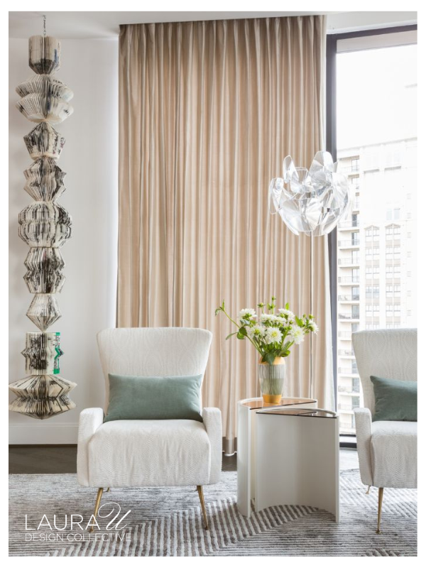
We also like to blur the line between art and decoration, particularly with sculptural pieces. At The River Oaks, a Michael Laube totem fills one corner with stacked bands of color alongside striped drapery and patterned upholstery. At The Astoria, a totem-like installation by Karen Hawkins is made from folded paper and suspended vertically, with references to Ruth Asawa and postmodernist architecture.
In both interiors, the artwork participates in the larger composition rather than being isolated from the furniture, textiles, lighting, and architecture around it. This is a residence, so art needn’t be separated from decoration in the way it might be in a gallery.
#5 Design Millwork with Artwork in Mind
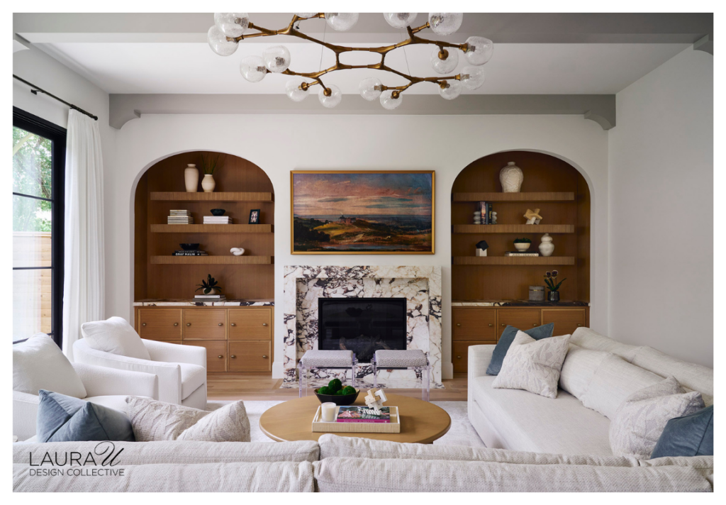
When artwork is installed alongside custom millwork, we want to account for its dimensions before fabrication. The relationship might be architectural, with cabinetry or shelving framing the work, or the piece might be set directly into the millwork itself.
Either approach requires us to consider scale, sight lines, shelf heights, lighting, and the amount of space around the artwork while we are still developing the elevation. For example, at West U Transitional, symmetrical built-ins flank the fireplace while the painting is centered between them, so the millwork creates a clear framework around the art without enclosing it.
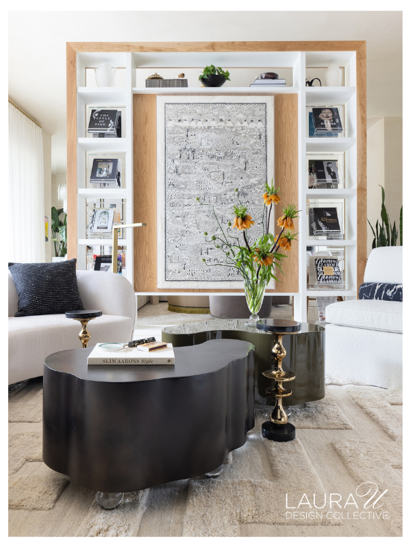
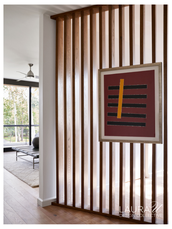
At Sandalwood Contemporary, the homeowners already owned the large work on paper, which we had reframed before incorporating it into the custom oak divider. Its dimensions helped determine the scale of the central opening, while the surrounding shelving was developed for books and collected objects.
We took a similar approach in the Highland Village Contemporary office, where a framed work is recessed within saturated magenta cabinetry. In both Sandalwood and Highland Village Contemporary, the art was inset directly into the millwork rather than hung on an uninterrupted wall.
#6 Mix Framing Approaches and Matting Widths
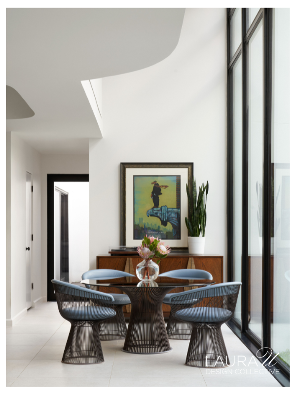
Not every piece in a collection needs the same frame profile or mat width. A smaller piece might benefit from a broader mat that gives the image more gravitas and space, while a larger piece might need a tighter mat so the artwork has more presence on the wall. At River Oaks Modern, our clients’ collection uses several approaches: some works are surrounded by wide white mats, while others have narrower borders and more decorative frames. That variation helps each piece respond to its own scale, medium, and placement.
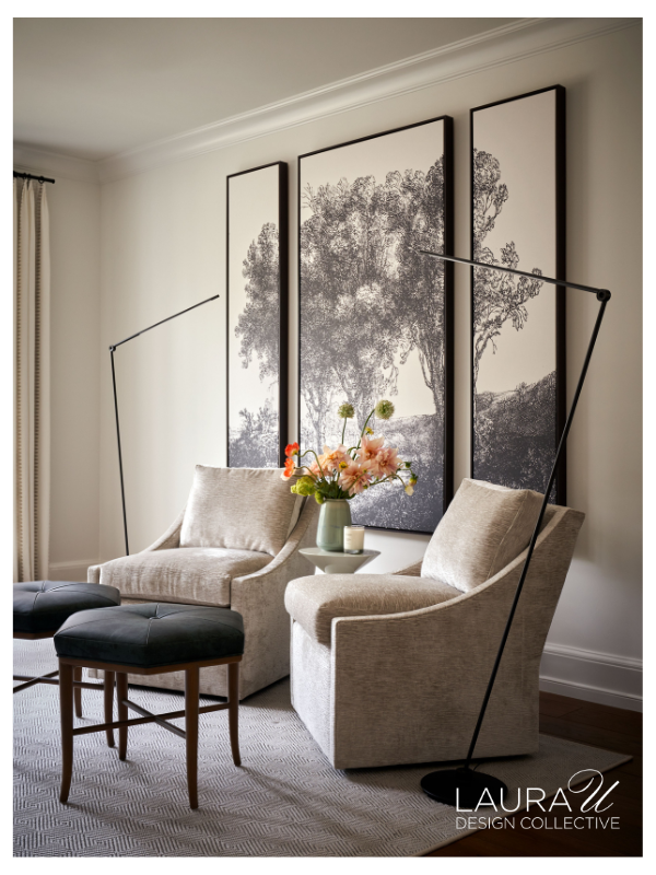
The triptych at Huntwick Forest takes a more consistent approach because the three panels are meant to be viewed together. Each panel is framed separately with the same narrow black profile, which gives the composition structure without competing with the detailed landscape imagery. Framing does not have to match from room to room, but within a multipart work, consistency can help the individual pieces function as one composition.
#7 Create a Dialogue Between Artwork and Wallcoverings
When we place art over wallcoverings, we consider pattern scale, texture, color, and how much contrast the artwork needs around its edges. Contrary to popular opinion, you don’t need to keep art extremely restrained when placing it on a patterned surface. That said, we want to understand how the two will look together before finalizing either selection, especially if the client insists that a certain painting or print go here or there.
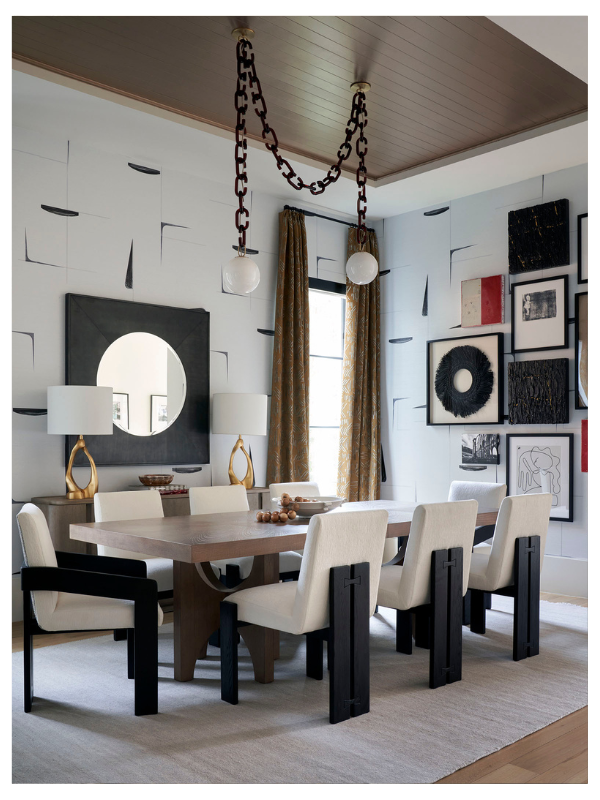
At West U Contemporary, the dining room combines graphic wallcovering with a salon-style grouping of artwork. The black marks within the paper relate to the dark frames and lines within several pieces, while the pale background gives the collection enough definition across the wall.
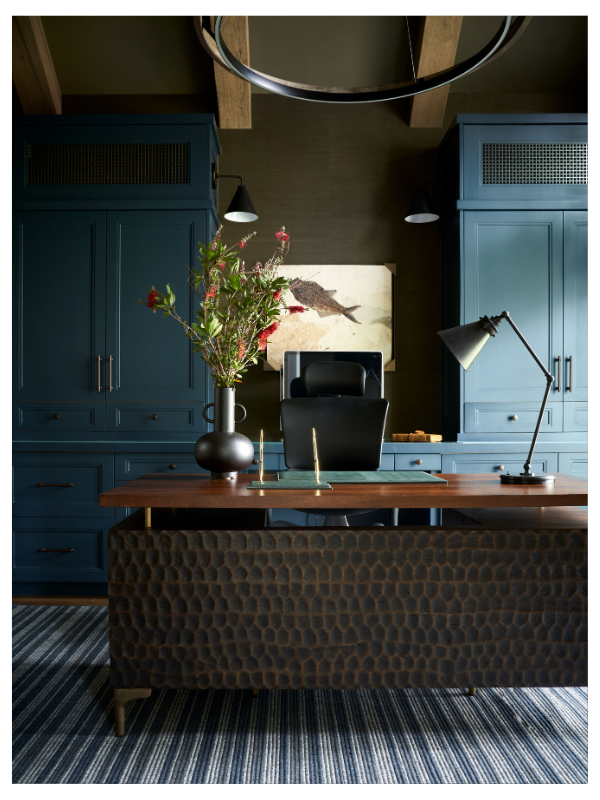
The Huntwick Forest study takes a different approach. There, a textured wallcovering creates a darker background between blue custom built-ins, with a single artwork centered above the desk. The artwork has a lighter ground and enough contrast against the wallcovering that its details are easy to see from across the room. In both spaces, we considered the wall finish and artwork together rather than treating the wallcovering as a background selected independently.
#8 Place a Mirror Opposite Large-Scale Artwork
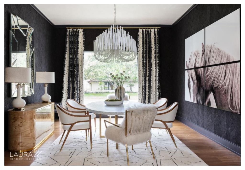
When one large artwork is the primary piece in a room, we often consider what should occupy the wall directly across from it. A mirror can give us a second view of the artwork without introducing another piece of similar scale. This is particularly helpful in smaller dining rooms, where two monumental works on opposing walls might compete for attention or make the room more visually dense.
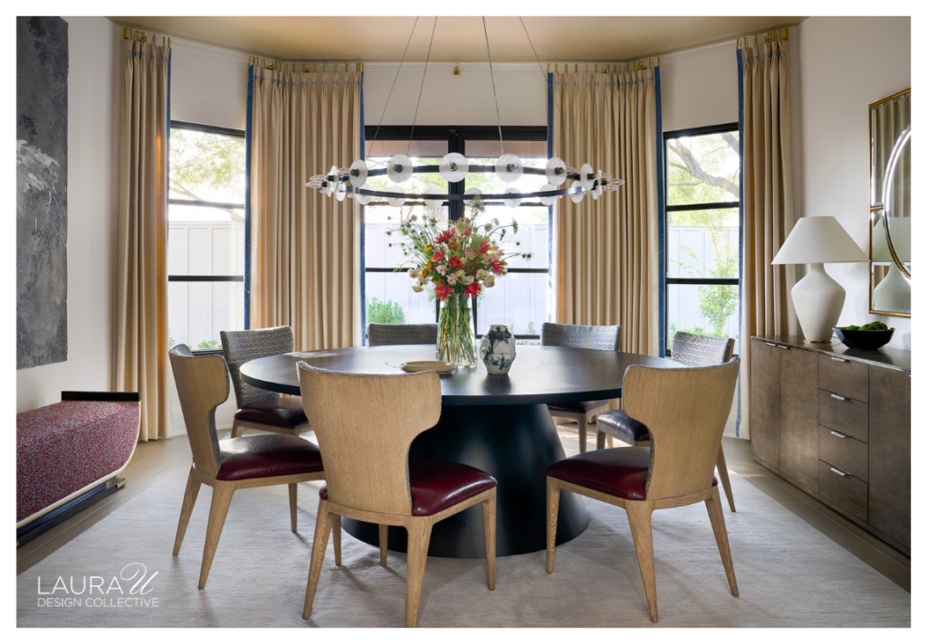
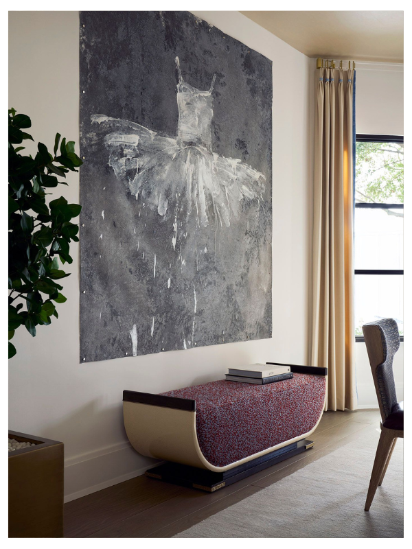
At Sandalwood Contemporary, a large painting of a dancer occupies one side of the dining room, while the mirror across from it reflects portions of the artwork back into the space. We used a similar relationship in the Garden Oaks dining room, where a large-scale horse triptych faces a faceted mirror on the opposite wall. In each room, the mirror extends the visual reach of the artwork and adds depth without asking another major piece to compete with it.
We still consider the angle carefully, especially when windows or decorative lighting might also be reflected from the primary viewpoints around the table.
